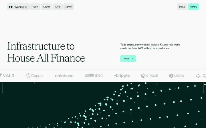
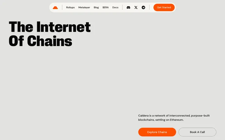
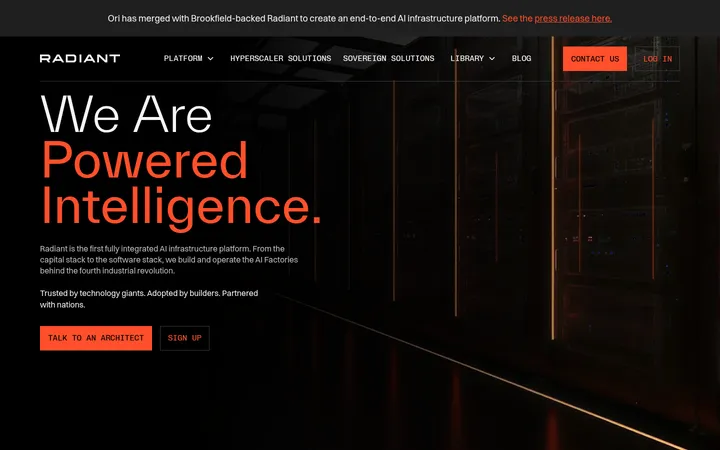
North star · Use the deep brown-black canvas and warm red signal accents to frame precise, spacious infrastructure storytelling.
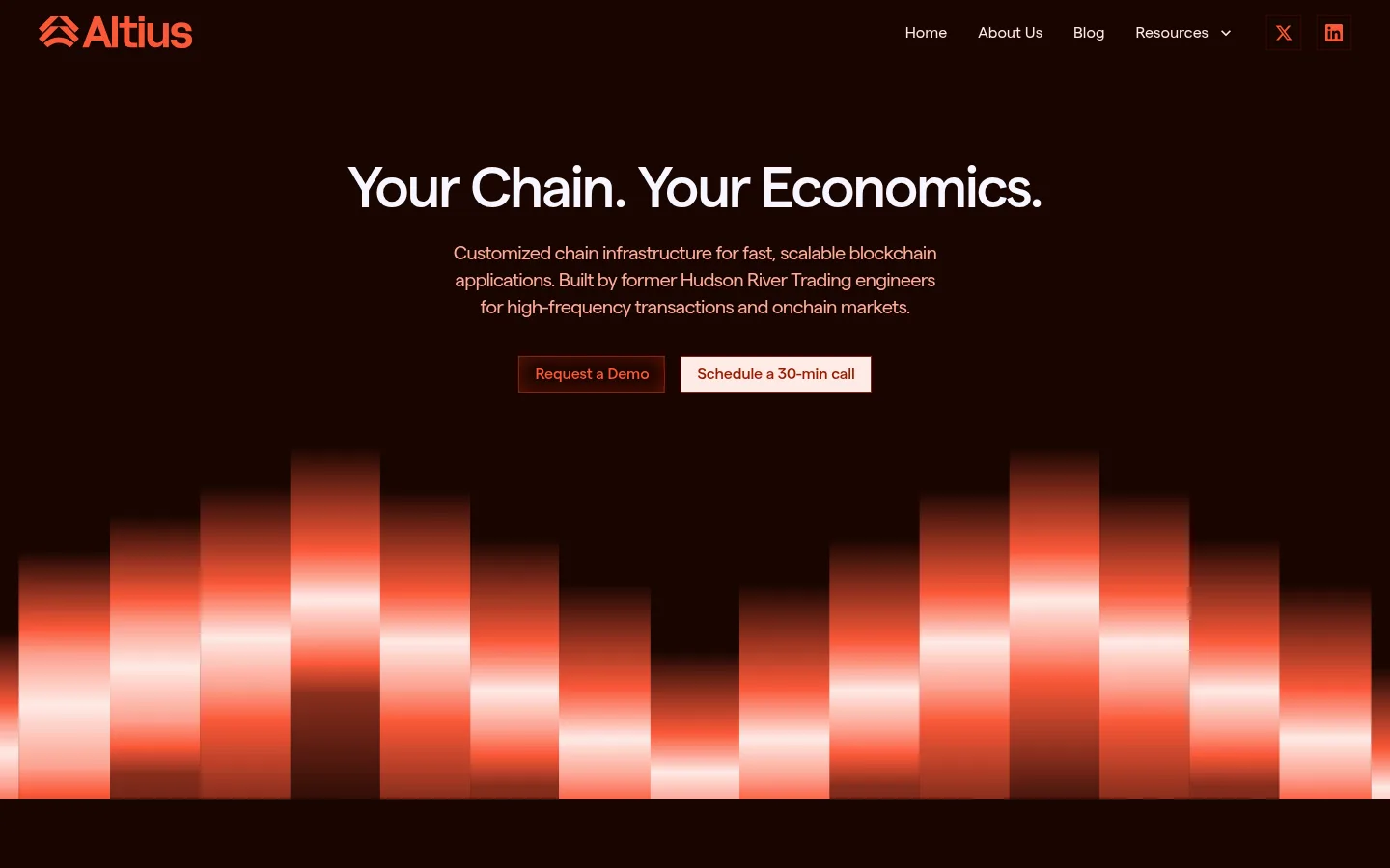
The visual strategy pairs a near-black brown canvas (#190501) with warm off-white surfaces (#f7f6ff and #feeae6) and a concentrated red-orange accent range. The hero stays restrained: centered headline and copy sit above compact paired CTAs, while an abstract luminous bar-wave anchors the bottom. Matter carries nearly all interface text, with rounded, closely tracked display and body typography; Fabrikatmono is reserved for terse technical labels. The page alternates dark investor and feature sections with pale explanatory bands, creating contrast without introducing a new visual language. Content moves from centered introduction to split text-and-diagram storytelling, then a three-card benefit grid and an architecture showcase. Fine red borders, square corners, and sparse inset button glow keep components technical rather than soft or ornamental. Spacious section breaks and a constrained content width let the dense infrastructure claims remain scannable.
Primary display, heading, body, navigation, caption, and button type.
Aa 设计
Fabrikatmono
网络字体 · 字重 400 / 500 · 占比 8%
免费替代:IBM Plex Mono
Compact technical and code-like labels.
角色
示例
字号
字重
行高
字距
特大标题
Large hero or section display headings.
Altius Labs
60px
500
1.08
-0.042em
一级标题
Primary hero title and major page headings.
Altius Labs
48px
500
1.13
-0.033em
二级标题
Feature card titles and secondary headings.
The quick brown fox 敏捷的狐狸
24px
700
1.16
0
正文
Hero supporting copy and explanatory paragraphs.
The quick brown fox 敏捷的狐狸
20px
400
1.4
-0.04em
辅助文字
Small supporting labels and secondary copy.
The quick brown fox 敏捷的狐狸
16px
400
1.5
0
按钮
CTA labels and interactive button text.
The quick brown fox 敏捷的狐狸
16px
500
1.25
-0.01em
导航
Header navigation links.
The quick brown fox 敏捷的狐狸
16px
400
1.5
0
代码
Uppercase technical labels and architecture annotations.
const style = 1;
14px
400
1.75
-0.05em
间距与布局
基准单位 8px · 密度:宽松
100px版块间距
20px元素间距
20px卡片内边距
1360px内容最大宽度
4px
8px
10px
14px
16px
20px
24px
32px
40px
48px
100px
The page uses a spacious single-column narrative with a measured 1360px maximum width and a 100px section rhythm. The hero is centered; later content shifts to left-aligned split layouts, a three-column benefit-card row, and a centered technical showcase. Alternating pale and dark section bands create clear chapter breaks. Keep text blocks compact within generous surrounding space, and group related labels, illustrations, and copy rather than filling every area.
圆角与层次
inset · button
inset · button
sm · card
The design is mostly flat, with square-corner components and fine coral or dark-red borders defining cards and controls. Avoid broad drop shadows; the measured card shadow is subtle, while buttons may use restrained inset glow. Layering comes mainly from diagram artwork and luminous hero graphics, not floating interface panels.
组件
下面的预览按实测的按钮、输入框、徽标、卡片样式重建(字体用替代字体)。
Navigation
Matter 16px links sit on the dark canvas beside a coral wordmark and social icons; use compact, unboxed navigation.
Hero CTA pair
Two square-corner controls use 8px 16px padding: a dark outlined Request a Demo and pale filled Schedule a 30-min call.
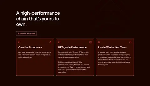
Benefit cards
Three dark reddish-brown cards use 20px padding, thin #fa5838 borders, pale text, and short numbered headings.
Investor logo band
A dark full-width section arranges investor and builder marks in a six-column grid with a small uppercase coral label.
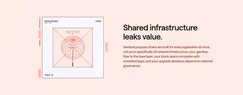
Feature split
Pair a technical diagram with a concise heading and paragraph, switching between pale and dark section bands.
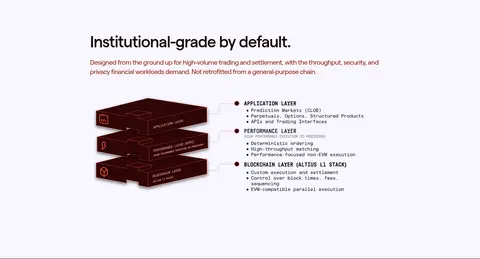
Architecture showcase
A pale section combines a heading and short introduction with a layered chain-stack illustration and technical annotations.
Imagery · The hero uses an abstract symmetrical bar-wave with soft red, coral, and pale highlights against the dark canvas; treat it as a luminous graphic, not a brand palette expansion. Later sections use investor logos, a technical diagram, and a layered chain architecture illustration. Keep diagrams clean and schematic, with warm red-brown outlines and restrained detail; there is no defining photography or video.
Use pale section bands to punctuate the dark narrative.
Reserve Signal Coral (#fa5838) for crisp accents and hairlines.
Keep CTAs square-cornered and visibly distinct.
Use Matter for interface copy and Fabrikatmono for technical labels.
Give diagrams clear space and a schematic, engineering-led treatment.
✕ 不该做
Do not introduce unmeasured brand colors.
Do not round cards or buttons into soft pills.
Do not cover the hero with dense copy or controls.
Do not use broad, dramatic drop shadows.
Do not make every section dark or every section pale.
Do not treat colors inside illustrations as core interface tokens.
给 AI 的提示词
想快速出一个同风格的新页面,把这段话连同 DESIGN.md 一起发给 AI。
Build a new Altius Labs page with a dark, technical editorial feel. Use Kiln Black (#190501) as the main canvas, Cool Porcelain (#f7f6ff) and Blush Paper (#feeae6) for alternating light bands and readable type, and Signal Coral (#fa5838) with Oxide Red (#951c04) for precise borders, links, and CTA accents. Set interface typography in Matter, with Fabrikatmono reserved for uppercase technical annotations. Use spacious section breaks, a constrained content width, square-corner cards, and fine borders rather than heavy shadows. Balance concise engineering-focused copy with schematic diagrams or luminous abstract graphics. Keep layouts centered for introductions, then use clean split sections and compact feature grids; avoid decorative clutter and unmeasured colors.