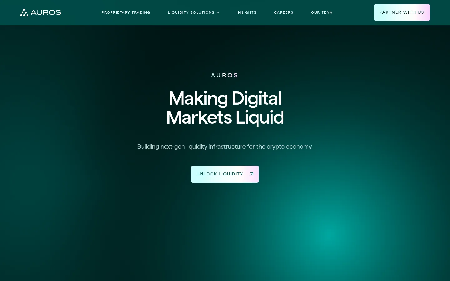
Auros以近黑深青为底,搭配明亮的水绿色渐变和克制的淡紫点缀,呈现专业而沉稳的机构级加密流动性品牌形象。超大标题、宽松的版块节奏与抽象市场视觉贯穿首页,从品牌主张延伸至数据、口碑和行业洞察。
North star · Keep the dark teal field uninterrupted, then use luminous gradients and oversized type as deliberate focal points.
The visual system is built on a near-black teal canvas (#001413), with deep green-teal surfaces used sparingly to distinguish content panels without breaking the continuous dark field. White and cool muted gray handle core reading; aqua-to-mint gradients bring emphasis to oversized statement text, hero lighting, and selected calls to action, while pale lilac appears as a subtle gradient endpoint rather than a dominant fill. Matter is the sole measured typeface: medium-weight display and heading styles use tight tracking, balanced by small, widely tracked uppercase labels. Layout alternates expansive centered statements with compact, structured content panels. Cards group statistics, partner quotes, and articles; the page remains spacious between these blocks. Visuals lean toward abstract luminous gradients, a dotted map, and geometric motion motifs, not conventional product screenshots. Borders are low-contrast hairlines, and rounded corners are reserved for cards, media, and links.
配色 点色块复制色值。用途说明来自对页面的实测位置(背景、文字、描边、按钮)与截图判读。
品牌色
Abyss Teal
#001413
The dominant page canvas and the continuous dark background behind hero, statements, and footer.
强调色
Glacier Tint
#edfffe
Pale aqua gradient stop and occasional link or text highlight.
Icy Mint
#cbfffc
Bright mint gradient stop used in luminous text and CTA treatments.
Lilac Haze
#fad1ff
Soft lilac gradient endpoint on highlighted lettering and light CTA fills.
Current Teal
#00827c
Saturated teal gradient origin and restrained text emphasis.
表层色
Deep Lagoon
#012624
Primary dark section and navigation surface, visibly separating content while staying within the teal palette.
Shadow Lagoon
#011d1c
Extra-dark card surface for inset feature content.
Tidal Green
#003734
Teal card fill used for metric panels and selected content blocks.
中性色
Mist Gray
#bbc7c6
Muted body copy and footer text, providing soft contrast against the deep teal canvas.
Clean White
#ffffff
Headings, navigation, prominent body text, and primary link labels.
Soft Porcelain
#f2f2f2
Secondary light text appearing in page copy; use for gentle contrast rather than prominent brand accents.
功能色
Reef Line
#01322f
Subtle hairline border color for quiet separation on dark surfaces.
Graphite Trace
#333333
Minor measured component text color; appears as an implementation-level trace, not a defining brand color.
文字 背景 对比度 WCAG #ffffff Clean White#001413 Abyss Teal18.93:1 AAA #ffffff Clean White#012624 Deep Lagoon16.1:1 AAA #ffffff Clean White#011d1c Shadow Lagoon17.59:1 AAA #ffffff Clean White#003734 Tidal Green13.16:1 AAA #bbc7c6 Mist Gray#001413 Abyss Teal10.9:1 AAA #bbc7c6 Mist Gray#012624 Deep Lagoon9.28:1 AAA
字体 字号阶梯:Custom(比例约 1.714,正文 20px)。示例用免费替代字体渲染,数值为实测。
Aa 设计
Matter 网络字体 · 字重 400 / 500 · 占比 100%
免费替代:Inter
All page typography, from oversized hero statements to navigation, labels, and body copy.
角色 示例 字号 字重 行高 字距 特大标题 Oversized scrolling or statement typography in the brand narrative.
Auros
295.5px 500 1 -0.012em 一级标题 Primary hero headline and dominant page-level statements.
Auros
96px 500 1 -0.04em 二级标题 Major section headlines, including editorial and trust areas.
Auros
86.5px 500 1 -0.046em 三级标题 Feature and content-card headings.
Auros
61px 500 1 -0.04em 四级标题 Secondary feature titles and compact section subheads.
Auros
36px 500 1 0 正文 Explanatory copy, descriptions, and testimonial text.
The quick brown fox 敏捷的狐狸
20px 400 1.3 -0.02em 辅助文字 Small uppercase metadata and category labels.
The quick brown fox 敏捷的狐狸
14px 400 1 0.12em 导航 Compact uppercase primary navigation links.
The quick brown fox 敏捷的狐狸
12px 400 1.4 0.12em 眉题 Uppercase section markers such as STATS, NETWORK, and INSIGHTS.
The quick brown fox 敏捷的狐狸
14px 400 1 0.12em
间距与布局 基准单位 4px · 密度:宽松
40px 版块间距
48px 元素间距
36px 卡片内边距
1280px 内容最大宽度
16px
18px
20px
22px
24px
28px
31px
32px
36px
40px
48px
64px
80px
97px
120px
140px
Use a centered content frame with a measured maximum width of 1280px, while allowing hero and statement treatments to feel expansive. Most sections sit on one uninterrupted canvas; content alternates between centered single-column statements and two-column feature or statistics arrangements. Cards organize information rather than creating a dense dashboard. Keep generous vertical separation between major blocks, with tighter spacing inside cards and article rows. Use left alignment for practical content and center alignment for brand statements, trust, and insights.
圆角与层次 没有测到阴影:页面是扁平的,层次靠底色和描边区分。
The design reads mostly flat, with card surfaces only slightly lifted from the canvas through tonal contrast. No measured shadows define the system. Use thin, low-contrast teal borders where separation is needed, and rely on spacing, surface shifts, and soft gradient lighting for depth. Cards and media have rounded corners; avoid heavy outlines or stacked elevation.
组件 下面的预览按实测的按钮、输入框、徽标、卡片样式重建(字体用替代字体)。
Primary navigation A deep teal horizontal header with a compact logo, small uppercase Matter links, and a pale gradient partner CTA.
Hero Centered uppercase brand eyebrow, large two-line white headline, muted supporting line, and a compact luminous gradient CTA over a teal glow.
Statement sections Oversized short phrases span the dark canvas, with aqua-to-mint gradient lettering and generous surrounding negative space.
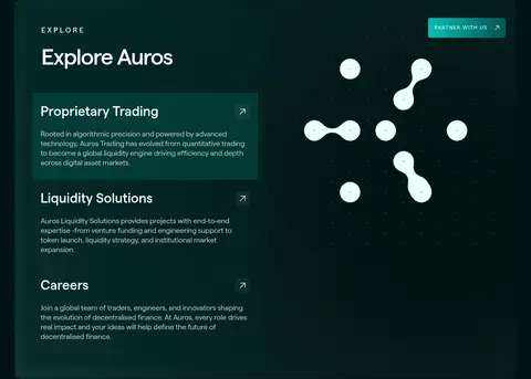
Feature panel A dark rounded panel pairs a stacked list of trading, liquidity, and careers links with abstract geometric media.
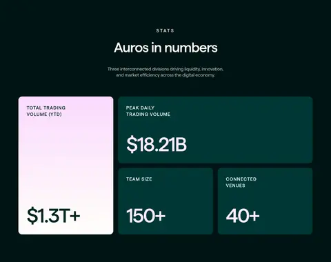
Statistics cards A compact asymmetric card arrangement emphasizes large figures; one light gradient card contrasts against teal metric surfaces.
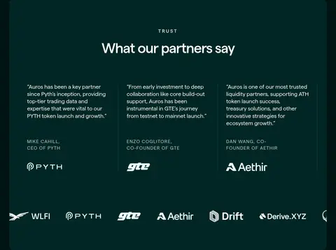
Testimonial panel A rounded dark-green section centers its heading, then presents partner quotes and logos in aligned columns.
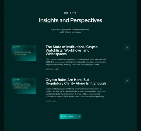
Insights list A dark inset editorial panel presents thumbnail-led article rows, short descriptions, dates, and restrained arrow links.
Imagery · Favor abstract luminous gradients and motion-led visuals over literal product photography. The hero uses a dark teal field with a soft aqua glow, while other sections use geometric orbs, a dotted world map, and restrained partner or editorial imagery. Keep media integrated into dark panels with rounded corners; use bright gradients as controlled focal accents, not as page-wide decoration.
页面版块 共 13 个版块,按页面从上到下排列,每个都标了类型、布局和交互套路。
该做与不该做 ✓ 该做 Use Abyss Teal as the dominant canvas. Reserve gradients for focal text, hero lighting, and important actions. Set navigation and section eyebrows in tracked uppercase. Let oversized statements breathe between content panels. Use tonal teal shifts to group cards without harsh contrast. Keep body copy muted and secondary to clear white headings. ✕ 不该做 Do not turn every section into a separate colored band. Do not use bright accent colors as large flat backgrounds. Do not crowd the wide section rhythm with dense content. Do not replace the abstract visual language with generic stock photography. Do not add heavy shadows or high-contrast borders. Do not use playful display fonts or oversized decorative icons. 给 AI 的提示词 想快速出一个同风格的新页面,把这段话连同 DESIGN.md 一起发给 AI。
复制 Build a new page in Auros’s institutional crypto style. Use Abyss Teal (#001413) as the continuous canvas, Deep Lagoon (#012624) and Shadow Lagoon (#011d1c) for restrained content surfaces, and Clean White (#ffffff) with Mist Gray (#bbc7c6) for text hierarchy. Use Matter or a close sans-serif substitute, with medium-weight tightly tracked headlines and widely tracked uppercase navigation and eyebrow labels. Create generous gaps between major sections, mixing centered statement moments with structured two-column content. Apply Current Teal (#00827c), Icy Mint (#cbfffc), Glacier Tint (#edfffe), and Lilac Haze (#fad1ff) as selective gradient accents, not broad fills. Favor abstract luminous media, rounded dark cards, quiet borders, and clear metric or editorial groupings.
DESIGN.md Tailwind v4 CSS 变量 Design Tokens
---
title: "Auros design system"
variant: extended
source: https://www.auros.global/
captured_at: 2026-10-12
theme: dark
industry: crypto
generator: Design DNA (https://four.wiralomi.com/style/auros-global)
ai_generated: true
ai_label: "本文件由 AI 辅助生成:数值取自公开网页的实测样式,命名、用途说明与建议为模型解读。商标归原所有者。 / AI-assisted content"
---
# Auros · Design System
> Deep teal, luminous gradients, institutional calm
**Theme:** dark · **Industry:** crypto · **Source:** https://www.auros.global/ · **Captured:** 2026-10-12 (1440×900 desktop)
_AI-assisted content: values are measured from the public page at capture time; names, roles and guidance are model-written interpretations. Trademarks belong to their owners._
Auros pairs a near-black teal canvas with vivid aqua gradients and restrained lilac highlights to present institutional crypto liquidity with a polished, confident feel. Oversized editorial headlines, spacious section pacing, and abstract market visuals carry the story from hero to proof points and insights.
## North star
Keep the dark teal field uninterrupted, then use luminous gradients and oversized type as deliberate focal points.
## Overview
The visual system is built on a near-black teal canvas (## Colors
| Name | Hex | Token | Group | Role |
|---|---|---|---|---|
| Abyss Teal | ` | `--color-abyss-teal` | brand | The dominant page canvas and the continuous dark background behind hero, statements, and footer. |
| Mist Gray | ` | `--color-mist-gray` | neutral | Muted body copy and footer text, providing soft contrast against the deep teal canvas. |
| Deep Lagoon | ` | `--color-deep-lagoon` | surface | Primary dark section and navigation surface, visibly separating content while staying within the teal palette. |
| Reef Line | ` | `--color-reef-line` | semantic | Subtle hairline border color for quiet separation on dark surfaces. |
| Clean White | ` | `--color-clean-white` | neutral | Headings, navigation, prominent body text, and primary link labels. |
| Soft Porcelain | ` | `--color-soft-porcelain` | neutral | Secondary light text appearing in page copy; use for gentle contrast rather than prominent brand accents. |
| Glacier Tint | ` | `--color-glacier-tint` | accent | Pale aqua gradient stop and occasional link or text highlight. |
| Icy Mint | ` | `--color-icy-mint` | accent | Bright mint gradient stop used in luminous text and CTA treatments. |
| Lilac Haze | ` | `--color-lilac-haze` | accent | Soft lilac gradient endpoint on highlighted lettering and light CTA fills. |
| Shadow Lagoon | ` | `--color-shadow-lagoon` | surface | Extra-dark card surface for inset feature content. |
| Tidal Green | ` | `--color-tidal-green` | surface | Teal card fill used for metric panels and selected content blocks. |
| Current Teal | ` | `--color-current-teal` | accent | Saturated teal gradient origin and restrained text emphasis. |
| Graphite Trace | ` | `--color-graphite-trace` | semantic | Minor measured component text color; appears as an implementation-level trace, not a defining brand color. |
### Semantic aliases
`--color-canvas` → ` (Abyss Teal) · `--color-surface` → ` (Deep Lagoon) · `--color-surface-2` → ` (Shadow Lagoon) · `--color-surface-3` → ` (Tidal Green) · `--color-text` → ` (Clean White) · `--color-text-muted` → ` (Mist Gray) · `--color-border` → ` (Reef Line) · `--color-accent` → ` (Lilac Haze) · `--color-accent-2` → ` (Current Teal)
### Contrast (WCAG 2.x)
| Text | Background | Ratio | Level |
|---|---|---|---|
| ` | ` | 18.93:1 | AAA |
| ` | ` | 16.1:1 | AAA |
| ` | ` | 17.59:1 | AAA |
| ` | ` | 13.16:1 | AAA |
| ` | ` | 10.9:1 | AAA |
| ` | ` | 9.28:1 | AAA |
| ` | ` | 10.13:1 | AAA |
| ` | ` | 7.58:1 | AAA |
| ` | ` | 14.09:1 | AAA |
| ` | ` | 11.99:1 | AAA |
### Gradients
- `linear-gradient(90deg, rgb(0, 130, 124) 0%, rgb(203, 255, 252) 100%)`
- `linear-gradient(90deg, rgb(237, 255, 254) 0%, rgb(250, 209, 255) 100%)`
- `radial-gradient(41288.3% 255.77% at -42.4% -22.13%, rgb(250, 209, 255) 0%, rgb(255, 253, 250) 44.72%, rgb(237, 255, 254) 85.38%, rgb(203, 255, 252) 100%)`
- `linear-gradient(90deg, rgb(203, 255, 252), rgb(250, 209, 255), rgb(2, 185, 176), rgb(1, 83, 79))`
## Typography
| Family | Token | Source | Weights | Role | Free substitute |
|---|---|---|---|---|---|
| Matter | `--font-body` | webfont | 400, 500 | All page typography, from oversized hero statements to navigation, labels, and body copy. | Inter |
- **Matter:** Use medium weight for display and headings, regular for body; headings track tightly, while uppercase navigation and eyebrow labels are widely tracked.
### Type scale — Custom (ratio ≈ 1.714, base 20px)
| Role | Size | Weight | Line height | Letter spacing | Case | Family | Used for |
|---|---|---|---|---|---|---|---|
| display | 295.5px | 500 | 1 | -0.012em | — | Matter | Oversized scrolling or statement typography in the brand narrative. |
| h1 | 96px | 500 | 1 | -0.04em | — | Matter | Primary hero headline and dominant page-level statements. |
| h2 | 86.5px | 500 | 1 | -0.046em | — | Matter | Major section headlines, including editorial and trust areas. |
| h3 | 61px | 500 | 1 | -0.04em | — | Matter | Feature and content-card headings. |
| h4 | 36px | 500 | 1 | 0 | — | Matter | Secondary feature titles and compact section subheads. |
| body | 20px | 400 | 1.3 | -0.02em | — | Matter | Explanatory copy, descriptions, and testimonial text. |
| caption | 14px | 400 | 1 | 0.12em | uppercase | Matter | Small uppercase metadata and category labels. |
| nav | 12px | 400 | 1.4 | 0.12em | uppercase | Matter | Compact uppercase primary navigation links. |
| eyebrow | 14px | 400 | 1 | 0.12em | uppercase | Matter | Uppercase section markers such as STATS, NETWORK, and INSIGHTS. |
## Spacing & layout
- Base unit **4px**, density **spacious**.
- Scale (most used values): 16, 18, 20, 22, 24, 28, 31, 32, 36, 40, 48, 64, 80, 97, 120, 140 px.
- Section rhythm 40px · element gap 48px · card padding 36px · max content width 1280px.
Use a centered content frame with a measured maximum width of 1280px, while allowing hero and statement treatments to feel expansive. Most sections sit on one uninterrupted canvas; content alternates between centered single-column statements and two-column feature or statistics arrangements. Cards organize information rather than creating a dense dashboard. Keep generous vertical separation between major blocks, with tighter spacing inside cards and article rows. Use left alignment for practical content and center alignment for brand statements, trust, and insights.
## Shape & elevation
- Radius: card `16px` · media `6px` · nav `6px` · link `6px` · xs `6px` · sm `8px` · md `16px`
- No box shadows measured: the page is flat.
- Motion: standard transition `0.2s ease-in-out` on interactive elements.
The design reads mostly flat, with card surfaces only slightly lifted from the canvas through tonal contrast. No measured shadows define the system. Use thin, low-contrast teal borders where separation is needed, and rely on spacing, surface shifts, and soft gradient lighting for depth. Cards and media have rounded corners; avoid heavy outlines or stacked elevation.
## Imagery
Favor abstract luminous gradients and motion-led visuals over literal product photography. The hero uses a dark teal field with a soft aqua glow, while other sections use geometric orbs, a dotted world map, and restrained partner or editorial imagery. Keep media integrated into dark panels with rounded corners; use bright gradients as controlled focal accents, not as page-wide decoration.
## Components
### Primary navigation
A deep teal horizontal header with a compact logo, small uppercase Matter links, and a pale gradient partner CTA.
### Hero
Centered uppercase brand eyebrow, large two-line white headline, muted supporting line, and a compact luminous gradient CTA over a teal glow.
### Statement sections
Oversized short phrases span the dark canvas, with aqua-to-mint gradient lettering and generous surrounding negative space.
### Feature panel
A dark rounded panel pairs a stacked list of trading, liquidity, and careers links with abstract geometric media.
### Statistics cards
A compact asymmetric card arrangement emphasizes large figures; one light gradient card contrasts against teal metric surfaces.
### Testimonial panel
A rounded dark-green section centers its heading, then presents partner quotes and logos in aligned columns.
### Insights list
A dark inset editorial panel presents thumbnail-led article rows, short descriptions, dates, and restrained arrow links.
### Measured component styles
- **Primary button** (“LIQUIDITY SOLUTIONS”): transparent background · text ## Do
- Use Abyss Teal as the dominant canvas.
- Reserve gradients for focal text, hero lighting, and important actions.
- Set navigation and section eyebrows in tracked uppercase.
- Let oversized statements breathe between content panels.
- Use tonal teal shifts to group cards without harsh contrast.
- Keep body copy muted and secondary to clear white headings.
## Don't
- Do not turn every section into a separate colored band.
- Do not use bright accent colors as large flat backgrounds.
- Do not crowd the wide section rhythm with dense content.
- Do not replace the abstract visual language with generic stock photography.
- Do not add heavy shadows or high-contrast borders.
- Do not use playful display fonts or oversized decorative icons.
## Agent prompt
Build a new page in Auros’s institutional crypto style. Use Abyss Teal (## Page sections (top to bottom)
| # | Type | Layout | UX patterns | UI patterns |
|---|---|---|---|---|
| 1 | hero | Full-viewport centered hero beneath a horizontal top navigation. | Primary partner navigation, Single prominent hero action | Dark teal gradient glow, Centered oversized headline, Pale gradient CTA |
| 2 | other | Oversized phrase spans the viewport with staggered alignment. | Scroll-led brand storytelling | Giant gradient lettering, Open dark canvas |
| 3 | other | A second oversized phrase follows the preceding statement. | Continuation of narrative | Large gradient lettering, Minimal surrounding content |
| 4 | other | Centered short statement on a single dark canvas. | Concise company introduction | Gradient emphasis, Spacious single-column layout |
| 5 | feature-grid | Two-column rounded panel with stacked links on one side and media on the other. | Explore business areas, Direct links to services and careers | Inset teal cards, Abstract geometric media, Small uppercase eyebrow |
| 6 | stats | Two-column asymmetric metric card grid beneath a centered section heading. | Fast credibility scan | Large numeric values, Contrasting pale metric card, Dark teal card fills |
| 7 | other | Centered statement with generous negative space. | Brand positioning interlude | Large aqua gradient text, Dark open background |
| 8 | feature-split | Wide rounded media panel with text on the left and map artwork on the right. | Team recruitment link, Global coverage message | Dotted map graphic, Luminous aqua wash, Compact CTA |
| 9 | other | Centered typographic statement between major content panels. | Reinforces institutional trust | Gradient headline, Open dark canvas |
| 10 | testimonials | Rounded dark panel with centered title, three quote columns, and a logo strip. | Partner proof, Quote attribution | Low-contrast dividers, Partner wordmarks, Dark teal surface |
| 11 | other | Centered oversized statement on the dark page canvas. | Narrative transition | Gradient display text, Broad negative space |
| 12 | content-feed | Rounded inset panel with centered intro and vertically stacked article rows. | Article discovery, View-all articles action | Thumbnail and text rows, Dates and arrow links, Dark panel |
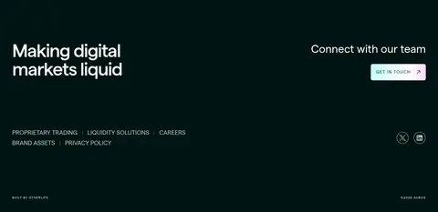
| 13 | footer | Two-column contact prompt above compact navigation and legal details. | Contact conversion, Secondary site navigation | Large closing headline, Gradient contact CTA, Small muted footer links |
## Source CSS custom properties (selected)
```css
--_typography---h1--font: Matter,Arial,sans-serif;
--_typography---h1--font-size: clamp(2.5*1rem,((2.5 - ((3.8 - 2.5)/(90 - 30)*30))*1rem + ((3.8 - 2.5)/(90 - 30))*100vw),3.8*1rem);
--_typography---h1--font-weight: 500;
--_typography---h1--letter-spacing: -2.44px;
--_typography---h2--font: Matter,Arial,sans-serif;
--_typography---h2--font-size: clamp(2.1*1rem,((2.1 - ((3 - 2.1)/(90 - 30)*30))*1rem + ((3 - 2.1)/(90 - 30))*100vw),3*1rem);
--_typography---h2--font-weight: 500;
--_typography---h2--letter-spacing: -.96px;
--_typography---h3--font: Matter,Arial,sans-serif;
--_typography---h3--font-size: clamp(1.75*1rem,((1.75 - ((2.25 - 1.75)/(90 - 30)*30))*1rem + ((2.25 - 1.75)/(90 - 30))*100vw),2.25*1rem);
--_typography---h3--font-weight: 500;
--_typography---h3--letter-spacing: 0px;
--_typography---h4--font: Matter,Arial,sans-serif;
--_typography---h4--font-weight: 500;
--_typography---h5--font: Matter,Arial,sans-serif;
--_typography---h5--font-size: clamp(1.188*1rem,((1.188 - ((1.5 - 1.188)/(90 - 30)*30))*1rem + ((1.5 - 1.188)/(90 - 30))*100vw),1.5*1rem);
--_typography---h5--font-weight: 500;
--_typography---h5--letter-spacing: -.72px;
--_typography---h6--font: Matter,Arial,sans-serif;
--_typography---h6--font-size: clamp(1.188*1rem,((1.188 - ((1.5 - 1.188)/(90 - 30)*30))*1rem + ((1.5 - 1.188)/(90 - 30))*100vw),1.5*1rem);
--_typography---h6--font-weight: 400;
--_typography---h6--letter-spacing: -.72px;
--_typography---body-m--font: Matter,Arial,sans-serif;
--_typography---body-m--font-size: clamp(1*1rem,((1 - ((1 - 1)/(90 - 30)*30))*1rem + ((1 - 1)/(90 - 30))*100vw),1*1rem);
--_typography---body-m--font-weight: 400;
--_typography---body-m--letter-spacing: -.32px;
--_colors---primary--liquid-900: