North star · Keep the canvas quiet and the typography bold; reserve saturated color for clear actions and focused content modules.
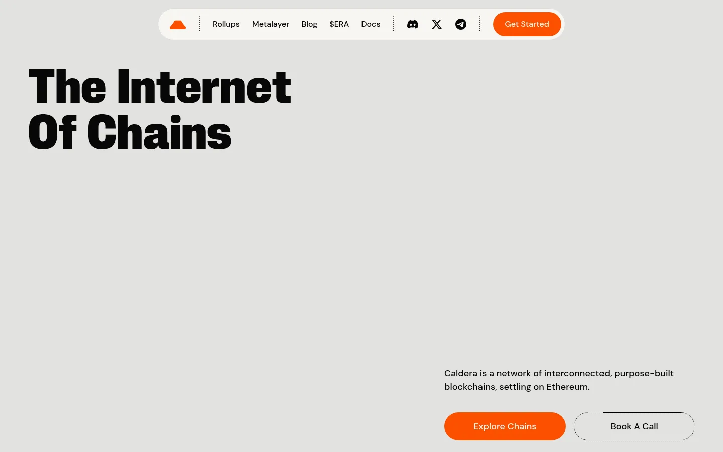
The visual strategy is built around a persistent warm-gray canvas (#e2e2df), which keeps the page calm while oversized, heavy display lettering supplies impact. Near-black (#070607) anchors headings, navigation, and body copy. Off-white (#f7f6f2) creates readable card surfaces, while bright orange (#fc5000) marks primary actions and selected feature panels; saturated violet (#524ae9) appears as a secondary feature-card color. The first screen is deliberately sparse: navigation sits in a pale rounded capsule, the headline occupies the upper left, and explanatory copy with paired actions anchors the lower right. Farther down, the page becomes more modular, combining rounded text cards with bold technical illustrations and use-case panels. Keep typography compact and assertive in headings, with DM Sans for supporting copy and controls. Generous blank intervals let each content cluster feel distinct without changing the underlying canvas.
Major section headings such as ecosystem and use-case titles.
Caldera
80px
400
1.1
0
三级标题
Feature or card headings within content modules.
Caldera
64px
400
1
0
四级标题
Smaller card titles and supporting section headings.
Caldera
56px
400
1
0
正文
Descriptions, explanatory copy, and navigation text.
The quick brown fox 敏捷的狐狸
16px
500
1.55
0
辅助文字
Dates, small labels, and compact metadata.
The quick brown fox 敏捷的狐狸
14px
500
1.2
0
链接
Text links and secondary navigation actions.
The quick brown fox 敏捷的狐狸
16px
500
1.55
0
间距与布局
基准单位 4px · 密度:适中
56px版块间距
10px元素间距
40px卡片内边距
1328px内容最大宽度
3px
8px
9px
10px
12px
16px
20px
24px
32px
40px
56px
64px
80px
The measured page uses a 1328px maximum content width, a comfortable density, and a 4px base spacing unit. The hero spans the viewport with a left-aligned title and lower-right copy/actions. Later content shifts into centered headings, multi-column cards, and split feature areas; the news feed is left-aligned. Sections share the same canvas, with substantial blank intervals creating rhythm rather than alternating background bands.
圆角与层次
按钮 · 50%
输入框 · 9999px
卡片 · 40px
链接 · 40px
没有测到阴影:页面是扁平的,层次靠底色和描边区分。
The page reads mostly flat: there are no measured shadows or gradients. Separate content with large areas of canvas, rounded card silhouettes, and fine dotted or hairline outlines on selected controls. Keep media and card colors visually distinct without adding artificial depth.
组件
下面的预览按实测的按钮、输入框、徽标、卡片样式重建(字体用替代字体)。
Capsule navigation
A centered pale rounded bar with compact dark links, dotted vertical separators, social icons, and an orange pill CTA.
Primary action
Bright orange pill button with a contrasting blue label in the measured CSS; keep the CTA compact and high visibility.
Outlined secondary action
Canvas-colored pill with a fine dotted outline and dark label, paired with the primary hero action.
Feature cards
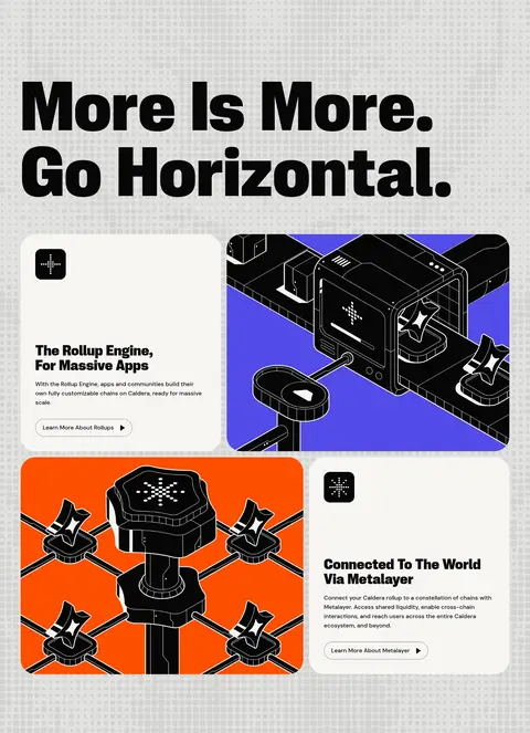
Large rounded modules alternate cream text-led cards with orange or violet illustration-led cards.
Use-case panel
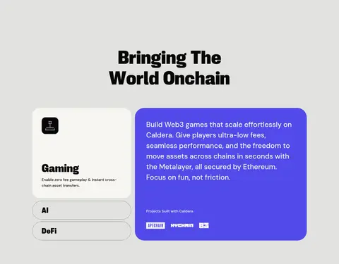
A cream category card and compact pill selectors sit beside a saturated violet content panel with white copy.
News feed
A two-column content area pairs a prominent News heading with image-led story links and small category/date metadata.
Imagery · The hero includes full-bleed video, leaving much of the first viewport visually quiet. Lower sections use technical, high-contrast illustrations inside rounded cards, including vivid orange and violet backgrounds. Use imagery as a contained feature accent rather than a photographic wash over the page; the measured screenshot palette is primarily defined by the canvas and typography, not the illustration colors.
Keep the warm-gray canvas continuous across sections.
Use condensed, heavy display typography for large headings.
Anchor primary actions with Signal Orange (#fc5000).
Pair cream text cards with vivid illustration cards.
Preserve generous empty space around major content groups.
Use rounded capsule controls and rounded card containers.
✕ 不该做
Do not introduce alternating colored section bands.
Do not fill the hero with dense copy or controls.
Do not use shadows or gradients to manufacture depth.
Do not use saturated accents as the page-wide background.
Do not replace the bold display hierarchy with generic light-weight headings.
Do not treat illustration-only colors as core interface colors.
给 AI 的提示词
想快速出一个同风格的新页面,把这段话连同 DESIGN.md 一起发给 AI。
Build a new Caldera-style page on a continuous Warm Concrete canvas (#e2e2df). Use Carbon Ink (#070607) for concise navigation, copy, and oversized condensed display headings; use DM Sans for supporting text. Keep the top navigation in a Porcelain Cream (#f7f6f2) capsule with subtle dividers and a Signal Orange (#fc5000) pill CTA. Compose the hero with a large left-aligned headline and a compact copy-and-actions group toward the lower right, leaving broad open space. Organize later content into rounded cream text cards and illustration-led modules, using orange and Electric Violet (#524ae9) selectively. Favor flat surfaces, fine outlines, generous section breathing room, and clear modular alignment. Do not add unmeasured colors, shadows, or gradients.