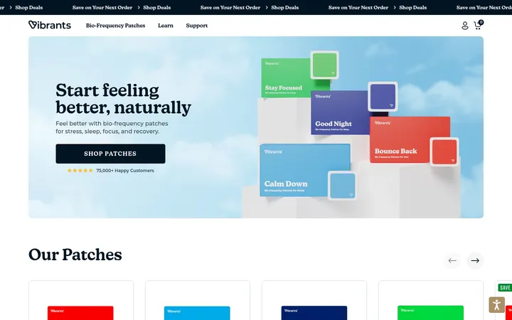
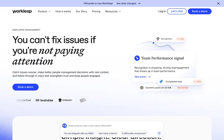
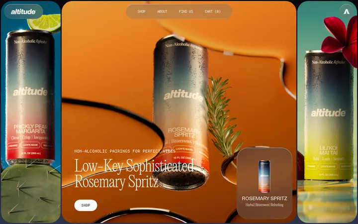
North star · Let calm blue surfaces and real product imagery explain the technology, keeping interface chrome quiet and the story spacious.
The page uses a near-white canvas (#f7fafc) as a quiet baseline, punctuated by broad pale-blue bands (#def0ff and #bbddff) and a deep navy technical section (#05102b). The palette stays cool and restrained; warm skin tones and blue-gray photography belong to the product imagery rather than the interface identity. Hanken Grotesk carries the page throughout, with regular-weight headings, compact explanatory copy, and white text over the photographic hero. Layout alternates centered introductions and feature-card rows with left-aligned text beside large media, giving the long product story a measured rhythm. Generous open areas let each section breathe, while rounded media and cards soften the clinical subject matter. The dark footer anchors the page, using muted gray text and a large wordmark as a final brand gesture. Controls remain visually simple and pill-shaped.
Site-wide headings, body copy, captions, and interface text.
角色
示例
字号
字重
行高
字距
一级标题
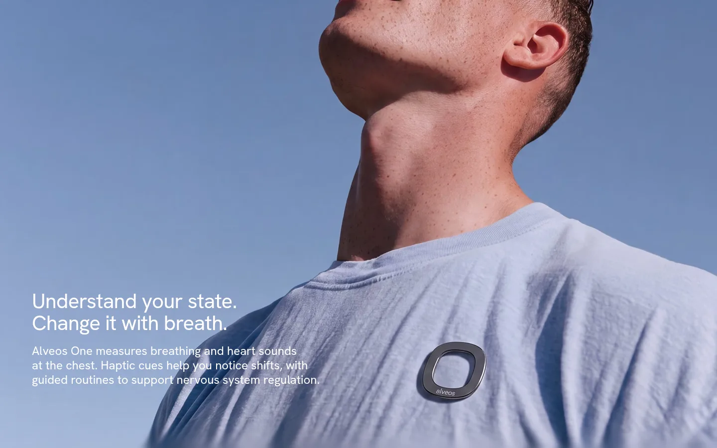
Hero headline over the full-bleed portrait, set in white.
Alveos
42px
400
1.05
-0.02em
二级标题
Major centered or split feature-section headings.
Alveos
34px
500
1.15
0
三级标题
Feature and product-story subheads.
Alveos
32px
400
1.15
0
四级标题
Smaller feature-card and supporting content headings.
The quick brown fox 敏捷的狐狸
24px
400
1.2
0
正文
Explanatory copy, product benefits, and FAQ content.
The quick brown fox 敏捷的狐狸
18px
400
1.6
0
辅助文字
Compact labels, media notes, and secondary interface details.
The quick brown fox 敏捷的狐狸
16px
400
1.5
0
间距与布局
基准单位 2px · 密度:紧凑
32px版块间距
10px元素间距
23px卡片内边距
1376px内容最大宽度
8px
10px
12px
16px
20px
25px
28px
30px
32px
40px
50px
80px
100px
The long page alternates full-width color bands with contained content blocks, using a measured page max width of 1376px. Centered introductions lead into four-column feature cards; technical storytelling shifts to a two-column text-and-media arrangement. Large blank intervals around some content create a slow, editorial scroll rhythm. Density is generally compact inside cards and footer columns, but spacious between major sections. Align text to the left when paired with imagery and center short section introductions.
圆角与层次
按钮 · 9999px
卡片 · 40px
图片 · 24px
链接 · 9999px
hairline · other
The overall treatment is mostly flat: broad color bands and white cards define hierarchy rather than visible outlines. Use rounded card and media corners, with subtle separation and little or no shadow. Preserve strong layering only where text overlays the hero photo or the dark footer contains its legal notice panel.
组件
下面的预览按实测的按钮、输入框、徽标、卡片样式重建(字体用替代字体)。
Hero overlay
Full-bleed portrait photography with a white, left-aligned two-line headline and concise supporting text over the image.
Section introduction
Centered short heading and compact paragraph on a light or blue band, surrounded by open space.
Feature cards
White cards with large rounded corners, concise benefit copy, and product or app imagery where available.
Technical split
Deep navy section pairing light copy on the left with rounded, prominent product-use media on the right.
Pill CTA
Compact pill control; dark fill for the footer question CTA and pale fill for the science link treatment.
FAQ list
Light-background question rows with restrained separators and a small disclosure chevron.
Dark footer
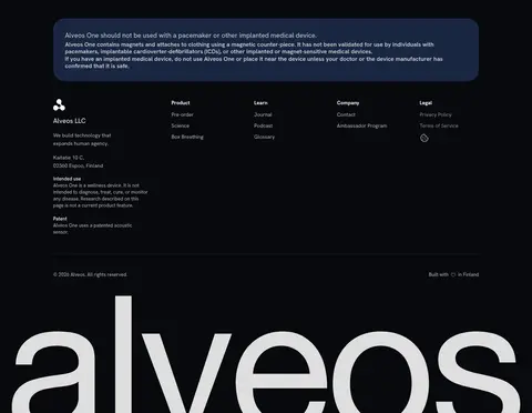
Near-black footer with legal note panel, muted link columns, fine divider, and oversized Alveos wordmark.
Imagery · Use large, natural product photography featuring people wearing or demonstrating the device, with close crops that make the monitor legible. The hero image fills the viewport and carries white copy directly over the photo. Supporting imagery includes rounded video and product/app cards. Keep treatment realistic and soft; blue-gray skies and clothing recur, while warm skin tones remain photographic rather than UI colors.
Use the near-white canvas as the default page background.
Alternate pale-blue bands with restrained light sections.
Use real people and device photography as the primary visual evidence.
Keep product explanations concise and clearly grouped.
Pair dark navy technical content with light, readable text.
Use rounded cards and pill-shaped controls sparingly.
✕ 不该做
Do not introduce bright interface colors absent from the measured palette.
Do not treat photographic blue-gray tones as core brand tokens.
Do not add heavy shadows or prominent borders to every card.
Do not crowd the spacious transitions between major sections.
Do not use decorative display type in place of Hanken Grotesk.
Do not let CTA styling compete with the hero photography.
给 AI 的提示词
想快速出一个同风格的新页面,把这段话连同 DESIGN.md 一起发给 AI。
Build a new Alveos-style health product page with Hanken Grotesk throughout and a calm, editorial rhythm. Use Cloud Canvas (#f7fafc) for the base, Mist Blue (#def0ff) and Sky Blue (#bbddff) for broad section bands, and Midnight Navy (#05102b) for technical content. Keep text mostly Soft Black (#1a1a1a), switching to white on photography and dark surfaces. Lead with authentic, close-cropped product photography; use rounded media, concise copy, centered section introductions, and occasional text-and-image splits. Keep cards mostly flat and spacious, with rounded corners and restrained pill controls. Finish with a Night Ink (#07090e) footer, muted gray text, compact link columns, and a strong wordmark. Avoid extra colors, decorative effects, and dense interface chrome.