North star · Keep the page airy and editorial: let expressive dark headlines explain the story, and use vivid blue only to guide action and spotlight product UI.
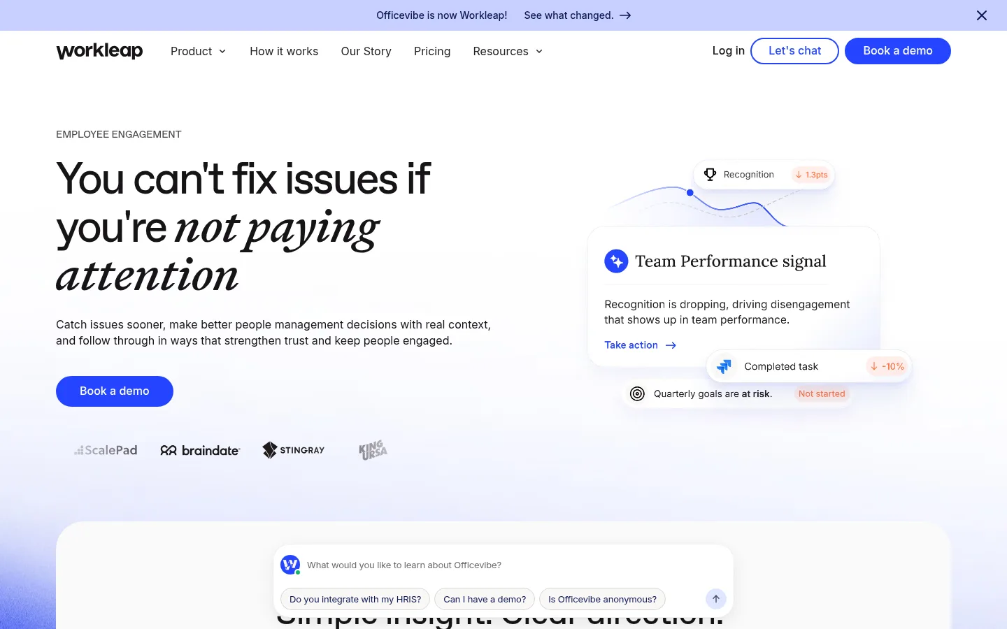
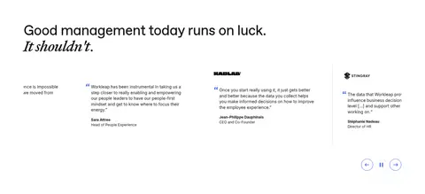
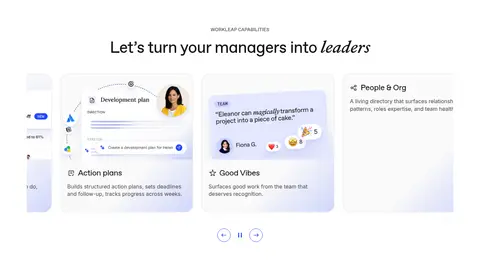
The page is built on a predominantly white canvas, with subtle pale-blue atmospheric gradients near the hero and selective warm off-white bands. Ink-dark typography carries the narrative, while vivid Signal Blue is reserved for filled demo buttons, outlined actions, links, and small interface accents. Oversized, closely tracked display headlines create an editorial voice; italic serif-like emphasis appears within otherwise clean sans-serif headlines. Body copy stays compact and readable. The layout alternates centered product explanations, spacious two-column feature splits, integration content, testimonials, capability cards, FAQ, and a dark closing footer. Product UI screenshots—not lifestyle photography—supply most of the visual detail, often framed in saturated blue panels or softly elevated cards. Rounded buttons, generous media corners, thin dividers, and restrained shadows keep the interface approachable without making the page feel ornamental.
Body copy, navigation, links, captions, and button labels.
Aa 设计
Abcfavoritvariable
网络字体 · 字重 400 · 占比 10%
免费替代:Manrope
Display and heading typography, including the page's large editorial hero headline.
角色
示例
字号
字重
行高
字距
特大标题
Oversized editorial headline treatment, most notably in the hero.
Workleap
96px
400
1
-0.05em
一级标题
Primary page headline and major standalone statements.
Workleap
64px
400
1
-0.05em
二级标题
Section headlines for features, testimonials, and FAQs.
Workleap
48px
400
1.1
-0.02em
三级标题
Feature and content subsection headings.
Workleap
40px
400
1.1
-0.02em
四级标题
Small card or nested section headings.
The quick brown fox 敏捷的狐狸
24px
400
1.1
-0.02em
正文
Product explanations, feature descriptions, and paragraph copy.
The quick brown fox 敏捷的狐狸
16px
400
1.4
0
辅助文字
Eyebrows, labels, and compact secondary information.
The quick brown fox 敏捷的狐狸
14px
400
1.4
0
按钮
Primary and outlined CTA labels.
The quick brown fox 敏捷的狐狸
16px
500
1.1
0
导航
Header and footer navigation links.
The quick brown fox 敏捷的狐狸
16px
400
1.4
0
链接
Inline links and text actions.
The quick brown fox 敏捷的狐狸
16px
400
1.6
0
间距与布局
基准单位 8px · 密度:紧凑
40px版块间距
8px元素间距
—卡片内边距
1280px内容最大宽度
4px
8px
11px
12px
16px
18px
20px
24px
32px
40px
48px
64px
80px
Use a centered content area capped at the measured 1280px page maximum. The page moves from a full-width announcement and navigation into an airy hero, then alternates centered how-it-works content with broad feature splits. Keep text aligned to the start beside product visuals; reserve centered alignment for selected statements and CTA moments. Sections have substantial vertical breathing room, while cards and interface groupings remain compact. Overall density is compact in controls and copy, but spacious in section rhythm.
圆角与层次
按钮 · 9999px
卡片 · 24px
图片 · 24px
md · other
sm · card
lg · media
Most sections sit flat on white, with fine pale borders separating cards and controls. Product UI mockups and chat-like overlays use soft, low-contrast shadows to suggest depth without a heavy card-stack effect. Rounded media and cards create the main layering cue; reserve the strongest contrast for the dark footer and blue CTA treatment.
组件
下面的预览按实测的按钮、输入框、徽标、卡片样式重建(字体用替代字体)。
Primary CTA
Filled Signal Blue (#2545ff) pill button with white label, medium Inter styling, and a thin blue border.
Outlined CTA
White or transparent pill button with a 2px Signal Blue (#2545ff) border and matching text.
Feature split
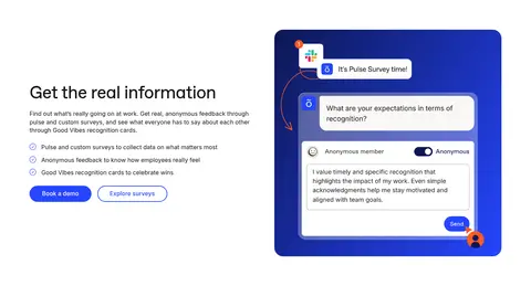
Large product mockup paired with a headline, explanatory copy, compact checklist, and demo or survey action.
Product UI panel
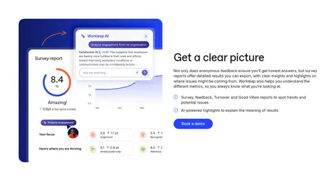
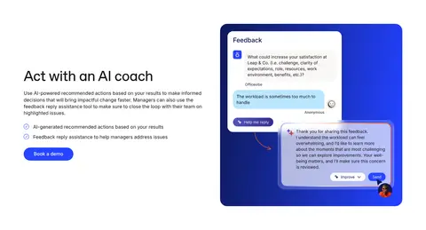
Rounded interface mockup with survey, report, or feedback content; use blue framing or subtle elevation when appropriate.
Capability card
Rounded light-gray or near-white card with dark text, a thin subtle border, and minimal or soft blue shadow.
FAQ accordion
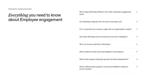
Question list with concise text, subtle separators, and small disclosure icons; pair with an editorial section heading.
Footer
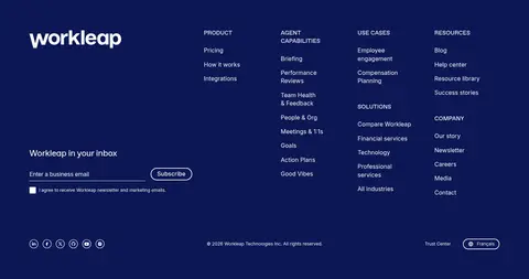
Deep Indigo (#0c1754) full-width footer with white brand and navigation content, email signup, and compact legal details.
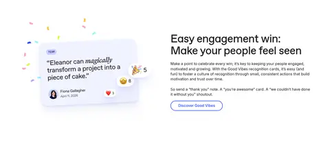
Imagery · Use product-interface screenshots and UI mockups as the main imagery; lifestyle photography is not the defining visual language. Frame dashboard, survey, and feedback examples in rounded panels, sometimes with saturated blue backgrounds. Small partner marks and app icons appear in integration content. Keep visuals crisp and legible, with occasional pale blue atmospheric gradients and playful confetti or reaction details inside recognition mockups.
Use Signal Blue for clear actions and selected links.
Pair expressive headlines with concise Inter body copy.
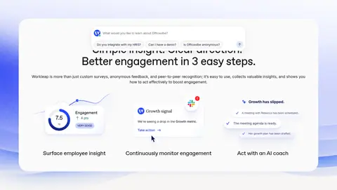
Let product UI mockups carry feature explanations.
Alternate centered content with aligned feature splits.
Use rounded buttons, cards, and media consistently.
✕ 不该做
Do not turn every section into a tinted band.
Do not use blue as a broad background by default.
Avoid heavy shadows and thick decorative borders.
Do not crowd feature text or interface mockups.
Avoid lifestyle imagery as the dominant visual.
Do not add unmeasured colors or decorative palettes.
给 AI 的提示词
想快速出一个同风格的新页面,把这段话连同 DESIGN.md 一起发给 AI。
Build a new Workleap-style SaaS page with an airy white canvas (#ffffff), ink-dark text (#171417), and carefully rationed Signal Blue (#2545ff) for primary actions, outlines, and small UI accents. Add a restrained Haze Lilac (#c9d0f5) glow behind hero or product visuals, and use Warm Porcelain (#f9f8f6) for an occasional section band. Use an editorial display face such as Manrope for large, tightly tracked headings and Inter for body, navigation, and controls. Structure the page as a clear narrative with a spacious hero, alternating copy-and-product-UI feature splits, and concise content sections. Frame interface mockups in rounded panels; keep elevation subtle. Finish with a contrasting Midnight Indigo (#0c1754) footer. Preserve generous section breathing room and concise, readable copy.