amp 以醒目的黑色首屏开启页面,随后用大面积白底展开产品故事,并以橙色突出行动按钮和重点文案。轻盈的大字排版搭配电影感健身影像,让紧凑型力量训练设备显得高端又亲和。
North star · Use quiet white space and precise, lightweight typography to frame vivid fitness imagery, reserving orange for decisive emphasis.
The page opens with a nearly black, full-width hero that gives the oversized white headline and bright orange Buy now button strong contrast. A slim announcement and navigation sit above it, while a fine rule separates the hero message from concise reassurance points. The rest of the page shifts to a bright white canvas, with pale-gray panels used for selected copy blocks, filters, and product cards rather than continuous colored bands. PublicaSans is used throughout: headlines are large, light to regular, tightly tracked, and sentence-case; body copy is restrained and light. Orange highlights selected words and purchase actions, not large background areas. A mix of full-bleed workout video, warm-toned lifestyle photography, and clean product close-ups gives the long page variety while keeping the device central. Generous whitespace and clear section breaks let the editorial story breathe.
配色 点色块复制色值。用途说明来自对页面的实测位置(背景、文字、描边、按钮)与截图判读。
品牌色
Graphite Ink
#292b2a
Primary text and dark inverse surfaces, including compact UI controls.
强调色
Amp Orange
#ff6105
Primary purchase buttons and selective highlighted words or links.
表层色
Gallery White
#ffffff
Main page canvas, bright content sections, hero headings, and fine rules over dark media.
Cool Mist
#e5e7eb
Pale canvas tone detected in controls and cards; use sparingly behind secondary UI.
Soft Alloy
#bfbfbf
Muted section surface tone; supports neutral transitions and product-focused panels.
Cloud Panel
#f5f5f7
Light-gray cards, feature panels, and soft filter controls against white.
中性色
Slate Copy
#656665
Muted body text and supporting copy where primary ink would feel too strong.
Pale Divider
#cccccc
Occasional subdued section or text detail; not a defining brand surface.
Iron Hairline
#3c3e3d
Subtle dark border detail, used sparingly for separation on dark elements.
Silver Detail
#a6a6a6
Minor neutral detail in measured UI or media; keep subordinate to text and imagery.
Deep Charcoal
#202120
Near-black text and button detail on selected components.
Quiet Gray
#8a8b8a
Secondary text or control detail with restrained contrast.
功能色
Midnight Gradient
#141416
Deep endpoint in measured dark gradients; mainly a media or gradient detail.
Sandstone Image
#a89a8b
Warm hue appearing in lifestyle media and photography rather than core interface chrome.
文字 背景 对比度 WCAG #292b2a Graphite Ink#e5e7eb Cool Mist11.51:1 AAA #292b2a Graphite Ink#ffffff Gallery White14.25:1 AAA #292b2a Graphite Ink#bfbfbf Soft Alloy7.75:1 AAA #ffffff Gallery White#e5e7eb Cool Mist1.24:1 不达标 #ffffff Gallery White#292b2a Graphite Ink14.25:1 AAA #ffffff Gallery White#bfbfbf Soft Alloy1.84:1 不达标
字体 字号阶梯:Augmented Fourth(比例约 1.428,正文 16px)。示例用免费替代字体渲染,数值为实测。
Aa 设计
PublicaSans 网络字体 · 字重 300 / 400 / 500 · 占比 100%
免费替代:Manrope
Site-wide display headings, body copy, navigation, links, and buttons.
角色 示例 字号 字重 行高 字距 特大标题 Oversized hero-scale headline treatment.
amp
95px 400 0.9 -0.03em 一级标题 Primary page and major section headings.
amp
55px 400 1 -0.03em 二级标题 Large feature and product-story headings.
amp
50px 400 1 -0.03em 三级标题 Secondary feature headings, usually lightweight.
amp
45px 300 1 -0.03em 四级标题 Smaller feature titles and card headings.
amp
34px 300 1 -0.03em 正文 Supporting descriptions and explanatory copy.
The quick brown fox 敏捷的狐狸
16px 300 1.2 0 辅助文字 Compact media labels and fine supporting notes.
The quick brown fox 敏捷的狐狸
14px 400 1 0 按钮 Purchase actions and pill-style category controls.
The quick brown fox 敏捷的狐狸
16px 300 1.2 0 导航 Top navigation links and announcement details.
The quick brown fox 敏捷的狐狸
14px 400 1.5 0 链接 Inline learn-more and supporting navigation links.
The quick brown fox 敏捷的狐狸
14px 400 1 0
间距与布局 基准单位 4px · 密度:适中
80px 版块间距
2px 元素间距
20px 卡片内边距
1400px 内容最大宽度
2px
8px
10px
12px
14px
15px
16px
18px
20px
23px
25px
32px
40px
50px
80px
120px
Use a centered desktop frame with a measured maximum width of 1400px, but let the hero and select media sections run full bleed. Alternate two-column text-and-media stories with broad single-column moments and card or carousel rows. Keep headings left aligned except for focused centered feature and category sections. The measured section rhythm is spacious, with an 80px section gap and comfortable density; use smaller measured gaps for related controls and card content. Preserve ample white space between the image-led narrative blocks.
圆角与层次 The design is mostly flat: whitespace, tonal panels, and occasional hairlines establish structure rather than heavy shadows. Keep card edges softly rounded and use measured borders sparingly. Layer text directly over media only where the photo treatment keeps it legible; dark gradients and subtle overlays are media treatments, not a reason to add generic interface depth.
组件 下面的预览按实测的按钮、输入框、徽标、卡片样式重建(字体用替代字体)。
Announcement and navigation A narrow announcement line sits above a restrained navigation row with brand mark, centered links, account control, and an orange purchase action.
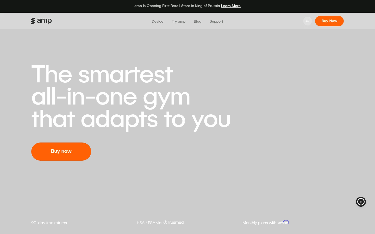
Hero purchase block Full-width near-black opening with a large left-aligned white headline, rounded orange Buy now button, and a bottom reassurance row separated by a fine rule.
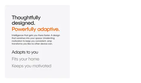
Pale feature panel Use a #f5f5f7 panel for selected editorial copy, feature lists, or onboarding steps against the white page.
Media story panel Pair workout video or lifestyle imagery with short white overlaid headings and supporting copy; keep the image as the dominant surface.
Product feature cards Present device details and adaptive features in softly rounded cards, with light surfaces and concise copy rather than decorative chrome.
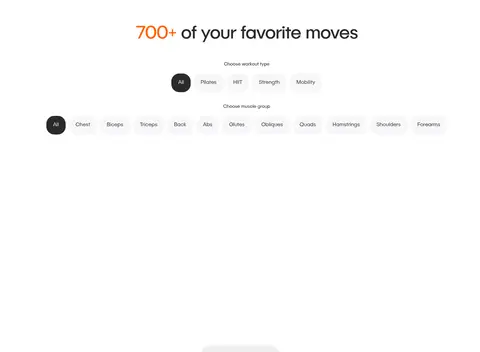
Category filter pills Compact rounded controls use pale neutral fills and dark text, with a dark selected state for exercise and muscle-group filters.
Orange emphasis Reserve #ff6105 for purchase actions and occasional highlighted words in otherwise dark editorial headings.
Imagery · Use cinematic video and lifestyle photography of people training with the device, often in warm, softly lit interiors. Mix full-bleed story panels with carefully framed product close-ups, phone screens, and compact feature cards. Keep imagery realistic and editorial, with restrained grading; warm tans and muted colors belong to the media, while the interface remains mostly white and neutral.
页面版块 共 14 个版块,按页面从上到下排列,每个都标了类型、布局和交互套路。
该做与不该做 ✓ 该做 Keep the hero dark, spacious, and high contrast. Use orange for primary actions and selective text emphasis. Set large headings in a light, tightly tracked sans serif. Let white space separate major story sections. Use warm, realistic fitness photography and video. Keep panels pale and interface decoration restrained. ✕ 不该做 Do not spread orange across large interface backgrounds. Do not make every section a card grid. Do not add heavy shadows or ornamental borders. Do not use dense, bold all-caps typography. Do not replace the white page rhythm with continuous dark bands. Do not treat warm photographic tones as interface colors. 给 AI 的提示词 想快速出一个同风格的新页面,把这段话连同 DESIGN.md 一起发给 AI。
复制 Build a new page in amp’s visual style: begin with a dramatic near-black hero, oversized lightweight white heading, and a clear Amp Orange (#ff6105) purchase action. Use Graphite Ink (#292b2a) for primary text and Gallery White (#ffffff) as the main content canvas. Introduce Cloud Panel (#f5f5f7) only for selected feature blocks, filters, or cards. Use PublicaSans or a close substitute such as Manrope, with tight tracking on large sentence-case headings and light body copy. Organize the page as a spacious editorial sequence of text-and-media splits, full-bleed workout imagery, product close-ups, and restrained pill controls. Keep UI largely flat, with subtle dividers and softly rounded elements. Preserve natural photography warmth without importing its colors into the core interface palette.
DESIGN.md Tailwind v4 CSS 变量 Design Tokens
---
title: "amp design system"
variant: extended
source: https://amp.ai/
captured_at: 2026-10-12
theme: light
industry: health
generator: Design DNA (https://four.wiralomi.com/style/ampfit-com)
ai_generated: true
ai_label: "本文件由 AI 辅助生成:数值取自公开网页的实测样式,命名、用途说明与建议为模型解读。商标归原所有者。 / AI-assisted content"
---
# amp · Design System
> Sculptural fitness, framed with clarity and warmth
**Theme:** light · **Industry:** health · **Source:** https://amp.ai/ · **Captured:** 2026-10-12 (1440×900 desktop)
_AI-assisted content: values are measured from the public page at capture time; names, roles and guidance are model-written interpretations. Trademarks belong to their owners._
amp pairs a dramatic black hero with a long, mostly white product story, using vivid orange to mark calls to action and key phrases. Large, lightweight typography and cinematic fitness imagery make the compact strength machine feel both premium and approachable.
## North star
Use quiet white space and precise, lightweight typography to frame vivid fitness imagery, reserving orange for decisive emphasis.
## Overview
The page opens with a nearly black, full-width hero that gives the oversized white headline and bright orange Buy now button strong contrast. A slim announcement and navigation sit above it, while a fine rule separates the hero message from concise reassurance points. The rest of the page shifts to a bright white canvas, with pale-gray panels used for selected copy blocks, filters, and product cards rather than continuous colored bands. PublicaSans is used throughout: headlines are large, light to regular, tightly tracked, and sentence-case; body copy is restrained and light. Orange highlights selected words and purchase actions, not large background areas. A mix of full-bleed workout video, warm-toned lifestyle photography, and clean product close-ups gives the long page variety while keeping the device central. Generous whitespace and clear section breaks let the editorial story breathe.
## Colors
| Name | Hex | Token | Group | Role |
|---|---|---|---|---|
| Gallery White | ` | `--color-gallery-white` | surface | Main page canvas, bright content sections, hero headings, and fine rules over dark media. |
| Graphite Ink | ` | `--color-graphite-ink` | brand | Primary text and dark inverse surfaces, including compact UI controls. |
| Cool Mist | ` | `--color-cool-mist` | surface | Pale canvas tone detected in controls and cards; use sparingly behind secondary UI. |
| Soft Alloy | ` | `--color-soft-alloy` | surface | Muted section surface tone; supports neutral transitions and product-focused panels. |
| Amp Orange | ` | `--color-amp-orange` | accent | Primary purchase buttons and selective highlighted words or links. |
| Cloud Panel | ` | `--color-cloud-panel` | surface | Light-gray cards, feature panels, and soft filter controls against white. |
| Midnight Gradient | ` | `--color-midnight-gradient` | semantic | Deep endpoint in measured dark gradients; mainly a media or gradient detail. |
| Slate Copy | ` | `--color-slate-copy` | neutral | Muted body text and supporting copy where primary ink would feel too strong. |
| Pale Divider | ` | `--color-pale-divider` | neutral | Occasional subdued section or text detail; not a defining brand surface. |
| Sandstone Image | ` | `--color-sandstone-image` | semantic | Warm hue appearing in lifestyle media and photography rather than core interface chrome. |
| Iron Hairline | ` | `--color-iron-hairline` | neutral | Subtle dark border detail, used sparingly for separation on dark elements. |
| Silver Detail | ` | `--color-silver-detail` | neutral | Minor neutral detail in measured UI or media; keep subordinate to text and imagery. |
| Deep Charcoal | ` | `--color-deep-charcoal` | neutral | Near-black text and button detail on selected components. |
| Quiet Gray | ` | `--color-quiet-gray` | neutral | Secondary text or control detail with restrained contrast. |
### Semantic aliases
`--color-canvas` → ` (Cool Mist) · `--color-surface` → ` (Graphite Ink) · `--color-surface-2` → ` (Gallery White) · `--color-surface-3` → ` (Soft Alloy) · `--color-surface-4` → ` (Cloud Panel) · `--color-text` → ` (Graphite Ink) · `--color-text-muted` → ` (Gallery White) · `--color-text-subtle` → ` (Cloud Panel) · `--color-border` → ` (Gallery White) · `--color-accent` → ` (Amp Orange) · `--color-on-accent` → `
### Contrast (WCAG 2.x)
| Text | Background | Ratio | Level |
|---|---|---|---|
| ` | ` | 11.51:1 | AAA |
| ` | ` | 14.25:1 | AAA |
| ` | ` | 7.75:1 | AAA |
| ` | ` | 1.24:1 | fail |
| ` | ` | 14.25:1 | AAA |
| ` | ` | 1.84:1 | fail |
| ` | ` | 1.14:1 | fail |
| ` | ` | 13.09:1 | AAA |
| ` | ` | 1.09:1 | fail |
| ` | ` | 1.69:1 | fail |
### Gradients
- `linear-gradient(rgba(255, 255, 255, 0.08), rgba(255, 255, 255, 0.02))`
- `linear-gradient(145deg, rgb(42, 42, 46), rgb(20, 20, 22))`
- `linear-gradient(165deg, rgba(255, 255, 255, 0.1), rgba(255, 255, 255, 0.02) 40%, rgba(0, 0, 0, 0) 65%)`
- `linear-gradient(0deg, rgba(255, 255, 255, 0.05), rgba(255, 255, 255, 0.05)), linear-gradient(0deg, rgba(0, 0, 0, 0.1), rgba(0, 0, 0, 0.1))`
## Typography
| Family | Token | Source | Weights | Role | Free substitute |
|---|---|---|---|---|---|
| PublicaSans | `--font-body` | webfont | 300, 400, 500 | Site-wide display headings, body copy, navigation, links, and buttons. | Manrope |
- **PublicaSans:** Use light-to-regular weights, tight negative tracking on large headings, sentence case, and restrained, clean body copy.
### Type scale — Augmented Fourth (ratio ≈ 1.428, base 16px)
| Role | Size | Weight | Line height | Letter spacing | Case | Family | Used for |
|---|---|---|---|---|---|---|---|
| display | 95px | 400 | 0.9 | -0.03em | — | PublicaSans | Oversized hero-scale headline treatment. |
| h1 | 55px | 400 | 1 | -0.03em | — | PublicaSans | Primary page and major section headings. |
| h2 | 50px | 400 | 1 | -0.03em | — | PublicaSans | Large feature and product-story headings. |
| h3 | 45px | 300 | 1 | -0.03em | — | PublicaSans | Secondary feature headings, usually lightweight. |
| h4 | 34px | 300 | 1 | -0.03em | — | PublicaSans | Smaller feature titles and card headings. |
| body | 16px | 300 | 1.2 | 0 | — | PublicaSans | Supporting descriptions and explanatory copy. |
| caption | 14px | 400 | 1 | 0 | — | PublicaSans | Compact media labels and fine supporting notes. |
| button | 16px | 300 | 1.2 | 0 | — | PublicaSans | Purchase actions and pill-style category controls. |
| nav | 14px | 400 | 1.5 | 0 | — | PublicaSans | Top navigation links and announcement details. |
| link | 14px | 400 | 1 | 0 | — | PublicaSans | Inline learn-more and supporting navigation links. |
## Spacing & layout
- Base unit **4px**, density **comfortable**.
- Scale (most used values): 2, 8, 10, 12, 14, 15, 16, 18, 20, 23, 25, 32, 40, 50, 80, 120 px.
- Section rhythm 80px · element gap 2px · card padding 20px · max content width 1400px.
Use a centered desktop frame with a measured maximum width of 1400px, but let the hero and select media sections run full bleed. Alternate two-column text-and-media stories with broad single-column moments and card or carousel rows. Keep headings left aligned except for focused centered feature and category sections. The measured section rhythm is spacious, with an 80px section gap and comfortable density; use smaller measured gaps for related controls and card content. Preserve ample white space between the image-led narrative blocks.
## Shape & elevation
- Radius: button `8px` · card `12px` · media `8px` · xs `6px` · sm `8px` · md `10px` · lg `12px` · xl `16px` · 2xl `24px` · pill `9999px`
- Shadow `inset` (other): `rgba(0, 0, 0, 0.11) 0px 0px 0.5px 0px inset`
- Shadow `md` (button): `rgba(37, 44, 97, 0.15) 0px 5px 15px 0px, rgba(93, 100, 148, 0.2) 0px 2px 4px 0px`
- Motion: standard transition `0.3s ease-in-out` on interactive elements.
The design is mostly flat: whitespace, tonal panels, and occasional hairlines establish structure rather than heavy shadows. Keep card edges softly rounded and use measured borders sparingly. Layer text directly over media only where the photo treatment keeps it legible; dark gradients and subtle overlays are media treatments, not a reason to add generic interface depth.
## Imagery
Use cinematic video and lifestyle photography of people training with the device, often in warm, softly lit interiors. Mix full-bleed story panels with carefully framed product close-ups, phone screens, and compact feature cards. Keep imagery realistic and editorial, with restrained grading; warm tans and muted colors belong to the media, while the interface remains mostly white and neutral.
## Components
### Announcement and navigation
A narrow announcement line sits above a restrained navigation row with brand mark, centered links, account control, and an orange purchase action.
### Hero purchase block
Full-width near-black opening with a large left-aligned white headline, rounded orange Buy now button, and a bottom reassurance row separated by a fine rule.
### Pale feature panel
Use a ### Media story panel
Pair workout video or lifestyle imagery with short white overlaid headings and supporting copy; keep the image as the dominant surface.
### Product feature cards
Present device details and adaptive features in softly rounded cards, with light surfaces and concise copy rather than decorative chrome.
### Category filter pills
Compact rounded controls use pale neutral fills and dark text, with a dark selected state for exercise and muscle-group filters.
### Orange emphasis
Reserve ### Measured component styles
- **Primary button** (“Buy Now”): background ## Do
- Keep the hero dark, spacious, and high contrast.
- Use orange for primary actions and selective text emphasis.
- Set large headings in a light, tightly tracked sans serif.
- Let white space separate major story sections.
- Use warm, realistic fitness photography and video.
- Keep panels pale and interface decoration restrained.
## Don't
- Do not spread orange across large interface backgrounds.
- Do not make every section a card grid.
- Do not add heavy shadows or ornamental borders.
- Do not use dense, bold all-caps typography.
- Do not replace the white page rhythm with continuous dark bands.
- Do not treat warm photographic tones as interface colors.
## Agent prompt
Build a new page in amp’s visual style: begin with a dramatic near-black hero, oversized lightweight white heading, and a clear Amp Orange (## Page sections (top to bottom)
| # | Type | Layout | UX patterns | UI patterns |
|---|---|---|---|---|
| 1 | hero | Dark full-width hero; left-aligned headline and CTA, with reassurance notes along the bottom. | Primary purchase action, Trust and payment reassurance | Black media backdrop, Oversized white headline, Orange pill CTA, Fine divider |
| 2 | feature-split | Two-column story pairing a pale editorial card with product or lifestyle media. | Feature introduction, Progressive benefit list | Pale-gray panel, Orange phrase emphasis, Video-led pairing |
| 3 | feature-split | Single-column editorial transition with heading and short supporting copy. | Benefit framing, Story transition | White canvas, Left-aligned heading, Selective orange emphasis |
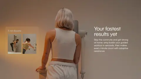
| 4 | video | Full-width cinematic video panel with text and interface details overlaid on the imagery. | Visual product demonstration, Contextual benefit copy | Warm lifestyle footage, White overlay text, Full-bleed framing |
| 5 | video | Full-width story panel, with training footage balanced by a concise text overlay. | Workout guidance, Personalized-plan explanation | Lifestyle video, Overlay copy, Warm neutral grading |
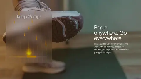
| 6 | video | Edge-to-edge media story with short heading and supporting text. | Anywhere training, Coaching and progress cues | Full-bleed footage, Overlaid typography, Muted warm tones |
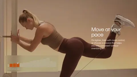
| 7 | video | Wide video-led feature with text positioned beside the subject. | Flexible workout intensity, Encouraging guidance | Cinematic fitness footage, Short overlay heading, Subtle color grading |
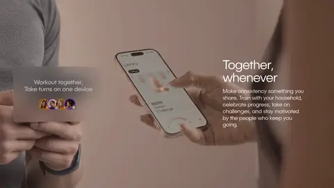
| 8 | feature-split | Lifestyle image paired with concise copy in a broad two-part composition. | Shared training, Household motivation | Phone and people imagery, Editorial overlay copy, Warm pale tones |
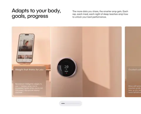
| 9 | product-showcase | Introductory heading and copy followed by a horizontally arranged feature-card carousel. | Feature browsing, Adaptive product explanation | Product close-ups, Rounded media cards, Carousel indicator |
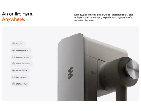
| 10 | product-showcase | Split introduction above a large full-bleed product showcase with feature controls. | Product feature exploration, Progressive detail reveal | Device close-up, Feature list, Rounded media frame |
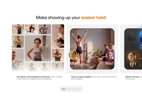
| 11 | feature-grid | Centered heading over a horizontal sequence of image-led feature cards. | Benefit discovery, Carousel browsing | Lifestyle card imagery, Centered heading, Carousel indicator |
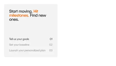
| 12 | how-it-works | Two-column section with a pale numbered-step panel beside video content. | Three-step onboarding, Step selection | Pale-gray card, Numbered rows, Video demonstration |
| 13 | category-nav | Centered heading above two rows of horizontally arranged filter controls and exercise content. | Workout-type filter, Muscle-group filter | Rounded pills, Dark selected option, Compact category labels |
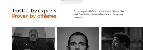
| 14 | testimonials | Editorial heading and supporting copy above a horizontal row of portrait testimonial cards. | Credibility through endorsements, Browse testimonials | Grayscale portrait cards, Two-column introduction, Editorial typography |
## Source CSS custom properties (selected)
```css
--background-primary-v2: