North star · Use saturated orange as a focused entry point, then let warm neutral space and clear typographic hierarchy carry the information.
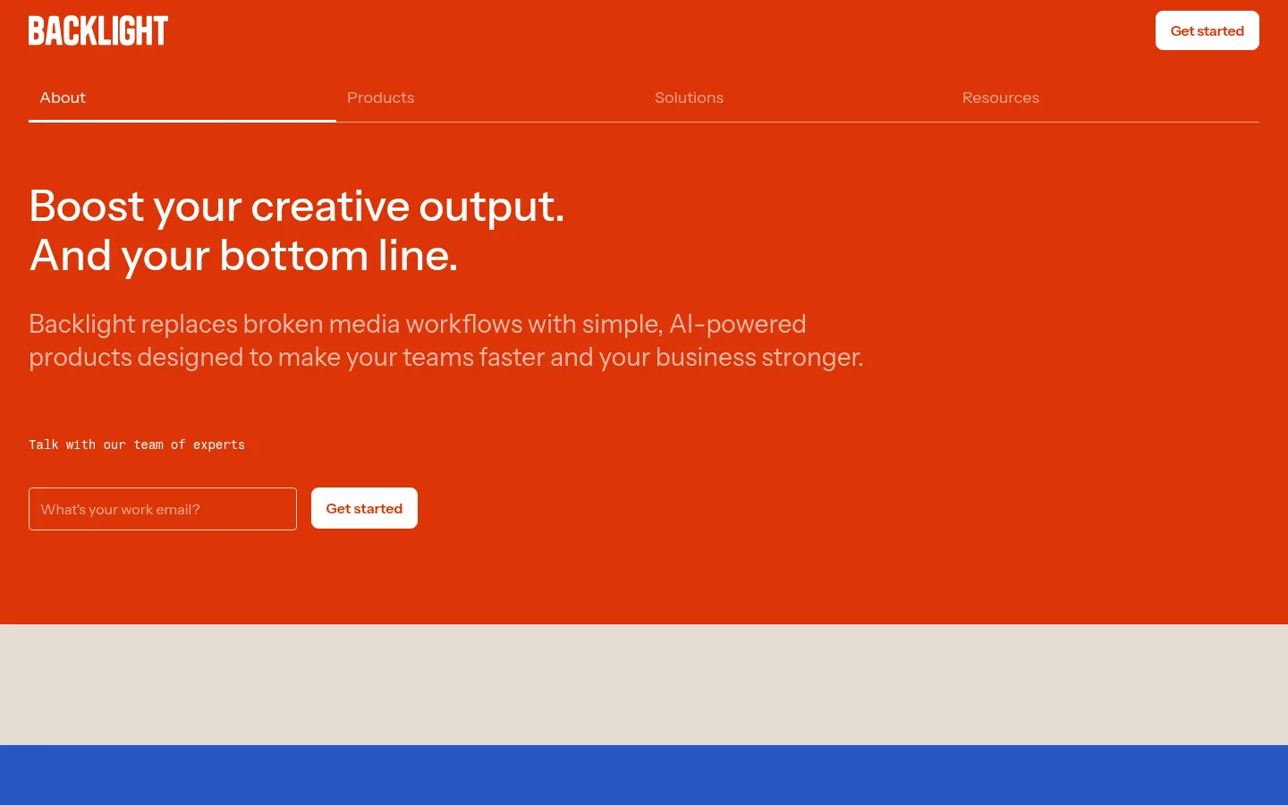
The page is anchored by a saturated Ember Orange (#dd3508) header and hero, set against warm Canvas Sand (#e4ddd5) content bands and near-black sections. White type carries the hero headline and navigation; muted peach text softens supporting copy on orange. Instrument Sans is the primary voice: medium-weight, sentence-case headings with open line spacing and readable body copy. Fragment Mono appears sparingly for compact labels and form prompts, adding a technical editorial note. Layout alternates between broad, uncluttered fields and tightly organized content: split feature panels, a horizontal proof-point list, resource cards, and FAQ rows. Product and editorial photography sits in rounded frames, while thin rules organize menus and accordions. The visual system favors flat color fields and hairlines over decorative effects, with orange reserved for high-impact entry points, small controls, and links.
配色
点色块复制色值。用途说明来自对页面的实测位置(背景、文字、描边、按钮)与截图判读。
品牌色
强调色
表层色
中性色
功能色
页面底色 · Canvas Sand表层 · Soft Charcoal主文字 · Soft Charcoal次要文字 · Graphite Grey弱文字 · Paper White描边 · Stone Rule强调 · Ember Orange强调 2 · Peach Tint
Primary family for display headings, body copy, navigation, buttons, and most interface text.
Aa 设计
Fragment Mono
网络字体 · 字重 400 / 700 · 占比 7%
免费替代:Space Mono
Compact technical labels and occasional form or eyebrow copy.
角色
示例
字号
字重
行高
字距
特大标题
Large feature or statement headline.
Backlight
60px
500
1.2
0
一级标题
Primary hero headline.
Backlight
48px
500
1.15
0
二级标题
Major section titles.
Backlight
39px
500
1.2
0
三级标题
Resource titles and prominent content headings.
Backlight
32px
500
1.3
0
四级标题
Smaller subsection and card headings.
Backlight
28px
400
1.3
0
正文
Paragraphs, descriptions, and standard interface copy.
The quick brown fox 敏捷的狐狸
16px
400
1.25
0
辅助文字
Compact metadata and secondary labels.
The quick brown fox 敏捷的狐狸
12px
400
1.3
0
按钮
Primary CTA labels.
The quick brown fox 敏捷的狐狸
16px
600
1.25
0
导航
Top-level navigation items.
The quick brown fox 敏捷的狐狸
18px
400
1
0
代码
Monospaced eyebrow and technical label text.
const style = 1;
14px
400
1.15
-0.02em
间距与布局
基准单位 8px · 密度:紧凑
32px版块间距
8px元素间距
—卡片内边距
1376px内容最大宽度
4px
8px
10px
12px
15px
16px
20px
24px
32px
64px
80px
120px
Use a wide desktop canvas with content capped at the measured 1376px maximum and consistent left alignment. The header and hero share one full-width orange field; subsequent sections alternate warm neutral and charcoal bands. Content shifts between compact multi-column groupings and broad, airy single-column statements, with split layouts for product features. The measured spacing scale runs from 4px to 120px; use its larger values for section breathing room and smaller values for controls and card content. Overall density is compact within groups but generous between sections.
圆角与层次
按钮 · 8px
输入框 · 4px
图片 · 8px
导航 · 8px
没有测到阴影:页面是扁平的,层次靠底色和描边区分。
The interface is predominantly flat, with no measured shadow system. Use thin rules to separate navigation, FAQ rows, and footer columns. Buttons, media, navigation, and inputs use restrained rounded corners; image cards provide the main visual layering. Avoid floating panels or pronounced depth effects.
组件
下面的预览按实测的按钮、输入框、徽标、卡片样式重建(字体用替代字体)。
Orange hero and navigation
Join the top navigation and headline area on the Ember Orange field. Set white navigation and headline text, with a compact white Get started button.
Email CTA form
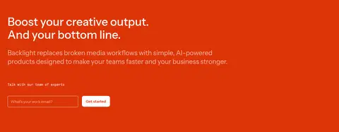
Pair a transparent email input with a fine light border and a white button. Place a small monospaced prompt above the controls.
Feature accordion
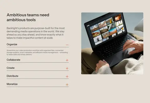
Present feature labels as simple rows on the warm canvas, divided by hairlines with small orange plus or minus indicators.
Proof-point list
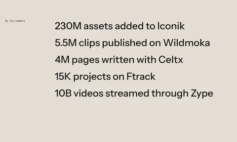
Set large dark metrics in a vertical editorial list, with a small label aligned separately from the main figures.
Resource cards
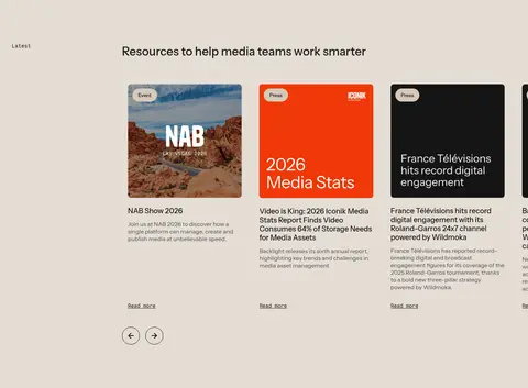
Use image-led editorial cards with compact category labels, readable titles, brief supporting copy, and restrained text links.
FAQ rows
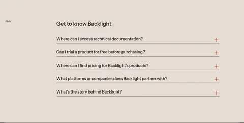
Stack question links in a single column on the warm canvas, using thin separators and a small orange expand indicator.
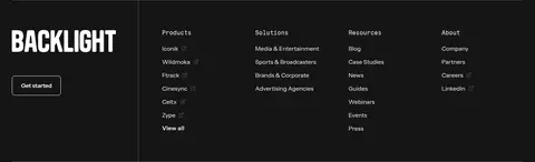
Dark footer
Organize the logo, CTA, and grouped link columns on charcoal; divide the legal and utility area with a fine horizontal rule.
Imagery · Use real media-workflow and product imagery, including interface or device context, in a limited set of rounded frames. Resource cards use editorial thumbnails with varied source imagery and concise text beneath. Keep photography natural and credible rather than heavily stylized; any illustration or colored mockup should remain supporting material, not a replacement for the brand’s orange, warm-neutral, and charcoal fields.
Anchor the opening viewport in Ember Orange (#dd3508).
Use Canvas Sand (#e4ddd5) as the primary content background.
Keep headlines in Instrument Sans with sentence-case wording.
Reserve white-on-orange contrast for the hero and navigation.
Use thin rules to structure lists, accordions, and footer groups.
Give major section transitions more breathing room than card content.
✕ 不该做
Do not spread the orange accent across every content section.
Do not add gradients, heavy shadows, or glossy effects.
Do not replace the warm canvas with stark white throughout.
Do not overuse monospaced text for headlines or paragraphs.
Do not crowd resource cards with excessive decoration.
Do not use rounded cards as the default for every content group.
给 AI 的提示词
想快速出一个同风格的新页面,把这段话连同 DESIGN.md 一起发给 AI。
Build a new Backlight-style page using Ember Orange (#dd3508) as a bold, focused opening field, Canvas Sand (#e4ddd5) for the main content, and Soft Charcoal (#151515) for a closing band or footer. Use Instrument Sans for nearly all text and reserve Fragment Mono for small technical labels. Set large, medium-weight sentence-case headlines above restrained supporting copy. Structure the content with clear full-width section bands, split feature layouts, compact card groups, and thin dividing rules rather than shadows. Use white text and a white CTA on orange; use charcoal text and orange link accents on the light canvas. Frame authentic product or media imagery simply, with measured rounded corners. Maintain generous transitions between sections while keeping controls and repeated content compact.