North star · Let warm editorial typography and immersive food photography carry the story, with restrained gold accents and generous breathing room.
The page uses warm parchment (#d8cbb8) as its primary canvas, interrupted by a muted taupe catering band and a deep charcoal footer. A nearly black gradient over full-bleed restaurant photography creates the opening hero’s cinematic mood and keeps its pale, uppercase display type legible. Saffron gold is a restrained signal for small controls and brand details rather than a broad background colour. TT Ramillas Variable provides the high-contrast editorial voice in airy, tightly tracked uppercase headings; Satoshi handles compact navigation, descriptions, links, and card copy. Layout alternates spacious single-column statements with asymmetric two-column food showcases and a three-card catering row. Large image areas, quiet hairlines, and simple square-edged controls keep the experience tactile without relying on shadows or decorative UI. The gift-card and review sections return to the light canvas, while the dark footer closes the long page with a strong tonal contrast.
Navigation, body copy, links, captions, menu descriptions, and review-card text.
Aa 设计
TT Ramillas Variable
网络字体 · 字重 300 · 占比 19%
免费替代:Cormorant Garamond
Display headings and section titles across the hero and editorial content.
角色
示例
字号
字重
行高
字距
特大标题
Oversized uppercase hero and brand statement headings.
Amrit Palace
69px
300
0.9
-0.04em
一级标题
Primary hero headline, set in large uppercase display serif.
Amrit Palace
65px
300
0.85
-0.04em
二级标题
Major editorial section headings, often uppercase.
Amrit Palace
50.5px
300
0.9
-0.03em
三级标题
Secondary section titles and supporting feature headings.
The quick brown fox 敏捷的狐狸
26px
300
1.2
-0.006em
四级标题
Compact subheadings and card-level titles.
The quick brown fox 敏捷的狐狸
21.5px
300
1
-0.035em
正文
Restaurant descriptions, menu details, and general explanatory copy.
The quick brown fox 敏捷的狐狸
13px
500
1.4
-0.011em
辅助文字
Small labels, image captions, and understated supporting notes.
The quick brown fox 敏捷的狐狸
12px
500
1.4
-0.012em
链接
Navigation and text actions such as menu, catering, and gift links.
The quick brown fox 敏捷的狐狸
13.5px
500
1.4
0
间距与布局
基准单位 4px · 密度:适中
92px版块间距
6px元素间距
5px卡片内边距
1384px内容最大宽度
1px
2px
3px
4px
5px
6px
7px
10px
12px
16px
20px
28px
42px
The page is a long, comfortable-density editorial scroll, with measured content capped by a 1384px page maximum. It alternates single-column narrative sections, asymmetric two-column food showcases, and a three-column catering feature row; reviews use a four-column card layout. Most headings align to the start edge, while the gift feature centers its title and call to action. Broad section gaps separate content, and image blocks often span a substantial part of the layout. Use the measured 4px spacing base and scale for rhythm; avoid compressing the generous transitions.
圆角与层次
卡片 · 3px
链接 · 3px
没有测到阴影:页面是扁平的,层次靠底色和描边区分。
The interface is largely flat, with no measured shadows. Separate content through background bands, image placement, and thin muted borders rather than floating cards. Review cards and menu panels use restrained outlines, while the hero’s dark image overlay supplies depth. Keep corners nearly square, using only the measured subtle card and link radii.
组件
下面的预览按实测的按钮、输入框、徽标、卡片样式重建(字体用替代字体)。
Hero navigation
Slim overlay navigation on the dark photographic hero, with small Satoshi links and gold-toned icon controls.
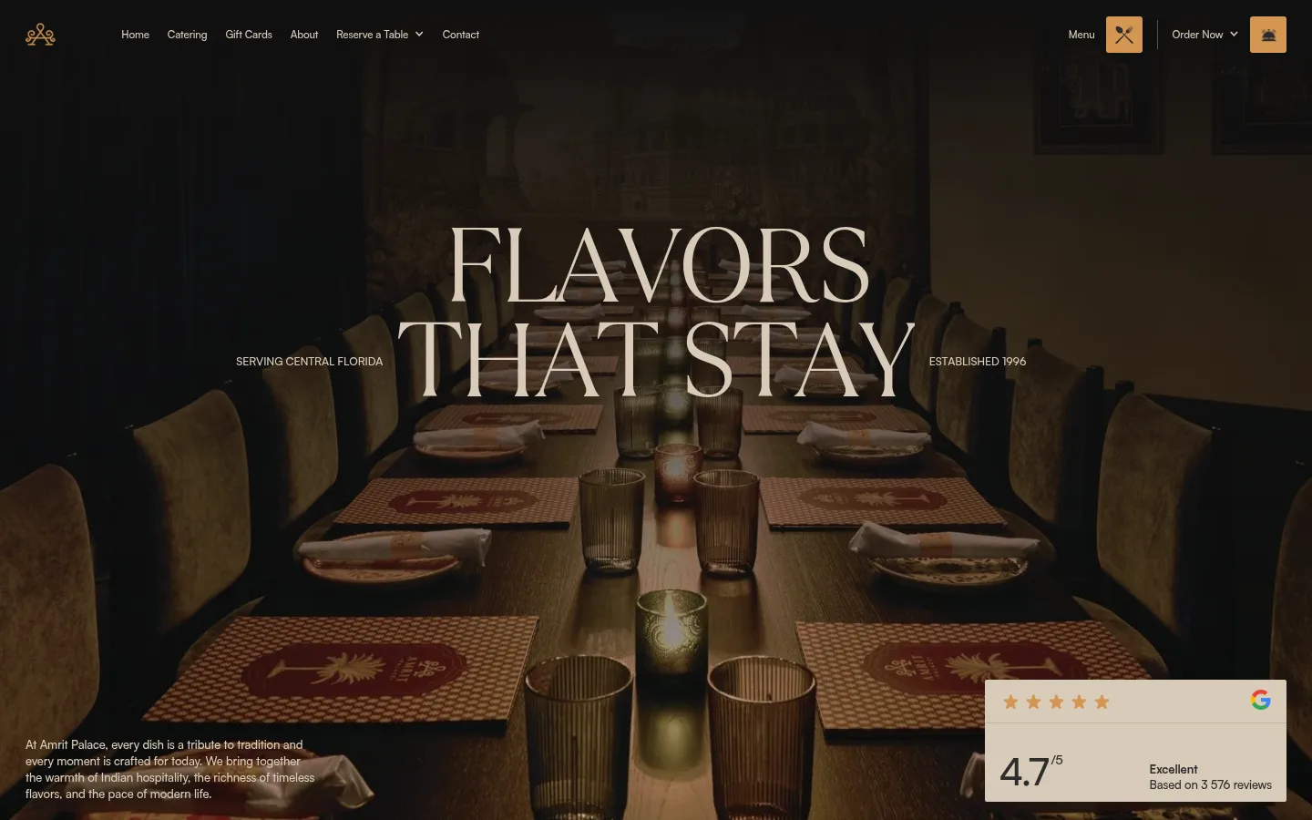
Cinematic hero
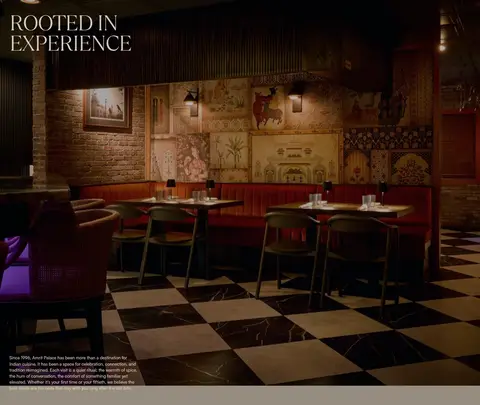
Full-bleed dining-room image under a dark gradient, centered uppercase display headline, small side labels, and a review badge.
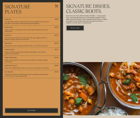
Menu showcase
Two-column food presentation with a bordered menu panel beside editorial copy, outlined menu action, and large dish photography.
Catering features
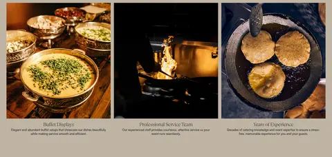
Muted sand section with a centered editorial heading followed by three photographic service cards and compact captions.
Drink menu
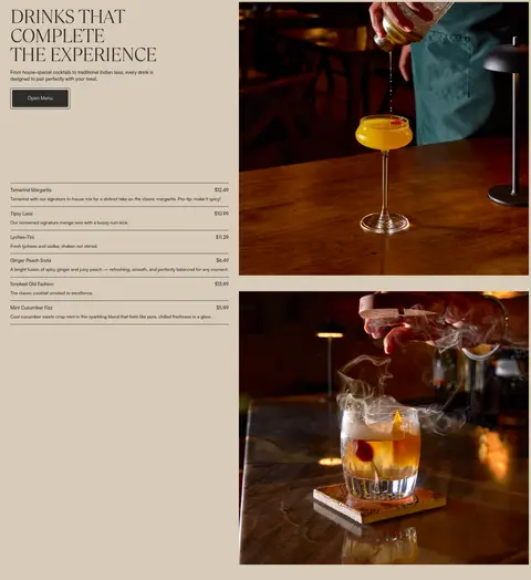
Asymmetric drinks section pairing a text-and-menu column with stacked cocktail photography.
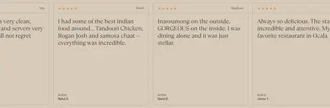
Review cards
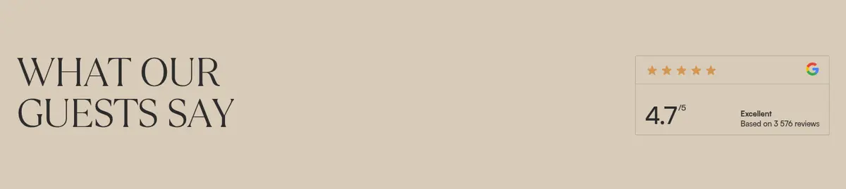
Light-canvas guest review area with fine taupe borders, small supporting text, and a compact rating summary.
Footer
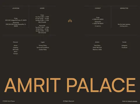
Deep charcoal two-column information area with thin dividers, small pale links, centered brand mark, and oversized gold wordmark.
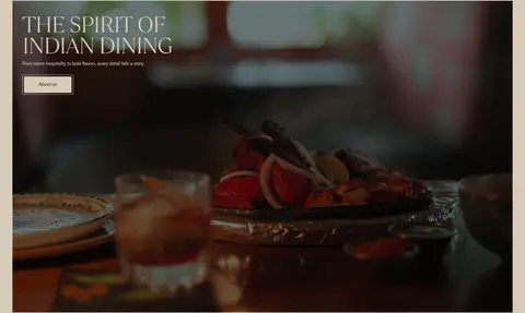
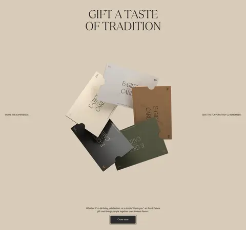
Imagery · Use immersive restaurant, plated-food, and cocktail photography as the primary visual content. The hero is full-bleed and heavily darkened with a black gradient to support pale headline text. Other sections use large, cleanly cropped images beside or beneath text, including service photography in a three-card row. Gift cards appear as a photographic arrangement rather than a flat UI mockup. Keep image treatment warm, low-gloss, and realistic; measured screenshot colours inside imagery should not be mistaken for the interface palette.
Use Warm Parchment (#d8cbb8) as the dominant light canvas.
Reserve Roasted Charcoal (#292622) for the deep footer contrast.
Use large, light uppercase serif headings for editorial moments.
Keep body and navigation copy compact in a clean sans serif.
Pair generous text space with large, warm food photography.
Use thin borders and section bands instead of drop shadows.
✕ 不该做
Do not turn Saffron Gold (#d49653) into a dominant page background.
Do not apply heavy shadows or elevated floating-card effects.
Do not force every section into a uniform centered grid.
Do not use dense, oversized body copy beside the display headings.
Do not treat photographic colours as additional interface palette tokens.
Do not round cards and controls heavily.
给 AI 的提示词
想快速出一个同风格的新页面,把这段话连同 DESIGN.md 一起发给 AI。
Build a new restaurant page in the Amrit Palace visual style. Use Warm Parchment (#d8cbb8) as the primary canvas, Charcoal Ink (#2c2c2c) for text and outlines, and Saffron Gold (#d49653) only for small highlights. Use Roasted Charcoal (#292622) for a strong dark band or footer. Set editorial headings in a light, high-contrast serif with tight tracking and uppercase styling; use a clean medium-weight sans serif for navigation and compact copy. Organize content as a spacious long-form scroll with asymmetric image-and-text sections, broad photography, occasional three-column features, and restrained review cards. Keep food and dining imagery warm and cinematic, darkening the hero with a subtle gradient. Prefer hairline borders and flat surfaces over shadows, and keep corner rounding minimal.