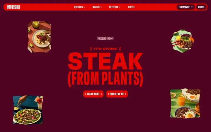
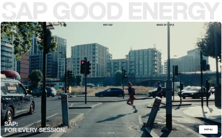
North star · Let oversized saffron typography and the terracotta field establish the mood, then use product imagery and deliberate negative space to tell the story.
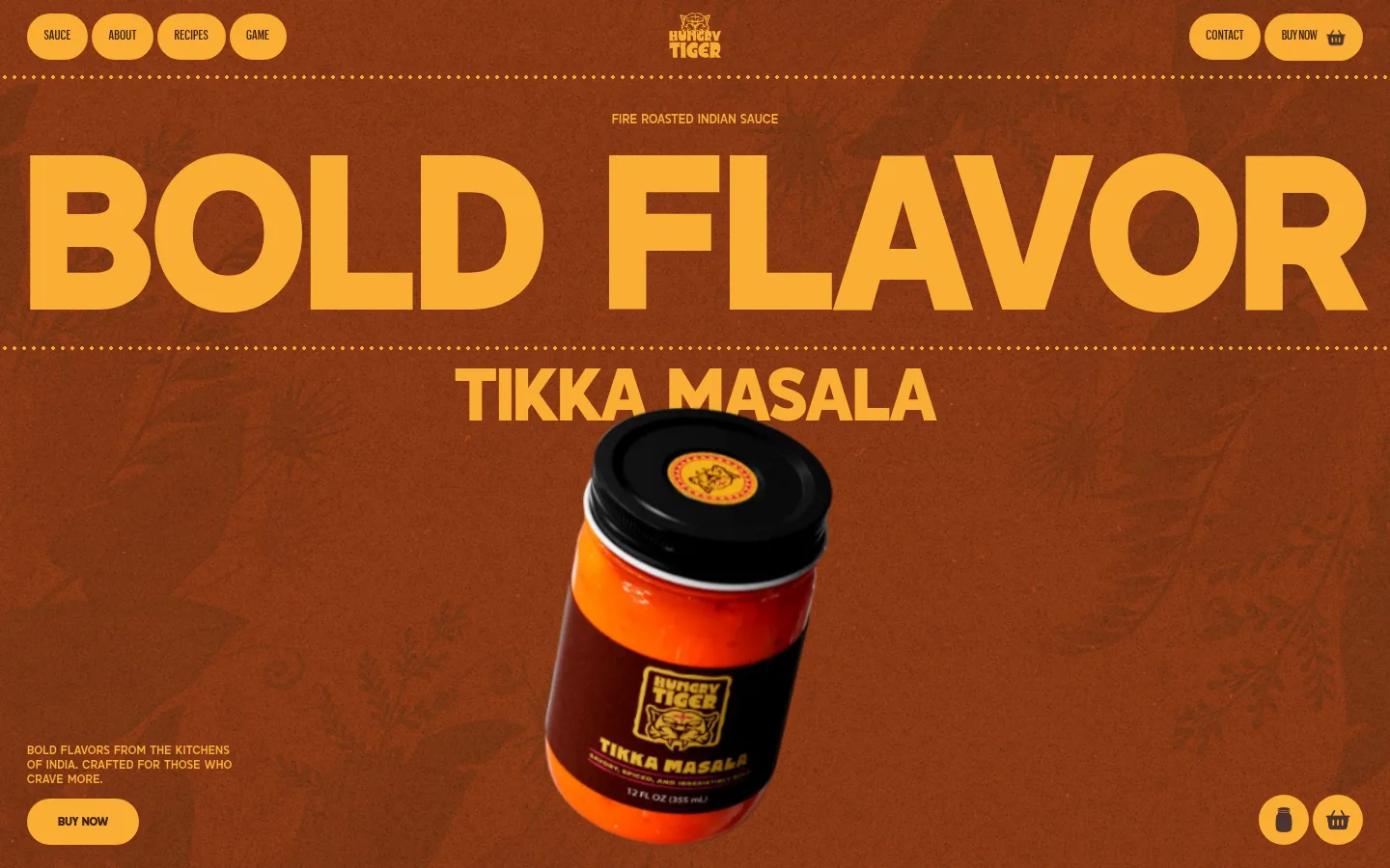
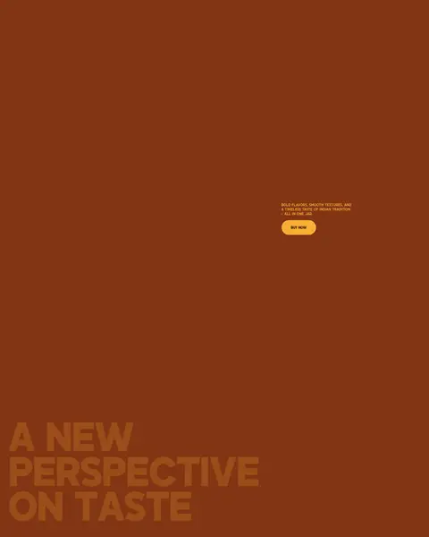
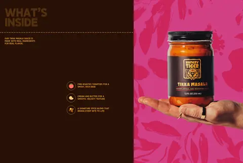
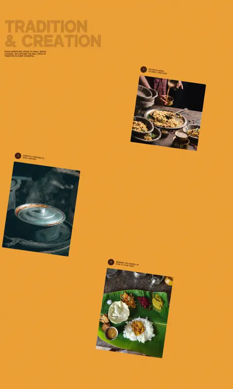
The page builds its identity from a warm terracotta canvas (#823513) and a bright saffron-orange (#faae33) used for oversized headlines, navigation pills, dotted dividers, and primary calls to action. Deep brown (#402011) provides contrast for small text and button labels, while the near-black brown surface (#281006) marks the ingredient-story panel. A muted burnt orange (#9f531b) appears as a secondary accent rather than a dominant structural color. Salmond carries the display system: heavy, uppercase, tightly tracked headlines that sometimes blend into the background for atmospheric emphasis. Compact Graphikx navigation keeps utility links legible. The layout alternates vast open color fields and product-led moments, then introduces a sharp bright-yellow section with offset documentary food photographs. The jar is the central visual anchor, treated like a hero object against the textured backdrop.
Display headlines, section titles, body copy, and captions
Aa 设计
Graphikx
网络字体 · 字重 500 · 占比 3%
免费替代:DM Sans
Navigation and compact utility labels
角色
示例
字号
字重
行高
字距
特大标题
Hero-scale uppercase slogan spanning the opening canvas.
Hungry Tiger
213px
700
0.8
-0.02em
一级标题
Primary hero title and the strongest page-level message.
Hungry Tiger
144px
700
0.9
-0.02em
二级标题
Large uppercase titles introducing major story sections.
Hungry Tiger
129.5px
700
0.9
-0.016em
三级标题
Secondary story headlines and ingredient statements.
Hungry Tiger
101px
700
0.88
-0.016em
四级标题
Compact subsection titles in product and editorial panels.
Hungry Tiger
72px
700
0.9
-0.02em
正文
Short product storytelling and supporting explanatory copy.
The quick brown fox 敏捷的狐狸
18px
500
1
0
辅助文字
Small uppercase flavor notes and image-adjacent details.
The quick brown fox 敏捷的狐狸
11.5px
500
1.3
0.02em
导航
Compact uppercase links and utility navigation.
The quick brown fox 敏捷的狐狸
13px
500
1.3
0.01em
间距与布局
基准单位 4px · 密度:宽松
115px版块间距
12px元素间距
—卡片内边距
1384px内容最大宽度
2px
4px
6px
8px
9px
10px
12px
16px
17px
20px
24px
26px
28px
32px
115px
A spacious, single-column page uses a measured maximum width of 1384px, with much of the opening design running nearly full bleed. The navigation sits across the top, the hero centers its headline and jar, and later story content shifts between left-aligned titles, centered display text, and offset imagery. Large section gaps create a slow editorial pace; the ingredients section is the main split-panel interruption. Keep smaller copy close to its related product or image, rather than filling the open canvas.
圆角与层次
按钮 · 9999px
没有测到阴影:页面是扁平的,层次靠底色和描边区分。
The measured interface is predominantly flat, with no recorded shadows. Use color fields, scale, and image overlap to create hierarchy rather than card elevation. Dotted saffron rules provide decorative separation, while pill-shaped controls and the dark ingredients panel define the few strong component boundaries.
组件
下面的预览按实测的按钮、输入框、徽标、卡片样式重建(字体用替代字体)。
Pill navigation
Compact uppercase links sit in saffron rounded pills along the top, balanced around a centered brand mark.
Primary buy button
Use a saffron pill with Roasted Cacao lettering; the measured BUY NOW control is uppercase and bold.
Hero product display
Pair a giant uppercase slogan with a centered sauce jar, secondary product title, and compact supporting copy.
Dotted divider
A fine, saffron dotted horizontal rule separates the navigation and hero headline bands.
Ingredients panel
A near-black brown content panel carries a saffron title, compact copy, and ingredient details beside product imagery.
Editorial photo sequence
Offset, slightly rotated food and process photographs sit with short captions across a bright saffron section.
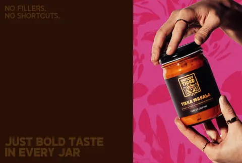
Imagery · Product photography gives the sauce jar a central, almost floating hero presence against the textured terracotta field. Later imagery mixes product-in-hand shots with food and process photographs, including tilted documentary-style frames on the bright final section. Use the palette and image composition to make the jar legible; vivid pink backdrops and food colors belong to photography, not the core brand palette.
Reserve #faae33 for high-contrast emphasis and controls.
Set major headlines in bold uppercase Salmond-style typography.
Let the hero jar remain the visual focal point.
Use generous open space between story moments.
Keep utility copy compact and subordinate.
✕ 不该做
Do not introduce cool corporate blues or greens.
Do not fill the open canvas with unnecessary cards.
Do not use soft shadows to create hierarchy.
Do not make small copy compete with display headlines.
Do not treat photographic pink as a core brand color.
Do not replace the bold, warm palette with muted neutrals.
给 AI 的提示词
想快速出一个同风格的新页面,把这段话连同 DESIGN.md 一起发给 AI。
Build a new Hungry Tiger page with the same bold, warm editorial character. Use Spice Terracotta (#823513) as the main canvas and Saffron Signal (#faae33) for oversized uppercase headings, navigation pills, dotted separators, and primary actions. Use Roasted Cacao (#402011) for concise supporting text and button labels; reserve Molten Umber (#281006) for a strong content panel, with Burnt Spice (#9f531b) as a minor accent. Choose a heavy, tightly tracked display face similar to Salmond and a clean compact sans like Graphikx for navigation. Favor full-width color fields, spacious section pacing, and one clear product-photo focal point. Keep cards flat, copy short, and imagery tactile and documentary. Avoid generic shadows and unrelated palette colors.