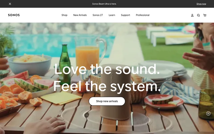
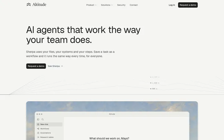
North star · Let cinematic product imagery and elegant serif headlines lead, while the interface stays quiet, monochrome and precisely structured.
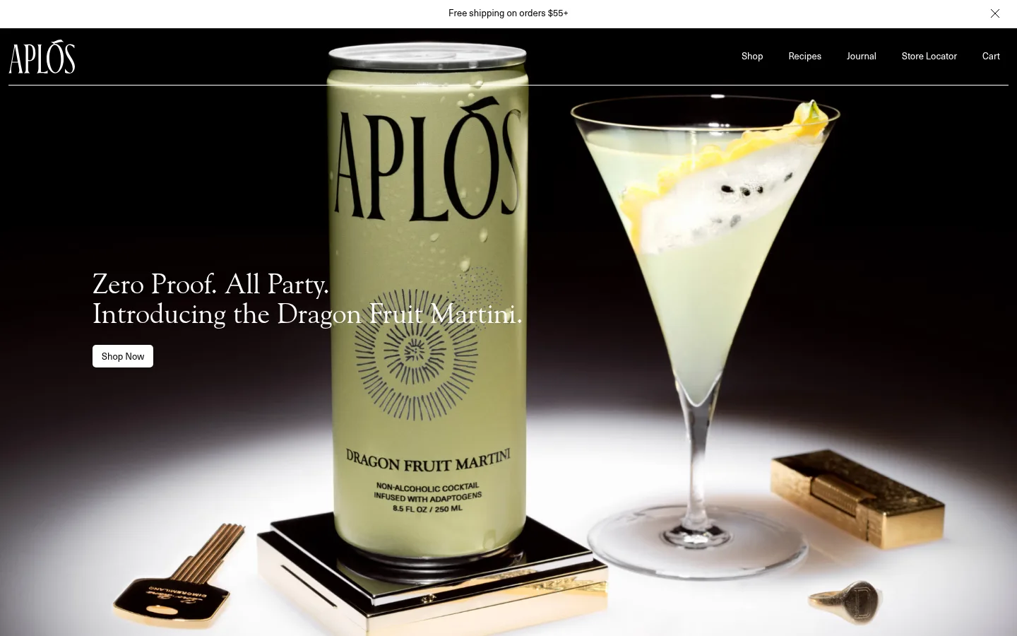
The page is built around a strong black and warm-ivory contrast: black anchors the navigation, hero, immersive brand stories and footer, while #f2f1ed marks benefits, reviews and editorial event content. White is reserved for legibility, fine rules and compact controls; muted gray supports quieter text. The palette in the product and cocktail photography adds olive, citrus and earthy tones, but these read as image content rather than a competing interface palette. Large Goudy Old Style headlines lend the page an editorial, spirits-label character, balanced by compact Neue Haas Unica navigation and body copy. Full-bleed product imagery alternates with centered or column-based light sections, giving the long page a deliberate sequence of visual pauses. Content sits within a measured maximum width, with generous section separation and restrained card framing. Keep controls small and quiet so the photography and headlines carry the emphasis.
配色
点色块复制色值。用途说明来自对页面的实测位置(背景、文字、描边、按钮)与截图判读。
品牌色
表层色
中性色
功能色
页面底色 · Midnight Ink表层 · Warm Parchment表层 2 · Pure Porcelain表层 3 · Charcoal Slate主文字 · Pure Porcelain次要文字 · Midnight Ink弱文字 · Soft Graphite描边 · Pure Porcelain
文字
背景
对比度
WCAG
#ffffff Pure Porcelain
#000000 Midnight Ink
21:1
AAA
#ffffff Pure Porcelain
#f2f1ed Warm Parchment
1.13:1
不达标
#ffffff Pure Porcelain
#333333 Charcoal Slate
12.63:1
AAA
#000000 Midnight Ink
#f2f1ed Warm Parchment
18.58:1
AAA
#000000 Midnight Ink
#ffffff Pure Porcelain
21:1
AAA
#000000 Midnight Ink
#333333 Charcoal Slate
1.66:1
不达标
字体
字号阶梯:Custom(比例约 1.754,正文 13px)。示例用免费替代字体渲染,数值为实测。
Aa 设计
Neue Haas Unica
网络字体 · 字重 400 · 占比 76%
免费替代:Inter
Navigation, body copy, buttons, labels and compact utility text.
Aa 设计
Goudy Old Style
网络字体 · 字重 400 · 占比 24%
免费替代:EB Garamond
Hero and section headlines, oversized editorial links and prominent quotation copy.
角色
示例
字号
字重
行高
字距
一级标题
Hero headline and major brand statement.
Aplós
40px
400
1.05
0
二级标题
Section headings such as Benefits and Aplós Hour.
The quick brown fox 敏捷的狐狸
26px
400
1.08
-0.012em
正文
Product descriptions, reviews and supporting editorial copy.
The quick brown fox 敏捷的狐狸
13px
400
1.23
0
按钮
Compact shopping and section-action labels.
The quick brown fox 敏捷的狐狸
13px
400
1.23
0
导航
Primary links and header utility navigation.
The quick brown fox 敏捷的狐狸
13px
400
1.23
0
链接
Large editorial product or collection links.
Aplós
40px
400
1.05
-0.012em
间距与布局
基准单位 4px · 密度:适中
48px版块间距
12px元素间距
—卡片内边距
1416px内容最大宽度
1px
6px
9px
12px
24px
48px
96px
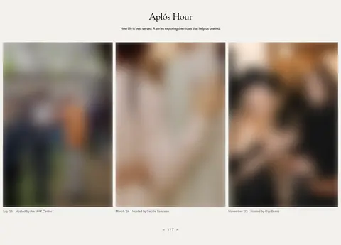
A long, full-width homepage alternates full-bleed photographic stories with light editorial sections. The measured page maximum width is 1416px, with comfortable density and clear separation between major bands. The benefits area centers its heading above three columns; reviews use a split arrangement, while Aplós Hour presents an image-led multi-column gallery. Navigation remains a slim overlay-like band at the top of the hero, and the dark footer separates its statement from grouped link columns.
圆角与层次
按钮 · 5px
卡片 · 3px
导航 · 5px
链接 · 5px
inset · link
The interface is mostly flat: large color bands and imagery provide structure instead of shadows. Thin light rules define the navigation boundary, while cards use restrained corner rounding and little visual chrome. Product photography and overlaid content create the main sense of depth; the measured inset shadow is limited to a link detail, not a general elevation system.
组件
下面的预览按实测的按钮、输入框、徽标、卡片样式重建(字体用替代字体)。
Announcement strip
A slim white bar above the dark hero carries centered shipping information and a close control.
Primary navigation
White wordmark and compact Neue Haas Unica links sit on black, separated from the hero by a fine light rule.
Hero CTA
A small white Shop Now button with black text and a measured 5px radius sits beneath the large serif headline.
Benefit cards
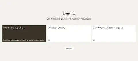
Three-column benefit content on warm ivory uses restrained card treatment, with a dark featured card among light cards.
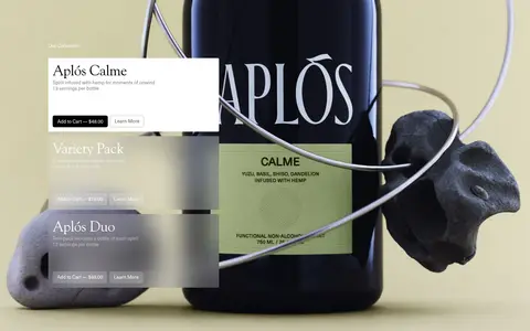
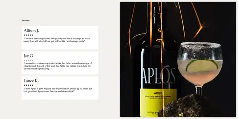
A light editorial section pairs stacked customer review cards with a large product-and-cocktail photograph.
Editorial gallery
A centered heading and short introduction precede a multi-column event image row on warm ivory.
Footer
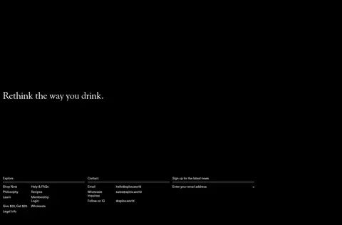
A large serif brand statement leads into compact link, contact and email-signup columns on black.
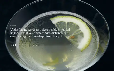
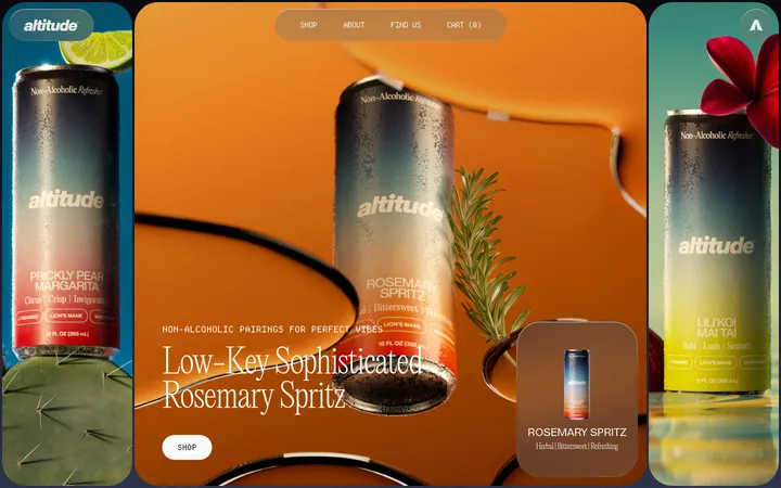
Imagery · Photography is the dominant visual material: oversized cans and cocktails appear in carefully staged, full-bleed hero and product-story compositions. Close crops, dramatic lighting and deep backgrounds make packaging legible while keeping the scene atmospheric. Reviews pair testimonial cards with a product image; event content uses a row of editorial photographs. Olive and citrus hues belong chiefly to the photographed products and settings, rather than the interface palette.
Use black and warm ivory as the dominant section canvases.
Reserve serif display type for headlines and editorial statements.
Use compact sans-serif text for navigation, buttons and utility content.
Give product photography full-bleed space when telling a brand story.
Alternate immersive dark imagery with calm light editorial sections.
Keep controls understated and clearly legible.
✕ 不该做
Do not introduce bright interface accents absent from the measured palette.
Do not turn the page into a dense dashboard or app-like grid.
Do not add heavy shadows to ordinary cards and controls.
Do not make every text element oversized or serif.
Do not mistake colors inside product photographs for interface colors.
Do not crowd full-bleed imagery with extra decorative UI.
给 AI 的提示词
想快速出一个同风格的新页面,把这段话连同 DESIGN.md 一起发给 AI。
Build a new Aplós-style page as a premium, image-led storefront. Use Midnight Ink (#000000) for dark story bands, navigation and footer, and Warm Parchment (#f2f1ed) for calm editorial sections. Set headlines in an elegant Goudy Old Style-like serif and interface copy in a compact Neue Haas Unica-like sans serif. Keep the measured interface palette restrained: Pure Porcelain (#ffffff) for contrast and controls, Soft Graphite (#646464) only for muted copy, and Charcoal Slate (#333333) only as a subtle surface detail. Organize content into full-bleed product photography alternating with centered or multi-column editorial sections. Make CTAs compact, lightly rounded and visually quiet. Favor fine rules and spacing over shadows; let product imagery, typography and alternating canvases establish hierarchy.