AngelList以深青色首屏和页脚搭配大面积浅色产品区,呈现覆盖私募市场的多项业务。醒目的展示字体、克制的淡紫点缀与产品视觉,让页面既有金融品牌的沉稳,也便于快速浏览。
North star · Use deep teal for the brand frame, pale bands for business detail, and reserve lavender for deliberate emphasis.
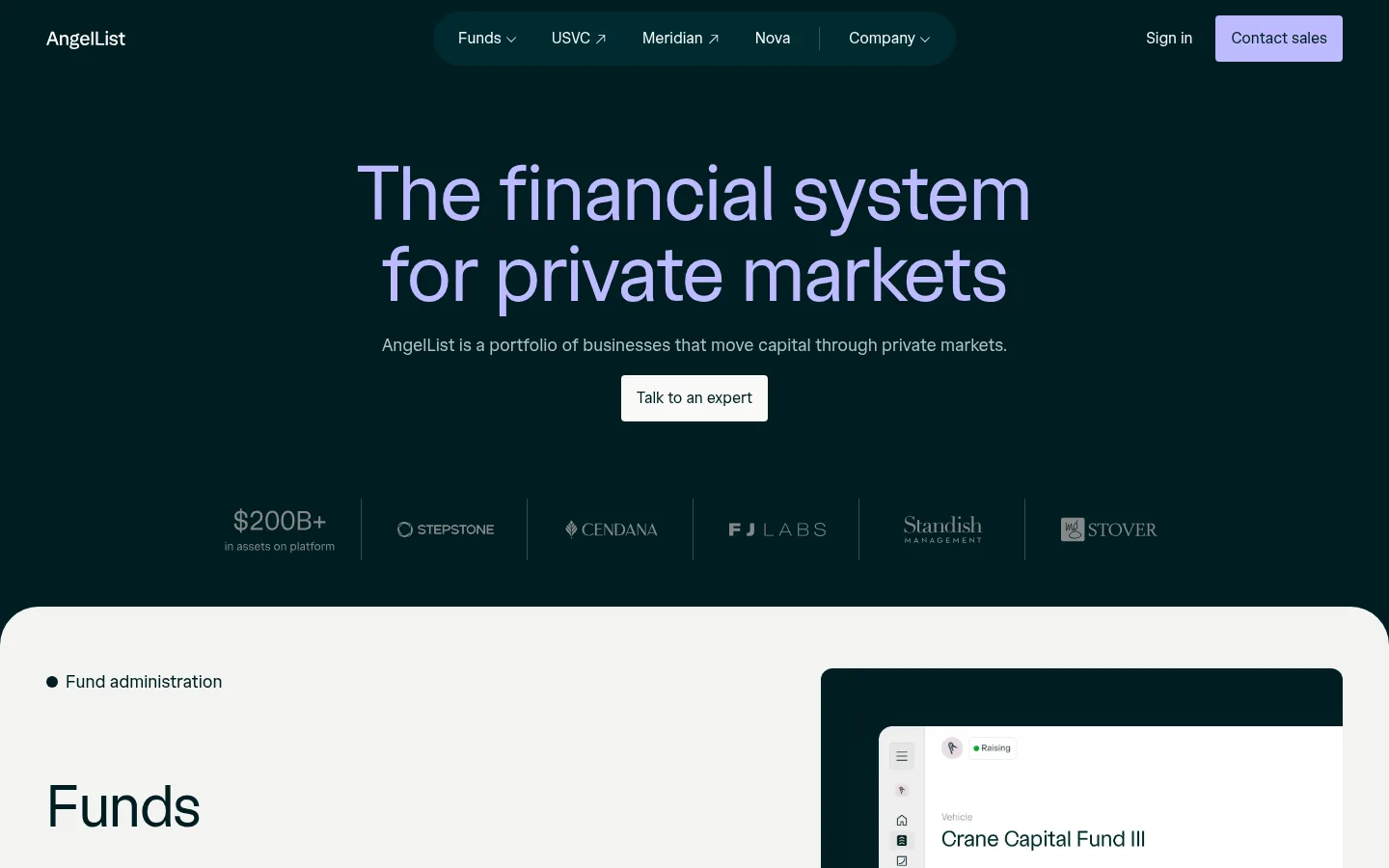
The page alternates a deep teal canvas with generous pale product bands, creating a clear shift from brand statement to business detail. The hero centers a large, soft-lavender headline above muted supporting text, a light CTA, and a compact row of partner marks. Product sections use pale backgrounds, dark teal typography, and a two-column split: concise labels and copy on the left, framed product or brand imagery on the right. The custom AngelList display face gives headlines a rounded, open character; the companion sans-serif handles navigation, body copy, and controls with a practical, quiet tone. Lavender is reserved for emphasis and the primary sales action rather than used as a broad background. Cards and buttons have modest rounded corners, while subtle hairlines and restrained layering keep the interface crisp. Comfortable spacing and repeated section proportions make a long homepage feel orderly rather than dense.
配色 点色块复制色值。用途说明来自对页面的实测位置(背景、文字、描边、按钮)与截图判读。
品牌色
Deep Teal
#001d21
Primary canvas for the hero, navigation, footer, dark buttons, and headline text on pale sections.
强调色
Soft Lavender
#bdbbff
Primary sales CTA fill and selective accent text against the dark teal canvas.
Electric Indigo
#3e3aff
Small badge lettering, not a broad brand surface or dominant page color.
表层色
Gallery White
#f3f4f2
Dominant pale background for the stacked business and product sections.
Clean White
#ffffff
Light section and canvas surface used around the page transition and footer content.
Cloud Gray
#ebeceb
Pale card surface and secondary tonal shift within light product areas.
中性色
Harbor Mist
#b2bfc1
Main muted text tone, especially supporting copy and subdued footer content.
Slate Moss
#68706f
Secondary text and link color for subdued headings and supporting content.
Warm Chalk
#f9f9f7
Light navigation, button, and footer text; also used for the inverse CTA surface.
Quiet Pewter
#848888
Low-emphasis footer text and minor supporting details.
功能色
Teal Hairline
#334a4d
Fine border color, most visible in footer dividers and restrained structural rules.
文字 背景 对比度 WCAG #b2bfc1 Harbor Mist#001d21 Deep Teal9.28:1 AAA #b2bfc1 Harbor Mist#f3f4f2 Gallery White1.71:1 不达标 #b2bfc1 Harbor Mist#ffffff Clean White1.89:1 不达标 #b2bfc1 Harbor Mist#ebeceb Cloud Gray1.6:1 不达标 #68706f Slate Moss#001d21 Deep Teal3.45:1 AA-large #68706f Slate Moss#f3f4f2 Gallery White4.6:1 AA
字体 字号阶梯:Augmented Fourth(比例约 1.417,正文 14px)。示例用免费替代字体渲染,数值为实测。
Aa 设计
angellist 网络字体 · 字重 400 / 500 · 占比 75%
免费替代:Inter
Navigation, body copy, buttons, labels, and footer text
Aa 设计
angellistDisplay 网络字体 · 字重 400 · 占比 25%
免费替代:DM Sans
Display headlines and major section titles
角色 示例 字号 字重 行高 字距 特大标题 Oversized centered hero statement.
AngelList
80px 400 1.05 -0.01em 一级标题 Primary page or section headline emphasis.
AngelList
60px 400 1.15 -0.015em 二级标题 Business names and major content section titles.
AngelList
38px 400 1.25 0 三级标题 Subsection titles and product content headings.
The quick brown fox 敏捷的狐狸
22px 400 1.4 0 四级标题 Compact feature or footer group headings.
The quick brown fox 敏捷的狐狸
18px 400 1.6 -0.002em 正文 Product explanations, navigation details, and general copy.
The quick brown fox 敏捷的狐狸
14px 400 1.5 0 辅助文字 Small supporting labels, disclosures, and fine print.
The quick brown fox 敏捷的狐狸
12px 400 1.5 0 按钮 CTA and action labels.
The quick brown fox 敏捷的狐狸
16px 400 1.5 -0.002em 导航 Header navigation and account actions.
The quick brown fox 敏捷的狐狸
16px 400 1.5 -0.002em 眉题 Uppercase business-category labels above section titles.
The quick brown fox 敏捷的狐狸
11px 500 1.45 0.08em
间距与布局 基准单位 4px · 密度:适中
48px 版块间距
4px 元素间距
— 卡片内边距
1344px 内容最大宽度
2px
4px
6px
8px
12px
16px
18px
24px
32px
48px
64px
80px
96px
The page uses a broad centered content frame, measured at a 1344px maximum, with comfortable density. A centered hero gives way to repeated two-column product splits: text and actions on the left, media on the right. Pale sections form a steady vertical rhythm, followed by a white-to-deep-teal footer transition. Align headlines and copy to the left in product bands, reserving centered alignment for the opening statement. Keep spacing generous and consistent with the measured scale.
圆角与层次 The interface is mostly flat: pale section bands and dark canvas carry the hierarchy rather than prominent shadows. Cards use a measured 12px radius, while buttons and badges use 4px corners. Thin borders appear sparingly, including muted footer dividers; imagery can sit within a contrasting frame for depth.
组件 下面的预览按实测的按钮、输入框、徽标、卡片样式重建(字体用替代字体)。
Header navigation Compact horizontal navigation on deep teal, with light text, grouped product links, and a lavender Contact sales action.
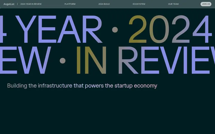
Hero statement Centered display headline and muted one-line supporting copy, followed by a light Talk to an expert button.
Partner mark row A subdued horizontal strip of investor and partner marks, separated by fine vertical rules beneath the hero.
Business feature split Pale section band with a small category label, large dark heading, concise description, action links, and right-side media.
Product card A product visual on a light or dark contrasting panel, with measured 12px corner radius and no prominent shadow.
CTA button Compact 16px sans-serif label, measured 4px radius, and solid fill; lavender, deep teal, or warm chalk variants.
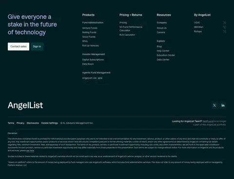
Footer directory Deep teal footer with a lead statement, grouped link columns, brand mark, social links, and subdued legal text.
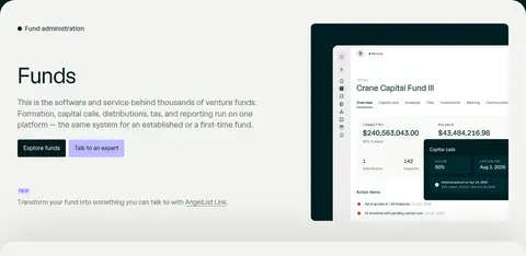
Imagery · Use product-interface captures and brand-specific media as framed visual anchors, rather than decorative stock imagery. The Funds section shows a bright fund dashboard inset against a deep teal surround; other blocks use video or compact brand visuals. Imagery sits in the right column and follows the section’s rounded card treatment. Keep assets distinct and legible, with restrained cropping and no invented color overlays.
页面版块 共 6 个版块,按页面从上到下排列,每个都标了类型、布局和交互套路。
该做与不该做 ✓ 该做 Keep the hero centered on the deep teal canvas. Alternate dark framing with broad pale product sections. Use lavender selectively for the primary sales CTA and emphasis. Build business sections as clear text-and-media splits. Use display typography for large headings and sans-serif for controls. Keep cards and controls flat with restrained corner rounding. ✕ 不该做 Do not turn the pale product bands into dark cards. Do not use lavender as a large page background. Do not add heavy shadows or decorative gradients. Do not crowd product descriptions or navigation. Do not center-align the copy inside feature sections. Do not treat illustration-only colors as core brand colors. 给 AI 的提示词 想快速出一个同风格的新页面,把这段话连同 DESIGN.md 一起发给 AI。
复制 Build a new AngelList-style page using Deep Teal (#001d21) as the brand frame and Gallery White (#f3f4f2) for broad content bands. Use Harbor Mist (#b2bfc1) for subdued copy and Soft Lavender (#bdbbff) sparingly for the primary action. Set large headlines in a rounded display sans-serif similar to DM Sans; use an Inter-like sans-serif for body copy, navigation, and controls. Start with a centered hero, then organize content into repeated two-column feature sections with left-aligned text and right-side product media. Keep the layout comfortable and clean, with restrained borders, modest corner rounding, and little visible shadow. End with a dense but orderly deep teal footer and grouped link columns. Preserve clear contrast and avoid decorative color or layout flourishes not supported by the page.
DESIGN.md Tailwind v4 CSS 变量 Design Tokens
---
title: "AngelList design system"
variant: extended
source: https://www.angellist.com/
captured_at: 2026-10-12
theme: dark
industry: fintech
generator: Design DNA (https://four.wiralomi.com/style/angellist-com)
ai_generated: true
ai_label: "本文件由 AI 辅助生成:数值取自公开网页的实测样式,命名、用途说明与建议为模型解读。商标归原所有者。 / AI-assisted content"
---
# AngelList · Design System
> Private markets, framed in deep teal and pale light.
**Theme:** dark · **Industry:** fintech · **Source:** https://www.angellist.com/ · **Captured:** 2026-10-12 (1440×900 desktop)
_AI-assisted content: values are measured from the public page at capture time; names, roles and guidance are model-written interpretations. Trademarks belong to their owners._
AngelList pairs a deep teal hero and footer with broad, pale product sections to present its private-market businesses as one connected financial system. Oversized display type, restrained lavender accents, and product imagery keep the page polished and information-led.
## North star
Use deep teal for the brand frame, pale bands for business detail, and reserve lavender for deliberate emphasis.
## Overview
The page alternates a deep teal canvas with generous pale product bands, creating a clear shift from brand statement to business detail. The hero centers a large, soft-lavender headline above muted supporting text, a light CTA, and a compact row of partner marks. Product sections use pale backgrounds, dark teal typography, and a two-column split: concise labels and copy on the left, framed product or brand imagery on the right. The custom AngelList display face gives headlines a rounded, open character; the companion sans-serif handles navigation, body copy, and controls with a practical, quiet tone. Lavender is reserved for emphasis and the primary sales action rather than used as a broad background. Cards and buttons have modest rounded corners, while subtle hairlines and restrained layering keep the interface crisp. Comfortable spacing and repeated section proportions make a long homepage feel orderly rather than dense.
## Colors
| Name | Hex | Token | Group | Role |
|---|---|---|---|---|
| Deep Teal | ` | `--color-deep-teal` | brand | Primary canvas for the hero, navigation, footer, dark buttons, and headline text on pale sections. |
| Harbor Mist | ` | `--color-harbor-mist` | neutral | Main muted text tone, especially supporting copy and subdued footer content. |
| Gallery White | ` | `--color-gallery-white` | surface | Dominant pale background for the stacked business and product sections. |
| Teal Hairline | ` | `--color-teal-hairline` | semantic | Fine border color, most visible in footer dividers and restrained structural rules. |
| Clean White | ` | `--color-clean-white` | surface | Light section and canvas surface used around the page transition and footer content. |
| Slate Moss | ` | `--color-slate-moss` | neutral | Secondary text and link color for subdued headings and supporting content. |
| Soft Lavender | ` | `--color-soft-lavender` | accent | Primary sales CTA fill and selective accent text against the dark teal canvas. |
| Cloud Gray | ` | `--color-cloud-gray` | surface | Pale card surface and secondary tonal shift within light product areas. |
| Warm Chalk | ` | `--color-warm-chalk` | neutral | Light navigation, button, and footer text; also used for the inverse CTA surface. |
| Electric Indigo | ` | `--color-electric-indigo` | accent | Small badge lettering, not a broad brand surface or dominant page color. |
| Quiet Pewter | ` | `--color-quiet-pewter` | neutral | Low-emphasis footer text and minor supporting details. |
### Semantic aliases
`--color-canvas` → ` (Deep Teal) · `--color-surface` → ` (Gallery White) · `--color-surface-2` → ` (Clean White) · `--color-surface-3` → ` (Cloud Gray) · `--color-text` → ` (Harbor Mist) · `--color-text-muted` → ` (Slate Moss) · `--color-text-subtle` → ` (Warm Chalk) · `--color-border` → ` (Teal Hairline) · `--color-accent` → ` (Soft Lavender) · `--color-on-accent` → ` (Deep Teal)
### Contrast (WCAG 2.x)
| Text | Background | Ratio | Level |
|---|---|---|---|
| ` | ` | 9.28:1 | AAA |
| ` | ` | 1.71:1 | fail |
| ` | ` | 1.89:1 | fail |
| ` | ` | 1.6:1 | fail |
| ` | ` | 3.45:1 | AA-large |
| ` | ` | 4.6:1 | AA |
| ` | ` | 5.08:1 | AA |
| ` | ` | 4.29:1 | AA-large |
| ` | ` | 16.63:1 | AAA |
| ` | ` | 1.05:1 | fail |
## Typography
| Family | Token | Source | Weights | Role | Free substitute |
|---|---|---|---|---|---|
| angellist | `--font-body` | webfont | 400, 500 | Navigation, body copy, buttons, labels, and footer text | Inter |
| angellistDisplay | `--font-display` | webfont | 400 | Display headlines and major section titles | DM Sans |
- **angellistDisplay:** Regular weight; large headlines use subtly tight negative tracking, with sentence case rather than all caps.
- **angellist:** Mostly regular weight; medium uppercase eyebrow labels use noticeably expanded tracking.
### Type scale — Augmented Fourth (ratio ≈ 1.417, base 14px)
| Role | Size | Weight | Line height | Letter spacing | Case | Family | Used for |
|---|---|---|---|---|---|---|---|
| display | 80px | 400 | 1.05 | -0.01em | — | angellistDisplay | Oversized centered hero statement. |
| h1 | 60px | 400 | 1.15 | -0.015em | — | angellistDisplay | Primary page or section headline emphasis. |
| h2 | 38px | 400 | 1.25 | 0 | — | angellistDisplay | Business names and major content section titles. |
| h3 | 22px | 400 | 1.4 | 0 | — | angellistDisplay | Subsection titles and product content headings. |
| h4 | 18px | 400 | 1.6 | -0.002em | — | angellist | Compact feature or footer group headings. |
| body | 14px | 400 | 1.5 | 0 | — | angellist | Product explanations, navigation details, and general copy. |
| caption | 12px | 400 | 1.5 | 0 | — | angellist | Small supporting labels, disclosures, and fine print. |
| button | 16px | 400 | 1.5 | -0.002em | — | angellist | CTA and action labels. |
| nav | 16px | 400 | 1.5 | -0.002em | — | angellist | Header navigation and account actions. |
| eyebrow | 11px | 500 | 1.45 | 0.08em | uppercase | angellist | Uppercase business-category labels above section titles. |
## Spacing & layout
- Base unit **4px**, density **comfortable**.
- Scale (most used values): 2, 4, 6, 8, 12, 16, 18, 24, 32, 48, 64, 80, 96 px.
- Section rhythm 48px · element gap 4px · card padding — · max content width 1344px.
The page uses a broad centered content frame, measured at a 1344px maximum, with comfortable density. A centered hero gives way to repeated two-column product splits: text and actions on the left, media on the right. Pale sections form a steady vertical rhythm, followed by a white-to-deep-teal footer transition. Align headlines and copy to the left in product bands, reserving centered alignment for the opening statement. Keep spacing generous and consistent with the measured scale.
## Shape & elevation
- Radius: button `4px` · card `12px` · badge `4px` · nav `4px` · xs `4px` · sm `12px` · md `40px`
- Shadow `xl` (section): `rgba(0, 0, 0, 0) 0px 0px 0px 0px, rgba(0, 0, 0, 0) 0px 0px 0px 0px, rgba(0, 0, 0, 0) 0px 0px 0px 0px, rgba(0, 0, 0, 0) 0px 0px 0px 0px, rgba(0, 0, 0, 0.1) 0px -40px 100px 0px`
- Motion: standard transition `0.2s cubic-bezier(0.4, 0, 0.2, 1)` on interactive elements.
The interface is mostly flat: pale section bands and dark canvas carry the hierarchy rather than prominent shadows. Cards use a measured 12px radius, while buttons and badges use 4px corners. Thin borders appear sparingly, including muted footer dividers; imagery can sit within a contrasting frame for depth.
## Imagery
Use product-interface captures and brand-specific media as framed visual anchors, rather than decorative stock imagery. The Funds section shows a bright fund dashboard inset against a deep teal surround; other blocks use video or compact brand visuals. Imagery sits in the right column and follows the section’s rounded card treatment. Keep assets distinct and legible, with restrained cropping and no invented color overlays.
## Components
### Header navigation
Compact horizontal navigation on deep teal, with light text, grouped product links, and a lavender Contact sales action.
### Hero statement
Centered display headline and muted one-line supporting copy, followed by a light Talk to an expert button.
### Partner mark row
A subdued horizontal strip of investor and partner marks, separated by fine vertical rules beneath the hero.
### Business feature split
Pale section band with a small category label, large dark heading, concise description, action links, and right-side media.
### Product card
A product visual on a light or dark contrasting panel, with measured 12px corner radius and no prominent shadow.
### CTA button
Compact 16px sans-serif label, measured 4px radius, and solid fill; lavender, deep teal, or warm chalk variants.
### Footer directory
Deep teal footer with a lead statement, grouped link columns, brand mark, social links, and subdued legal text.
### Measured component styles
- **Primary button** (“Contact sales”): background ## Do
- Keep the hero centered on the deep teal canvas.
- Alternate dark framing with broad pale product sections.
- Use lavender selectively for the primary sales CTA and emphasis.
- Build business sections as clear text-and-media splits.
- Use display typography for large headings and sans-serif for controls.
- Keep cards and controls flat with restrained corner rounding.
## Don't
- Do not turn the pale product bands into dark cards.
- Do not use lavender as a large page background.
- Do not add heavy shadows or decorative gradients.
- Do not crowd product descriptions or navigation.
- Do not center-align the copy inside feature sections.
- Do not treat illustration-only colors as core brand colors.
## Agent prompt
Build a new AngelList-style page using Deep Teal (## Page sections (top to bottom)
| # | Type | Layout | UX patterns | UI patterns |
|---|---|---|---|---|
| 1 | hero | Centered statement on deep teal, with a compact navigation header and partner-mark row below. | primary sales CTA, partner credibility strip | large lavender display headline, muted support copy, light CTA button, dark navigation |
| 2 | feature-split | Pale band with left-aligned product copy and actions beside a dashboard visual on the right. | fund administration overview, explore and contact actions | category eyebrow, large section title, dashboard media frame, paired CTAs |
| 3 | feature-split | Two-column product section with text at left and video imagery at right. | venture product introduction, external product link | category eyebrow, large title, dark media panel, compact CTA |
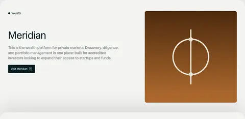
| 4 | feature-split | Light two-column band; explanatory copy and link on the left, branded image on the right. | wealth platform overview, visit product link | category eyebrow, large title, brand visual, dark CTA |
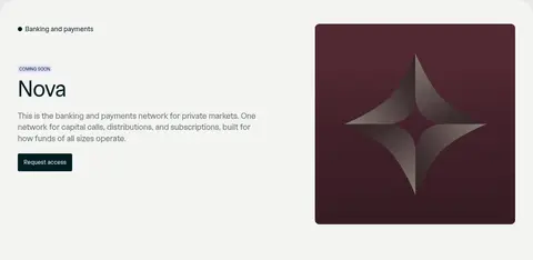
| 5 | feature-split | Two-column pale product band with status label and description at left and product artwork at right. | coming-soon status, request-access action | eyebrow label, status badge, large title, square brand artwork |
| 6 | footer | Deep teal multi-column directory above a brand, social, legal, and disclosure area. | contact and sign-in actions, grouped site navigation | lead statement, link columns, brand signature, fine-print dividers |
## Source CSS custom properties (selected)
```css
--colors-accent-gradient-1: linear-gradient(186deg,