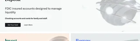
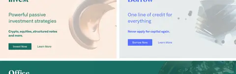
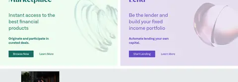
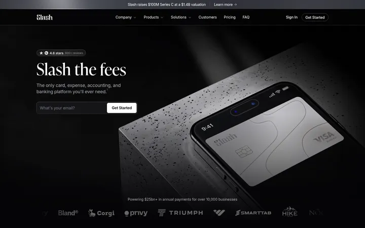
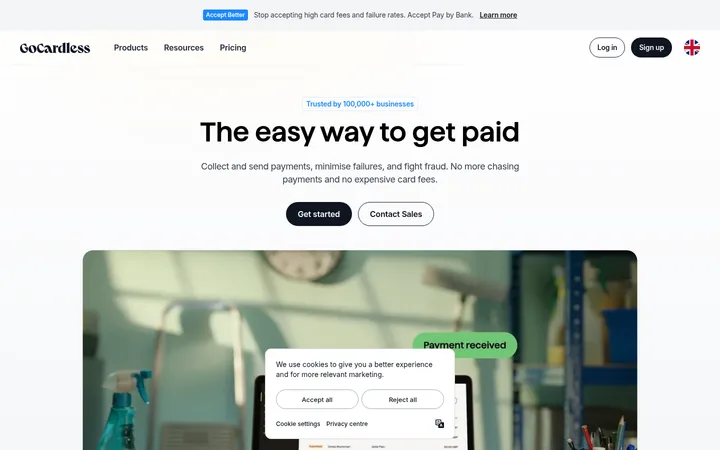
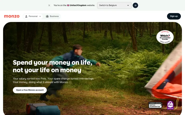
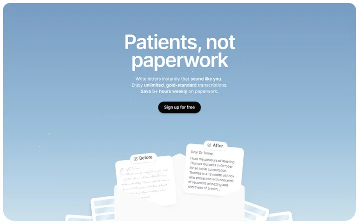
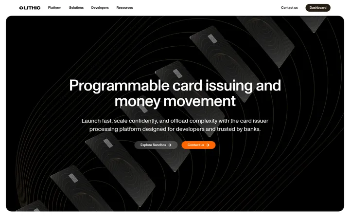
North star · Let expressive typography and cinematic imagery introduce the brand, then keep financial choices legible through calm surfaces and precise color-coded modules.
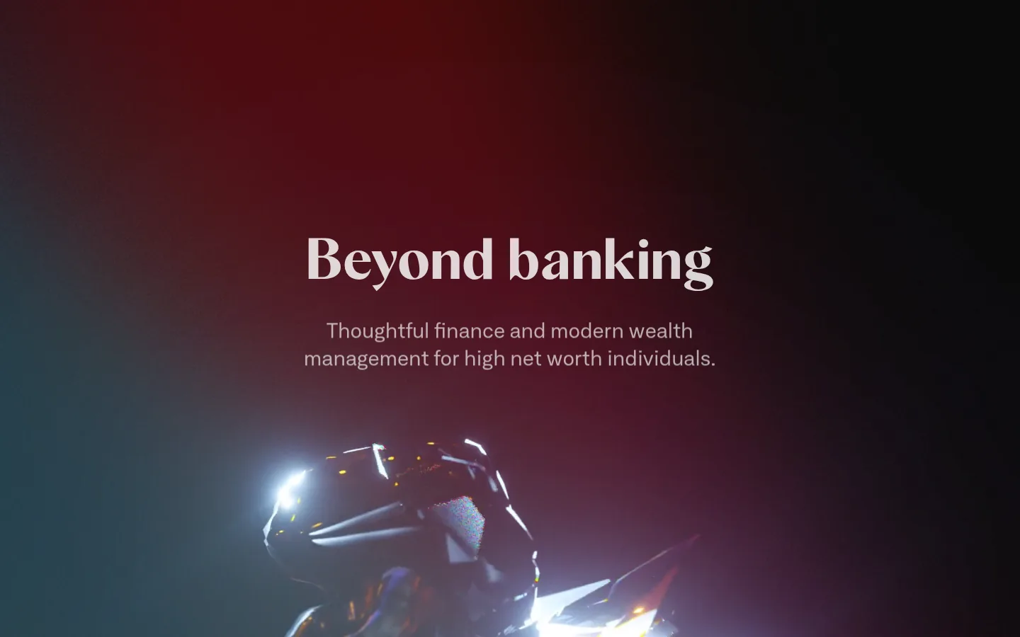
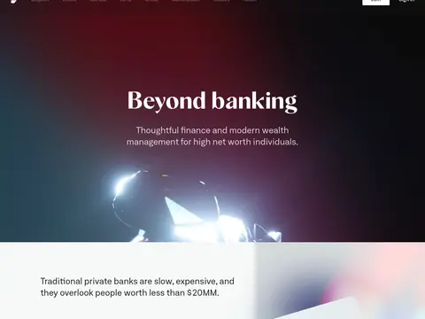
The page balances a cinematic opening with a calm, editorial product experience. The hero uses a dark burgundy-and-black video image with centered pale text; those dramatic colors belong to the footage, not the core interface palette. Elsewhere, white canvas and cool mist surfaces provide breathing room, while deep green anchors investment actions and occasional section treatments. Blue and violet are selective service accents, especially on Borrow and Lend cards. Neufile Grotesk Extended carries navigation, body copy, and much of the interface; Albra Sans gives key headings a more expressive, editorial voice. Large headings sit beside concise supporting copy, with imagery treated as an integral part of split layouts and product panels. Sections alternate between open white space, softly tinted bands, and paired cards. The composition is comfortable rather than dense, with square-edged panels and almost no visible elevation.
配色
点色块复制色值。用途说明来自对页面的实测位置(背景、文字、描边、按钮)与截图判读。
品牌色
强调色
表层色
中性色
功能色
页面底色 · Gallery White表层 · Mist Surface表层 2 · Cloud Slate表层 3 · Letter Ink表层 4 · Letter Green主文字 · Letter Ink次要文字 · Soft Charcoal弱文字 · Gallery White强调 · Letter Green强调 2 · Guide Blue强调 3 · Lend Violet
Navigation, body copy, links, captions, and interface text.
Aa 设计
Albra Sans
网络字体 · 字重 600 · 占比 9%
免费替代:DM Serif Display
Display and selected prominent section headings.
角色
示例
字号
字重
行高
字距
特大标题
Cinematic hero headline and high-impact brand statements.
Letter
80px
600
1.1
0
一级标题
Primary page or section headline, especially explanatory content.
Letter
60px
700
1.4
0
二级标题
Prominent feature and product-section headings.
Letter
46px
600
1.2
0
三级标题
Supporting section titles and feature headings.
Letter
28px
400
1.4
0
四级标题
Compact feature labels and card subheads.
The quick brown fox 敏捷的狐狸
22px
600
1.2
0.02em
正文
Paragraphs describing services, products, and benefits.
The quick brown fox 敏捷的狐狸
16px
400
1.33
0
辅助文字
Small supporting details and secondary descriptions.
The quick brown fox 敏捷的狐狸
13px
400
1.3
0
导航
Header navigation and footer navigation labels.
The quick brown fox 敏捷的狐狸
16px
400
2
0
链接
Text links such as Learn More.
The quick brown fox 敏捷的狐狸
16px
500
1
0
间距与布局
基准单位 4px · 密度:适中
52px版块间距
16px元素间距
52px卡片内边距
1230px内容最大宽度
8px
12px
13px
16px
19px
24px
27px
32px
44px
48px
52px
64px
The page uses a centered content system capped at a measured 1230px, opening with a full-bleed hero and moving into mixed one- and two-column sections. A two-column explanatory split places copy beside imagery; subsequent feature content alternates single-band product presentations with paired product cards. The Guides block reverses the balance, placing a photo collage opposite right-aligned copy. Section rhythm is spacious and comfortable, with a measured 52px section gap and 16px element gap. White remains the dominant canvas, interrupted by soft surface bands.
圆角与层次
按钮 · 2px
链接 · 2px
没有测到阴影:页面是扁平的,层次靠底色和描边区分。
The interface is predominantly flat: no measured shadows and no visible border system define its hierarchy. Separate content through white space, full-width background bands, and contrasting card fills instead. Cards have square corners; buttons and links use a subtly softened measured 2px radius. Layer photography within panels rather than simulating depth with UI shadows.
组件
下面的预览按实测的按钮、输入框、徽标、卡片样式重建(字体用替代字体)。
Hero
Full-bleed video with centered display headline and pale supporting copy over dark footage.
Primary action
Compact filled button with a measured 2px radius, 12px vertical padding, and 27.2px horizontal padding; color varies by product.
Product card
Flat, square-corner panel with generous measured 52px padding, tinted background, colored title, copy, and action.
Feature split
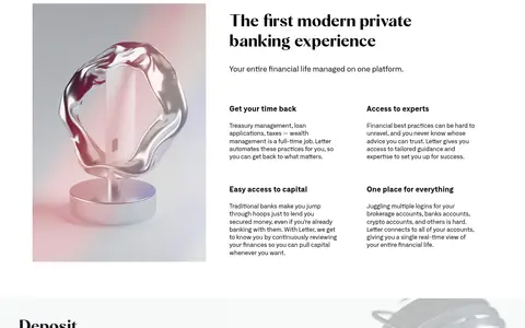
Two-column editorial block pairing a strong heading and concise copy with a large image or video.
Text link
Medium-weight 16px Neufile Grotesk Extended text; green is primary, with charcoal used as a secondary option.
Guides collage
Overlapping human-photo tiles paired with right-aligned blue heading, description, and call-to-action.
Footer navigation
Sparse multi-column link groups on white, followed by a compact muted copyright line.
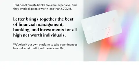
Imagery · A full-bleed cinematic video establishes the hero, with deep burgundy and black tones that should be treated as media rather than interface colors. Product sections use polished still-life and abstract 3D imagery, often cropped into their panels. Guides introduces a collage of human photography. Keep images large and editorial, allow imagery to share the composition with copy, and preserve the soft, low-contrast treatment visible in product media.
Use white as the default canvas and reserve tinted bands for section grouping.
Keep cinematic dark color confined to hero media.
Use Albra Sans selectively for expressive display headings.
Use Neufile Grotesk Extended for navigation, copy, and controls.
Give paired product cards distinct soft fills and color-coded actions.
Keep panels flat, spacious, and square-cornered.
Pair concise copy with large editorial imagery.
✕ 不该做
Do not treat hero footage colors as the core interface palette.
Do not add shadows or decorative borders to create hierarchy.
Do not round cards; their measured corners are square.
Do not use every accent color in the same module.
Do not compress the generous space around section content.
Do not make body copy compete with display headings.
Do not force all sections into identical two-column layouts.
给 AI 的提示词
想快速出一个同风格的新页面,把这段话连同 DESIGN.md 一起发给 AI。
Build a new Letter-style fintech page with an editorial, premium feel. Use Gallery White (#ffffff) as the main canvas, Mist Surface (#f6f9f9) and Cloud Slate (#e6ebec) for restrained section changes, and Letter Green (#186f64) for primary actions and links. Apply Guide Blue (#154ea5), Signal Periwinkle (#536eff), and Lend Violet (#644bc4) selectively to service-specific modules. Keep dramatic dark footage in media only. Use Neufile Grotesk Extended for navigation, body, and controls, with Albra Sans for prominent headings. Favor a centered content width, spacious alternating bands, split image-and-copy sections, and flat tinted product cards. Preserve square card corners, the subtle measured button radius, concise copy, and large, softly treated imagery; avoid shadows and unnecessary borders.