North star · Keep the interface quiet and spacious so high-impact printer imagery—not decoration—drives attention.
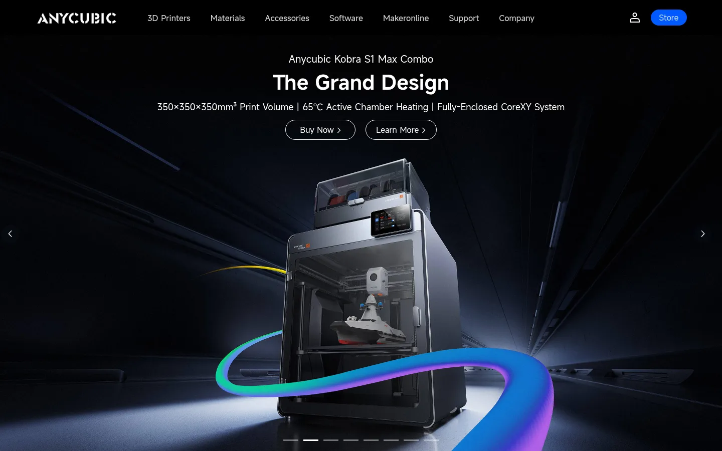
The page is built around a deliberate contrast: a full-bleed, near-black launch hero gives way to broad white shopping and community sections, with a black footer closing the page. Use the measured palette as a restrained interface system: white canvas, black primary text and inverse bands, pale gray cards, charcoal secondary text and rules, and Signal Blue (#0059ff) for prominent interactive accents. The hero’s blue-green-purple light trails belong to the campaign artwork, not the reusable UI palette. MiSans supplies a contemporary, neutral sans-serif voice; semibold centered headings establish hierarchy above compact, readable body copy. The layout alternates large media-led bands with orderly category tiles, carousels, and testimonial cards. Rounded product cards and pill-shaped actions soften the otherwise clean geometry. Generous white space separates content groups, while fine gray borders and subtle shadows provide just enough component definition. Product photography and creator videos provide the page’s color and personality.
Site-wide typeface for navigation, headings, body copy, buttons, and captions.
角色
示例
字号
字重
行高
字距
一级标题
Centered hero campaign title.
Anycubic
40px
600
1.18
0
二级标题
Major centered section headings.
Anycubic
36px
600
1.5
0
三级标题
Category titles and card headings.
The quick brown fox 敏捷的狐狸
20px
600
1.35
0
四级标题
Supporting labels and smaller content headings.
The quick brown fox 敏捷的狐狸
18px
400
1.33
0
正文
Product descriptions, testimonials, and general supporting copy.
The quick brown fox 敏捷的狐狸
14px
400
1.71
0
辅助文字
Compact metadata, fine print, and secondary labels.
The quick brown fox 敏捷的狐狸
12px
400
2.67
0
导航
Primary navigation labels.
The quick brown fox 敏捷的狐狸
16px
500
3.75
0
间距与布局
基准单位 2px · 密度:适中
46px版块间距
—元素间距
14px卡片内边距
1310px内容最大宽度
7px
8px
10px
12px
13px
14px
15px
16px
20px
23px
25px
35px
36px
40px
Use a centered content system capped at the measured 1310px page width, with full-bleed media for the launch hero and selected carousel content. The header runs horizontally above the hero. Below it, category cards form a balanced two-column grid; later sections center their headings above carousels and card rows. The page alternates broad white content bands with media-led blocks, leaving comfortable gaps between sections. Keep card interiors moderately padded and align headings centrally where the page does.
圆角与层次
按钮 · 9999px
输入框 · 3px
卡片 · 10px
图片 · 10px
导航 · 9999px
链接 · 10px
inset · card
md · other
Keep most sections flat against white, with cards defined by pale fills and rounded corners rather than heavy effects. Use restrained outlines on pill actions and carousels. Reserve noticeable depth for product imagery or occasional card shadowing; the black hero and footer provide strong contrast through color blocks rather than elevation.
组件
下面的预览按实测的按钮、输入框、徽标、卡片样式重建(字体用替代字体)。
Primary navigation
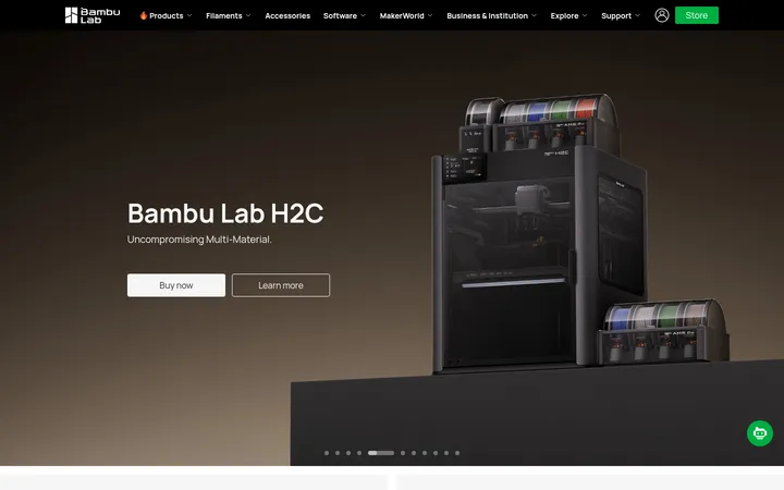
Black horizontal header with white Anycubic mark, dark-background navigation labels, account icon, and a bright-blue Store pill.
Campaign hero
Full-width dark product visual with centered campaign title and supporting line, two outlined pill actions, and discreet carousel controls.
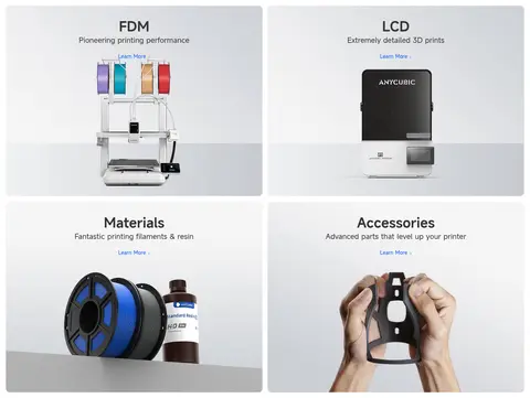
Category tiles
Four image-led FDM, LCD, Materials, and Accessories cards in a two-column arrangement, with centered titles and compact Learn More links.
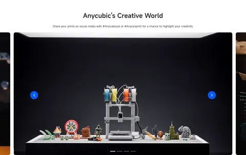
Content carousel
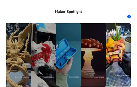
Wide media cards with rounded corners, side navigation controls, and centered pagination indicators for maker and product content.
Editorial cards
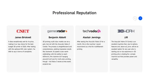
Compact, pale cards for print inspiration and professional reviews, using centered section headings and restrained text styling.
Newsletter and footer
Black footer band with subscription controls, privacy agreement, grouped site links, locale selector, and subdued legal details.
Imagery · Prioritize polished product photography and campaign renders of printers, materials, and printed objects. The hero uses dark, immersive, full-bleed product imagery with dramatic colored light trails; treat those colors as artwork, not interface accents. Category cards use bright, uncluttered product imagery. Community and Maker Spotlight areas use video or creator-submitted work in horizontal carousel frames.
Use full-bleed dark imagery for the primary launch moment.
Keep ordinary commerce sections white and spacious.
Use Signal Blue (#0059ff) sparingly for active controls.
Center section headings above their content.
Let product photography supply most visual detail.
Use rounded cards and pill-shaped actions consistently.
✕ 不该做
Do not extend hero artwork colors into the general UI palette.
Do not add decorative gradients to plain interface surfaces.
Do not make every section dark or high contrast.
Do not crowd product cards with dense supporting copy.
Do not use heavy shadows as the primary layout device.
Do not replace product imagery with generic illustrations.
给 AI 的提示词
想快速出一个同风格的新页面,把这段话连同 DESIGN.md 一起发给 AI。
Build a new Anycubic-style ecommerce page with a restrained, product-first visual system. Use Gallery White (#ffffff) for the main canvas, Carbon Black (#000000) for primary text and selected dark bands, and Soft Porcelain (#f8f8f8) for quiet card surfaces. Reserve Signal Blue (#0059ff) for a few high-priority controls. Set type in MiSans or a close sans-serif substitute, with semibold centered headings and regular, compact supporting copy. Start with a full-bleed cinematic product hero, then move into clear category tiles, creator or product carousels, and editorial cards with generous breathing room. Keep the header horizontal, actions pill-shaped, cards softly rounded, and borders subtle. Use authentic printer and maker photography; keep campaign lighting inside imagery rather than turning it into interface chrome. Finish with a black, information-dense footer.