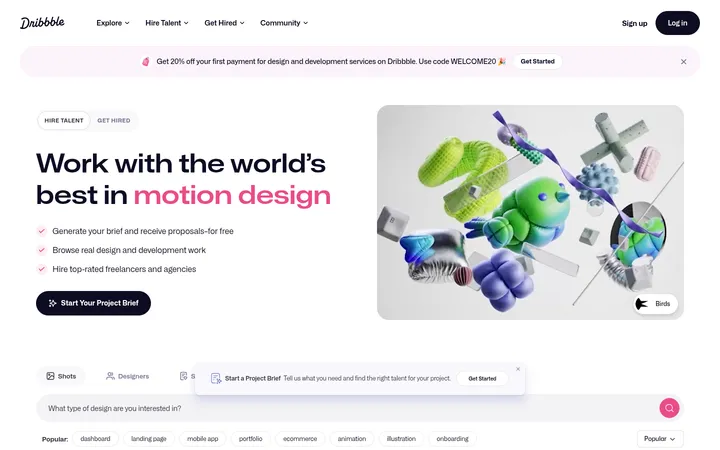
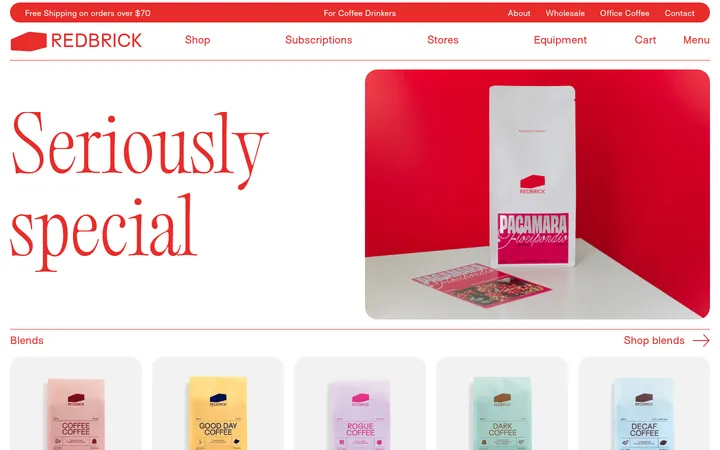
North star · Let vivid product and lifestyle photography breathe, using Signal Yellow only to make the next shopping action unmistakable.
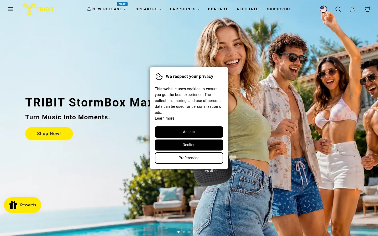
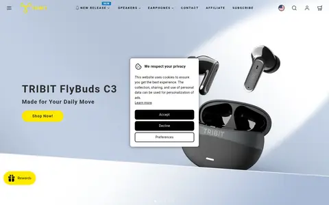
The page’s visual identity is led by full-bleed lifestyle photography rather than a uniformly dark interface: campaign imagery supplies much of the visible color, while the measured site canvas is black and lower sections alternate into clean white product and editorial areas. Signal Yellow (#ffe900) is the key functional accent, used for pill-shaped shopping CTAs and small sale badges. Roboto carries the full hierarchy, with bold, slightly tracked campaign headings, uppercase tracked navigation, and readable body copy. The opening hero places concise copy and a yellow CTA over a large photographic scene; subsequent category tiles, technology callouts, product cards, and social-video thumbnails create a varied shopping journey. Spacious section breaks separate these dense image groups. Pale gray card surfaces distinguish product imagery from the surrounding page, while rounded cards and pill controls soften the otherwise straightforward grid. Blue and pink accents are minor supporting colors, not the dominant brand signature.
Site-wide sans serif for navigation, campaign headings, body copy, product details, and controls.
角色
示例
字号
字重
行高
字距
一级标题
Primary campaign product title in the hero.
Tribit
44.5px
700
1.2
0.06em
二级标题
Major centered section titles, including category and social sections.
Tribit
44px
600
0.7
0.06em
三级标题
Category and product-family headings.
Tribit
35.5px
600
1.2
0.06em
四级标题
Product names and smaller section headings.
The quick brown fox 敏捷的狐狸
24.5px
700
1.2
0.06em
正文
Campaign subtitles, descriptions, and supporting editorial copy.
The quick brown fox 敏捷的狐狸
20px
400
1.6
0.02em
辅助文字
Compact supporting labels and small content captions.
The quick brown fox 敏捷的狐狸
16px
700
1.3
0.025em
按钮
Shopping CTA and other prominent action labels.
The quick brown fox 敏捷的狐狸
17px
600
1.6
0.06em
导航
Uppercase primary navigation links.
The quick brown fox 敏捷的狐狸
13px
600
1.6
0.2em
链接
Product titles and other emphasized text links.
The quick brown fox 敏捷的狐狸
16px
700
1.3
0.025em
眉题
Short uppercase labels above or alongside section content.
The quick brown fox 敏捷的狐狸
13px
600
1.6
0.2em
间距与布局
基准单位 2px · 密度:宽松
96px版块间距
16px元素间距
—卡片内边距
1344px内容最大宽度
2px
4px
5px
7px
8px
9px
10px
12px
16px
24px
38px
44px
96px
The page uses a spacious, full-width storefront composition with campaign media spanning the viewport and content grids nested within a measured 1344px maximum width. The hero aligns headline and CTA to the left over photography; category and editorial headings are centered. Three-column category and technology groupings lead into a denser multi-column product grid and social gallery. Large section breaks create a clear shift between shopping modules. The footer returns to a compact, dark multi-column information layout.
圆角与层次
按钮 · 9999px
输入框 · 6px
卡片 · 20px
图片 · 50%
徽标 · 5px
导航 · 3px
链接 · 50%
hairline · media
inset · input
lg · other
Most sections and cards read as flat, with contrast created by background changes and white space rather than heavy shadows. Product tiles use rounded pale surfaces; video cards can use a dark plum field. Thin outlines are used for small selectors, while shadowing is subtle and secondary. Keep overlays, including the cookie dialog, clearly above the hero.
组件
下面的预览按实测的按钮、输入框、徽标、卡片样式重建(字体用替代字体)。
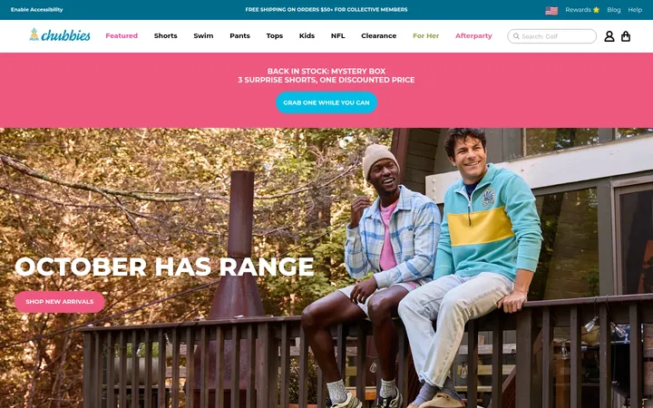
Campaign hero
Full-bleed lifestyle image with left-aligned product title, concise subtitle, and a Signal Yellow pill CTA.
Primary navigation
Compact uppercase Roboto links sit over the hero alongside menu, locale, account, search, and cart icons.
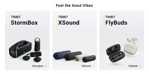
Category tiles
Three product-family cards pair bold labels and speaker or earbud imagery with restrained yellow details.
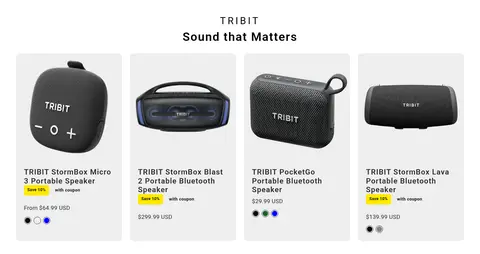
Product cards
Pale gray rounded cards show product photography, names, sale badges, prices, color swatches, and quick-view actions.
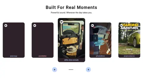
Social video gallery
Portrait creator videos form a horizontal carousel beneath a centered heading, with compact circular navigation controls.
Newsletter and footer
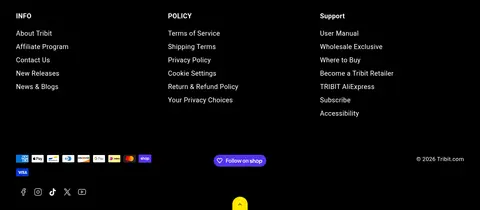
Centered email signup sits above a dark footer with three information columns, payment marks, social links, and policy links.
Sale badge
Small Signal Yellow rounded label highlights promotional savings within the product grid.
Imagery · Large lifestyle photography drives the hero and makes the products feel part of everyday moments. Product sections switch to isolated speaker and earbud photography on pale card surfaces, keeping silhouettes and variants easy to scan. Social content appears as portrait video thumbnails in a horizontal gallery. The screenshots show no defining illustration style; the palette variations in those tiles and product images are local image content rather than core brand colors.
Use large campaign photography as the opening visual.
Make the primary shopping action Signal Yellow (#ffe900).
Keep campaign copy concise and legible over imagery.
Use Roboto throughout the interface.
Separate shopping modules with generous whitespace.
Keep product details structured and easy to scan.
Use rounded pills for prominent shopping actions.
✕ 不该做
Do not treat the page as uniformly dark; screenshots show broad light content areas.
Do not let secondary accent colors compete with the yellow CTA.
Do not add heavy shadows to every card.
Do not crowd category and editorial sections together.
Do not mistake colors inside product imagery for UI palette colors.
Do not use oversized decorative typography in place of product photography.
给 AI 的提示词
想快速出一个同风格的新页面,把这段话连同 DESIGN.md 一起发给 AI。
Build a new Tribit-style ecommerce page with an image-led campaign hero, clear product discovery, and spacious editorial breaks. Use Stage Black (#000000) as the measured canvas and footer color, but let campaign photography and bright product sections define the visible page. Use Signal Yellow (#ffe900) for the main pill CTA, rewards, and sale badges; use Soft Graphite (#2b2b2b) for secondary text and outlines. Set all interface text in Roboto, with bold, slightly tracked headings and compact uppercase navigation. Build pale product cards using Cloud Gray (#eeeeee), rounded corners, and simple product-image presentation. Keep category and social sections centered, product grids practical and scannable, and large gaps between major modules. Use shadows sparingly; prioritize image scale, clean alignment, and generous whitespace.