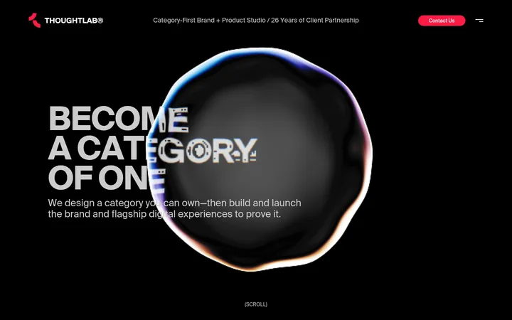
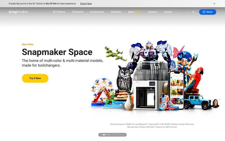
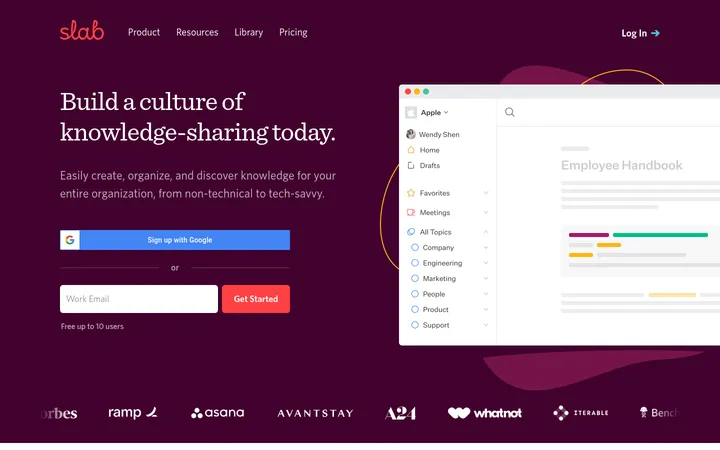
North star · Let immersive product imagery lead, then use a bright modular storefront and restrained green actions to make every next step clear.
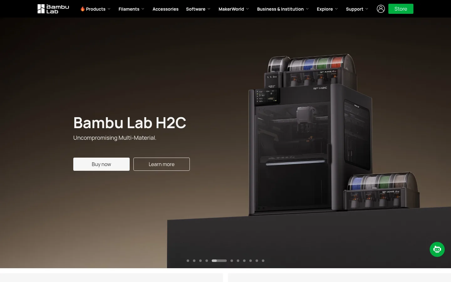
The page contrasts a cinematic, full-bleed dark hero with a predominantly white and pale-gray storefront. The hero uses a warm, low-key product image and white type, with the printer placed to the right and concise copy and paired actions to the left; the measured black gradient supports legibility over media. Below, white canvas and #eeeeee promotional bands organize category cards, inspiration tiles, learning resources, reviews, and editorial content into distinct, easy-to-scan blocks. Manrope carries the interface throughout: bold, compact headlines establish hierarchy, while regular-weight body copy and links remain restrained. Green is reserved for high-intent commerce and navigation actions rather than broad decoration. Product photography and maker imagery provide the page’s color and personality, while flat surfaces, fine separators, and minimal rounding preserve a precise, modern hardware feel. Generous white intervals separate content modules without making the overall storefront feel sparse.
Primary family for headings, body copy, navigation, buttons, and links.
Aa 设计
Arial
系统字体 · 字重 700 · 占比 7%
免费替代:Arial
System fallback measured on the input field.
角色
示例
字号
字重
行高
字距
一级标题
Primary hero headline and strongest page-level announcement.
Bambu Lab
48px
700
1.01
0
二级标题
Major section titles introducing content groups.
Bambu Lab
34px
700
1.2
0
三级标题
Promotional and feature-card headlines.
Bambu Lab
32px
700
1.3
0
四级标题
Secondary section or card heading.
Bambu Lab
30px
700
1.2
0
正文
Descriptions, supporting copy, and editorial summaries.
The quick brown fox 敏捷的狐狸
14px
400
1.5
0
辅助文字
Small labels, metadata, and understated helper text.
The quick brown fox 敏捷的狐狸
12px
400
1.5
0
按钮
Commerce, signup, and hero action labels.
The quick brown fox 敏捷的狐狸
16px
400
1.4
0
链接
Navigation, product actions, and inline calls to explore.
The quick brown fox 敏捷的狐狸
14px
400
1.5
0
间距与布局
基准单位 4px · 密度:紧凑
40px版块间距
12px元素间距
—卡片内边距
1280px内容最大宽度
2px
4px
6px
8px
10px
12px
16px
24px
28px
32px
40px
102px
140px
159px
The measured content uses a maximum width of 1280px, while the opening hero and media run full bleed. A compact horizontal navigation sits above the hero. Below it, promotional tiles form a two-column grid, followed by paired image cards and three-column learning cards. Content is center-aligned at section level, with left-aligned text inside cards where appropriate. Sections alternate broad light bands and white breathing spaces; the dense commerce links are balanced by spacious editorial and review areas.
圆角与层次
按钮 · 4px
输入框 · 5px
没有测到阴影:页面是扁平的,层次靠底色和描边区分。
The interface is mostly flat: cards rely on pale surface blocks and spacing rather than visible shadows. Fine gray borders appear in selected menus or card details, while image-led tiles create their own depth. The hero gains separation from the dark product scene and its overlay gradient; buttons use simple fills and modest corner rounding.
组件
下面的预览按实测的按钮、输入框、徽标、卡片样式重建(字体用替代字体)。
Primary navigation
Compact black top bar with white logo and links, account icon, and a green Store action.
Hero actions
Two adjacent actions over the hero: a filled pale Buy now button and an outlined Learn more button.
Commerce button
Manrope 16px regular; Buy now uses #f5f5f5 with #333333 text and a measured 4px radius.
Store button
Green #00ae42 fill with white text; compact navigation treatment uses a measured 3px radius.
Category tile
Pale surface with a small category label, centered heading, green text links, and product imagery.
Editorial image card
Large photography with white overlaid title and supporting copy, plus a circular directional affordance.
Email signup
Dark footer section with concise invitation, email input, green signup action, and muted supporting text.
Imagery · Large, polished product photography dominates the hero, with the printer isolated against a warm, dark studio background. Below, cutout product and filament images share pale category tiles, while lifestyle photography shows practical printing, hobbies, education, and fashion. Review thumbnails and blog imagery add a candid editorial layer. The measured page is image-led rather than illustration-led, with photography supplying most color beyond the restrained interface palette.
Reserve Maker Green for high-intent actions and links.
Keep product categories in clear, pale modular tiles.
Set headings in bold Manrope and supporting text in regular Manrope.
Use whitespace to distinguish content groups.
✕ 不该做
Do not add extra accent colors to the interface palette.
Do not put heavy shadows on ordinary content cards.
Do not make every section dark or full bleed.
Do not let product imagery obscure labels or actions.
Do not turn links into oversized decorative buttons.
Do not introduce rounded-card styling where the measured layout is flat.
给 AI 的提示词
想快速出一个同风格的新页面,把这段话连同 DESIGN.md 一起发给 AI。
Build a new Bambu Lab page with a compact black navigation bar, crisp white links, and a sparse #00ae42 action. Start with a full-bleed, cinematic product image: keep the product prominent, place concise white copy beside it, and use a subtle dark gradient only to preserve contrast. Follow with a bright storefront rhythm using #ffffff canvas, #eeeeee product bands, and flat image-led tiles. Use Manrope for the interface, bold for headings and regular for body copy; keep text direct and sentence case. Apply #f5f5f5 to quiet controls and #333333 to primary light-surface text. Make product photography do the visual work, separate modules with whitespace, and avoid decorative shadows, extra palette colors, or excessive rounding. Keep commerce actions clear and easy to scan.