North star · Keep the page editorial and spacious, using black type for hierarchy and lime only where users should act.
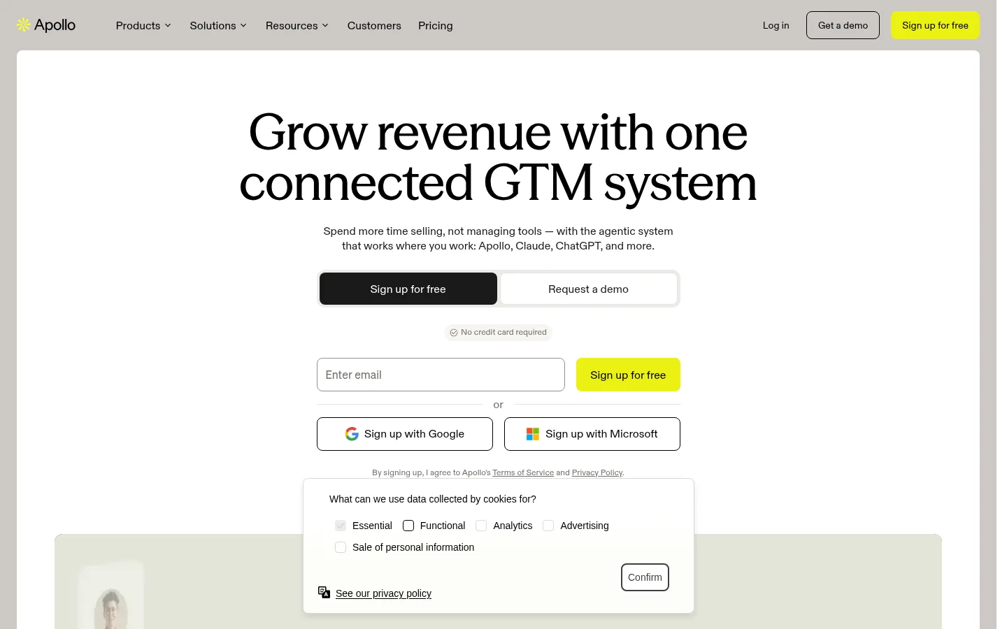
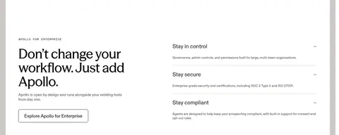
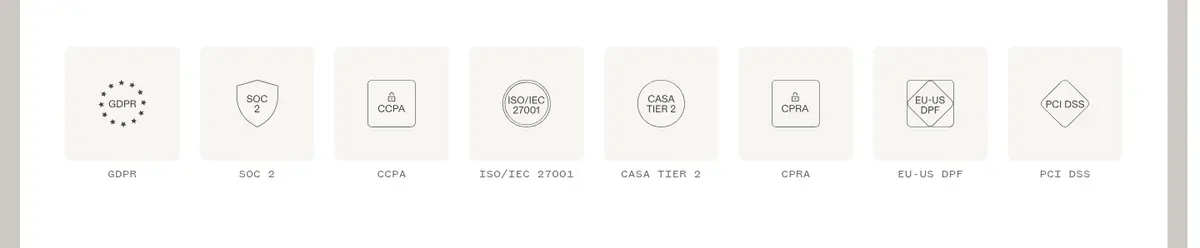
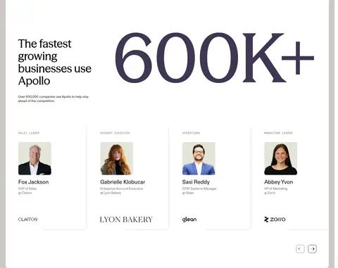
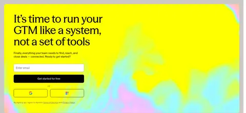
Apollo’s visual system pairs a predominantly white canvas with occasional warm neutral section bands, keeping the long SaaS homepage calm and readable. Black display headlines carry the editorial character; compact sans-serif body copy and navigation keep product explanations practical. The vivid lime accent is reserved for signup actions and selected interface details, so it reads as a clear interaction signal rather than a background colour. The page alternates centered hero content with broad, alternating product-feature splits, then uses a three-part process diagram, a pale proof grid, enterprise information, and testimonial cards to vary the rhythm. Product screenshots sit inside soft neutral frames, while people photography appears in customer proof. Rounded cards and restrained hairlines provide definition without heavy shadows. The measured palette is authoritative; bright multicolour artwork visible in the final CTA belongs to its graphic treatment, not the site’s general surface palette.
Body copy, navigation, captions, and bold text links.
Aa 设计
seasonMix
网络字体 · 字重 550 · 占比 7%
免费替代:DM Serif Display
Display headlines and major section headings.
Aa 设计
foundersGroteskMono
网络字体 · 字重 400 · 占比 4%
免费替代:Space Mono
Small uppercase labels and code-like eyebrow text.
角色
示例
字号
字重
行高
字距
特大标题
Oversized editorial statements and prominent campaign headlines.
Apollo
72px
550
1
-0.01em
一级标题
Primary hero headline and major page-level statement.
Apollo
64px
550
1.05
-0.01em
二级标题
Section headlines such as enterprise and proof narratives.
Apollo
56px
550
1.05
-0.01em
三级标题
Feature and supporting content headings.
Apollo
48px
550
1.1
-0.01em
四级标题
Smaller card or subsection headings.
Apollo
40px
550
1.1
-0.01em
正文
Feature descriptions, signup guidance, and general explanatory copy.
The quick brown fox 敏捷的狐狸
16px
400
1.3
0
辅助文字
Compact labels, helper text, and customer-role details.
The quick brown fox 敏捷的狐狸
14px
400
1.3
0
导航
Top-level navigation and menu labels.
The quick brown fox 敏捷的狐狸
16px
400
1.3
0
链接
Emphasized inline links and feature exploration actions.
The quick brown fox 敏捷的狐狸
16px
700
1.3
0
代码
Eyebrow labels and short uppercase section identifiers.
const style = 1;
12px
400
1.2
0.014em
间距与布局
基准单位 8px · 密度:适中
56px版块间距
8px元素间距
24px卡片内边距
—内容最大宽度
1px
4px
8px
10px
12px
16px
20px
24px
32px
40px
48px
54px
56px
80px
The page uses a centered, wide desktop composition with a compact top navigation and a large centered hero. Below, alternating two-column feature sections switch text and product media from side to side, followed by full-width process, proof, and testimonial areas. The measured page has no fixed maximum width; screenshots show generous outer margins and comfortable density. Repeated section gaps and card padding create a steady long-scroll rhythm, while the CTA and footer form a more substantial closing band.
圆角与层次
按钮 · 8px
卡片 · 8px
图片 · 12px
没有测到阴影:页面是扁平的,层次靠底色和描边区分。
The interface is mostly flat: section backgrounds, rounded cards, and subtle borders do the structural work instead of prominent shadows. Cards use measured rounded corners, with neutral fills distinguishing testimonial surfaces. Product imagery sits on pale frames. Keep layering restrained and use thin outlines for controls and separators.
组件
下面的预览按实测的按钮、输入框、徽标、卡片样式重建(字体用替代字体)。
Header navigation
A compact horizontal bar with black navigation labels, brand mark, demo action, and a Signal Lime signup button.
Hero signup panel
Centered editorial headline and supporting copy above signup choices, email entry, and outlined Google or Microsoft options.
Primary CTA
Signal Lime fill (#ebf212), black text (#000000), and measured 8px corner radius.
Feature split
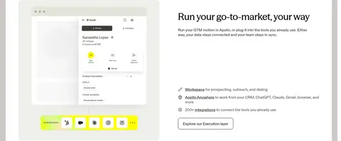
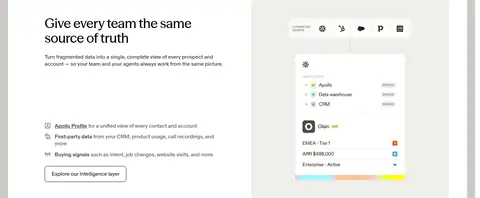
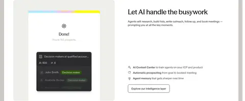
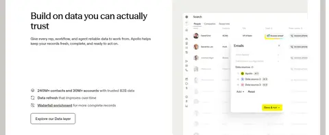
Alternating text and product screenshot columns, with concise copy, feature bullets, and a plain text exploration link.
Process cards
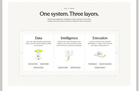
Three connected Data, Intelligence, and Execution cards with explanatory copy and small illustrations.
Proof cards
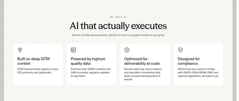
Pale warm cards with customer quotes or capability claims; use measured 16px card radius for testimonial surfaces.
Footer link columns
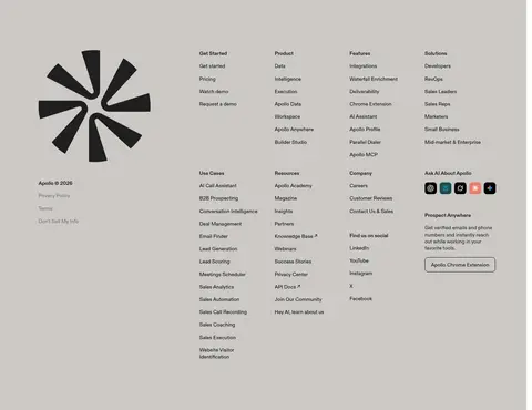
Dense multi-column product, resource, and company links on a broad warm gray closing surface.
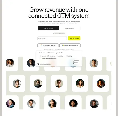
Imagery · Product UI screenshots are the primary feature imagery, framed within pale neutral panels and shown large enough to read as software rather than decoration. Customer portraits and company marks support trust and testimonials. The process section uses small explanatory illustrations. The hero includes a motion-led product or people showcase; the vivid, multicolour treatment in the final CTA is an isolated campaign graphic, not a general colour rule.
Set major headlines in the editorial display face.
Keep supporting copy compact and easy to scan.
Reserve Signal Lime for signup and selected highlights.
Alternate product media and copy across feature sections.
Use warm neutral bands to distinguish proof and conversion areas.
✕ 不该做
Do not spread lime across large page backgrounds.
Do not use heavy shadows to separate every card.
Do not turn product screenshots into decorative thumbnails.
Do not crowd the hero with extra competing messages.
Do not apply the CTA’s multicolour graphic treatment across the page.
Do not make every section a centered card grid.
给 AI 的提示词
想快速出一个同风格的新页面,把这段话连同 DESIGN.md 一起发给 AI。
Build a new Apollo-style SaaS page with a calm Gallery White (#ffffff) canvas and strong editorial headlines in a display serif-like face. Use Carbon Ink (#000000) for headings and navigation; keep explanatory copy compact and restrained. Signal Lime (#ebf212) should identify the main signup action, not become a broad background colour. Structure the page with a centered hero, alternating two-column feature sections, and full-width proof or process blocks. Use Oat Milk (#f7f5f2) for selected card or section surfaces and Warm Concrete (#ccc9c6) only for a distinct closing band. Frame legible product UI in pale neutral panels, use customer imagery for proof, and rely on rounded cards and fine borders rather than strong shadows. Preserve generous whitespace and clear scan paths.