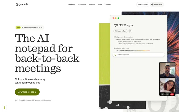
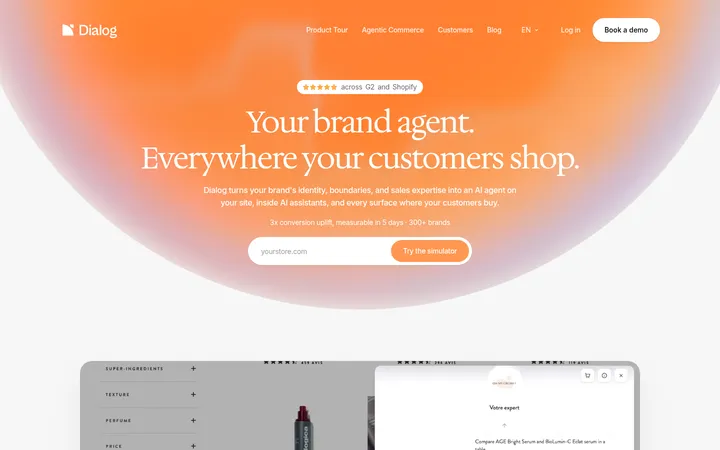
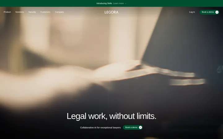
North star · Let editorial serif typography and generous white space lead; reserve vivid orange and cinematic imagery for deliberate moments of emphasis.
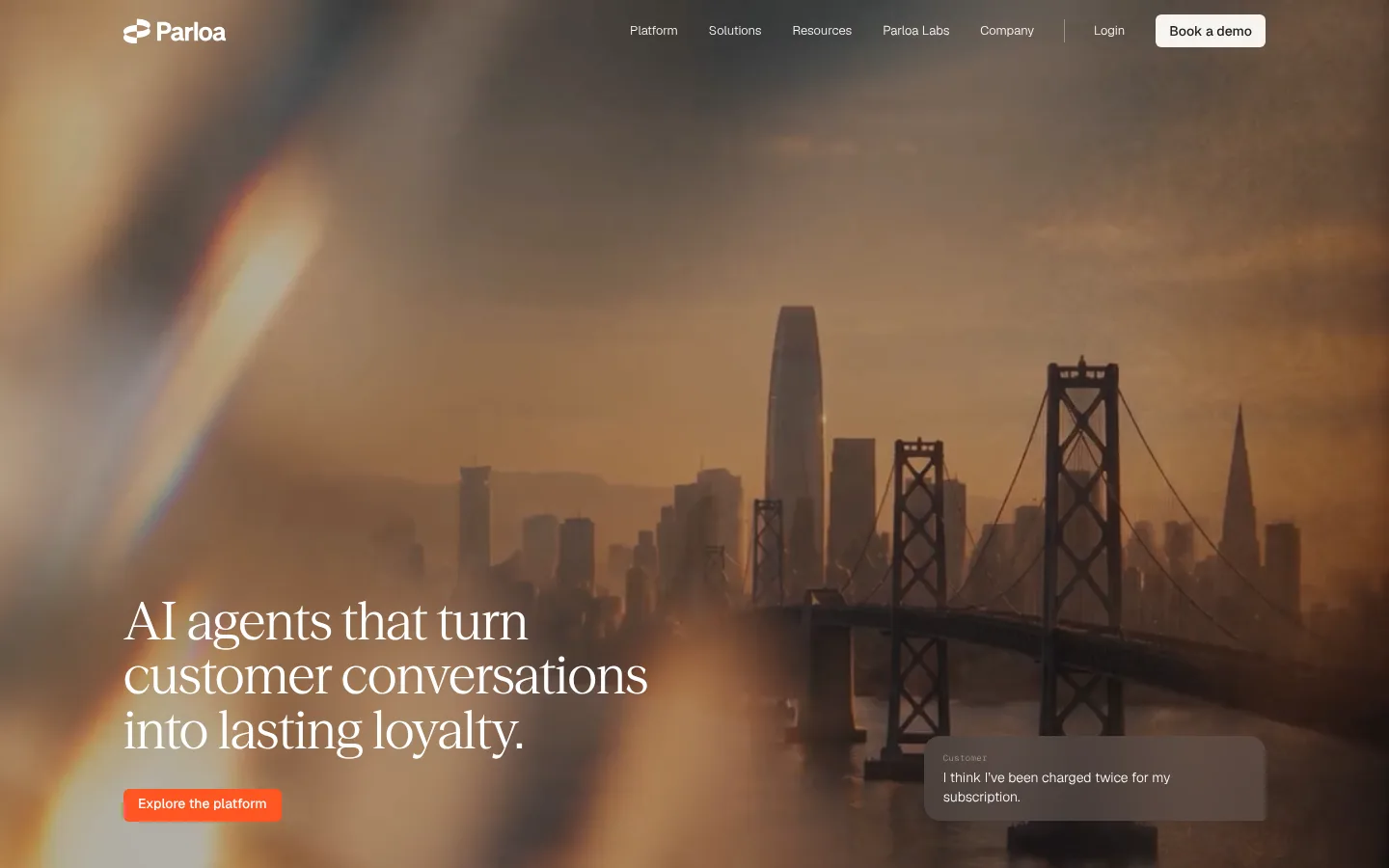
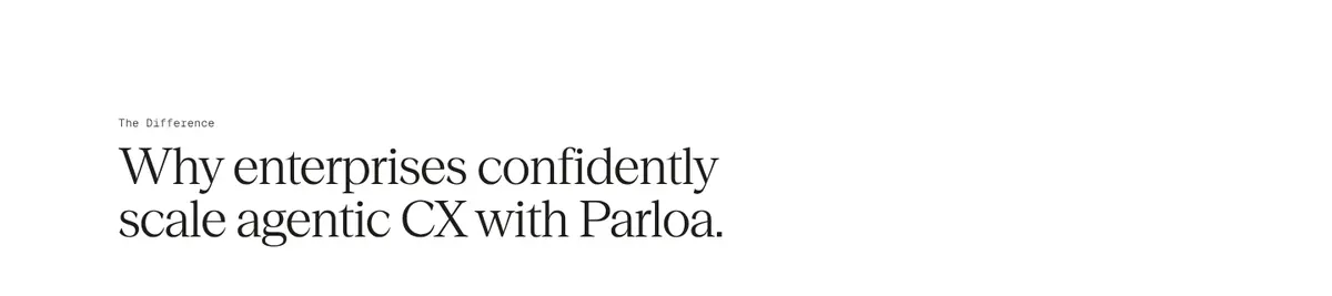
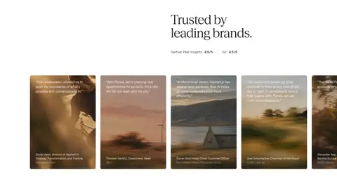
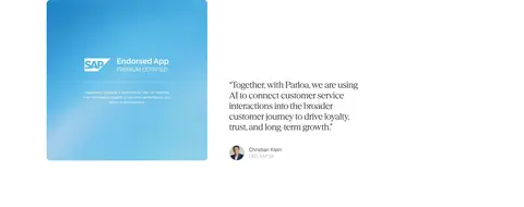
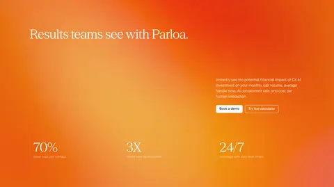
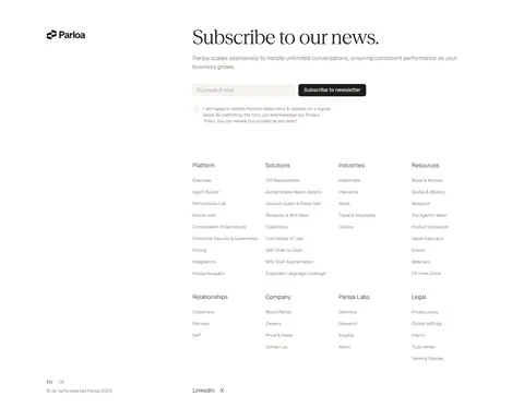
The page opens with full-bleed video of a hazy, amber city scene, overlaid with white navigation, a large Season Serif headline and a small orange primary CTA. The image’s browns and golds are photographic atmosphere, not the core UI palette. Below, a white canvas and ink-colored text establish a calm editorial rhythm: serif headlines introduce sections, while light Geist body copy stays compact and legible. Pale warm-gray cards and hairlines separate feature and testimonial content without heavy framing. Content is arranged in broad, aligned bands, with spacious transitions and selective multi-column grids. Customer imagery appears inside testimonial cards, while the security and certification sections return to restrained white space. A bright orange gradient dominates the results band as a deliberate late-page contrast. The footer is dense but orderly, returning to neutral surfaces, dark text, and subtle dividers.
Body copy, navigation, buttons, captions, and interface text.
Aa 设计
Season Serif
网络字体 · 字重 440 · 占比 13%
免费替代:Cormorant Garamond
Large editorial headlines and section titles.
Aa 设计
Geist Mono
网络字体 · 字重 300 · 占比 1%
免费替代:Roboto Mono
Small technical or code-like labels, used sparingly.
角色
示例
字号
字重
行高
字距
一级标题
Editorial hero headline, set large over the cinematic image.
Parloa
54px
440
1.05
-0.01em
二级标题
Section introductions and prominent editorial statements.
Parloa
42px
440
1.05
-0.01em
三级标题
Feature, card, and subsection headings.
The quick brown fox 敏捷的狐狸
24px
440
1.2
-0.01em
正文
Explanatory paragraphs, testimonial copy, and supporting descriptions.
The quick brown fox 敏捷的狐狸
14px
300
1.4
0
辅助文字
Compact attribution, metadata, and low-priority supporting labels.
The quick brown fox 敏捷的狐狸
12px
300
1.4
0
按钮
Concise CTA and action labels.
The quick brown fox 敏捷的狐狸
13px
300
1.2
0
导航
Small, understated primary navigation labels.
The quick brown fox 敏捷的狐狸
12px
300
1.4
0
代码
Occasional technical or code-like interface label.
const style = 1;
12px
300
1.2
0.02em
间距与布局
基准单位 8px · 密度:适中
64px版块间距
24px元素间距
24px卡片内边距
1280px内容最大宽度
5px
6px
8px
10px
12px
14px
16px
20px
24px
32px
42px
48px
64px
128px
Use a centered content frame capped at the measured 1280px, with broad white section bands and comfortable density. The page alternates full-bleed media with left-aligned editorial content, feature columns, testimonial cards, and simple split layouts. Maintain a clear 8px-based spacing rhythm, generous section gaps, and consistent 24px card padding. The footer can be denser and multi-column, but should keep its hierarchy, alignment, and breathing room. Preserve the page’s long-form vertical pacing rather than compressing every section into one screen.
圆角与层次
按钮 · 6px
输入框 · 6px
卡片 · 6px
inset · other
The interface is mostly flat: rely on white space, warm-gray surfaces, and thin pale borders rather than pronounced shadows. Cards and controls have small rounded corners, typically 6px, with soft contrast against the canvas. Layer text directly over hero media with image treatment for legibility; keep cards visually grounded without conspicuous elevation.
组件
下面的预览按实测的按钮、输入框、徽标、卡片样式重建(字体用替代字体)。
Primary CTA
Signal Orange (#ff5522) fill with white label, compact Geist medium text, and a 6px radius; use sparingly for the lead action.
Secondary CTA
Warm Porcelain (#f5f4f0) or Charcoal Ink (#1f1c1b) fill with contrasting text and a 6px radius.
Navigation
Small Geist labels sit over the hero image in white; keep the menu quiet and the booking action clearly differentiated.
Feature cards
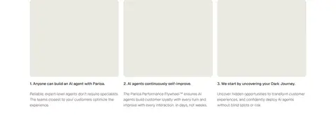
Three-column editorial feature row with pale neutral card surfaces, concise serif headings, and compact supporting copy.
Testimonial cards
A horizontally broad gallery of customer quotes, combining photographic backgrounds with concise white copy and restrained framing.
Newsletter form
Footer signup uses a warm off-white input with a thin Limestone Line (#ebe9e1) border and a contrasting dark submit button.
Imagery · Lead with full-bleed cinematic video: hazy city and bridge photography in warm dusk tones, darkened enough for white overlays to read. Treat this amber palette as image content, not a UI token. Use customer and brand imagery in restrained card galleries, and certification graphics as evidence within mostly white sections. Avoid decorative illustration or generic product mockups where the page calls for photography.
Lead with a cinematic, full-bleed hero image or video.
Use Season Serif-style headlines for editorial emphasis.
Keep body copy light, compact, and easy to scan.
Preserve large areas of clean white canvas.
Use Signal Orange (#ff5522) for a small number of high-priority actions.
Separate sections with whitespace and subtle warm-neutral rules.
✕ 不该做
Do not turn the amber hero photography into the general UI palette.
Do not add heavy shadows or thick card borders.
Do not use orange on every button or link.
Do not crowd the editorial sections with dense copy.
Do not replace the serif display voice with bold geometric headings.
Do not make every section a boxed card grid.
给 AI 的提示词
想快速出一个同风格的新页面,把这段话连同 DESIGN.md 一起发给 AI。
Build a new enterprise AI page in Parloa’s visual style. Use a white canvas (#ffffff), Charcoal Ink (#1f1c1b) for primary text, and Warm Porcelain (#f5f4f0) with Limestone Line (#ebe9e1) for quiet UI surfaces. Set display headlines in an elegant Season Serif-like face, with light Geist-like sans-serif for navigation, buttons, and body copy. Create a cinematic, full-bleed photographic hero with subdued white overlays and one Signal Orange (#ff5522) primary CTA. Keep content aligned in a broad centered frame, with generous whitespace, editorial section introductions, and selective multi-column cards. Use photography as atmosphere and proof, not decoration. Keep elevation minimal, corners gently rounded, and the footer orderly even when it becomes dense.