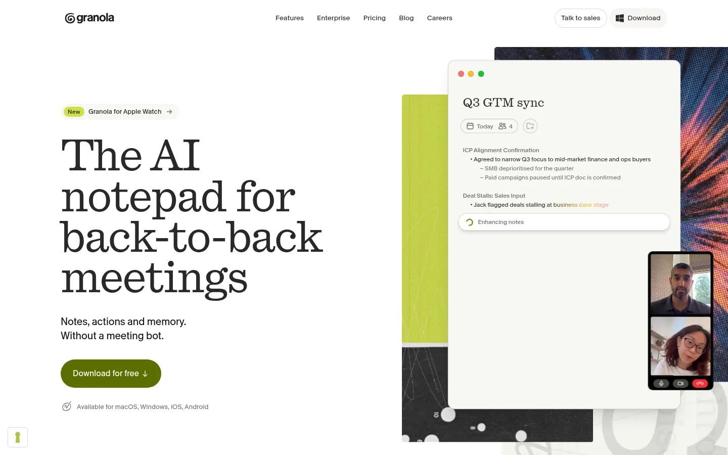
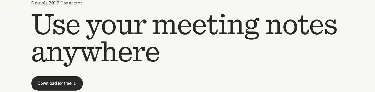
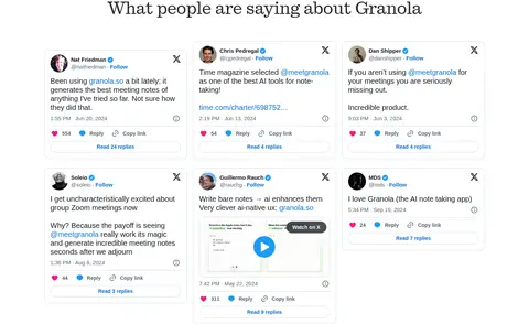
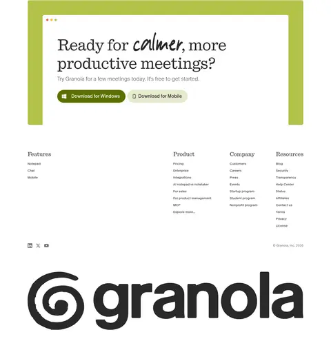
Granola 以醒目的编辑式大标题、充足留白和层叠产品界面展示 AI 会议笔记工具。整体以白色和炭黑为主,少量橄榄青柠色提亮,并用深色评价区和明亮功能区形成对比。
North star · Let editorial serif headlines and open white space lead, using olive lime only to direct attention to product actions and key feature moments.
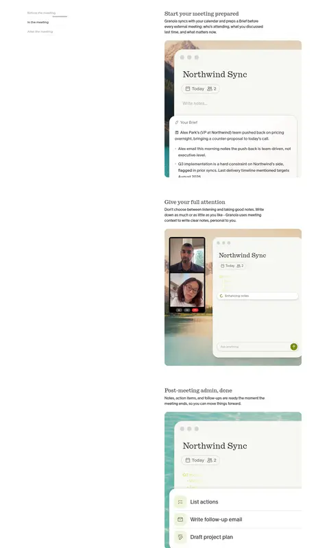
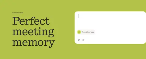
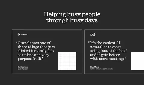
The page uses white as its dominant canvas, letting large, dark serif headlines and generous negative space establish an editorial, unhurried tone. Charcoal navigation and copy remain crisp, while muted gray supports secondary text and fine separators. Olive lime is reserved for meaningful emphasis: the primary download action, new badges, selected interface details, and a full-width meeting-memory feature band. A warm off-white surface introduces a quieter change of pace near the closing MCP feature. Quadrant display typography gives the hero and major statements a distinctive literary voice; Melange handles navigation, body copy, captions, and controls in a more neutral, readable manner. The layout alternates spacious, mostly white feature sections with compact two-column product explanations, interface mockups, a charcoal testimonial panel, and the striking lime feature band. Product screenshots are framed as floating note windows over contextual meeting imagery, while restrained borders and subtle shadows preserve a light, tactile feel.
Body copy, navigation, buttons, captions, and most interface text
Aa 设计
quadrant
网络字体 · 字重 400 · 占比 19%
免费替代:DM Serif Display
Display headlines and prominent hero or feature statements
角色
示例
字号
字重
行高
字距
特大标题
Oversized hero-scale editorial statements and major page headlines.
Granola
108px
400
0.97
-0.02em
一级标题
Main hero headline and top-level feature title.
Granola
48px
400
1
-0.015em
二级标题
Section headings, including prominent feature and testimonial titles.
Granola
39.5px
400
1.15
-0.01em
三级标题
Secondary feature headings and product-explanation titles.
Granola
36px
400
1.1
0
四级标题
Smaller feature and product-interface headings.
Granola
32px
400
1.05
-0.01em
正文
Feature descriptions, testimonial copy, and explanatory text.
The quick brown fox 敏捷的狐狸
16px
400
1.5
0
辅助文字
Badges, attribution, and small supporting labels.
The quick brown fox 敏捷的狐狸
12px
400
1.5
0.02em
按钮
Download actions and compact call-to-action controls.
The quick brown fox 敏捷的狐狸
16px
430
1.13
0.01em
导航
Header links and compact navigation labels.
The quick brown fox 敏捷的狐狸
14px
400
1.71
0.01em
间距与布局
基准单位 4px · 密度:紧凑
40px版块间距
8px元素间距
46px卡片内边距
1280px内容最大宽度
3px
4px
6px
8px
9px
10px
12px
16px
20px
24px
32px
36px
40px
48px
52px
56px
The page uses a measured maximum content width of 1280px, with a compact overall density but generous visual breathing room. The hero is a two-column composition: left-aligned copy and CTA beside a large layered product visual. Subsequent sections alternate centered statements, split feature rows, and wide contrast bands. Feature explanations pair concise text with interface imagery; several late-page sections use horizontal rules to anchor title-and-description rows above expansive media areas. Keep section transitions clear and preserve the unusually open whitespace around product showcases.
圆角与层次
按钮 · 9999px
卡片 · 16px
图片 · 6px
徽标 · 9999px
导航 · 8px
lg · card
inset · other
md · other
lg · media
The page is mostly flat, with hairline borders and restrained inset outlines doing much of the separation work. Product windows sit above contextual media through layering and occasional soft shadows, rather than heavy card elevation. Buttons and badges are pill-shaped, while feature media uses lightly rounded corners. Preserve the contrast bands as flat color fields.
组件
下面的预览按实测的按钮、输入框、徽标、卡片样式重建(字体用替代字体)。
Primary download button
Pill-shaped call to action; hero uses Deep Olive #5b6f00 with off-white text, while later actions also appear charcoal.
Top navigation
Compact header with charcoal links, centered navigation items, and subdued outlined or filled pill controls.
New badge
Small rounded Badge Lime #d1e043 label with charcoal text, placed beside the Apple Watch announcement.
Product note mockup
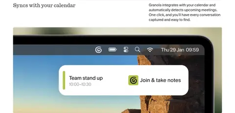
Pale rounded note window layered over contextual media, with compact meeting metadata and understated controls.
Feature row
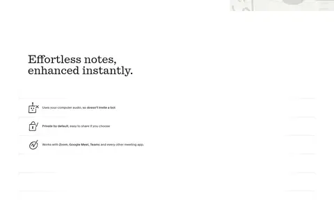
Open split layout pairing a short heading and explanatory copy with a product image or interface visual.
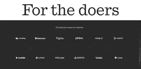
Testimonial panel
Charcoal full-width section with centered light serif heading and bordered quote cards.
Meeting-memory band
Olive Lime #b2c248 full-width feature section pairing a large serif title with a bright chat interface.
Imagery · The defining visuals are product-interface mockups: pale note windows with restrained controls, layered over meeting or device context imagery. Hero art combines a vivid lime panel, dark textured backdrop, and floating note interface. Testimonial cards use simple, high-contrast typography and small visual accents rather than prominent portrait photography. Keep media crisp and lightly framed; colors inside mockups should not redefine the site palette.
Use white space as a defining part of the composition.
Set major statements in an expressive editorial serif.
Use olive lime for clear, purposeful emphasis.
Pair concise feature copy with relevant product-interface imagery.
Alternate open white sections with occasional full-width contrast bands.
Keep borders and shadows subtle around interface surfaces.
✕ 不该做
Do not add a dense, persistent colored background.
Do not use bright accents as general-purpose decoration.
Do not replace the editorial display serif with generic bold sans headlines.
Do not crowd product imagery with surrounding copy.
Do not make every section a raised card.
Do not treat mockup colors as the core brand palette.
给 AI 的提示词
想快速出一个同风格的新页面,把这段话连同 DESIGN.md 一起发给 AI。
Build a new page in Granola’s calm, editorial product style. Use Gallery White #ffffff as the main canvas, Soft Charcoal #292929 and Near Ink #0e0f0c for text, and Oat Surface #f7f7f2 for occasional quiet bands. Reserve Olive Lime #b2c248 and Deep Olive #5b6f00 for meaningful product emphasis and primary actions; use Badge Lime #d1e043 sparingly. Set display statements in an expressive serif similar to Quadrant, with a clean sans such as DM Sans for body, navigation, and controls. Keep layouts wide and open, with concise left-aligned feature copy beside layered, pale product-interface imagery. Alternate split features with occasional charcoal or lime full-width sections. Favor thin rules, subtle rounding, and restrained shadows over card-heavy elevation.