AirPods 5 产品发布页以沉浸式媒体开场,再切换到明亮、清晰的产品与功能介绍。克制的字体和充足留白让宣传影像成为视觉焦点,同时用明确的购买入口和简洁文案承接转化。
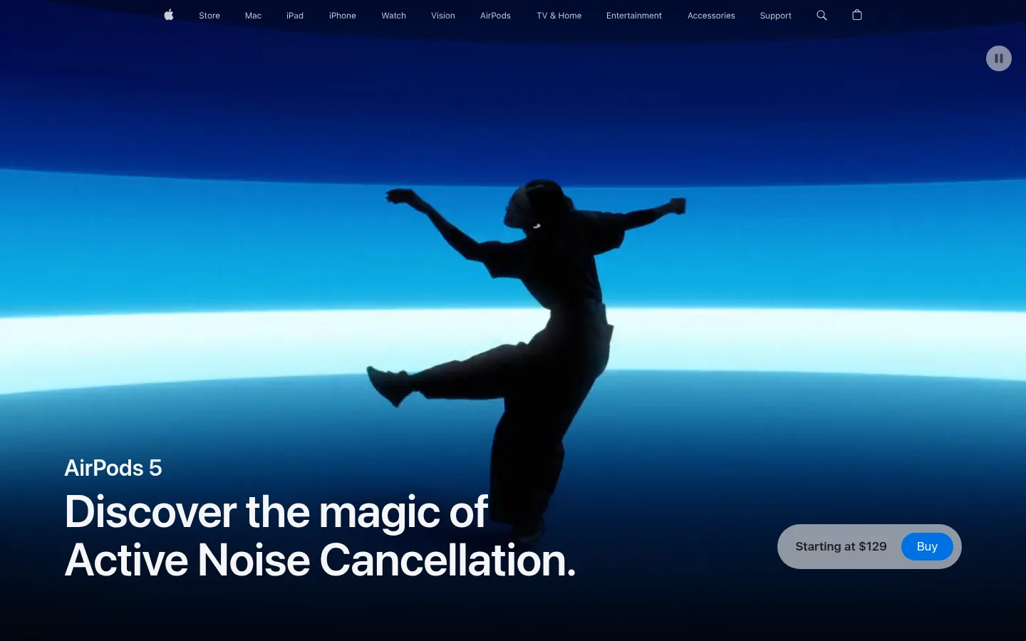
North star · Let cinematic product imagery create the drama, while a restrained, spacious interface makes every feature and purchase action immediately clear.
The page alternates an expansive white canvas with sharply defined feature bands, using near-black plum (#100322) for the immersive audio story and a soft off-white (#f5f5f7) for quieter product moments. The opening video supplies the dominant color and emotion: vivid magenta and violet lighting belongs to the campaign footage, not to the page’s reusable UI palette. Electric blue (#0071e3) is reserved for purchase actions and links. SF Pro Display sets large, tightly tracked, semibold headlines; SF Pro Text handles navigation, body copy and controls. Sections move between centered statements, full-bleed cinematic media, and horizontally browsable rounded cards. Generous vertical separation keeps dense feature details from competing with imagery. Product renders remain clean and bright against pale grounds, while dark cards create contrast without introducing heavy borders or shadows. The result is polished and editorial, with color intensity concentrated in media and a restrained interface around it.
配色 点色块复制色值。用途说明来自对页面的实测位置(背景、文字、描边、按钮)与截图判读。
品牌色
Plum Black
#100322
Deep audio-performance section background and dark cinematic transition.
强调色
Action Blue
#0071e3
Primary Buy buttons, link emphasis, and focus indication.
Violet Depth
#561f75
Gradient color in immersive campaign sections, not standard controls.
Mint Light
#a4f7cd
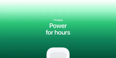
Upper stop in the charging-story green gradient.
Charging Green
#2cc677
Bright middle stop in the charging feature’s gradient.
Forest Teal
#10845b
Deepening green gradient stop behind charging imagery.
Evergreen Shadow
#014a34
Dark lower stop in the charging gradient, not a general UI color.
表层色
Gallery White
#ffffff
Primary canvas, navigation backdrop, and bright product-story sections.
Cloud Silver
#f5f5f7
Soft section grounds and light product-card surfaces.
Soft Alloy
#a7a7a7
Muted gray section surface; secondary to the page’s white and dark bands.
Muted Aubergine
#4c4259
Background for Personalized Spatial Audio feature cards.
Night Violet
#271038
Supporting deep-purple gradient stop in cinematic media.
中性色
Graphite Mist
#5b5b61
Muted supporting text and select inline links.
Apple Ink
#1d1d1f
Primary headings, body text, navigation, and dark feature cards.
Quiet Slate
#86868b
Secondary copy, captions, and subdued navigation details.
Steel Gray
#6e6e73
Less prominent explanatory text and links.
文字 背景 对比度 WCAG #1d1d1f Apple Ink#ffffff Gallery White16.83:1 AAA #1d1d1f Apple Ink#100322 Plum Black1.18:1 不达标 #1d1d1f Apple Ink#f5f5f7 Cloud Silver15.46:1 AAA #5b5b61 Graphite Mist#ffffff Gallery White6.74:1 AA #5b5b61 Graphite Mist#100322 Plum Black2.94:1 不达标 #5b5b61 Graphite Mist#f5f5f7 Cloud Silver6.19:1 AA
字体 字号阶梯:Perfect Fourth(比例约 1.363,正文 17px)。示例用免费替代字体渲染,数值为实测。
Aa 设计
SF Pro Text 网络字体 · 字重 600 / 400 · 占比 68%
免费替代:Inter
Navigation, body copy, captions, buttons, and links.
Aa 设计
SF Pro Display 网络字体 · 字重 600 · 占比 33%
免费替代:Inter
Large display headlines and prominent section headings.
角色 示例 字号 字重 行高 字距 特大标题 Oversized campaign and immersive section headlines.
Apple
80px 600 1.05 -0.015em 一级标题 Primary product-story headline.
Apple
64px 600 1.06 -0.009em 二级标题 Major feature-section headlines.
Apple
56px 600 1.07 -0.005em 三级标题 Secondary feature and card-group headlines.
Apple
48px 600 1.08 -0.003em 四级标题 Compact feature titles and supporting headings.
Apple
32px 600 1.13 0.004em 正文 Feature descriptions and prominent introductory copy.
The quick brown fox 敏捷的狐狸
17px 600 1.24 -0.022em 辅助文字 Small card details, footnotes, and media labels.
The quick brown fox 敏捷的狐狸
12px 400 1.33 -0.01em 按钮 Buy controls and compact calls to action.
The quick brown fox 敏捷的狐狸
12px 400 1.33 -0.01em 导航 Global Apple navigation and local product navigation.
The quick brown fox 敏捷的狐狸
12px 400 1 -0.01em 链接 Inline feature links and supporting actions.
The quick brown fox 敏捷的狐狸
17px 600 1.24 -0.022em
间距与布局 基准单位 2px · 密度:宽松
160px 版块间距
20px 元素间距
— 卡片内边距
1260px 内容最大宽度
2px
3px
4px
7px
8px
10px
11px
12px
14px
18px
20px
21px
22px
25px
30px
40px
A spacious, single-page editorial flow uses a measured 1260px maximum content width and full-bleed media where the story calls for immersion. Major sections are separated by generous vertical rhythm; the long product page alternates full-width feature bands with centered content and horizontal card rails. Headline alignment changes by purpose: centered for campaign statements, left-aligned for galleries and explanatory content. Dense details are kept in compact cards or short text blocks rather than continuous paragraphs.
圆角与层次 The interface is mostly flat: contrast comes from shifts between white, pale gray, and deep plum section surfaces, not layered shadows. Cards use soft rounded corners and image crops; the measured inset shadow is subtle and not a defining visual effect. Keep controls and cards visually crisp, avoiding decorative outlines and strong elevation.
组件 下面的预览按实测的按钮、输入框、徽标、卡片样式重建(字体用替代字体)。
Global navigation Compact Apple navigation sits over the opening media, with small light labels and familiar search and bag icons.
Hero purchase control Full-bleed campaign media carries the title and a rounded purchase capsule; its Buy action uses #0071e3 with white text.
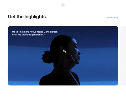
Highlight media card A large dark video or feature panel appears within a white section, with rounded corners and concise copy.
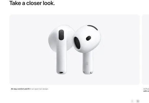
Product gallery rail Horizontal gallery of rounded product images and short captions, with simple carousel navigation.
Cinematic feature band Full-width image-led section layers centered white headlines over dark or vivid campaign footage.
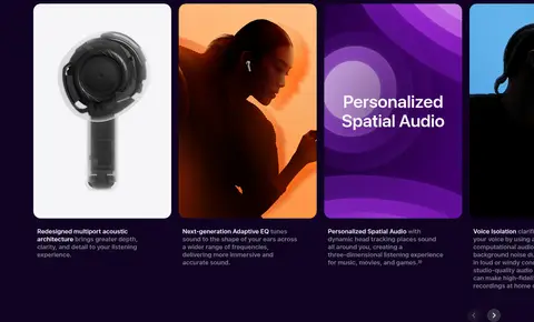
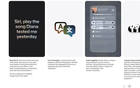
Feature cards Rounded cards organize audio, Siri, and device features; imagery and surface colors vary by story.
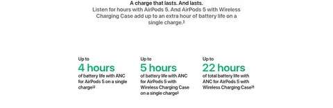
Charging feature Green gradient headline area leads into a white product render and concise battery-life statistics.
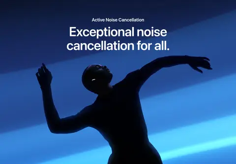
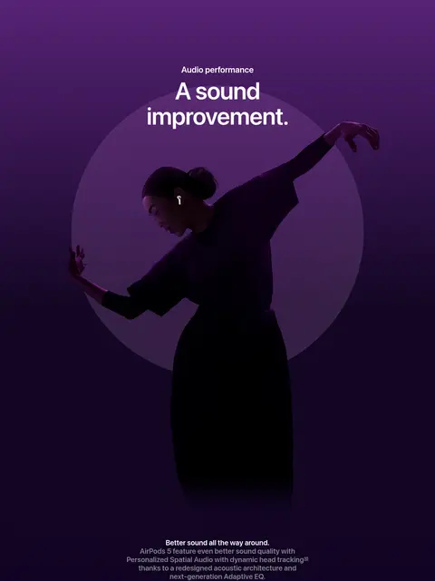
Imagery · Campaign video and full-bleed photography show silhouetted people in expressive colored light, while isolated AirPods and case renders sit on pale, quiet backgrounds. Images are often oversized and edge-to-edge in hero or feature moments, with rounded crops for gallery cards. Purple and orange hero hues, blue performance scenes, and green charging gradients are media-specific treatments rather than a default interface palette.
页面版块 共 9 个版块,按页面从上到下排列,每个都标了类型、布局和交互套路。
该做与不该做 ✓ 该做 Use white and pale-gray surfaces for product explanation. Reserve deep plum bands for immersive audio storytelling. Keep vivid campaign colors inside imagery or feature gradients. Use blue only for clear primary actions and link emphasis. Set headlines in bold, compact SF-style sans-serif typography. Use generous section spacing and rounded media cards. ✕ 不该做 Do not treat hero video colors as the general UI palette. Do not crowd large headlines with dense supporting copy. Do not add heavy shadows, borders, or decorative chrome. Do not place multiple competing primary actions in one feature. Do not replace product imagery with generic illustrations. Do not make every section dark or gradient-filled. 给 AI 的提示词 想快速出一个同风格的新页面,把这段话连同 DESIGN.md 一起发给 AI。
复制 Build a new product page using Apple’s AirPods 5 visual language: spacious editorial sections, crisp product renders, and cinematic media used selectively. Use Gallery White (#ffffff) as the main canvas, Cloud Silver (#f5f5f7) for quiet product surfaces, Apple Ink (#1d1d1f) for readable text, and Action Blue (#0071e3) for the primary CTA. Introduce Plum Black (#100322) for a single immersive feature band; keep Violet Depth (#561f75) and the green charging colors confined to relevant campaign imagery or feature gradients. Use a close SF Pro substitute such as Inter, with semibold, tightly tracked display headlines and restrained supporting copy. Alternate full-bleed visual moments with centered statements and horizontally browsable rounded cards. Preserve generous vertical breathing room, clean edges, and minimal elevation. Make each section’s imagery and copy explain one product benefit.
DESIGN.md Tailwind v4 CSS 变量 Design Tokens
---
title: "Apple — AirPods 5 design system"
variant: extended
source: https://www.apple.com/airpods-5/
captured_at: 2026-10-12
theme: light
industry: consumer-electronics
generator: Design DNA (https://four.wiralomi.com/style/apple-com-airpods-5)
ai_generated: true
ai_label: "本文件由 AI 辅助生成:数值取自公开网页的实测样式,命名、用途说明与建议为模型解读。商标归原所有者。 / AI-assisted content"
---
# Apple — AirPods 5 · Design System
> Cinematic product storytelling, framed with quiet precision.
**Theme:** light · **Industry:** consumer-electronics · **Source:** https://www.apple.com/airpods-5/ · **Captured:** 2026-10-12 (1440×900 desktop)
_AI-assisted content: values are measured from the public page at capture time; names, roles and guidance are model-written interpretations. Trademarks belong to their owners._
A cinematic AirPods 5 launch page pairs dramatic, full-bleed media with bright, carefully ordered product and feature sections. Apple’s restrained typography and spacious layouts let vivid campaign imagery carry the emotion while clear controls and concise copy support shopping.
## North star
Let cinematic product imagery create the drama, while a restrained, spacious interface makes every feature and purchase action immediately clear.
## Overview
The page alternates an expansive white canvas with sharply defined feature bands, using near-black plum (## Colors
| Name | Hex | Token | Group | Role |
|---|---|---|---|---|
| Gallery White | ` | `--color-gallery-white` | surface | Primary canvas, navigation backdrop, and bright product-story sections. |
| Graphite Mist | ` | `--color-graphite-mist` | neutral | Muted supporting text and select inline links. |
| Plum Black | ` | `--color-plum-black` | brand | Deep audio-performance section background and dark cinematic transition. |
| Apple Ink | ` | `--color-apple-ink` | neutral | Primary headings, body text, navigation, and dark feature cards. |
| Cloud Silver | ` | `--color-cloud-silver` | surface | Soft section grounds and light product-card surfaces. |
| Quiet Slate | ` | `--color-quiet-slate` | neutral | Secondary copy, captions, and subdued navigation details. |
| Steel Gray | ` | `--color-steel-gray` | neutral | Less prominent explanatory text and links. |
| Action Blue | ` | `--color-action-blue` | accent | Primary Buy buttons, link emphasis, and focus indication. |
| Soft Alloy | ` | `--color-soft-alloy` | surface | Muted gray section surface; secondary to the page’s white and dark bands. |
| Muted Aubergine | ` | `--color-muted-aubergine` | surface | Background for Personalized Spatial Audio feature cards. |
| Violet Depth | ` | `--color-violet-depth` | accent | Gradient color in immersive campaign sections, not standard controls. |
| Night Violet | ` | `--color-night-violet` | surface | Supporting deep-purple gradient stop in cinematic media. |
| Mint Light | ` | `--color-mint-light` | accent | Upper stop in the charging-story green gradient. |
| Charging Green | ` | `--color-charging-green` | accent | Bright middle stop in the charging feature’s gradient. |
| Forest Teal | ` | `--color-forest-teal` | accent | Deepening green gradient stop behind charging imagery. |
| Evergreen Shadow | ` | `--color-evergreen-shadow` | accent | Dark lower stop in the charging gradient, not a general UI color. |
### Semantic aliases
`--color-canvas` → ` (Gallery White) · `--color-surface` → ` (Plum Black) · `--color-surface-2` → ` (Cloud Silver) · `--color-surface-3` → ` (Apple Ink) · `--color-surface-4` → ` (Soft Alloy) · `--color-text` → ` (Apple Ink) · `--color-text-muted` → ` (Graphite Mist) · `--color-text-subtle` → ` (Quiet Slate) · `--color-accent` → ` (Action Blue) · `--color-accent-2` → ` (Violet Depth) · `--color-accent-3` → ` (Mint Light) · `--color-on-accent` → ` (Gallery White)
### Contrast (WCAG 2.x)
| Text | Background | Ratio | Level |
|---|---|---|---|
| ` | ` | 16.83:1 | AAA |
| ` | ` | 1.18:1 | fail |
| ` | ` | 15.46:1 | AAA |
| ` | ` | 6.74:1 | AA |
| ` | ` | 2.94:1 | fail |
| ` | ` | 6.19:1 | AA |
| ` | ` | 2.5:1 | fail |
| ` | ` | 3.62:1 | AA-large |
| ` | ` | 5.48:1 | AA |
| ` | ` | 3.33:1 | AA-large |
### Gradients
- `linear-gradient(0deg, rgb(16, 3, 34), rgba(16, 3, 34, 0) 18%), url("https://www.apple.com/v/airpods-5/b/images/overview/stories/audio_noise__eyjpb90hu4qe_large.png"), linear-gradient(rgba(16, 3, 34, 0) 1148.96px, 1467.01`
- `linear-gradient(rgb(255, 255, 255), rgb(164, 247, 205) 10%, rgb(44, 198, 119) 22%, rgb(16, 132, 91) 38%, rgb(1, 74, 52) 59%, rgb(0, 47, 38) 73%, rgb(1, 22, 21) 94%)`
- `linear-gradient(rgb(243, 242, 241) 20%, rgba(243, 242, 241, 0)), linear-gradient(90deg, rgb(203, 160, 152) 0%, rgb(189, 143, 101) 21%, rgb(177, 153, 93) 41%, rgb(129, 159, 117) 54%, rgb(120, 155, 194) 78%, rgb(153, 161, `
- `linear-gradient(330deg, rgb(24, 152, 94), rgb(0, 190, 104))`
## Typography
| Family | Token | Source | Weights | Role | Free substitute |
|---|---|---|---|---|---|
| SF Pro Text | `--font-body` | webfont | 600, 400 | Navigation, body copy, captions, buttons, and links. | Inter |
| SF Pro Display | `--font-display` | webfont | 600 | Large display headlines and prominent section headings. | Inter |
- **SF Pro Text:** Use regular and semibold weights; compact supporting text and controls, with sentence case.
- **SF Pro Display:** Semibold, large and tightly tracked; preserve natural case and compact headline line spacing.
### Type scale — Perfect Fourth (ratio ≈ 1.363, base 17px)
| Role | Size | Weight | Line height | Letter spacing | Case | Family | Used for |
|---|---|---|---|---|---|---|---|
| display | 80px | 600 | 1.05 | -0.015em | — | SF Pro Display | Oversized campaign and immersive section headlines. |
| h1 | 64px | 600 | 1.06 | -0.009em | — | SF Pro Display | Primary product-story headline. |
| h2 | 56px | 600 | 1.07 | -0.005em | — | SF Pro Display | Major feature-section headlines. |
| h3 | 48px | 600 | 1.08 | -0.003em | — | SF Pro Display | Secondary feature and card-group headlines. |
| h4 | 32px | 600 | 1.13 | 0.004em | — | SF Pro Display | Compact feature titles and supporting headings. |
| body | 17px | 600 | 1.24 | -0.022em | — | SF Pro Text | Feature descriptions and prominent introductory copy. |
| caption | 12px | 400 | 1.33 | -0.01em | — | SF Pro Text | Small card details, footnotes, and media labels. |
| button | 12px | 400 | 1.33 | -0.01em | — | SF Pro Text | Buy controls and compact calls to action. |
| nav | 12px | 400 | 1 | -0.01em | — | SF Pro Text | Global Apple navigation and local product navigation. |
| link | 17px | 600 | 1.24 | -0.022em | — | SF Pro Text | Inline feature links and supporting actions. |
OpenType features in use: `"numr"` .
## Spacing & layout
- Base unit **2px**, density **spacious**.
- Scale (most used values): 2, 3, 4, 7, 8, 10, 11, 12, 14, 18, 20, 21, 22, 25, 30, 40 px.
- Section rhythm 160px · element gap 20px · card padding — · max content width 1260px.
A spacious, single-page editorial flow uses a measured 1260px maximum content width and full-bleed media where the story calls for immersion. Major sections are separated by generous vertical rhythm; the long product page alternates full-width feature bands with centered content and horizontal card rails. Headline alignment changes by purpose: centered for campaign statements, left-aligned for galleries and explanatory content. Dense details are kept in compact cards or short text blocks rather than continuous paragraphs.
## Shape & elevation
- Radius: button `50%` · card `20px` · xs `20px` · sm `28px` · pill `9999px`
- Shadow `inset` (other): `rgba(0, 0, 0, 0.11) 0px 0px 1px 0px inset`
- Motion: standard transition `0.32s cubic-bezier(0.4, 0, 0.6, 1)` on interactive elements.
The interface is mostly flat: contrast comes from shifts between white, pale gray, and deep plum section surfaces, not layered shadows. Cards use soft rounded corners and image crops; the measured inset shadow is subtle and not a defining visual effect. Keep controls and cards visually crisp, avoiding decorative outlines and strong elevation.
## Imagery
Campaign video and full-bleed photography show silhouetted people in expressive colored light, while isolated AirPods and case renders sit on pale, quiet backgrounds. Images are often oversized and edge-to-edge in hero or feature moments, with rounded crops for gallery cards. Purple and orange hero hues, blue performance scenes, and green charging gradients are media-specific treatments rather than a default interface palette.
## Components
### Global navigation
Compact Apple navigation sits over the opening media, with small light labels and familiar search and bag icons.
### Hero purchase control
Full-bleed campaign media carries the title and a rounded purchase capsule; its Buy action uses ### Highlight media card
A large dark video or feature panel appears within a white section, with rounded corners and concise copy.
### Product gallery rail
Horizontal gallery of rounded product images and short captions, with simple carousel navigation.
### Cinematic feature band
Full-width image-led section layers centered white headlines over dark or vivid campaign footage.
### Feature cards
Rounded cards organize audio, Siri, and device features; imagery and surface colors vary by story.
### Charging feature
Green gradient headline area leads into a white product render and concise battery-life statistics.
### Measured component styles
- **Primary button** (“Buy , AirPods 5”): background ## Do
- Use white and pale-gray surfaces for product explanation.
- Reserve deep plum bands for immersive audio storytelling.
- Keep vivid campaign colors inside imagery or feature gradients.
- Use blue only for clear primary actions and link emphasis.
- Set headlines in bold, compact SF-style sans-serif typography.
- Use generous section spacing and rounded media cards.
## Don't
- Do not treat hero video colors as the general UI palette.
- Do not crowd large headlines with dense supporting copy.
- Do not add heavy shadows, borders, or decorative chrome.
- Do not place multiple competing primary actions in one feature.
- Do not replace product imagery with generic illustrations.
- Do not make every section dark or gradient-filled.
## Agent prompt
Build a new product page using Apple’s AirPods 5 visual language: spacious editorial sections, crisp product renders, and cinematic media used selectively. Use Gallery White (## Page sections (top to bottom)
| # | Type | Layout | UX patterns | UI patterns |
|---|---|---|---|---|
| 1 | hero | Full-bleed campaign video with title and purchase control anchored over the image. | autoplay campaign video, pause control, prominent Buy action | white display text, blue CTA, transparent navigation |
| 2 | feature-grid | White section with introductory content and a prominent rounded media panel. | feature highlights, watch-film link, numbered details | dark media card, concise copy, spacious white canvas |
| 3 | gallery | Wide horizontal product gallery with large image cards and short captions. | horizontal browsing, carousel arrows, feature captions | rounded pale image cards, left-aligned heading, clean product renders |
| 4 | video | Centered two-line headline over a full-width cinematic image or video. | feature-led storytelling | pale neutral band, centered display type, full-bleed media |
| 5 | video | Deep plum immersive media band spanning the page width. | immersive feature narrative | dark plum background, cinematic media, white headline |
| 6 | feature-grid | Centered section heading above a horizontal row of rounded feature cards. | card rail browsing, feature summaries | dark section surface, rounded image cards, compact captions |
| 7 | feature-grid | Bright section with centered headline and a horizontal feature-card rail. | feature card browsing, inline links | white canvas, varied card surfaces, centered headline |
| 8 | product-showcase | Centered charging headline over a vertical green-gradient product showcase. | battery benefit introduction | green gradient, centered title, large charging-case render |
| 9 | stats | White background with centered product copy above three compact battery statistics. | side-by-side battery comparisons | black explanatory text, green numeric emphasis, open whitespace |
## Source CSS custom properties (selected)
```css
--r-globalnav-background-opened: