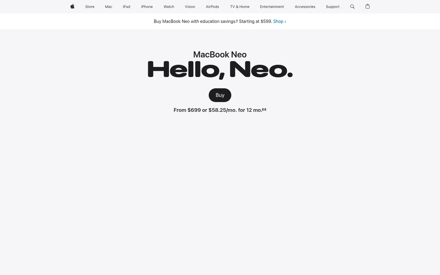
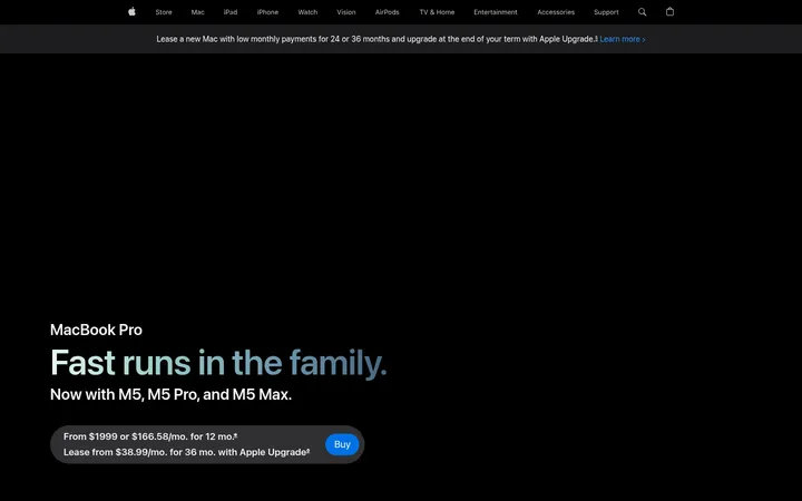
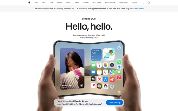
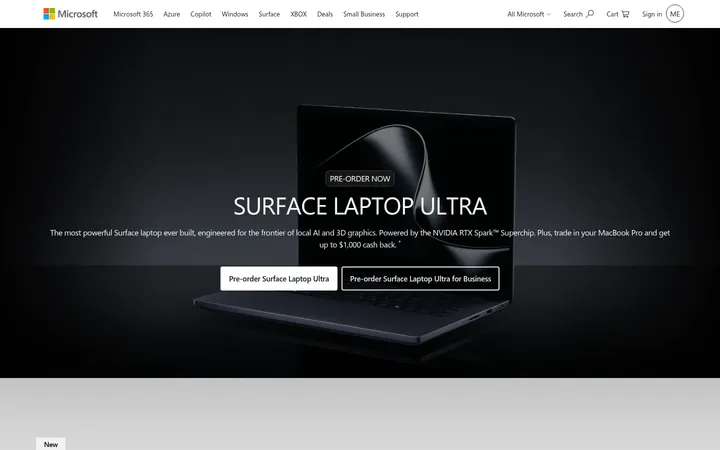
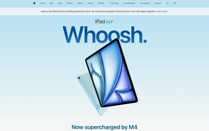
页面以宽松留白、柔和中性色背景和醒目标题呈现 MacBook Neo 的产品发布故事。通过电影感媒体内容与克制的蓝色链接,把注意力集中在产品本身。
North star · Keep the interface quiet and spacious so oversized product imagery and concise, high-contrast headlines carry the story.
The visual system is built on a quiet alternation between white and very light cool gray, with near-black typography providing strong contrast. Blue is reserved for shopping and text links rather than broad decoration, while black appears in compact purchase controls and occasional inverse areas. SF Pro Display gives headlines a confident, tightly tracked editorial presence; SF Pro Text handles navigation, body copy, captions, and controls. The page uses centered hero messaging, broad section bands, and wide product media, then shifts into feature stories and closer-look controls. Spacious vertical pacing lets each image or headline read as a distinct moment. Product imagery supplies the page’s expressive colors—citrus yellow, blush, silver, and indigo—without turning those photographic tones into interface colors. Rounded purchase buttons and softly rounded media frames are the main departures from the otherwise flat, precise interface.
配色 点色块复制色值。用途说明来自对页面的实测位置(背景、文字、描边、按钮)与截图判读。
品牌色
Apple Ink
#1d1d1f
Primary headings, body text, navigation, and the dark purchase button.
强调色
Action Blue
#0071e3
Primary blue purchase button with white text.
Link Blue
#0066cc
Shopping and inline links against white or gray backgrounds.
表层色
Soft Fog
#f5f5f7
Cool light-gray canvas for the hero and alternating full-width feature bands.
Gallery White
#ffffff
Main page canvas and the white sections separating gray product-story bands.
中性色
True Black
#000000
Inverse navigation and dark surface details; use sparingly outside the global navigation.
Quiet Gray
#ebebeb
Minor subdued text or interface details; not a defining section background.
Graphite Detail
#313131
Secondary dark navigation detail rather than a primary page color.
功能色
Indigo Signal
#2535e0
Small accent text or color detail; not a dominant interface surface.
Warm Charcoal
#232320
Subtle dark gradient transition within decorative content, not a general-purpose surface.
文字 背景 对比度 WCAG #1d1d1f Apple Ink#ffffff Gallery White16.83:1 AAA #1d1d1f Apple Ink#f5f5f7 Soft Fog15.46:1 AAA #1d1d1f Apple Ink#000000 True Black1.25:1 不达标 #0071e3 Action Blue#ffffff Gallery White4.7:1 AA #0071e3 Action Blue#f5f5f7 Soft Fog4.31:1 AA-large #0071e3 Action Blue#000000 True Black4.47:1 AA-large
字体 字号阶梯:Augmented Fourth(比例约 1.414,正文 17px)。示例用免费替代字体渲染,数值为实测。
Aa 设计
SF Pro Display 网络字体 · 字重 600 / 700 · 占比 81%
免费替代:Inter
Display headlines and prominent editorial titles.
Aa 设计
SF Pro Text 网络字体 · 字重 400 / 600 · 占比 19%
免费替代:Inter
Navigation, body copy, captions, buttons, and supporting interface text.
角色 示例 字号 字重 行高 字距 特大标题 Oversized hero or campaign display headline.
Apple
96px 600 1.04 -0.015em 一级标题 Primary product-launch headline.
Apple
80px 700 1.05 -0.015em 二级标题 Major section headline, such as performance.
Apple
56px 700 1.07 -0.005em 三级标题 Feature-story headline and prominent secondary title.
Apple
48px 600 1.08 -0.003em 四级标题 Smaller feature or sub-section heading.
Apple
40px 600 1.2 0 正文 Emphasized introductory and feature-story copy.
The quick brown fox 敏捷的狐狸
17px 600 1.24 -0.022em 辅助文字 Media captions and supporting product details.
The quick brown fox 敏捷的狐狸
14px 600 1.43 -0.016em 按钮 Compact purchase and action button labels.
The quick brown fox 敏捷的狐狸
12px 400 1.33 -0.01em 导航 Global navigation labels.
The quick brown fox 敏捷的狐狸
12px 400 1 -0.01em 链接 Prominent editorial text links.
Apple
28px 600 1.14 0.007em
间距与布局 基准单位 4px · 密度:宽松
144px 版块间距
20px 元素间距
— 卡片内边距
1260px 内容最大宽度
2px
3px
4px
8px
10px
11px
12px
14px
16px
17px
18px
20px
21px
22px
32px
44px
Use a centered, spacious composition with a measured page max width of 1260px. Alternate full-width #f5f5f7 and white section bands, placing large media across the available width. Center the hero title and purchase information; use left-aligned section headings and varied split or multi-column feature layouts below. The measured spacing scale is generous, with a 144px section gap and 20px element gap. Keep content density low, give product imagery room to breathe, and use the measured 4px base spacing system rather than adding arbitrary dimensions.
圆角与层次 The page is predominantly flat: section bands, typography, and imagery provide hierarchy instead of card shadows. Use only the measured subtle inset shadow where relevant. Media may have softly rounded framing, while controls use pill-shaped corners; avoid heavy borders, layered panels, or pronounced drop shadows.
组件 下面的预览按实测的按钮、输入框、徽标、卡片样式重建(字体用替代字体)。
Global navigation Compact, centered Apple navigation with small SF Pro Text labels, restrained dark text, and search and bag icons.
Announcement strip A narrow white message row below navigation with centered pricing copy and a blue Shop link.
Hero purchase block Centered product name, bold oversized launch headline, dark pill Buy control, and concise price or monthly-payment line.
Blue purchase CTA Use #0071e3 with white SF Pro Text and a fully rounded pill silhouette for the product purchase action.
Editorial feature media Wide image or video paired with concise feature copy; alternate white and #f5f5f7 section backgrounds.
Closer-look selector Feature categories sit beside a large product view, with compact controls for exploring colors and hardware details.
Imagery · Make high-quality product photography and video the main visual event: close crops, floating devices, color reveals, and lifestyle scenes. Images are broad and often full bleed, with their color variation coming from the MacBook finishes and environments rather than interface decoration. Use clean lighting and restrained backgrounds, and allow media to dominate feature sections without adding ornamental overlays.
页面版块 共 7 个版块,按页面从上到下排列,每个都标了类型、布局和交互套路。
该做与不该做 ✓ 该做 Use #1d1d1f for primary text and headlines. Alternate white and #f5f5f7 section backgrounds. Let product photography carry the product colors. Keep the hero message centered and concise. Use blue for links and purchase actions only. Preserve generous vertical breathing room. ✕ 不该做 Do not add unmeasured palette colors. Do not use product-photo colors as interface fills. Do not crowd sections with dense card grids. Do not add heavy shadows or decorative borders. Do not turn links into oversized colorful buttons. Do not apply all-caps styling to the navigation. 给 AI 的提示词 想快速出一个同风格的新页面,把这段话连同 DESIGN.md 一起发给 AI。
复制 Build a new product-story page in Apple’s MacBook Neo visual style. Use Gallery White (#ffffff) and Soft Fog (#f5f5f7) for quiet alternating section bands, with Apple Ink (#1d1d1f) headlines and copy. Set prominent titles in a bold, tightly tracked SF Pro Display-like face and supporting interface text in a clean SF Pro Text-like sans serif. Center the opening product message and pill-shaped dark purchase control; reserve Action Blue (#0071e3) for the primary buy action and Link Blue (#0066cc) for inline links. Give full-width product photography and video generous room, and let the photographed product provide the vivid color. Keep the measured wide content frame, spacious section rhythm, flat surfaces, and minimal shadows. Use restrained controls, clear alignment changes between centered hero and editorial feature layouts, and no invented colors or decorative clutter.
DESIGN.md Tailwind v4 CSS 变量 Design Tokens
---
title: "Apple — MacBook Neo design system"
variant: extended
source: https://www.apple.com/macbook-neo/
captured_at: 2026-10-12
theme: light
industry: consumer-electronics
generator: Design DNA (https://four.wiralomi.com/style/apple-com-macbook-neo)
ai_generated: true
ai_label: "本文件由 AI 辅助生成:数值取自公开网页的实测样式,命名、用途说明与建议为模型解读。商标归原所有者。 / AI-assisted content"
---
# Apple — MacBook Neo · Design System
> Quiet surfaces, bold type, color-forward product storytelling.
**Theme:** light · **Industry:** consumer-electronics · **Source:** https://www.apple.com/macbook-neo/ · **Captured:** 2026-10-12 (1440×900 desktop)
_AI-assisted content: values are measured from the public page at capture time; names, roles and guidance are model-written interpretations. Trademarks belong to their owners._
A spacious product launch page pairs soft neutral backgrounds with bold headlines and vivid MacBook color imagery. Editorial pacing, cinematic media, and restrained blue links keep the product at the center.
## North star
Keep the interface quiet and spacious so oversized product imagery and concise, high-contrast headlines carry the story.
## Overview
The visual system is built on a quiet alternation between white and very light cool gray, with near-black typography providing strong contrast. Blue is reserved for shopping and text links rather than broad decoration, while black appears in compact purchase controls and occasional inverse areas. SF Pro Display gives headlines a confident, tightly tracked editorial presence; SF Pro Text handles navigation, body copy, captions, and controls. The page uses centered hero messaging, broad section bands, and wide product media, then shifts into feature stories and closer-look controls. Spacious vertical pacing lets each image or headline read as a distinct moment. Product imagery supplies the page’s expressive colors—citrus yellow, blush, silver, and indigo—without turning those photographic tones into interface colors. Rounded purchase buttons and softly rounded media frames are the main departures from the otherwise flat, precise interface.
## Colors
| Name | Hex | Token | Group | Role |
|---|---|---|---|---|
| Apple Ink | ` | `--color-apple-ink` | brand | Primary headings, body text, navigation, and the dark purchase button. |
| Soft Fog | ` | `--color-soft-fog` | surface | Cool light-gray canvas for the hero and alternating full-width feature bands. |
| Gallery White | ` | `--color-gallery-white` | surface | Main page canvas and the white sections separating gray product-story bands. |
| True Black | ` | `--color-true-black` | neutral | Inverse navigation and dark surface details; use sparingly outside the global navigation. |
| Action Blue | ` | `--color-action-blue` | accent | Primary blue purchase button with white text. |
| Link Blue | ` | `--color-link-blue` | accent | Shopping and inline links against white or gray backgrounds. |
| Quiet Gray | ` | `--color-quiet-gray` | neutral | Minor subdued text or interface details; not a defining section background. |
| Indigo Signal | ` | `--color-indigo-signal` | semantic | Small accent text or color detail; not a dominant interface surface. |
| Graphite Detail | ` | `--color-graphite-detail` | neutral | Secondary dark navigation detail rather than a primary page color. |
| Warm Charcoal | ` | `--color-warm-charcoal` | semantic | Subtle dark gradient transition within decorative content, not a general-purpose surface. |
### Semantic aliases
`--color-canvas` → ` (Gallery White) · `--color-surface` → ` (Soft Fog) · `--color-surface-2` → ` (True Black) · `--color-text` → ` (Apple Ink) · `--color-border` → ` (Apple Ink) · `--color-accent` → ` (Action Blue) · `--color-accent-2` → ` (Link Blue) · `--color-accent-3` → ` (Indigo Signal) · `--color-on-accent` → ` (Gallery White)
### Contrast (WCAG 2.x)
| Text | Background | Ratio | Level |
|---|---|---|---|
| ` | ` | 16.83:1 | AAA |
| ` | ` | 15.46:1 | AAA |
| ` | ` | 1.25:1 | fail |
| ` | ` | 4.7:1 | AA |
| ` | ` | 4.31:1 | AA-large |
| ` | ` | 4.47:1 | AA-large |
### Gradients
- `linear-gradient(rgb(29, 29, 31) 20%, rgb(30, 31, 31) 21.44%, rgb(35, 35, 32) 22.88%, rgb(43, 43, 34) 24.31%, rgb(54, 55, 37) 25.75%, rgb(68, 70, 41) 27.19%, rgb(86, 88, 45) 28.63%, rgb(105, 108, 50) 30.06%, rgb(126, 130,`
- `linear-gradient(184deg, rgb(29, 29, 31) 20%, rgb(30, 30, 33) 21.44%, rgb(33, 35, 38) 22.88%, rgb(39, 42, 47) 24.31%, rgb(47, 53, 59) 25.75%, rgb(57, 66, 76) 27.19%, rgb(70, 82, 95) 28.63%, rgb(84, 101, 118) 30.06%, rgb(9`
- `linear-gradient(184deg, rgb(29, 29, 31) 0%, rgb(49, 50, 36) 2.08%, rgb(68, 69, 41) 4.17%, rgb(85, 88, 45) 6.25%, rgb(102, 105, 49) 8.33%, rgb(119, 122, 53) 10.42%, rgb(134, 138, 57) 12.5%, rgb(148, 153, 61) 14.58%, rgb(1`
- `linear-gradient(184deg, rgb(29, 29, 31) 0%, rgb(29, 29, 31) 0.31%, rgb(29, 29, 31) 0.63%, rgb(29, 29, 31) 0.94%, rgb(29, 29, 31) 1.25%, rgb(29, 29, 31) 1.56%, rgb(29, 29, 31) 1.88%, rgb(29, 29, 31) 2.19%, rgb(29, 29, 31)`
## Typography
| Family | Token | Source | Weights | Role | Free substitute |
|---|---|---|---|---|---|
| SF Pro Display | `--font-display` | webfont | 600, 700 | Display headlines and prominent editorial titles. | Inter |
| SF Pro Text | `--font-body` | webfont | 400, 600 | Navigation, body copy, captions, buttons, and supporting interface text. | Inter |
- **SF Pro Display:** Use bold or semibold display weights; headlines are large, compact, and slightly negatively tracked.
- **SF Pro Text:** Use regular and semibold weights; keep interface text compact and avoid all-caps styling.
### Type scale — Augmented Fourth (ratio ≈ 1.414, base 17px)
| Role | Size | Weight | Line height | Letter spacing | Case | Family | Used for |
|---|---|---|---|---|---|---|---|
| display | 96px | 600 | 1.04 | -0.015em | — | SF Pro Display | Oversized hero or campaign display headline. |
| h1 | 80px | 700 | 1.05 | -0.015em | — | SF Pro Display | Primary product-launch headline. |
| h2 | 56px | 700 | 1.07 | -0.005em | — | SF Pro Display | Major section headline, such as performance. |
| h3 | 48px | 600 | 1.08 | -0.003em | — | SF Pro Display | Feature-story headline and prominent secondary title. |
| h4 | 40px | 600 | 1.2 | 0 | — | SF Pro Display | Smaller feature or sub-section heading. |
| body | 17px | 600 | 1.24 | -0.022em | — | SF Pro Text | Emphasized introductory and feature-story copy. |
| caption | 14px | 600 | 1.43 | -0.016em | — | SF Pro Text | Media captions and supporting product details. |
| button | 12px | 400 | 1.33 | -0.01em | — | SF Pro Text | Compact purchase and action button labels. |
| nav | 12px | 400 | 1 | -0.01em | — | SF Pro Text | Global navigation labels. |
| link | 28px | 600 | 1.14 | 0.007em | — | SF Pro Display | Prominent editorial text links. |
OpenType features in use: `"numr"` .
## Spacing & layout
- Base unit **4px**, density **spacious**.
- Scale (most used values): 2, 3, 4, 8, 10, 11, 12, 14, 16, 17, 18, 20, 21, 22, 32, 44 px.
- Section rhythm 144px · element gap 20px · card padding — · max content width 1260px.
Use a centered, spacious composition with a measured page max width of 1260px. Alternate full-width ## Shape & elevation
- Radius: button `50%` · xs `28px` · pill `9999px`
- Shadow `inset` (other): `rgba(0, 0, 0, 0.11) 0px 0px 0.5px 0px inset`
- Motion: standard transition `0.32s cubic-bezier(0.4, 0, 0.6, 1)` on interactive elements.
The page is predominantly flat: section bands, typography, and imagery provide hierarchy instead of card shadows. Use only the measured subtle inset shadow where relevant. Media may have softly rounded framing, while controls use pill-shaped corners; avoid heavy borders, layered panels, or pronounced drop shadows.
## Imagery
Make high-quality product photography and video the main visual event: close crops, floating devices, color reveals, and lifestyle scenes. Images are broad and often full bleed, with their color variation coming from the MacBook finishes and environments rather than interface decoration. Use clean lighting and restrained backgrounds, and allow media to dominate feature sections without adding ornamental overlays.
## Components
### Global navigation
Compact, centered Apple navigation with small SF Pro Text labels, restrained dark text, and search and bag icons.
### Announcement strip
A narrow white message row below navigation with centered pricing copy and a blue Shop link.
### Hero purchase block
Centered product name, bold oversized launch headline, dark pill Buy control, and concise price or monthly-payment line.
### Blue purchase CTA
Use ### Editorial feature media
Wide image or video paired with concise feature copy; alternate white and ### Closer-look selector
Feature categories sit beside a large product view, with compact controls for exploring colors and hardware details.
### Measured component styles
- **Primary button** (“Buy MacBook Neo”): background ## Do
- Use ## Don't
- Do not add unmeasured palette colors.
- Do not use product-photo colors as interface fills.
- Do not crowd sections with dense card grids.
- Do not add heavy shadows or decorative borders.
- Do not turn links into oversized colorful buttons.
- Do not apply all-caps styling to the navigation.
## Agent prompt
Build a new product-story page in Apple’s MacBook Neo visual style. Use Gallery White (## Page sections (top to bottom)
| # | Type | Layout | UX patterns | UI patterns |
|---|---|---|---|---|
| 1 | hero | Centered headline and purchase details above large product media on a light-gray band. | Buy action, Price disclosure | Oversized bold headline, Dark pill button, Light-gray canvas |
| 2 | gallery | Left-aligned section title followed by a wide, horizontally organized media gallery. | Feature browsing, Color discovery | White background, Full-bleed media, Compact category links |
| 3 | video | Full-width cinematic product film on a light-gray section band. | Play film | Full-bleed video, Gray canvas |
| 4 | product-showcase | Section heading above a large product view with a compact feature selector alongside. | Explore product details, Select feature | Product visualization, Compact selector, White heading band |
| 5 | feature-split | Centered performance headline and explanatory copy followed by a product-led visual. | Feature explanation | Large display heading, Centered copy, Product imagery |
| 6 | feature-split | Two-column lifestyle image and supporting battery-life message on white. | Read battery details | Lifestyle photography, Split text and image, Emphasized metric |
| 7 | feature-grid | Centered section heading above a multi-column, full-width media and feature layout. | Browse feature benefits | White background, Wide media, Centered heading |
## Source CSS custom properties (selected)
```css
--r-globalnav-background-opened: