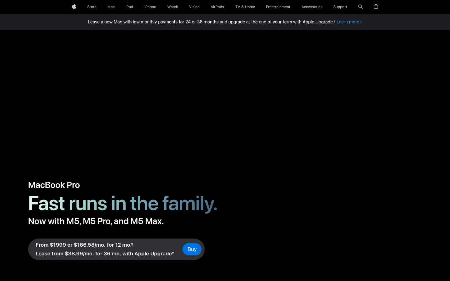
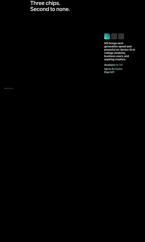
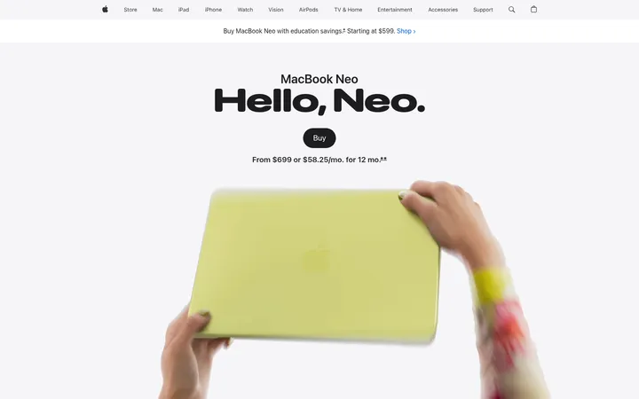
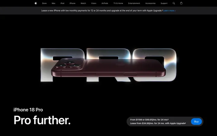
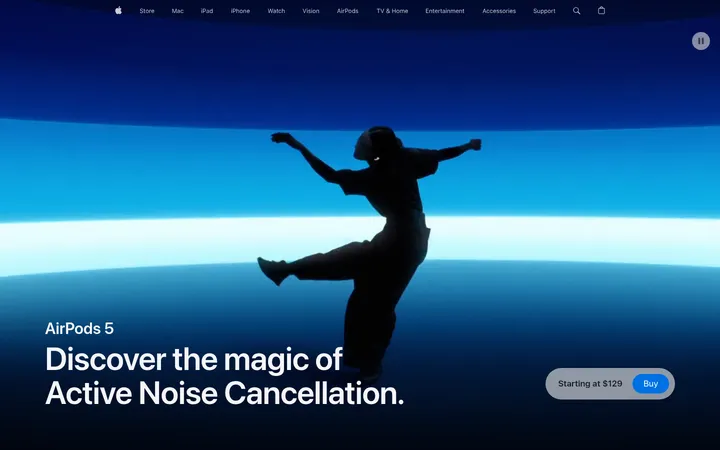
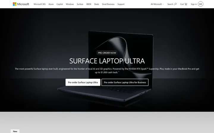
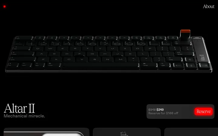
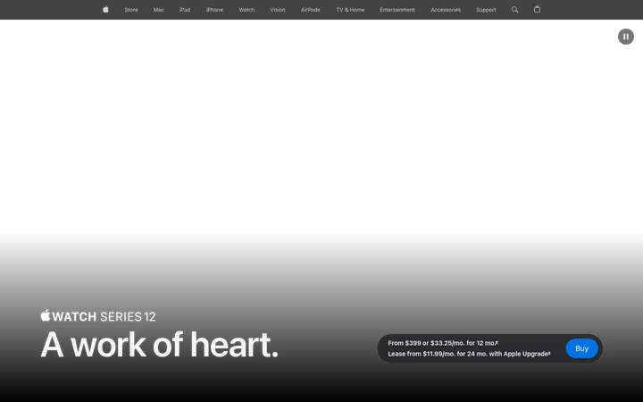
这是一款以电影感叙事呈现 MacBook Pro 的产品发布页,采用黑色画布、大幅产品影像和清晰醒目的文字。宽松的功能区块与深灰卡片、鲜明的媒体内容交替出现,并以克制的蓝色按钮引导操作。
North star · Let immersive product imagery and bold, precise typography emerge from a near-black canvas, keeping interface accents restrained.
The page uses a predominantly black canvas, letting the MacBook imagery and large type carry the visual impact. Charcoal feature bands create a clear change of pace without breaking the dark theme; cards sit directly within those bands, with soft, generous corners and no prominent shadows. White and soft gray text establish hierarchy, while muted gray handles secondary copy and utility labels. Blue is reserved for purchase and informational links, with purple and cool-toned colors appearing mainly as chip or media accents. SF Pro Display gives headlines a compact, confident presence, paired with SF Pro Text for navigation, captions, and controls. The layout moves between a full-bleed hero, horizontally browsable highlight content, product-focused demonstrations, and two-column feature cards. Large vertical intervals separate major product stories, while imagery remains richly detailed and high contrast. Gradient headline and media colors add energy, but remain subordinate to the black-and-charcoal system.
Display headlines, section headings, prominent product statements, and large links.
Aa 设计
SF Pro Text
网络字体 · 字重 400 / 600 · 占比 22%
免费替代:Inter
Navigation, body copy, captions, buttons, and utility text.
角色
示例
字号
字重
行高
字距
特大标题
Oversized hero statement and primary launch headline.
Apple
80px
600
1.05
-0.015em
一级标题
Main page or major product story heading.
Apple
64px
600
1.06
-0.009em
二级标题
Large feature-section and product-family heading.
Apple
56px
600
1.07
-0.005em
三级标题
Subsection headings and prominent feature titles.
Apple
48px
600
1.08
-0.003em
四级标题
Compact card or feature-group headings.
Apple
32px
600
1.13
0.004em
正文
Emphasized introductory copy and short feature statements.
The quick brown fox 敏捷的狐狸
19px
600
1.21
0.012em
辅助文字
Supporting descriptions, media labels, and footnote-style copy.
The quick brown fox 敏捷的狐狸
14px
400
1.43
-0.016em
按钮
Compact purchase and action labels.
The quick brown fox 敏捷的狐狸
12px
400
1.33
-0.01em
导航
Global navigation links and utility navigation.
The quick brown fox 敏捷的狐狸
12px
400
1
-0.01em
链接
Large promotional or feature links.
Apple
28px
600
1.14
0.007em
间距与布局
基准单位 4px · 密度:宽松
144px版块间距
20px元素间距
—卡片内边距
1260px内容最大宽度
3px
4px
7px
8px
9px
10px
11px
12px
15px
16px
18px
20px
22px
30px
32px
35px
A centered, spacious desktop composition with measured maximum content width of 1260px. The opening hero uses full-bleed media and left-aligned product copy; later sections alternate between full-width charcoal bands and black editorial space. Feature cards form multi-column arrangements, while product demonstrations use split layouts and large media. Major stories have a pronounced measured section gap of 144px, with 20px element gaps. Keep text blocks compact beside imagery and let long vertical intervals preserve the deliberate, low-density rhythm.
圆角与层次
按钮 · 50%
卡片 · 28px
图片 · 12px
没有测到阴影:页面是扁平的,层次靠底色和描边区分。
The interface is mostly flat: black canvas and charcoal bands provide the depth instead of shadows. Cards use the measured 28px radius, while media containers use 12px. Buttons are pill-shaped. Avoid invented borders and elevation; the measured border color is absent, and media itself provides most layering and contrast.
组件
下面的预览按实测的按钮、输入框、徽标、卡片样式重建(字体用替代字体)。
Global navigation
Compact horizontal navigation on the dark canvas, with light text and minimal visual framing. Keep utility icons and links quiet beside the central product story.
Announcement strip
A narrow dark-gray band beneath global navigation, containing centered financing copy and a restrained blue Learn more link.
Hero purchase panel
Full-bleed black product hero with large hardware imagery, white product naming, oversized headline, supporting line, and a rounded financing panel with a blue Buy button.
Highlight carousel
Charcoal section with a left-aligned heading, small blue Watch the film link, and horizontally browsable large media cards.
Chip showcase
Dark product-focused presentation that uses vivid chip artwork within a minimal interface, with text and controls kept secondary to the imagery.
Feature cards
Rounded charcoal cards combining concise white headings, supporting copy, and large app or workflow imagery; use a paired-column arrangement where appropriate.
Purchase CTA
Pill-shaped blue button with white SF Pro Text label. The measured hero Buy button uses 17px text; the compact product CTA uses 12px.
Imagery · Use cinematic, high-contrast product photography and video against near-black backgrounds. Product hardware is often large, isolated, and dramatically lit; app demonstrations and creative workflows appear within device screens. Feature cards use rounded media containers. Gradients and saturated color are most visible inside chip visuals, screen content, and selected headline treatments, rather than as broad page backgrounds.
Use black as the dominant canvas and preserve dark negative space.
Use charcoal bands to distinguish feature areas without introducing a light theme.
Pair bold, compact headlines with restrained supporting text.
Give product imagery room to dominate its section.
Reserve blue for purchase actions and useful links.
Use gradients as selective accents within media or headline treatments.
Separate major stories with generous vertical breathing room.
✕ 不该做
Do not introduce colors outside the measured palette.
Do not turn the page into a dense dashboard or conventional catalog grid.
Do not use heavy shadows or decorative borders to create depth.
Do not apply bright gradients across large page backgrounds.
Do not let secondary text compete with the main product headline.
Do not surround every media element with a card.
Do not make the interface feel cramped with tight section spacing.
给 AI 的提示词
想快速出一个同风格的新页面,把这段话连同 DESIGN.md 一起发给 AI。
Build a new product page in Apple's measured MacBook Pro style. Start with a near-black Stage Black (#000000) canvas, then use Graphite Band (#1d1d1f) only for selected feature sections and cards. Set large, tight SF Pro Display-style headlines in Pure White (#ffffff) or Cloud White (#f5f5f7); use SF Pro Text-style utility and supporting copy in Quiet Gray (#86868b). Make product imagery cinematic, high contrast, and generously framed, with media-led sections and spacious vertical transitions. Use Action Blue (#0071e3) for the primary pill-shaped CTA and Bright Link Blue (#2997ff) for secondary links. Restrict gradients to selective product or headline accents, including Frost Mint (#e4f6f0), Sea Glass (#9dcfca), and Deep Steel (#45657d). Keep surfaces flat, corners soft, and controls visually restrained.