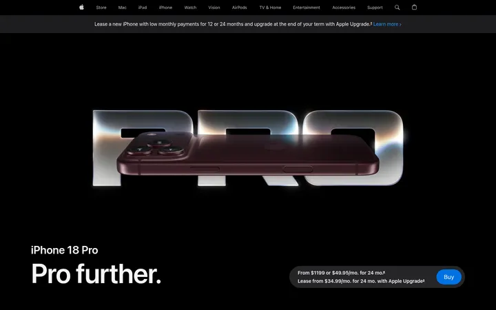
页面以深色沉浸式视觉为核心,通过大幅 Apple Watch 影像讲述健康与运动功能。清晰醒目的文字、克制的点缀色和充足留白,引导访客从了解产品走向购买。
North star · Let the watch imagery command the black canvas, using concise type and sparse color to make each product detail feel deliberate.
The page uses a near-black canvas as a continuous stage, with charcoal bands distinguishing the highlights and product-detail zones. White display type establishes a strong hierarchy, while muted gray supports quieter navigation and explanatory copy. Blue is reserved for purchase actions and selected links; green appears as a health-sensing cue, including in product imagery, rather than as a broad page background. SF Pro Display headlines pair with SF Pro Text interface and body copy, using compact tracking and clear weight contrast. Layout alternates full-bleed watch imagery with centered narrative sections and modular feature cards. Large gaps between content groups give the product visuals room to dominate, while concise text keeps the long page easy to scan. Rounded controls and cards soften the otherwise precise, flat-edged composition.
Navigation, body copy, captions, buttons, and links.
Aa 设计
SF Pro Display
网络字体 · 字重 600 · 占比 36%
免费替代:Inter
Large display headlines and section headings.
角色
示例
字号
字重
行高
字距
特大标题
Oversized campaign headline and hero-scale product statement.
Apple
80px
600
1.05
-0.015em
一级标题
Primary page or major feature headline.
Apple
64px
600
1.06
-0.009em
二级标题
Section headlines such as health, fitness, and body insights.
Apple
48px
600
1.08
-0.003em
三级标题
Feature-card and subsection headings.
Apple
28px
600
1.14
0.007em
四级标题
Compact feature titles and supporting subheads.
The quick brown fox 敏捷的狐狸
21px
600
1.38
0.011em
正文
Emphasized explanatory copy and key product statements.
The quick brown fox 敏捷的狐狸
17px
600
1.24
-0.022em
辅助文字
Small descriptions, image notes, and supporting details.
The quick brown fox 敏捷的狐狸
14px
400
1.29
-0.016em
按钮
Compact purchase and interface button labels.
The quick brown fox 敏捷的狐狸
12px
400
1.33
-0.01em
导航
Global and local navigation labels.
The quick brown fox 敏捷的狐狸
12px
400
1
-0.01em
链接
Inline calls to action and highlighted feature links.
The quick brown fox 敏捷的狐狸
17px
600
1.24
-0.022em
间距与布局
基准单位 4px · 密度:宽松
144px版块间距
20px元素间距
—卡片内边距
1260px内容最大宽度
3px
4px
6px
8px
10px
11px
12px
14px
16px
18px
20px
21px
22px
24px
28px
30px
The page uses a measured maximum content width of 1260px, but repeatedly breaks into full-bleed product media. Sections alternate between left-aligned feature introductions, centered narrative blocks, and card-based showcases. The 144px section rhythm and 20px element gap support a spacious, editorial pace rather than dense commerce browsing. A three-column feel appears in some media sections, while later feature content shifts between one- and two-column layouts. Keep copy narrow and images dominant.
圆角与层次
按钮 · 50%
inset · other
The page is predominantly flat, with black and charcoal section changes doing more work than borders or shadows. Cards and media panels use rounded corners where measured, while purchase controls are pill-shaped. Avoid adding decorative elevation: the sole measured shadow is a barely visible inset detail.
组件
下面的预览按实测的按钮、输入框、徽标、卡片样式重建(字体用替代字体)。
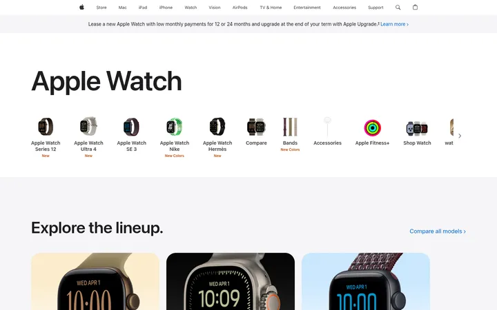
Global navigation
A compact dark top bar with small muted labels, white selected text, and simple store, search, and bag icons.
Hero purchase capsule
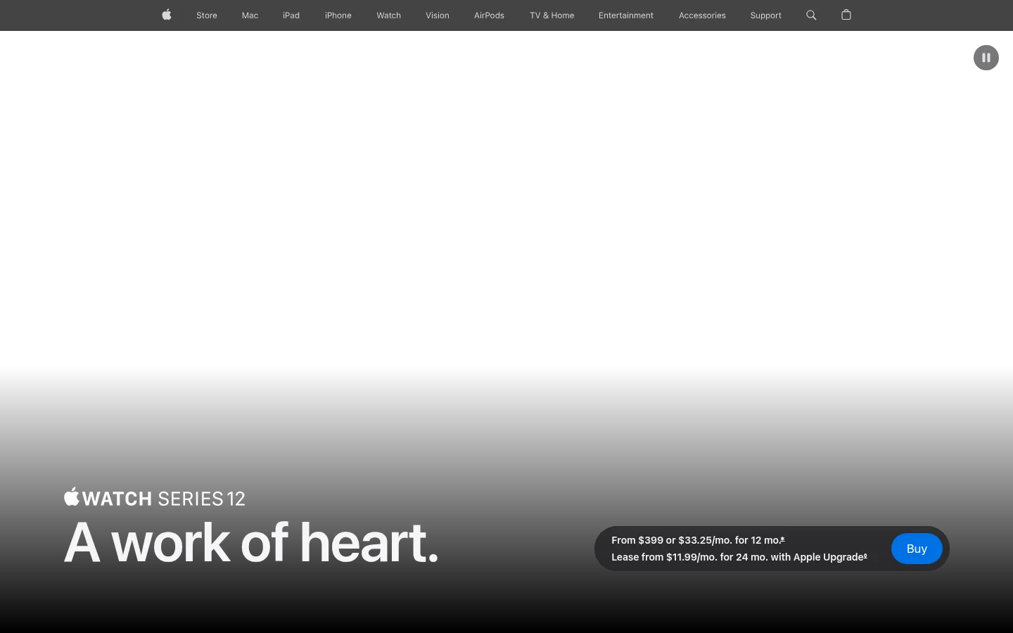
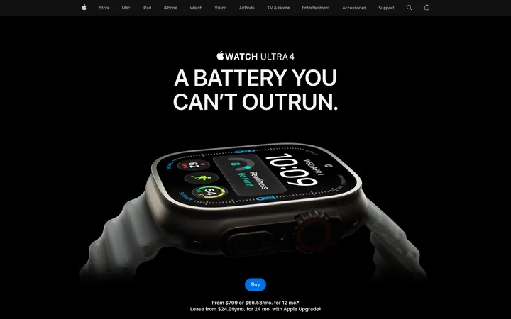
A dark rounded pricing strip pairs short purchase and lease details with a bright blue pill-shaped Buy action.
Highlights carousel
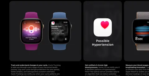
Large rounded media cards combine a concise feature statement with product imagery and small carousel controls.
Product detail selector
A vertical stack of compact rounded selectors sits beside a large watch render; active and inactive options remain understated.
Centered feature narrative
A centered heading and short supporting copy precede a large cinematic product image, with ample black space around both.
Feature cards
Dark rounded panels organize watch imagery, concise health or fitness details, and supporting links without heavy borders.
Pill purchase button
Use #0071e3 with white text, a fully rounded silhouette, and compact SF Pro Text labeling.
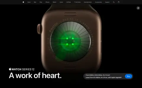
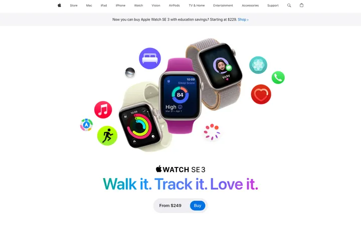
Imagery · High-contrast product photography and video carry the storytelling: close crops, dramatic watch lighting, dark studio scenes, and occasional lifestyle footage. Product images often emerge from black rather than sit inside framed illustrations. Health-interface colors may glow green, red, or blue within the watch display; treat these as image content, not as page-wide brand accents.
Give product photography more area than explanatory copy.
Reserve blue for purchase actions and selected links.
Use green as a focused health-sensing accent.
Alternate centered narratives with full-bleed media.
Keep body copy concise and comfortably separated.
✕ 不该做
Do not introduce bright page-wide color bands.
Do not treat colors inside watch displays as interface colors.
Do not crowd feature sections with dense text.
Do not add heavy outlines or prominent shadows.
Do not make every section a card grid.
Do not use oversized decorative gradients beyond product storytelling.
给 AI 的提示词
想快速出一个同风格的新页面,把这段话连同 DESIGN.md 一起发给 AI。
Build a new product page in Apple’s dark, cinematic launch style. Use Infinite Black (#000000) as the main canvas and Charcoal Panel (#111111) for occasional section bands. Set major headings in a close SF Pro Display substitute and interface copy in a clean SF Pro Text substitute, using crisp white (#f5f5f7) and muted gray (#86868b). Make large, high-quality product imagery the main event; alternate full-bleed visuals with centered copy and concise feature cards. Use Action Blue (#0071e3) for the primary pill-shaped purchase action and Sky Link (#2997ff) sparingly for feature links. Apply Pulse Green (#00d959) only to relevant health details, especially within product imagery. Preserve generous section gaps, calm navigation, rounded controls, and minimal elevation. Do not invent decorative borders or let imagery accents spread across the page.