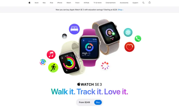
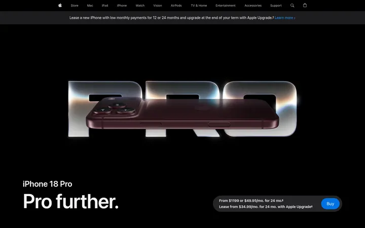
North star · Keep the interface nearly black and let oversized product imagery and clear type carry the story, with color used only for purposeful signals.
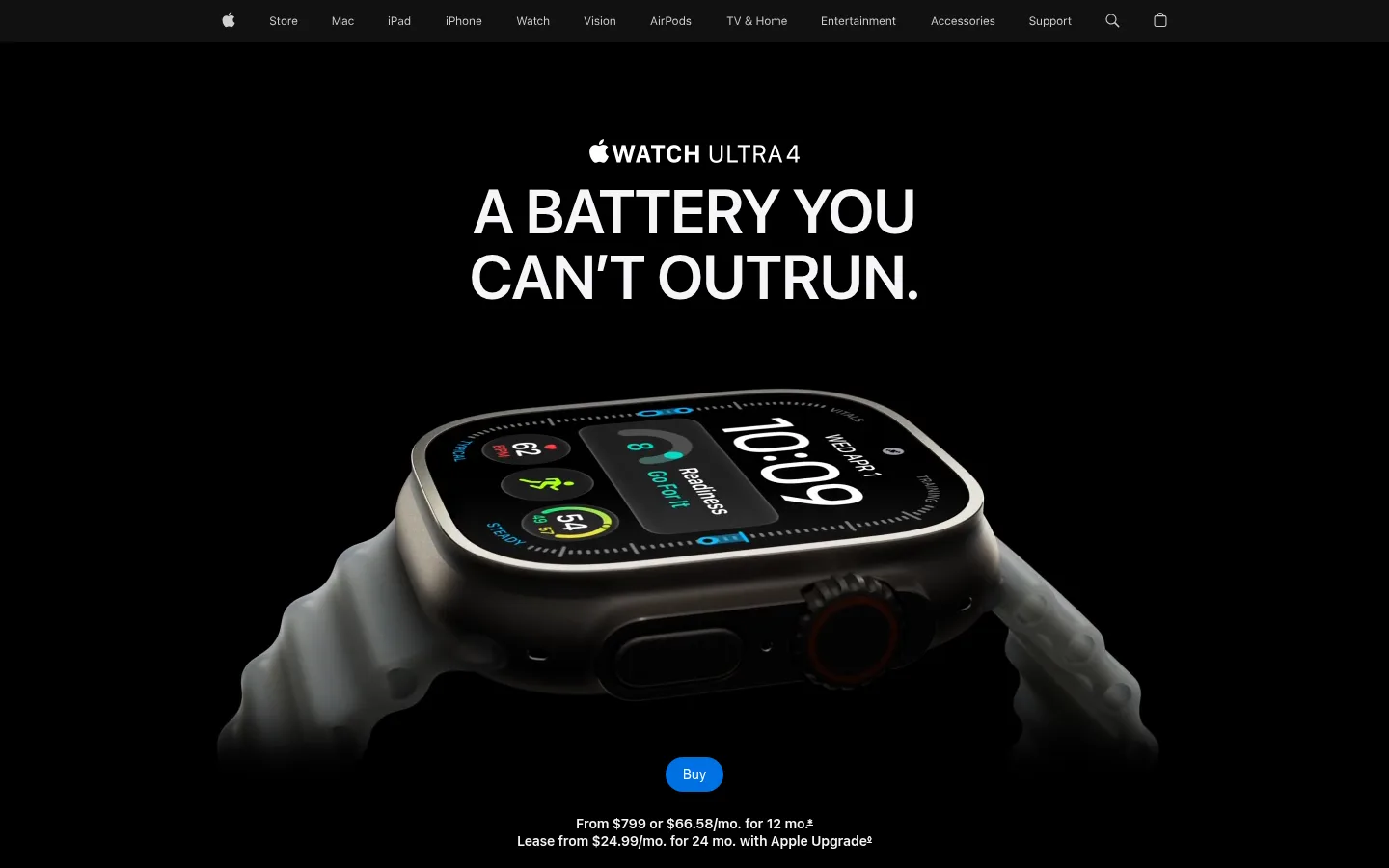
The page is anchored by a near-black canvas (#000000) and deep charcoal section bands (#111111), creating a quiet stage for the watch rather than a decorative interface. Bright off-white headings (#f5f5f7) establish a strong reading hierarchy, while muted gray (#86868b) handles supporting copy. Blue is reserved for purchase actions and links; vivid green highlights health and performance themes. SF Pro Display gives headlines a compact, confident presence, while SF Pro Text supports navigation, body copy, and controls. The layout moves through expansive, full-bleed product scenes, dark editorial feature areas, and concise metrics or card collections. Large isolated product imagery and monochrome running photography supply most of the visual drama. Small details, including colorful watch-screen UI and green sensor light, remain inside product imagery rather than becoming broad page decoration. Rounded pill buttons and restrained borders keep controls familiar and unobtrusive.
配色
点色块复制色值。用途说明来自对页面的实测位置(背景、文字、描边、按钮)与截图判读。
强调色
表层色
中性色
功能色
页面底色 · Night Canvas表层 · Charcoal Band表层 2 · Pure White主文字 · Soft Silver次要文字 · Quiet Graphite强调 · Purchase Blue强调 2 · Signal Blue强调 3 · Vital Green
Navigation, body copy, captions, buttons, and links.
Aa 设计
SF Pro Display
网络字体 · 字重 600 · 占比 37%
免费替代:Inter
Display headlines and section headings.
角色
示例
字号
字重
行高
字距
特大标题
Oversized campaign headline in the hero.
Apple
80px
600
1.05
-0.015em
一级标题
Primary product or feature headline.
Apple
64px
600
1.06
-0.009em
二级标题
Major section headline, including feature introductions.
Apple
48px
600
1.08
-0.003em
三级标题
Subsection headings and prominent feature titles.
Apple
32px
600
1.13
0.004em
四级标题
Smaller feature and card headings.
Apple
28px
600
1.14
0.007em
正文
Product explanations and supporting feature copy.
The quick brown fox 敏捷的狐狸
17px
600
1.24
-0.022em
辅助文字
Compact card descriptions and image-related details.
The quick brown fox 敏捷的狐狸
14px
600
1.29
-0.016em
按钮
Purchase and other compact control labels.
The quick brown fox 敏捷的狐狸
12px
400
1.33
-0.01em
导航
Global navigation labels.
The quick brown fox 敏捷的狐狸
12px
400
1
-0.01em
链接
Inline calls to action and feature links.
The quick brown fox 敏捷的狐狸
17px
600
1.24
-0.022em
间距与布局
基准单位 4px · 密度:宽松
144px版块间距
7px元素间距
—卡片内边距
1260px内容最大宽度
3px
7px
8px
10px
12px
14px
16px
18px
20px
22px
24px
28px
30px
32px
34px
48px
Use a measured page max width of 1260px for contained content, with selected product photography and media extending full bleed. The page alternates centered, single-column editorial introductions with two-column product or text-and-image compositions, then denser card and metric groups. Section spacing is spacious, with a measured section gap of 144px; keep local element spacing tight and purposeful. Align major feature headings consistently within each section rather than forcing every section into one repeated template.
圆角与层次
按钮 · 50%
inset · other
The design is largely flat: dark bands, image panels, and text sit directly on their surfaces without prominent shadows. Separate sections through tonal shifts between black and #111111, imagery, and whitespace rather than decorative borders. Controls use rounded pill forms; cards and media rely on their own image framing and contrast for definition.
组件
下面的预览按实测的按钮、输入框、徽标、卡片样式重建(字体用替代字体)。
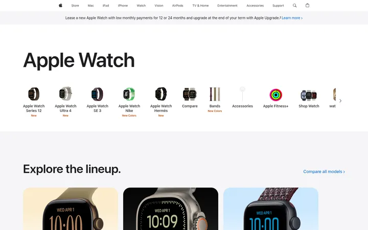
Global navigation
Compact Apple product navigation across the top, using muted or white labels over a dark background and restrained iconography.
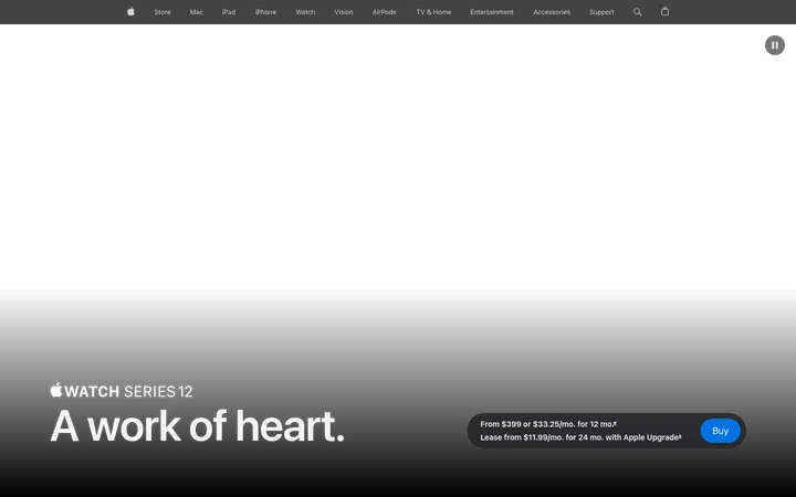
Purchase button
Blue #0071e3 pill with white text; Buy appears as the main hero action, with purchase information set beneath it.
Highlights carousel
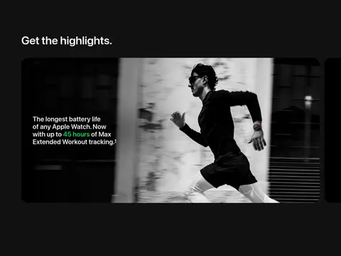
Full-bleed feature media with concise overlay copy; carousel content presents the battery claim alongside running imagery.
Product explorer
Large watch render paired with a list of selectable feature labels and compact plus controls.
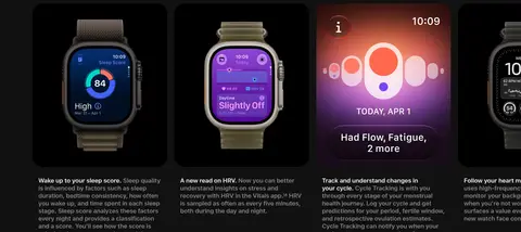
Feature cards
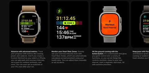
Dark image-led cards pair watch-screen visuals with brief explanatory text and compact headings.
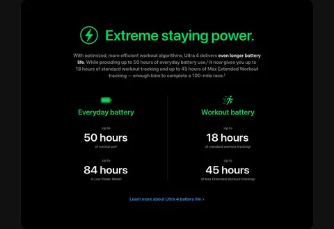
Battery metrics panel
A dark, rounded panel uses green headings and icons to organize everyday and workout battery figures.
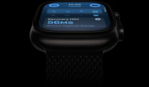
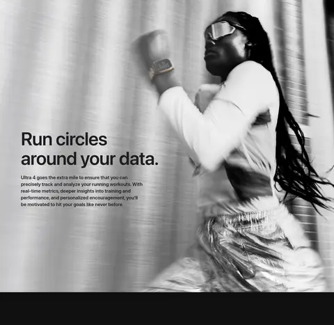
Imagery · Use large, high-detail product renders and video as the primary visual material, especially isolated watches against black. Pair these with cinematic, often monochrome running photography and close crops of the hardware or watch display. Keep color in imagery intentional: screen UI and green sensor glow can provide vivid accents, but should read as part of the product, not as a page-wide illustration style.
Use black and charcoal as the page's dominant surfaces.
Make product imagery large, dramatic, and central to the narrative.
Keep headings bright and supporting text visibly muted.
Reserve blue for purchase actions and purposeful links.
Use green for health and performance emphasis.
Alternate immersive scenes with concise feature explanations.
✕ 不该做
Do not introduce decorative colors across large page areas.
Do not add heavy shadows or ornamental borders.
Do not shrink product renders into generic thumbnail grids.
Do not make every section follow the same alignment or composition.
Do not use green as a general-purpose background color.
Do not crowd long-form feature sections with dense copy.
给 AI 的提示词
想快速出一个同风格的新页面,把这段话连同 DESIGN.md 一起发给 AI。
Build a new Apple-style product page with a cinematic, dark editorial feel. Use Night Canvas (#000000) as the primary canvas and Charcoal Band (#111111) for selected section bands. Set major headings in bright Soft Silver (#f5f5f7), supporting copy in Quiet Graphite (#86868b), and reserve Purchase Blue (#0071e3) for primary actions. Use Vital Green (#00d959) only to mark health or performance content. Pair SF Pro Display-style headlines with SF Pro Text-style interface and body copy. Organize the page as spacious feature chapters: alternate full-bleed product imagery, centered introductions, split editorial layouts, and compact metrics or cards. Keep the watch or product render as the visual focus. Favor clean surfaces and pill-shaped controls over shadows, borders, or ornamental decoration.