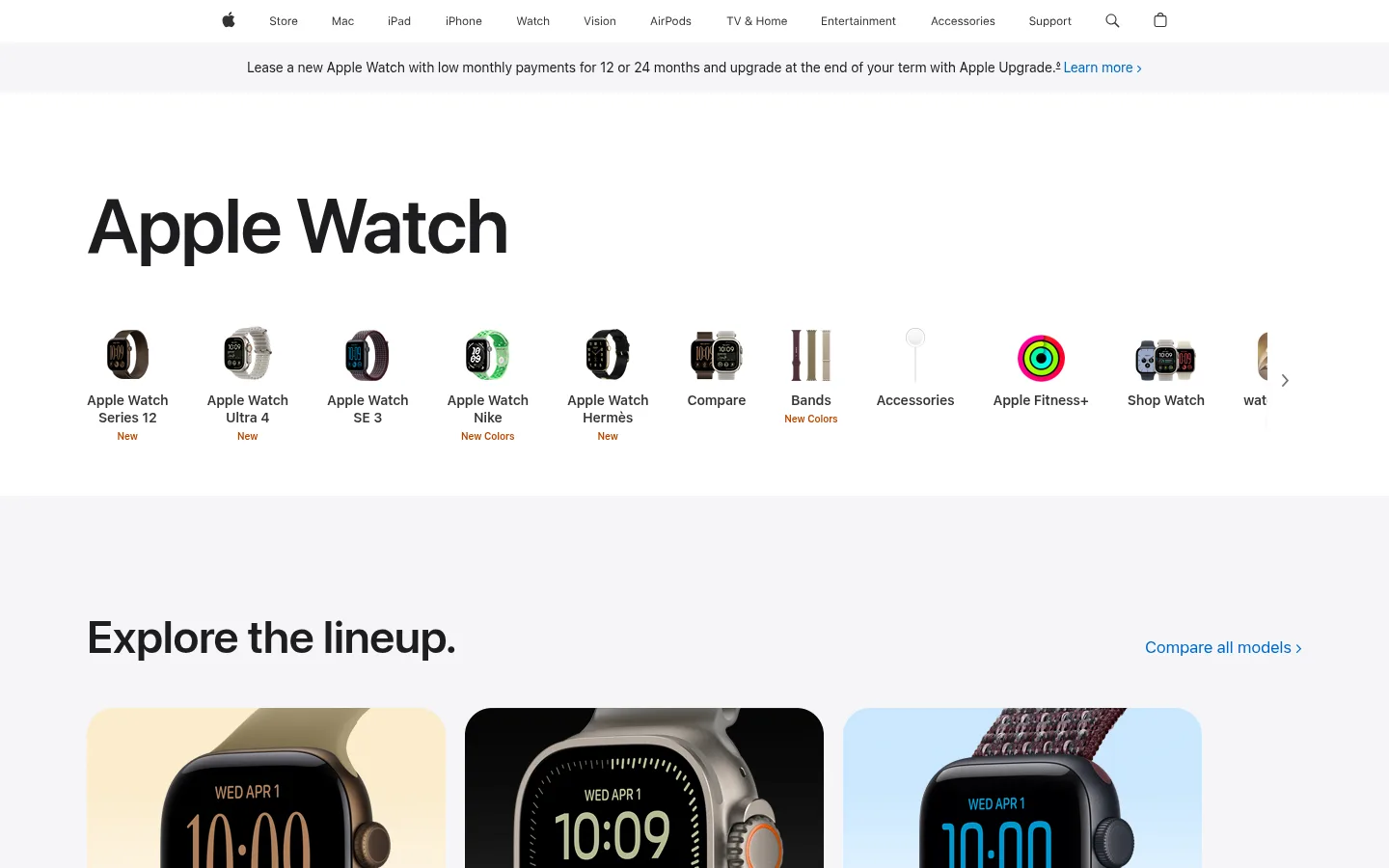
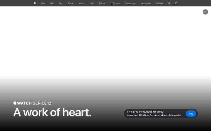
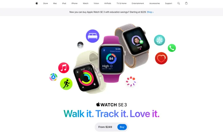
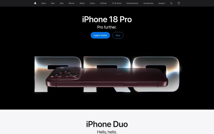
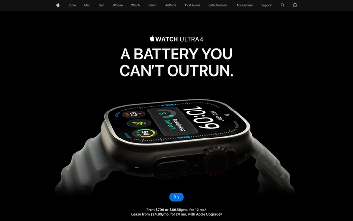
Apple Watch 商品集合页以克制的编辑式排版搭配产品主导的视觉,引导用户比较型号并进入购买流程。白色与浅灰色区块交替呈现产品阵容、购物服务、配件、生态功能和页尾导航。
North star · Keep the interface quiet and spacious so crisp product imagery and concise model choices carry the page.
The page uses a quiet neutral canvas, moving between white and pale cool gray bands to separate content without heavy dividers. Near-black headings provide strong contrast, while Apple blue is reserved for links and primary actions. SF Pro Display shapes large, compact headlines; SF Pro Text carries navigation, descriptions, and product details with restrained sizing and tracking. Product photography does most of the expressive work: isolated watch models and large lifestyle or detail images bring color, material, and screen content into the otherwise neutral interface. The layout is broad and editorial, with a centered content measure, generous section breaks, and left-aligned headings. Product models sit in a three-column comparison row, while service cards and ecosystem content use wider horizontal compositions. Rounded image and card corners soften the geometry. Borders are subtle, and elevation is minimal, keeping attention on products, concise copy, and clear shopping links.
配色
点色块复制色值。用途说明来自对页面的实测位置(背景、文字、描边、按钮)与截图判读。
品牌色
强调色
表层色
中性色
功能色
页面底色 · Gallery Mist表层 · Studio White主文字 · Apple Ink次要文字 · Soft Graphite弱文字 · Muted Charcoal描边 · Quiet Divider强调 · Action Blue
Navigation, body copy, links, product descriptions, and fine print.
Aa 设计
SF Pro Display
网络字体 · 字重 600 · 占比 5%
免费替代:Inter
Large display headlines and section headings.
角色
示例
字号
字重
行高
字距
特大标题
Oversized page or campaign headline when a section needs a strong opening.
Apple
80px
600
1.05
-0.015em
一级标题
Primary page title and prominent section headline.
Apple
48px
600
1.08
-0.003em
二级标题
Section titles such as lineup and shopping-benefit headings.
Apple
32px
600
1.13
0.004em
三级标题
Product names and smaller feature-section headings.
Apple
28px
600
1.14
0.007em
正文
Product summaries, service descriptions, and explanatory copy.
The quick brown fox 敏捷的狐狸
17px
400
1.47
-0.022em
辅助文字
Compact labels, model notes, and fine-print details.
The quick brown fox 敏捷的狐狸
12px
400
1.33
-0.01em
导航
Global navigation and product-category navigation labels.
The quick brown fox 敏捷的狐狸
12px
400
1.33
-0.01em
链接
Inline actions and comparison or shopping links.
The quick brown fox 敏捷的狐狸
14px
400
1.29
-0.016em
间距与布局
基准单位 4px · 密度:宽松
144px版块间距
20px元素间距
—卡片内边距
980px内容最大宽度
3px
4px
5px
8px
9px
10px
11px
12px
14px
20px
21px
28px
32px
34px
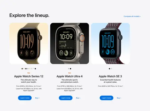
A spacious, mostly centered page with a measured content width around 980px and left-aligned section headings. The opening product-category rail spans horizontally, followed by a three-column model comparison and a wider row of shopping cards. White and pale-gray bands establish section boundaries. Large vertical pauses separate major topics, while compact product details and footer navigation create denser areas near the end.
圆角与层次
按钮 · 9999px
卡片 · 28px
md · button
The page is predominantly flat, using background bands rather than pronounced shadows to define sections. Product and benefit cards sit on clean surfaces with rounded corners; thin neutral borders provide occasional separation. Keep layering restrained, with only a subtle button shadow where needed and no dramatic floating panels.
组件
下面的预览按实测的按钮、输入框、徽标、卡片样式重建(字体用替代字体)。
Global navigation
A slim white top bar with compact dark labels, centered navigation, and small utility icons.
Announcement strip
A light-gray horizontal notice beneath navigation, using compact copy and a blue inline link.
Product category rail
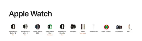
A horizontal row of small product images and centered labels, with concise new-item notes and a next control.
Model comparison cards
Three watch models in a row, each combining a large product image, brief model details, blue pill-shaped Learn more action, and a secondary purchase link.
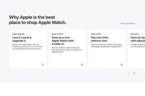
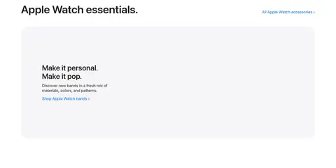
Shopping benefit cards
A horizontally arranged set of white cards on a pale-gray band, with compact headings, short explanatory copy, and simple circular affordances.
Feature accordion
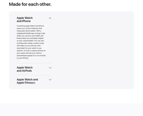
A broad, softly rounded light-gray panel with stacked ecosystem topics; one item expands to show descriptive copy.
Footer link directory
A dense multi-column navigation and legal area, separated with subtle rules and set in small, muted type.
Imagery · Use crisp product photography as the primary visual language: watches appear isolated for model comparison, while larger accessory and ecosystem panels support feature storytelling. Preserve realistic materials, finishes, and screen details; let product colors provide contrast against neutral backgrounds. Avoid illustration-led decoration or heavy filters. Images feel carefully cropped and placed within soft rounded containers.
Keep primary headings large, dark, and left aligned.
Let product photography carry the visual color.
Use blue for key actions and useful links.
Keep product comparisons concise and scannable.
Preserve generous gaps between major sections.
✕ 不该做
Do not add decorative gradients or saturated background panels.
Do not crowd product images with extra ornament.
Do not use heavy shadows to separate ordinary cards.
Do not turn every link into a filled button.
Do not center every heading or paragraph.
Do not introduce colors absent from the measured palette.
给 AI 的提示词
想快速出一个同风格的新页面,把这段话连同 DESIGN.md 一起发给 AI。
Build a new product page in Apple’s restrained Apple Watch style. Use Gallery Mist (#f5f5f7) and Studio White (#ffffff) as alternating section surfaces, with Apple Ink (#1d1d1f) for headings and primary copy. Reserve Action Blue (#0071e3) for primary actions and important links; use Soft Graphite (#6c6c6c) for supporting text and Quiet Divider (#cececf) for hairlines. Use SF Pro-like sans typography: compact navigation and readable body text, paired with bold, tightly tracked display headings. Keep a broad centered content measure, left-aligned section titles, generous vertical separation, and orderly product grids. Make realistic product photography the visual focus, placed in softly rounded frames. Prefer flat surfaces and subtle borders over shadows. Keep interactions clear, concise, and easy to scan.