North star · Keep the interface quiet and spacious so product imagery and a few precise colour accents carry the story.
The page uses white as its dominant canvas, with soft light-gray bands separating product exploration from long-form storytelling. Near-black headings provide crisp contrast, while muted gray supports utility copy and restrained blue marks purchase actions and links. Green and multicolour gradients are used selectively for feature messaging and watch-related visuals rather than as broad interface fills. SF Pro Display gives headlines a compact, assertive presence; SF Pro Text keeps navigation, captions, and controls readable and understated. The centered opening hero lets product imagery and a colourful campaign headline command attention, then transitions into left-aligned feature stories, horizontal card rails, and image-led sections. Generous vertical gaps keep the unusually long page calm and scannable. Rounded panels and pill-shaped buttons soften the otherwise precise, minimal interface; depth comes chiefly from imagery rather than borders or shadows.
Navigation, body copy, captions, buttons, and links.
Aa 设计
SF Pro Display
网络字体 · 字重 600 · 占比 42%
免费替代:Inter
Large hero and section headings.
角色
示例
字号
字重
行高
字距
特大标题
Oversized campaign headline in the product hero.
Apple
96px
600
1.04
-0.015em
一级标题
Primary product or major section headline.
Apple
64px
600
1.06
-0.009em
二级标题
Large feature-story and editorial section headings.
Apple
56px
600
1.07
-0.005em
三级标题
Subsection headings within feature narratives.
Apple
48px
600
1
-0.003em
四级标题
Compact feature-card and story titles.
Apple
28px
600
1.14
0.007em
正文
Prominent supporting copy and linked feature text.
The quick brown fox 敏捷的狐狸
17px
600
1.24
-0.022em
辅助文字
Descriptions, footnotes, and secondary explanatory copy.
The quick brown fox 敏捷的狐狸
14px
400
1.43
-0.016em
按钮
Compact purchase controls and small action labels.
The quick brown fox 敏捷的狐狸
12px
400
1.33
-0.01em
导航
Global navigation and product-navigation labels.
The quick brown fox 敏捷的狐狸
12px
400
1
-0.01em
链接
Inline calls to action and feature links.
The quick brown fox 敏捷的狐狸
17px
600
1.24
-0.022em
间距与布局
基准单位 2px · 密度:宽松
160px版块间距
20px元素间距
—卡片内边距
1260px内容最大宽度
2px
3px
4px
8px
10px
14px
15px
16px
18px
19px
20px
22px
24px
28px
30px
32px
The measured page max width is 1260px, with a spacious density and a large 160px section gap. The opening hero is centered, while subsequent editorial headings and feature content generally align left. Full-width imagery and color bands punctuate a sequence of single-column stories, card rails, and multi-column feature areas. Keep text blocks short beside large product visuals and allow substantial breathing room between story groups. The page’s long scroll is organized as distinct visual chapters rather than a dense catalogue.
圆角与层次
按钮 · 50%
卡片 · 28px
inset · other
The interface is predominantly flat, relying on white space, subtle background shifts, and imagery rather than visible outlines or drop shadows. Rounded light-gray cards provide separation without heavy borders. Buttons use pill silhouettes; product imagery and coloured section bands create the main sense of depth and layering.
组件
下面的预览按实测的按钮、输入框、徽标、卡片样式重建(字体用替代字体)。
Global navigation
A slim, centered Apple navigation row with small SF Pro Text labels and simple utility icons.
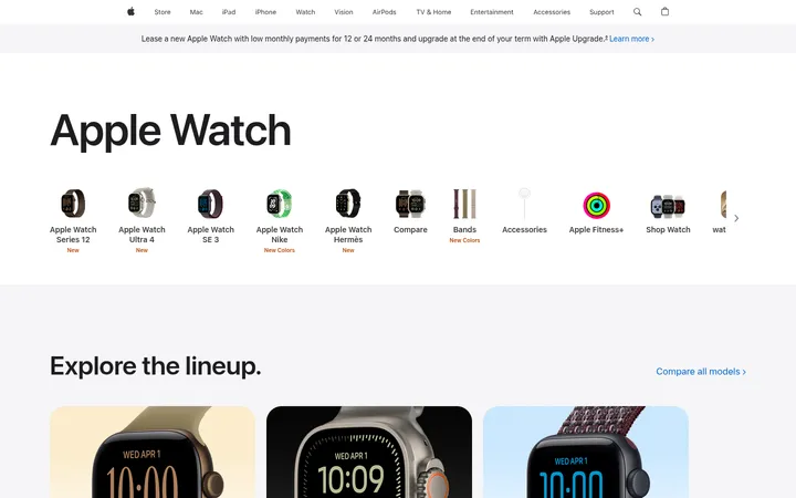
Announcement strip
A narrow pale-gray message band below the global navigation, with centered copy and a blue inline link.
Product hero
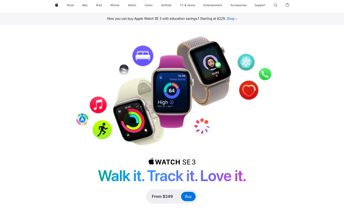
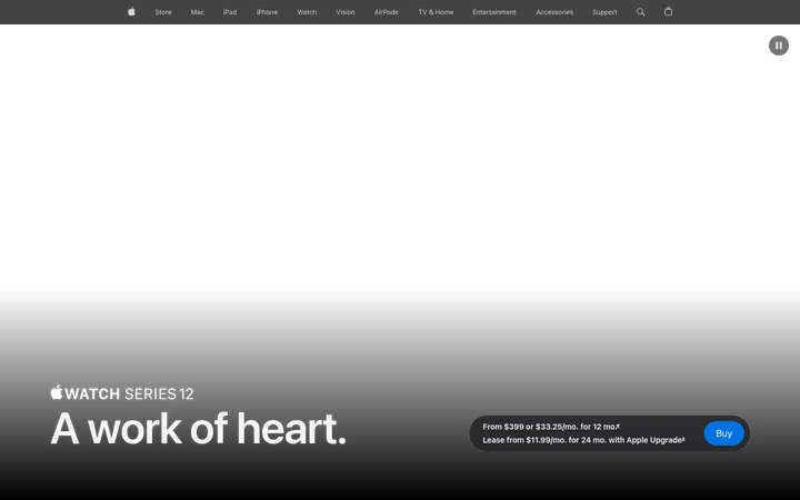
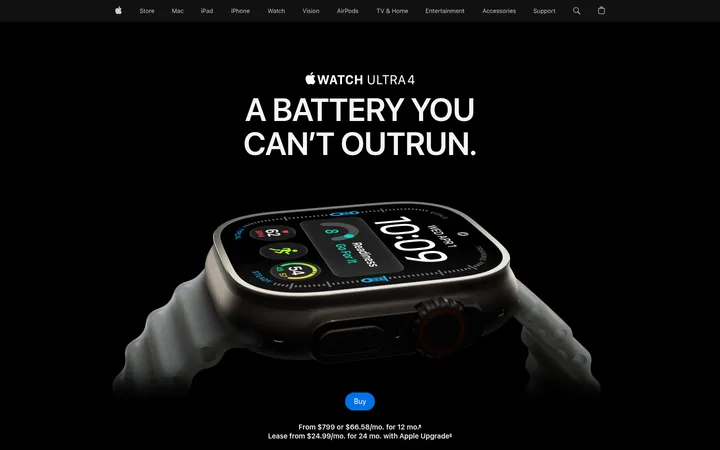
Centered product imagery, a large gradient campaign headline, concise price information, and a blue pill-shaped Buy action.
Feature carousel
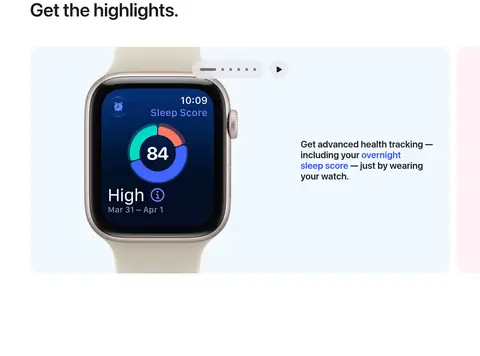
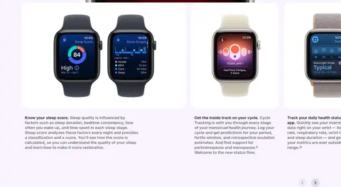
Wide rounded feature panels pairing watch imagery with concise explanatory text and small carousel controls.
Product explorer
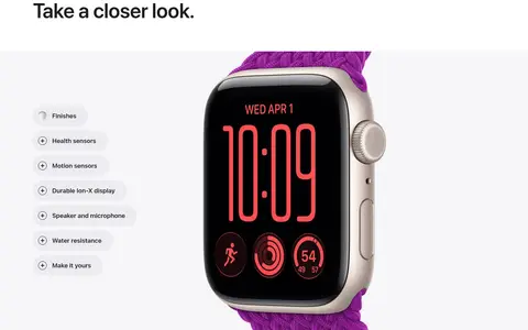
A pale-gray, image-led product area with finish and feature selectors beside a large watch render.
Story cards
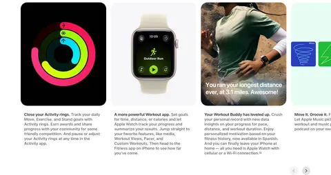
Rounded visual cards with short titles and supporting copy, arranged in horizontal feature rails.
Editorial feature section
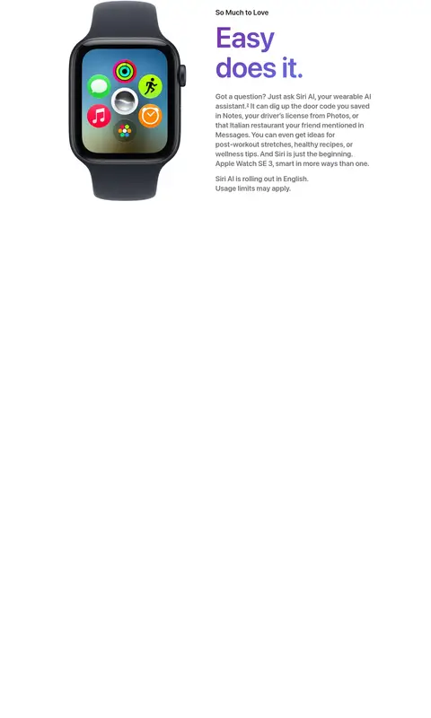
A spacious narrative block pairing prominent colored headlines and copy with large watch or lifestyle imagery.
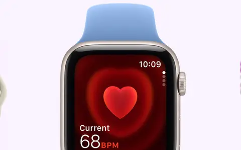
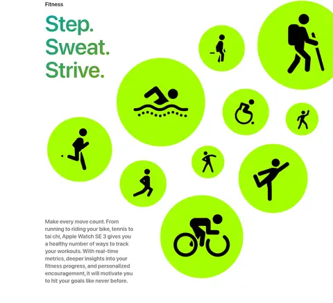
Imagery · Large, polished product renders and close-up watch photography lead the page, often set against clean white or pale tinted backgrounds. Feature cards combine watch-face visuals, interface screens, and lifestyle photography. The hero groups several watch finishes with floating, colourful app and feature symbols. Bright fitness graphics and gradient headlines appear as campaign artwork; preserve them as image-led accents rather than turning the entire UI into illustration.
Use white as the default canvas and reserve pale gray for distinct content zones.
Keep primary text near-black and secondary copy muted.
Use blue for purchase actions and functional links.
Give product imagery generous space and visual priority.
Break long product stories into clearly separated chapters.
Use gradients as selective campaign or feature accents.
Prefer pill buttons and softly rounded image panels.
✕ 不该做
Do not fill large interface areas with saturated accent colors.
Do not crowd product images with dense explanatory text.
Do not use heavy borders or prominent drop shadows.
Do not make every section a uniform card grid.
Do not treat illustration-only palette colours as core UI colours.
Do not use all-caps display headings or decorative typefaces.
Do not compress the page’s vertical rhythm into a dense layout.
给 AI 的提示词
想快速出一个同风格的新页面,把这段话连同 DESIGN.md 一起发给 AI。
Build a new Apple-style product page with a calm, long-form editorial rhythm. Use Gallery White (#ffffff) for the main canvas, Cloud Gray (#f5f5f7) for selected panels, Apple Ink (#1d1d1f) for headings, and Soft Graphite (#6e6e73) for supporting copy. Reserve Action Blue (#0071e3) for purchase actions and Link Blue (#0066cc) for inline links. Set large headlines in a tight, semibold display style and utility text in a clean sans serif. Lead with centered, generous product imagery, then alternate spacious feature stories, rounded visual cards, and occasional full-width tinted sections. Use gradients and vivid colours as restrained campaign artwork, not as default surfaces. Keep the layout precise, lightly layered, and free of heavy borders or shadows.