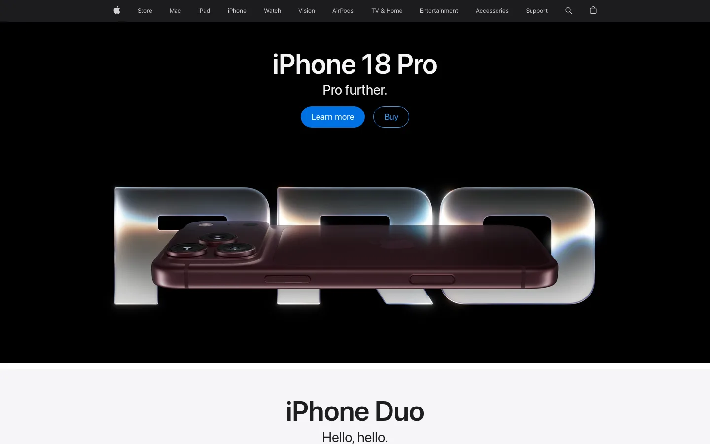
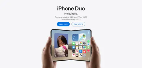
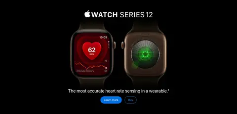
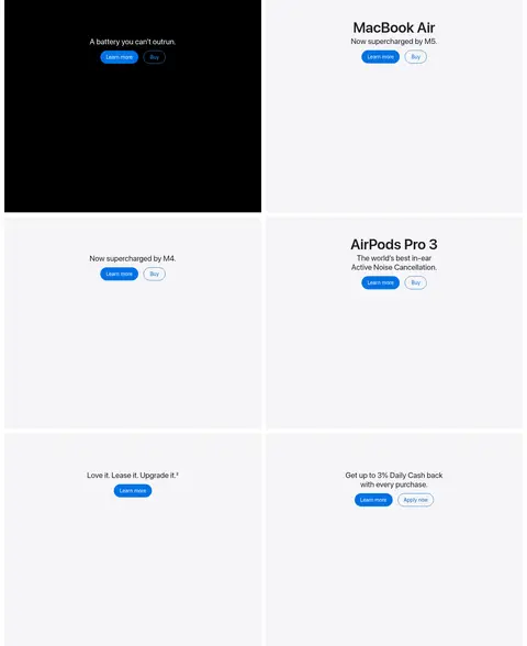
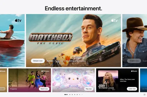
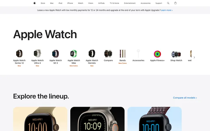
Apple 首页以交替呈现的产品主视觉为核心,并搭配克制的导航栏和内容丰富的娱乐媒体画廊。清晰的字体与鲜明影像承担主要表达,浅色中性面板和蓝色操作按钮则让浏览与购物路径一目了然。
North star · Keep the interface quiet and spacious so each product’s media, headline, and single clear blue action lead the experience.
The page uses a restrained palette of pure white, near-black, and soft cool gray, with saturated Apple blue reserved for primary actions and links. Large centered product headlines sit above concise supporting copy and paired pill-shaped actions. SF Pro Display lends the main product titles a crisp, confident presence; SF Pro Text handles navigation, body copy, and compact utility details. Full-width hero bands alternate black and pale gray, letting product imagery dominate without decorative framing. Below, a two-column product grid and entertainment gallery create a more varied rhythm, while the footer shifts to a dense, subdued information layout. Generous open space around each hero keeps attention on the featured device. Product photography, rendered device visuals, and video supply nearly all expressive color, so the interface itself stays deliberately quiet.
Navigation, body copy, buttons, captions, and most interface text.
Aa 设计
SF Pro Display
网络字体 · 字重 400 / 600 / 700 · 占比 17%
免费替代:Inter
Large display headlines and prominent product titles.
角色
示例
字号
字重
行高
字距
特大标题
Oversized headline for the leading product hero.
Apple
56px
600
1.07
-0.005em
一级标题
Primary title in prominent product and campaign bands.
Apple
40px
600
1.1
0
二级标题
Section headings, including the entertainment gallery title.
Apple
34px
600
1.47
-0.011em
三级标题
Product tile titles and secondary feature headings.
Apple
28px
400
1.14
0.007em
四级标题
Supporting headings in lower-page content and footer groups.
The quick brown fox 敏捷的狐狸
25.5px
600
1.47
-0.015em
正文
Compact product descriptions and short supporting statements.
The quick brown fox 敏捷的狐狸
14px
600
1.29
-0.016em
辅助文字
Footnotes, media labels, and small legal details.
The quick brown fox 敏捷的狐狸
12px
400
1.33
-0.01em
按钮
Learn more, Buy, and media action labels.
The quick brown fox 敏捷的狐狸
14px
400
1.29
-0.016em
导航
Top-level product navigation and compact menu labels.
The quick brown fox 敏捷的狐狸
12px
400
1.33
-0.01em
间距与布局
基准单位 2px · 密度:适中
56px版块间距
14px元素间距
28px卡片内边距
980px内容最大宽度
4px
5px
8px
9px
10px
11px
12px
15px
17px
18px
19px
20px
21px
40px
48px
A slim, full-width global navigation sits above vertically stacked, full-bleed campaign bands. Hero copy is centered and grouped near the top, with large product media below; black and pale-gray sections alternate to create a clear scroll rhythm. Later content shifts into a two-column product grid and an entertainment gallery, then a multi-column footer. The measured content max width is 980px, while major product bands extend across the viewport. Comfortable spacing leaves generous negative space around each featured device.
圆角与层次
按钮 · 9999px
图片 · 8px
lg · media
The design is predominantly flat: full-width color fields and media carry hierarchy instead of layered card chrome. Hairline separators are most apparent in the footer. Buttons rely on pill silhouettes and color contrast, not shadows; measured media can have a soft black shadow, but it is not a defining page-wide effect.
组件
下面的预览按实测的按钮、输入框、徽标、卡片样式重建(字体用替代字体)。
Global navigation
Compact, single-row product navigation over a dark translucent-looking strip, with small labels and utility icons.
Product hero
Full-width black or pale-gray band with centered headline and short copy above large device media.
Primary action
Filled #0071e3 pill button with white SF Pro Text label; used for Learn more.
Secondary action
Outlined Buy pill with #0066cc text and border, visually quieter than the filled primary action.
Product tile grid
Two-column run of spacious product panels, mixing black and #f5f5f7 backgrounds with centered copy and actions.
Entertainment gallery
Centered section heading above a horizontal, image-led selection of colorful show and service artwork.
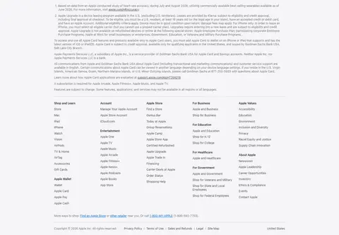
Footer directory
Dense multi-column link lists on #f5f5f7, with small muted text and subtle horizontal rules.
Imagery · Large, polished product photography and rendered device visuals anchor the hero bands, with video used in the upper sequence. Product images are centered, often shown at a dramatic scale against untextured black or light gray. The entertainment area uses a horizontal gallery of colorful show artwork, creating the page’s strongest color contrast. Media edges remain clean rather than enclosed in decorative cards.
Use full-width, calm color bands for major product stories.
Center hero headlines and action groups above product media.
Reserve filled blue for the primary action.
Use outlined blue pills for secondary purchase actions.
Let product imagery provide most of the page’s color.
Keep footer information compact, organized, and muted.
✕ 不该做
Do not add decorative gradients to ordinary interface surfaces.
Do not crowd the hero with extra copy or controls.
Do not frame every product image in a bordered card.
Do not use saturated colors for body text or large surfaces.
Do not replace the clean product bands with dense dashboard layouts.
Do not make secondary actions visually stronger than the primary action.
给 AI 的提示词
想快速出一个同风格的新页面,把这段话连同 DESIGN.md 一起发给 AI。
Build a polished consumer-electronics homepage with Apple’s restrained product-first visual language. Use Gallery White (#ffffff), Stage Black (#000000), and Cloud Gray (#f5f5f7) as broad, alternating surfaces; keep Apple Ink (#1d1d1f) text crisp and readable. Apply Action Blue (#0071e3) to filled primary pill buttons and Link Blue (#0066cc) to outlined purchase actions and secondary links. Use SF Pro-like sans-serif typography, centered hero copy, concise subheads, and generous open space around large product photography. Create full-width campaign bands, a spacious two-column product grid, an image-led entertainment gallery, and a compact multi-column footer. Keep borders and shadows subtle. Prioritize strong media framing, clear hierarchy, and a quiet interface over decorative effects.