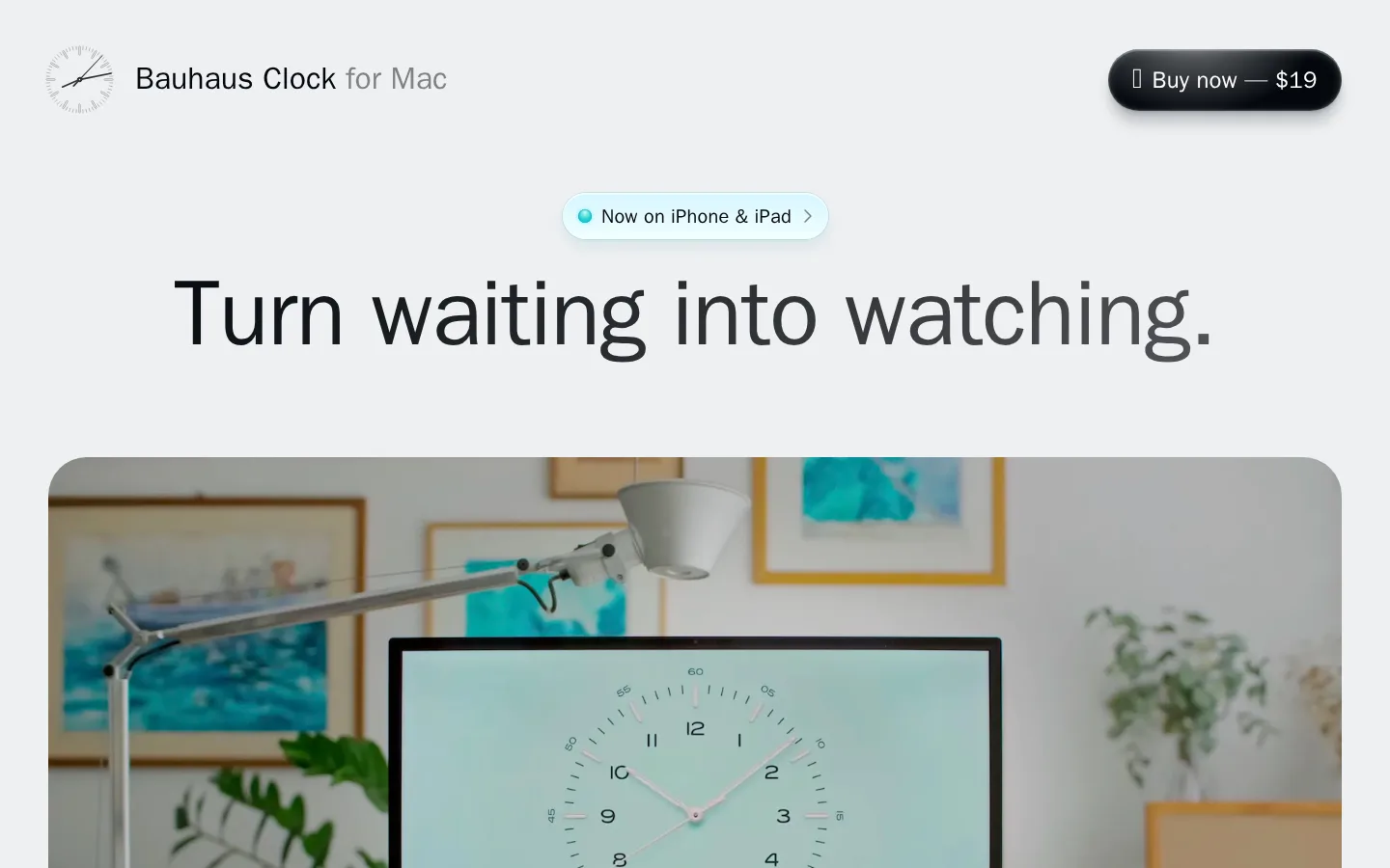
North star · Keep the interface quiet and spacious so the clock imagery and precise typography do the persuading.
The visual strategy is quiet and product-first: a cool gray canvas (#eef0f2) holds most of the page, letting large, near-black headlines and cinematic clock imagery take precedence. White marks a distinct comparison band, while pale aqua surfaces and a small green accent signal app availability and selected product details rather than becoming a competing palette. System sans-serif typography stays clean and familiar; the hero headline is large, centered, and tightly tracked, with lighter supporting copy and compact caption-like labels. The header places a small clock identity at left and a dark pill-shaped purchase link at right. Broad, centered content bands alternate with expansive media and testimonial groupings, leaving generous breathing room between them. Rounded media and cards soften the geometric Bauhaus influence. Keep shadows subtle and reserve visible contrast for text, product media, and the purchase control.
Site-wide system sans-serif for headlines, body copy, labels, and links.
角色
示例
字号
字重
行高
字距
特大标题
Oversized hero headline and other prominent page statements.
Bauhaus Clock
60px
600
1.07
-0.017em
一级标题
Primary section heading or main product heading.
Bauhaus Clock
40px
600
1.1
-0.005em
二级标题
Secondary section headings, including centered feature titles.
Bauhaus Clock
32px
400
1.2
0.006em
正文
Supporting product descriptions and explanatory copy.
The quick brown fox 敏捷的狐狸
18px
400
1.5
0
辅助文字
Compact labels, app announcement text, and small supporting details.
The quick brown fox 敏捷的狐狸
16px
400
1.2
0.02em
间距与布局
基准单位 2px · 密度:适中
50px版块间距
15px元素间距
30px卡片内边距
1340px内容最大宽度
2px
3px
4px
5px
8px
10px
12px
15px
20px
22px
25px
30px
50px
75px
Use a centered single-column hero within a wide page frame, followed by broad media and content bands. The measured maximum page width is 1340px; preserve generous outer margins and pronounced vertical gaps between sections. Most headings are centered, while the testimonial and product-display areas can expand into multi-column groupings. The page feels comfortable rather than dense: keep copy short, media visually dominant, and controls separated from surrounding text.
圆角与层次
卡片 · 30px
图片 · 50%
链接 · 9999px
md · other
hairline · other
hairline · other
inset · card
The interface is mostly flat, relying on tonal section changes and large media rather than heavy shadows. Cards use generously rounded corners, with a subtle measured hairline available for separation. The purchase control and app announcement may sit slightly above the canvas; keep their shadowing soft and restrained.
组件
下面的预览按实测的按钮、输入框、徽标、卡片样式重建(字体用替代字体)。
Header
Compact horizontal identity row with a small clock mark and product name at left, plus a dark pill purchase link at right.
App announcement
Centered pale aqua pill with a small status dot, concise iPhone and iPad copy, and a right-facing chevron.
Hero statement
Large, centered near-black sans-serif headline with tight tracking and ample clear space before the main media.
Lifestyle media
Wide rounded video or image showing the clock screensaver in a real-world setting; use it as the dominant visual proof.
Dial showcase
Centered section heading above a gallery of clock-face styles and color options, with product visuals carrying the detail.
Testimonial cards
White, generously rounded review cards on the pale canvas, using restrained borders and concise attribution.
Purchase callout
Centered closing pitch that emphasizes lifetime ownership and updates, paired with a clear buy action.
Imagery · Lead with large, rounded lifestyle video or photography showing the clock on a real screen in a calm interior. Keep the image natural and slightly softened by ambient light; the screenshot’s muted room tones and aqua clock face are product imagery, not the brand palette. Later sections use dial variations, product visuals, press marks, and testimonial media. Avoid decorative illustrations that compete with the clock.
Set prominent headings in centered near-black sans-serif.
Give product media generous space and rounded framing.
Use aqua accents selectively for app and product details.
Keep the header simple, with identity left and purchase action right.
Separate sections with generous vertical breathing room.
✕ 不该做
Do not turn the aqua accents into full-page color blocks.
Do not use a dense dashboard grid or crowded navigation.
Do not add saturated colors absent from the measured palette.
Do not let testimonial cards overpower product imagery.
Do not apply heavy shadows to every surface.
Do not use all-caps display typography or loose headline tracking.
给 AI 的提示词
想快速出一个同风格的新页面,把这段话连同 DESIGN.md 一起发给 AI。
Build a new product page in the Bauhaus Clock visual style. Use Gallery Mist (#eef0f2) as the broad canvas, Midnight Ink (#04080d) for typography, and Clean Porcelain (#ffffff) for occasional cards or a distinct section band. Reserve Lagoon Glass (#a1e5e4) and Frosted Aqua (#d5efef) for small announcements and product accents; Dial Green (#00753e) should remain rare. Use a clean system sans-serif, with large tightly tracked centered headlines and plain, readable supporting copy. Compose a restrained header with identity on the left and a dark pill action on the right. Organize content as spacious centered bands with large rounded lifestyle media, product-focused galleries, and simple review cards. Favor flat surfaces and subtle hairlines over strong shadows. Keep the overall interface calm, premium, and product-led.