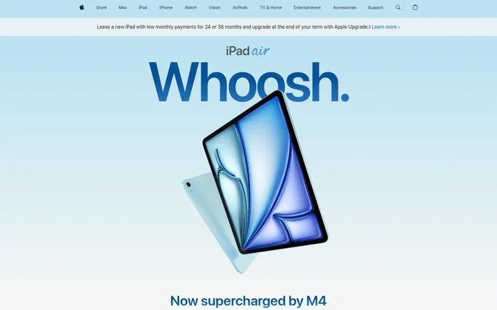
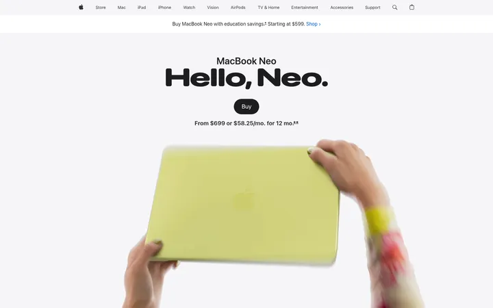
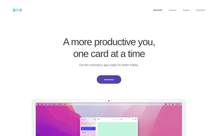
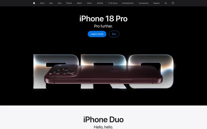
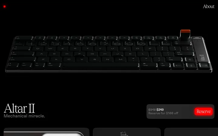
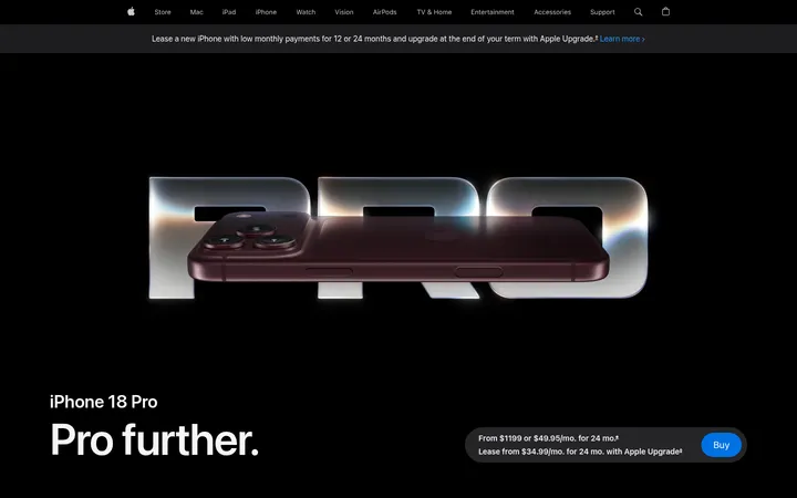
North star · Keep the interface visually quiet so large, carefully framed product imagery and concise type do the convincing.
The page uses a quiet neutral canvas so the foldable device and its vivid screen imagery carry the visual weight. Gallery White (#ffffff) dominates, while Soft Mist (#f5f5f7) marks occasional feature bands and card surfaces. Ink (#1d1d1f) gives headings and navigation crisp contrast; muted gray supports secondary copy, and Apple Blue is reserved for the pricing CTA and links. Typography pairs SF Pro Display for confident, tightly tracked headlines with SF Pro Text for readable supporting information and controls. The layout alternates centered product statements, wide media, and editorial feature arrangements, with generous vertical breathing room and occasional horizontal carousels. Product photography and video are presented at large scale against uncluttered backgrounds; screen content supplies most of the saturated color. Cards and controls stay simple, with rounded forms and very restrained hairline elevation rather than decorative shadows.
配色
点色块复制色值。用途说明来自对页面的实测位置(背景、文字、描边、按钮)与截图判读。
强调色
表层色
中性色
功能色
页面底色 · Gallery White表层 · Soft Mist主文字 · Apple Ink次要文字 · Quiet Graphite描边 · Apple Ink强调 · Apple Blue强调 2 · Link Blue
Body copy, navigation, captions, links, and buttons.
角色
示例
字号
字重
行高
字距
特大标题
Oversized campaign headline, such as “Hello, hello.”
Apple
80px
600
1.05
-0.015em
一级标题
Primary product and major feature headlines.
Apple
48px
600
1.08
-0.003em
二级标题
Section titles and prominent feature statements.
Apple
40px
600
1
0
三级标题
Feature-card headings and secondary section titles.
Apple
28px
600
1.14
0.007em
四级标题
Compact feature labels and supporting headings.
The quick brown fox 敏捷的狐狸
24px
600
1.33
0.009em
正文
Main explanatory paragraphs and product descriptions.
The quick brown fox 敏捷的狐狸
17px
400
1.24
-0.022em
辅助文字
Small product notes, dates, and image annotations.
The quick brown fox 敏捷的狐狸
14px
400
1.29
-0.016em
按钮
Purchase CTA labels and interactive controls.
The quick brown fox 敏捷的狐狸
17px
500
1.47
-0.022em
导航
Global navigation and compact utility labels.
The quick brown fox 敏捷的狐狸
12px
400
1
-0.01em
链接
Inline Learn more and supporting navigation links.
The quick brown fox 敏捷的狐狸
14px
600
1.29
-0.016em
间距与布局
基准单位 4px · 密度:宽松
128px版块间距
20px元素间距
32px卡片内边距
1260px内容最大宽度
2px
4px
6px
7px
8px
10px
12px
14px
15px
16px
20px
24px
32px
48px
80px
90px
Use a centered content frame with a measured page maximum of 1260px, while allowing product media and feature bands to extend broadly. The page alternates centered hero statements, split editorial content, and image-led feature sections; the highlights area uses a multi-column horizontal carousel. Keep alignment intentional: centered for launch messaging, left-aligned for editorial sections. The measured spacing system is spacious, with a 128px section rhythm, 20px element gaps, and 32px card padding.
圆角与层次
按钮 · 9999px
卡片 · 28px
导航 · 20px
hairline · nav
hairline · button
inset · other
Favor flat surfaces and clear whitespace over layered cards or deep shadows. Separate occasional cards with Soft Mist backgrounds and rounded corners; use thin, understated hairlines for navigation and controls. The visible purchase CTA is a bright blue pill, while other controls remain quiet and visually subordinate.
组件
下面的预览按实测的按钮、输入框、徽标、卡片样式重建(字体用替代字体)。
Global navigation
Compact horizontal Apple navigation with dark labels on a light background, restrained spacing, and subtle hairline separation.
Announcement strip
Centered lease-and-upgrade message on a pale neutral band, ending with a Link Blue text link.
Hero pricing pill
Rounded floating purchase panel combines concise pricing copy with a prominent Apple Blue View pricing button.
Highlights carousel
Soft Mist section with a left-aligned heading, film link, and wide rounded media cards arranged as a horizontal carousel.
Feature card
Large image-led card on a pale surface, with concise dark copy and generous vertical padding.
Interactive product selector
Compact list of device views with plus controls beside a large product render; selected states stay restrained.
Feature gallery
Wide rounded image or video panels with small pagination or category controls and minimal surrounding chrome.
Imagery · Use large, polished product photography and cinematic video as the primary visual content. Show the device at realistic scale and in multiple folded, open, and standing positions, with screen imagery providing color and human context. Keep image framing clean and let device edges remain distinct against white or pale-gray surroundings. Avoid decorative illustration; the page's visual variety comes from product renders, interface screens, and lifestyle footage.
Reserve Soft Mist for distinct feature bands and cards.
Use Apple Blue for the main purchase action.
Pair oversized display headlines with concise supporting copy.
Give product photography broad, uncluttered space.
Use rounded cards and controls sparingly.
Keep secondary copy visually quieter than headlines.
✕ 不该做
Do not add decorative gradients or bright accent colors.
Do not crowd product imagery with extra interface elements.
Do not use heavy shadows to create depth.
Do not turn every section into a card.
Do not use oversized body copy in place of headings.
Do not make navigation or utility controls visually dominant.
给 AI 的提示词
想快速出一个同风格的新页面,把这段话连同 DESIGN.md 一起发给 AI。
Build a new product page in Apple's restrained editorial launch style. Use Gallery White (#ffffff) as the main canvas, Soft Mist (#f5f5f7) for occasional section bands and cards, and Apple Ink (#1d1d1f) for headings and primary copy. Set supporting text in Quiet Graphite (#6e6e73); reserve Apple Blue (#0071e3) and Link Blue (#0066cc) for actions and links. Use SF Pro Display-style headlines and SF Pro Text-style body copy, with concise text and clear hierarchy. Center the main product statement, then alternate spacious feature layouts, wide product media, and editorial copy. Let high-quality product photography and video dominate, with screen content providing color. Use rounded controls, subtle hairlines, and minimal elevation. Keep the page calm, precise, and image-led.