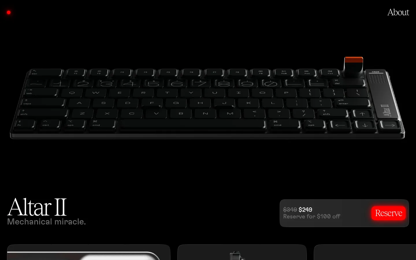
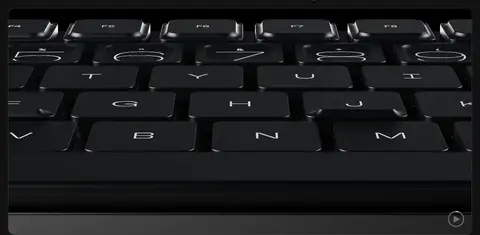
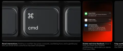
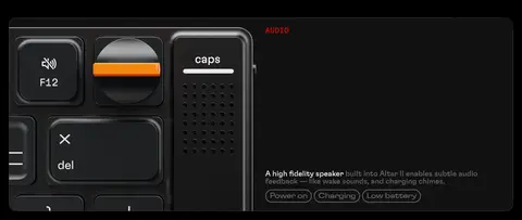
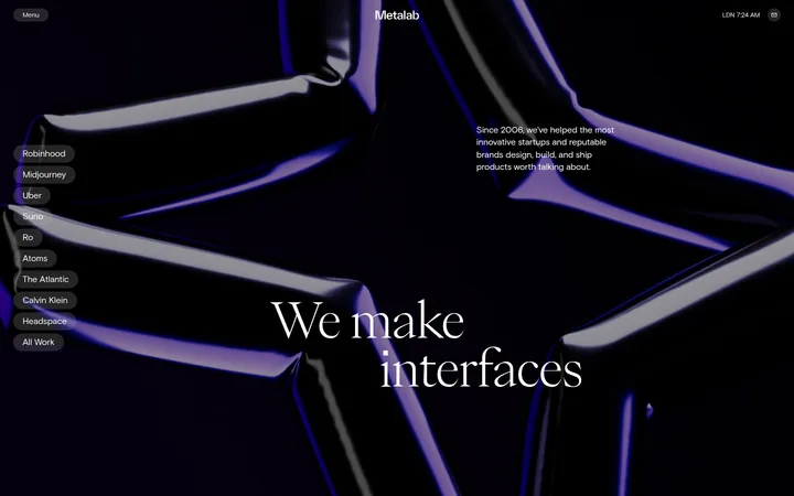
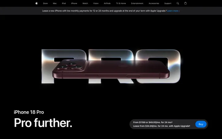
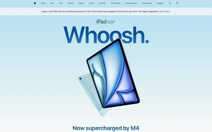
这是一款电影感十足的深色产品发布页,以大幅产品影像和精简文案突出 Altar II 超薄机械键盘。编辑式大字排版、近黑色分区与克制的红色点缀,共同塑造高端、强调工程感的视觉形象。
North star · Let near-black space and high-fidelity product imagery lead; use typography and red only to direct attention.
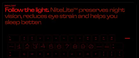
The page treats black as the primary canvas, letting detailed keyboard photography and product renders carry most of the visual weight. Pure black hero and showcase areas alternate with subtly lighter charcoal bands, while white text provides the main contrast and muted gray handles supporting copy, borders, and secondary links. Bright red is reserved for small category labels, the glowing nav indicator, and the hero reservation action; deeper red appears sparingly in text and backlight-related content. Typography pairs Tobias-Web’s high-contrast serif display moments with GT Flexa’s rounded sans-serif headlines and GT Flexa Text’s readable supporting copy. Broad, full-bleed media and asymmetric text placements keep the page cinematic; comparison cards and feature galleries create more structured pauses. Spacing feels generous around major narratives, but image-led card rows remain information-dense. Rounded media frames and pill controls soften the otherwise flat, technical presentation.
配色
点色块复制色值。用途说明来自对页面的实测位置(背景、文字、描边、按钮)与截图判读。
品牌色
强调色
表层色
中性色
功能色
页面底色 · Carbon表层 · Void Black表层 2 · Soft Black主文字 · Studio White次要文字 · Machine Gray描边 · Machine Gray强调 · Signal Red强调 2 · Ember Red
Main reading text, captions, and supporting links.
Aa 设计
GT Flexa
网络字体 · 字重 400 / 500 · 占比 20%
免费替代:Manrope
Sans-serif feature headings, buttons, product labels, and compact navigation UI.
Aa 设计
GT Flexa Mono
网络字体 · 字重 300 · 占比 8%
免费替代:IBM Plex Mono
Technical labels and uppercase code-like details.
Aa 设计
Tobias-Web
网络字体 · 字重 300 · 占比 1%
免费替代:Cormorant Garamond
Oversized display titles and editorial navigation or reservation links.
角色
示例
字号
字重
行高
字距
特大标题
Oversized serif product title and centerpiece editorial display.
Electronic Materials Office
200px
300
0.9
-0.08em
一级标题
Hero product heading and other high-impact serif statements.
Electronic Materials Office
83px
300
0.8
-0.072em
二级标题
Large sans-serif narrative headlines for feature sections.
Electronic Materials Office
65px
400
0.98
-0.062em
三级标题
Feature and comparison headlines with compact, assertive styling.
Electronic Materials Office
64px
400
1
-0.1em
四级标题
Secondary feature headings and supporting section titles.
Electronic Materials Office
51px
400
0.95
-0.059em
正文
Main product descriptions and feature explanations.
The quick brown fox 敏捷的狐狸
21px
400
1
0
辅助文字
Compact image captions, technical labels, and card details.
The quick brown fox 敏捷的狐狸
12.5px
500
1
0
按钮
Reservation and power controls.
The quick brown fox 敏捷的狐狸
21px
400
normal
-0.04em
导航
Serif About navigation and prominent editorial links.
Electronic Materials Office
31px
300
1.2
-0.04em
链接
Large supporting links such as the reveal trailer.
Electronic Materials Office
30px
400
1.2
0
代码
Uppercase technical annotations and monospace micro-labels.
const style = 1;
21px
300
1.2
0
间距与布局
基准单位 8px · 密度:适中
48px版块间距
24px元素间距
—卡片内边距
1392px内容最大宽度
6px
8px
10px
12px
24px
48px
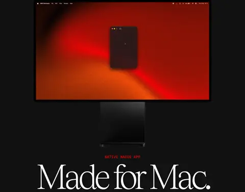
The page uses a wide, centered desktop composition with a measured maximum width of 1392px. A spacious, two-column hero pairs the keyboard image with title and purchase information, then gives way to full-bleed media, text-led feature introductions, and horizontally arranged image cards. Section backgrounds alternate mainly between black and charcoal to mark narrative chapters without adding heavy dividers. Headings are often left-aligned, with a centered macOS display as a deliberate variation. Comfortable spacing supports the cinematic pacing, while feature galleries and comparison cards create denser, scan-friendly stretches.
圆角与层次
按钮 · 50%
图片 · 20px
导航 · 50%
lg · nav
The interface is mostly flat, with dark canvas areas and subtle charcoal cards providing separation. Media frames and cards use softly rounded corners, while technical comparisons stay understated. The key exception is the small red nav indicator and glowing reservation action, which add a localized halo; avoid broad, heavy shadows or decorative layering.
组件
下面的预览按实测的按钮、输入框、徽标、卡片样式重建(字体用替代字体)。
Hero purchase panel
Pair the serif Altar II title and muted subtitle with compact pricing information and a bright red Reserve action.
About navigation
Keep the serif About link quiet at the upper right; a small glowing red indicator anchors the opposite corner.
Feature media frame
Show a large product render or video in a dark frame with a measured 20px media radius and minimal chrome.
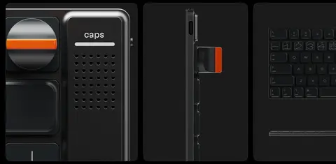
Feature gallery cards
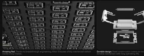
Arrange product-detail images in a horizontal row, with compact caption copy beneath or alongside each card.
Comparison cards
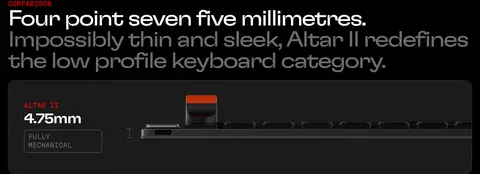
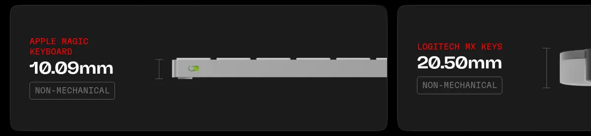
Use charcoal cards to compare keyboard dimensions and mechanical status, with small red labels and white measurements.
Power control
Use restrained pill-shaped power buttons with muted gray text and a 2px gray outline.
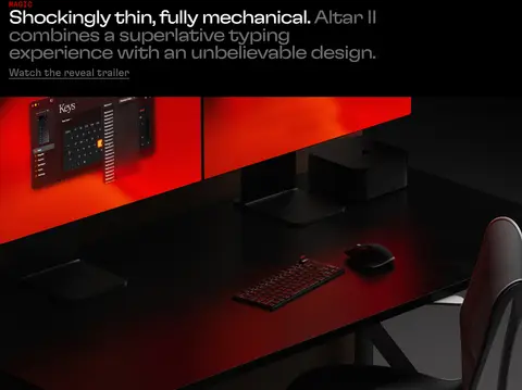
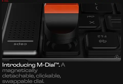
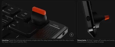
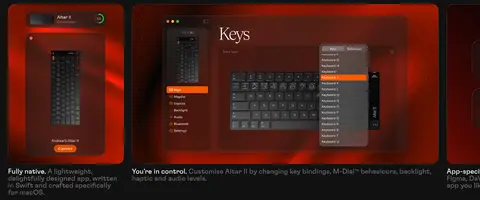
Imagery · High-fidelity renders and close-up product photography dominate: keyboards, switches, the magnetic dial, and interface screenshots. Large images often span the available content width, with detail crops and shallow dark surroundings emphasizing materials and thin profiles. Video-like showcase frames recur within the feature story. Keep product imagery crisp and controlled; vivid red and orange are most prominent within illuminated product or software visuals, not as broad page backgrounds.
Use pure black for the main canvas and full-bleed product moments.
Alternate black and charcoal bands to distinguish story chapters.
Reserve Signal Red for small, high-value attention cues.
Use crisp product renders and tightly framed hardware details.
Pair large serif display moments with rounded sans-serif features.
Keep technical labels compact, uppercase, and visually secondary.
✕ 不该做
Do not turn red into a large general-purpose section background.
Do not add bright, colourful UI chrome around product imagery.
Do not crowd the hero title and purchase action with extra copy.
Do not use heavy shadows across every card or section.
Do not make supporting text as prominent as the feature headline.
Do not replace cinematic imagery with generic illustrations.
给 AI 的提示词
想快速出一个同风格的新页面,把这段话连同 DESIGN.md 一起发给 AI。
Build a new premium hardware product page in the Electronic Materials Office style. Use Void Black (#000000) as the primary canvas, alternating with Soft Black (#111111) and Carbon (#1b1b1b) for quiet section and card separation. Set primary copy in Studio White (#ffffff), supporting text and outlines in Machine Gray (#6d6d6d), and reserve Signal Red (#ff0000) and Ember Red (#871200) for small labels, indicators, or a key action. Combine an editorial high-contrast serif display face with rounded sans-serif headlines and readable supporting text. Lead with a spacious product hero, then build a deliberate sequence of large hardware visuals, concise feature chapters, and structured comparison cards. Keep product imagery crisp, use restrained rounded frames, and let negative space establish the cinematic rhythm. Avoid decorative gradients, loud backgrounds, and unnecessary interface chrome.