浅色主题AIAI photo and video apps homepage极简编辑式排版黑白配色产品展示留白原网页 prisma-ai.com ↗ · 2026-10-12 采集 · 1440×900 桌面端
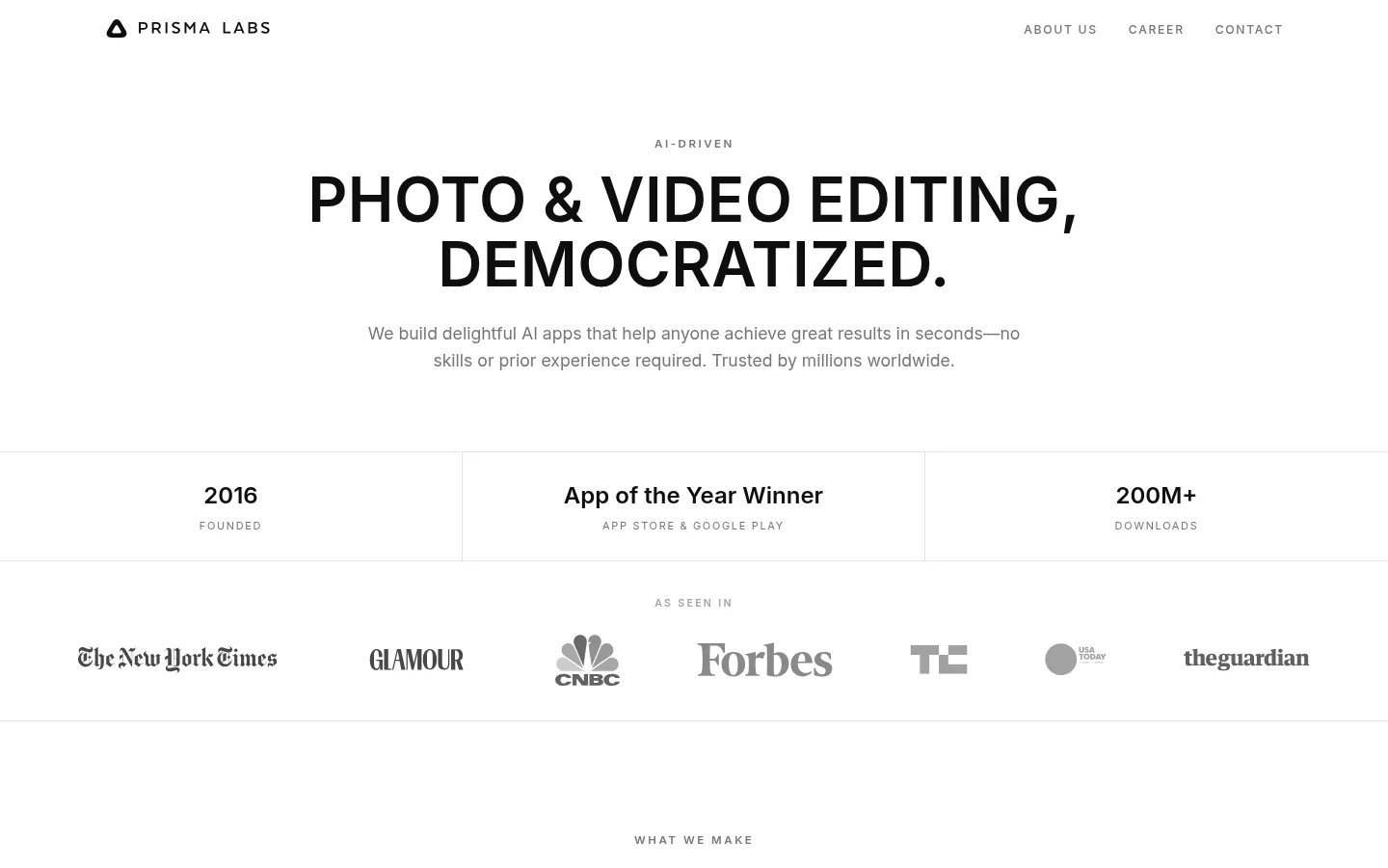
Prisma Labs 以克制的黑白页面和醒目的大写标题展示 AI 编辑应用,并用充足留白营造简洁感。产品界面承担主要色彩表达,细分隔线、灰色文字和深色团队区块共同组织页面节奏。
North star · Keep the interface nearly monochrome and spacious, letting bold uppercase type and vivid app screens carry the visual emphasis.
The visual strategy is intentionally restrained: a white canvas carries nearly the entire page, with near-black reserved for headline text, inverse buttons, and one full-width team section. Mid and light grays soften supporting copy, publication marks, and small metadata; a fine pale border separates statistics, press logos, and footer content. Inter is used throughout, combining large, tightly led uppercase headlines with small, widely tracked uppercase eyebrows and button labels. The centered hero and proof points give way to a two-column app showcase, where colorful phone screens become the dominant imagery against an otherwise quiet interface. Sections are broad and uncluttered, with fine horizontal rules and open space establishing rhythm instead of cards or shadows. Pill-shaped CTAs are the main rounded element. The footer returns to a white, compact multi-column arrangement with subdued text.
All page text, from display headlines and body copy to navigation, metadata, and CTAs.
角色
示例
字号
字重
行高
字距
特大标题
Oversized uppercase statement headlines.
Prisma Labs
72px
600
1.04
0.01em
一级标题
Primary hero headline.
Prisma Labs
64px
600
1.04
0.005em
二级标题
Major section headings such as app and team titles.
Prisma Labs
48px
600
1.04
0.01em
三级标题
App names and secondary feature headings.
Prisma Labs
35px
600
1.04
0.03em
四级标题
Smaller content headings and statistic labels.
The quick brown fox 敏捷的狐狸
24px
600
1.6
0
正文
Explanatory copy beneath hero and app headings.
The quick brown fox 敏捷的狐狸
16.5px
400
1.6
0
辅助文字
Small metadata, press labels, and footer details.
The quick brown fox 敏捷的狐狸
13.5px
400
1.6
0
按钮
Compact uppercase pill-button labels.
The quick brown fox 敏捷的狐狸
12.5px
600
1.6
0.14em
导航
Header navigation and footer link labels.
The quick brown fox 敏捷的狐狸
13.5px
400
1.6
0
眉题
Small, tracked uppercase section kickers.
The quick brown fox 敏捷的狐狸
11px
400
1.6
0.16em
间距与布局
基准单位 2px · 密度:紧凑
36px版块间距
4px元素间距
—卡片内边距
1224px内容最大宽度
2px
3px
4px
5px
7px
8px
12px
13px
14px
16px
18px
22px
26px
28px
32px
36px
The page is centered on a measured 1224px maximum content width, with a compact overall density but generous open space around major blocks. The hero, stats, and press strip span broad horizontal bands; the app showcase uses two balanced columns, and the footer resolves into three columns. Headings and hero copy are centered, while product copy sits beneath each device image. Thin horizontal rules mark transitions. Maintain the measured section rhythm and avoid adding card-heavy structure.
圆角与层次
按钮 · 9999px
没有测到阴影:页面是扁平的,层次靠底色和描边区分。
The interface is predominantly flat, with no measured shadows or gradients. Use pale, thin borders to separate broad bands and column divisions instead of raised cards. Keep the pill CTAs sharply legible through solid contrast, and let the phone mockups provide their own visual depth without adding extra layered panels.
组件
下面的预览按实测的按钮、输入框、徽标、卡片样式重建(字体用替代字体)。
Header navigation
A restrained white header with the Prisma Labs mark at left and small muted uppercase links aligned to the right.
Hero statement
Centered, uppercase Inter headline with a small tracked eyebrow and a short muted paragraph beneath.
Proof-point strip
Three horizontally aligned metrics separated by fine borders, pairing bold figures or claim text with small uppercase labels.
Press logo row
A centered, muted publication strip introduced by a small uppercase label and divided from neighboring sections by a hairline.
App showcase
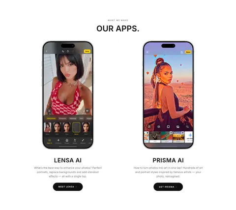
Two side-by-side product columns with colorful phone screens, uppercase app names, compact descriptions, and dark pill CTAs.
Team CTA
A full-width Carbon Ink section with centered white headline and copy, plus a white capsule button with dark text.
Footer
A white, compact three-column footer for address, company, social, and legal links, with muted text and fine separators.
Imagery · The app showcase uses portrait-oriented phone mockups displaying colorful editing interfaces and subjects; these screens supply nearly all strong color on the page. Keep the devices prominent and cleanly framed within their columns, with short app descriptions and CTAs below. Press logos appear as a subdued monochrome strip. The rest of the design relies on typography and whitespace rather than decorative illustration or background imagery.
Set major headlines in uppercase near-black Inter.
Use gray text for supporting copy and navigation.
Let product screenshots provide the strongest color.
Separate broad sections with pale hairlines.
Keep CTAs pill-shaped and high contrast.
✕ 不该做
Do not add gradients or decorative shadows.
Do not introduce unmeasured brand accent colors.
Do not enclose every content group in a card.
Do not make supporting text compete with the headlines.
Do not crowd the hero or product showcase.
Do not recolor the app screens to match the monochrome page.
给 AI 的提示词
想快速出一个同风格的新页面,把这段话连同 DESIGN.md 一起发给 AI。
Build a new Prisma Labs page using a restrained monochrome system. Use Gallery White (#ffffff) for the main canvas, Carbon Ink (#0e0e0e) for bold uppercase headings and primary actions, Quiet Gray (#767676) for navigation and supporting copy, and Soft Divider (#e4e4e2) for fine rules. Use Inter throughout; make display text bold, uppercase, and tightly led, with small tracked uppercase eyebrows and labels. Organize content in centered, broad sections with generous whitespace, balanced columns, and a compact multi-column footer. Use rounded capsule CTAs with strong foreground/background contrast. If product imagery is included, keep it vivid and let it supply the page’s color. Avoid shadows, gradients, extra accent colors, and unnecessary card containers.