North star · Use warm open space to clarify the story, deep green to anchor enterprise content, and spring green only to signal action.
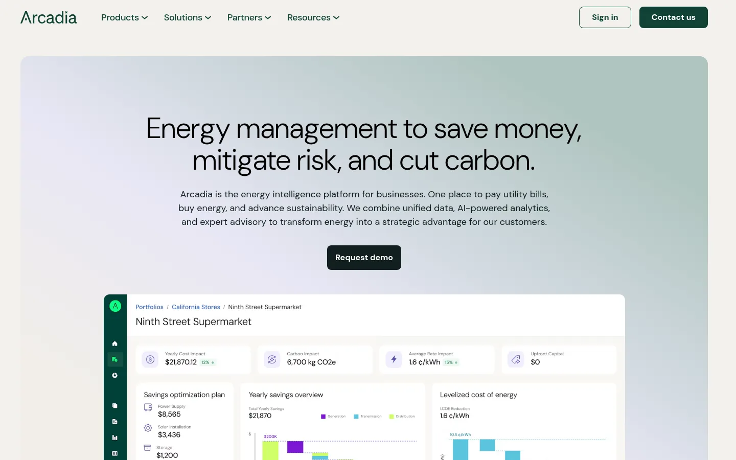
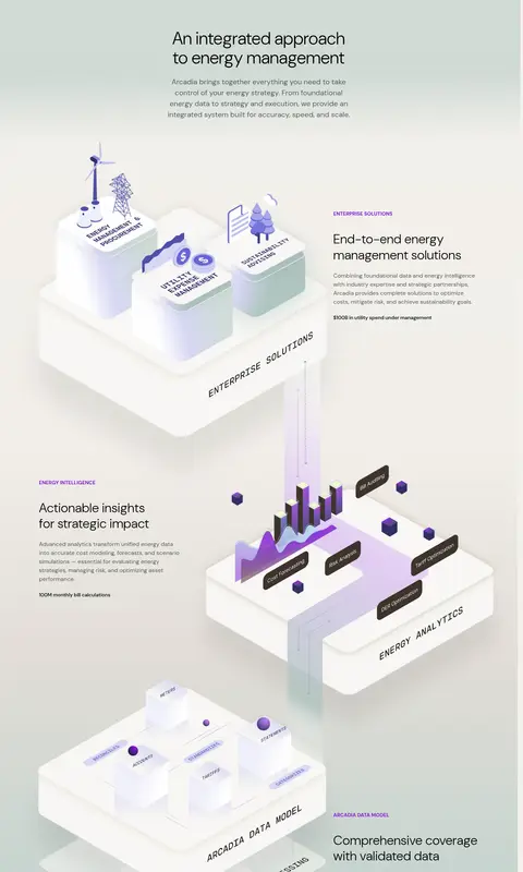
The visual system balances a warm, paper-like canvas (#f3f1ec) with deep evergreen surfaces, giving the page a calm enterprise character rather than a high-gloss tech aesthetic. DM Sans carries nearly all text: headlines are large, light, and open, while navigation and body copy stay compact and readable. The centered hero places its message over a pale, atmospheric gradient and a broad product dashboard, then transitions into a dark-green metrics band and a photo-led feature. Product areas use spacious, editorial compositions with detailed 3D data illustrations; purple appears sparingly within those visuals and select labels, not as a primary brand surface. Bright spring green is reserved for high-value actions and small highlights. Cards and controls use restrained rounded corners, while the footer reverses the palette into a dense, dark navigation field. Overall spacing is comfortable, with distinct section changes and clear hierarchy.
All page typography: display and section headlines, body copy, navigation, buttons, labels, and footer links.
角色
示例
字号
字重
行高
字距
特大标题
Large promotional or section-level display headlines.
Arcadia
56px
300
1.1
0.01em
一级标题
Primary hero headline.
Arcadia
48px
300
1.1
0.01em
二级标题
Major section headings and feature titles.
Arcadia
36px
300
1.2
0.01em
三级标题
Product cards and secondary feature headings.
The quick brown fox 敏捷的狐狸
24px
400
1.2
0.01em
正文
Hero descriptions, explanatory copy, and feature paragraphs.
The quick brown fox 敏捷的狐狸
18px
400
1.5
0
辅助文字
Compact supporting copy and card details.
The quick brown fox 敏捷的狐狸
16px
400
1.5
0
按钮
Primary and secondary action labels.
The quick brown fox 敏捷的狐狸
18px
500
1
-0.02em
导航
Header navigation and footer navigation links.
The quick brown fox 敏捷的狐狸
16px
400
1.5
0
眉题
Uppercase section labels and product-category markers.
The quick brown fox 敏捷的狐狸
14px
700
1
0.07em
间距与布局
基准单位 8px · 密度:适中
40px版块间距
24px元素间距
24px卡片内边距
—内容最大宽度
4px
8px
14px
16px
20px
24px
32px
40px
48px
58px
64px
88px
The page uses a broad, centered content frame with generous side margins and mostly left-aligned sections; the hero is centered and the footer expands into multiple link columns. Content alternates between full-width color bands, multi-column metrics or cards, and split text-and-image features. A comfortable spacing rhythm separates sections, while cards keep consistent internal padding. The long product story is editorial and vertically stacked rather than compressed into a dense dashboard grid. Keep the layout responsive, preserving clear hierarchy and breathing room.
圆角与层次
按钮 · 8px
输入框 · 2px
卡片 · 16px
图片 · 8px
没有测到阴影:页面是扁平的,层次靠底色和描边区分。
The page is mostly flat, with color bands and whitespace doing the work of separating content rather than heavy shadows. White cards sit cleanly on the warm canvas, with softly rounded corners; controls use restrained borders and modest radii. Product dashboards and 3D illustrations create depth through their own layering, not through a site-wide shadow system.
组件
下面的预览按实测的按钮、输入框、徽标、卡片样式重建(字体用替代字体)。
Primary CTA
Bright #0fff87 button with dark-green text, bold label, and rounded corners; used for demo and submit actions.
Header navigation
Compact horizontal header on the warm canvas, with evergreen links, dropdown indicators, outlined sign-in, and filled contact action.
Hero dashboard
Centered headline and supporting copy sit above a dark request-demo control and a large white product dashboard on a pale gradient.
Metrics band
Deep-green full-width section with a light heading and four horizontally arranged business metrics separated by fine green rules.
Feature cards
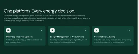
Three dark-green product cards with concise descriptions, compact icon tiles, and directional cues.
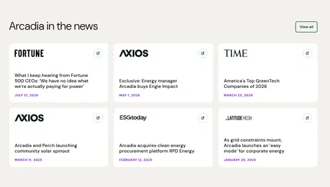
News cards
Six white editorial cards in a three-column layout, pairing publication identity with headline and small date text.
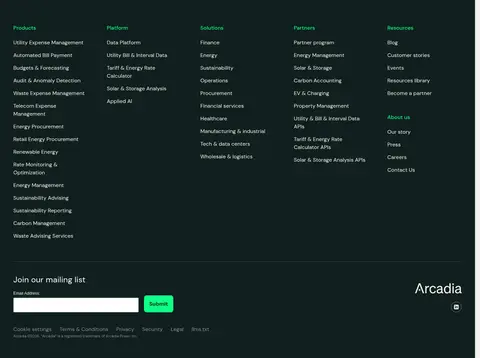
Footer
Dark inverse surface with grouped link columns, newsletter email field, green submit button, and subdued legal links.
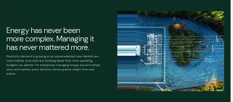
Imagery · The hero features a large product dashboard over a pale, softly blended gradient. A photographic energy-related image appears within a dark feature band, while the extended platform story uses layered 3D data and infrastructure illustrations with light materials and occasional violet details. News cards are mostly typographic, and the closing CTA uses a wide landscape photograph with a dark overlay for legibility.
Reserve deep green for major emphasis bands and the footer.
Keep large headlines light-weight and generously spaced.
Use spring green sparingly for clear, high-priority actions.
Make product imagery and data illustrations substantial and legible.
Separate content with whitespace and broad section transitions.
✕ 不该做
Do not make every section dark or high contrast.
Do not use violet as a dominant interface color.
Avoid dense, tightly packed copy and controls.
Avoid heavy shadows or ornamental borders.
Do not use loud gradients outside atmospheric backgrounds.
Do not let product mockups obscure page hierarchy.
给 AI 的提示词
想快速出一个同风格的新页面,把这段话连同 DESIGN.md 一起发给 AI。
Build a new Arcadia-style enterprise energy page with a calm, editorial SaaS feel. Use Pampus Canvas (#f3f1ec) as the main background, Night Evergreen (#101f1e) and Forest Depth (#0b2c24) for deliberate dark sections, and Spring Signal (#0fff87) only for primary actions. Set typography in DM Sans, using light, open display headlines and readable regular body text. Create a clear centered hero, then vary the page with metrics, split features, and spacious cards. Use pale gradients and substantial dashboard or layered data illustration imagery to explain the product; keep violet details confined to artwork or small labels. Prefer flat surfaces, restrained rounded corners, and comfortable whitespace. Ensure responsive layouts preserve the same strong contrast, hierarchy, and calm pacing.