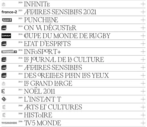
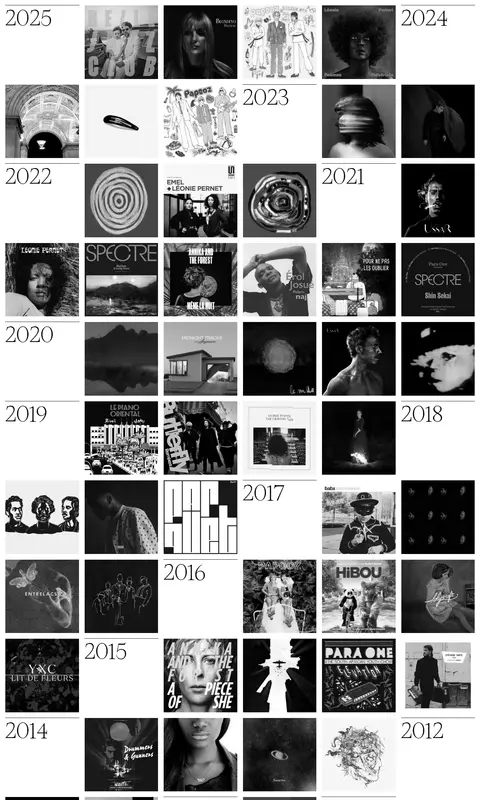
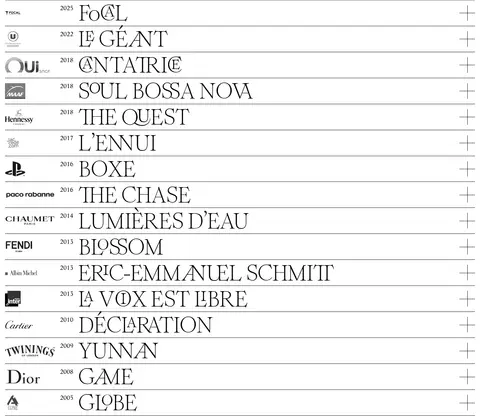
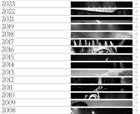
这是作曲家 Arthur Simonini 的作品集,以高反差衬线大字和黑白配色呈现影视、广告与音乐项目。细线分隔、按年份整理的档案,让页面像一本克制而有秩序的作品目录。
North star · Use black type, white space, oversized editorial serif lettering, and fine rules to make a structured archive feel like a printed score.
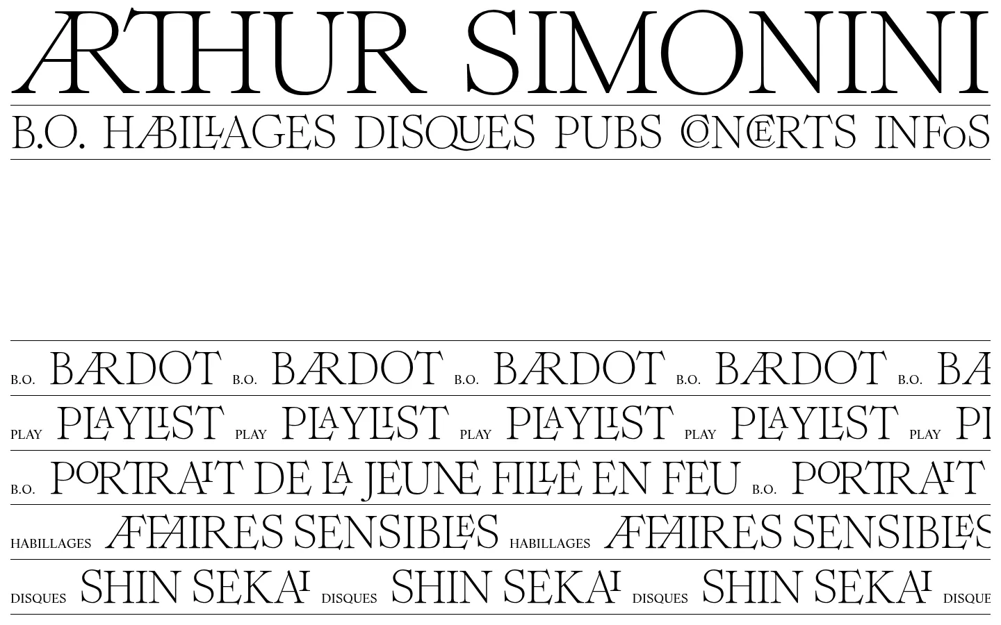
The page is built from only two measured colours: White Canvas (#ffffff) fills the page, while Black Ink (#000000) carries the typography, outlines, and rules. The result feels closer to a carefully typeset print catalogue than a conventional portfolio. Oversized, uppercase display lettering establishes the composer’s name and repeats in project labels; a quieter serif supports track names, credits, and other supporting copy. Thin black hairlines divide repeated rows and archive entries without adding card-like framing. The layout moves between a broad typographic opening, a compact list of audio selections, dense image grids, and long chronological lists. Photography and cover artwork supply tonal variety, but remain content within the black-and-white framework rather than defining a separate brand palette. Generous blank areas give the opening identity room to breathe, while dense archives use repetition and alignment to stay scannable.
配色
点色块复制色值。用途说明来自对页面的实测位置(背景、文字、描边、按钮)与截图判读。
品牌色
表层色
页面底色 · White Canvas表层 · Black Ink主文字 · Black Ink描边 · Black Ink
文字
背景
对比度
WCAG
#000000 Black Ink
#ffffff White Canvas
21:1
AAA
字体
字号阶梯:Custom(比例约 3.046,正文 18px)。示例用免费替代字体渲染,数值为实测。
Aa 设计
LifeLTStd-Roman
网络字体 · 字重 400 · 占比 94%
免费替代:Lora
Body copy and supporting text, including audio-track labels and secondary details.
Aa 设计
RomieLigatures-Regular
网络字体 · 字重 400 · 占比 6%
免费替代:Bodoni Moda
Display titles, uppercase navigation, project names, and prominent archive labels.
角色
示例
字号
字重
行高
字距
特大标题
Oversized uppercase identity lettering and repeated project marquees.
Arthur Simonini
167px
400
0.73
0
一级标题
Large uppercase section or project titles.
Arthur Simonini
65px
400
0.9
0
正文
Track names, dates, credits, and supporting copy.
The quick brown fox 敏捷的狐狸
18px
400
1.2
0
导航
Prominent uppercase navigation and portfolio categories.
Arthur Simonini
65px
400
0.9
0
间距与布局
基准单位 1px · 密度:适中
60px版块间距
15px元素间距
8px卡片内边距
1410px内容最大宽度
10px
15px
62px
The measured desktop maximum content width is 1410px. Content is primarily left-aligned, with a split identity header and a two-column film or advertising archive; other sections switch to a single-column list or image grid. The page alternates a spacious opening with tightly packed catalogues. A measured section gap of 60px sets the broad rhythm, while the repeated rows and media grids provide their own close internal cadence. Keep the presentation flat and let rules establish structure.
圆角与层次
没有测到阴影:页面是扁平的,层次靠底色和描边区分。
The interface is flat: measured shadows are absent and component radii are zero. Use fine black horizontal rules to separate typography-led rows and timeline entries; avoid elevated cards and ornamental layering. Image artwork is the principal source of visual depth, while the white canvas stays uninterrupted between sections.
组件
下面的预览按实测的按钮、输入框、徽标、卡片样式重建(字体用替代字体)。
Identity masthead
Large uppercase serif name above a compact, ruled row of category links; keep the identity typography prominent and the canvas white.
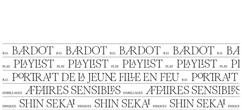
Scrolling project marquee
Repeat oversized uppercase project names in horizontal rows, paired with small category labels and thin black separators.
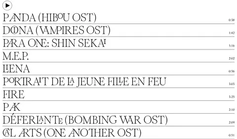
Audio track list
Single-column track titles in serif text, divided by fine rules, with short durations aligned to the far edge.
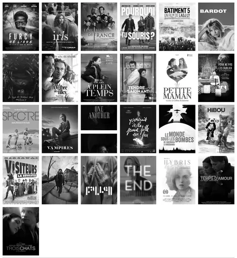
Poster gallery
A dense rectangular grid of film and television artwork; let each image retain its source composition and contrast.
Chronological credit list
Compact rows combine a client or channel mark, a small year, a large serif project title, and a right-aligned plus indicator.
Year-indexed archive
Mix prominent year labels with aligned cover-art thumbnails to make a long portfolio archive browseable.
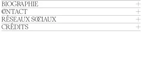
Expandable project row
Use a ruled, single-line title row with a plus affordance for long-form credits or project details.
Imagery · Use documentary-style project imagery, film posters, album artwork, and performance photographs. The screenshot shows mostly monochrome or subdued images, with varied original artwork retained in its own rectangular frame. Arrange covers in a dense, consistent grid, and use narrow horizontal crops for the performance archive. Avoid decorative 3D, gradients, or generic stock imagery.
Use only #000000 and #ffffff for the interface palette.
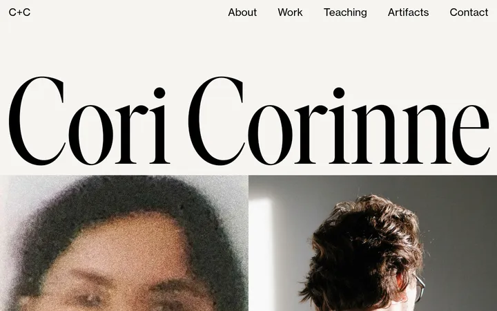
Set major identity and project labels in high-contrast serif typography.
Use uppercase display lettering for prominent titles and navigation.
Separate repeated list entries with thin black rules.
Keep archive artwork in clean rectangular grids.
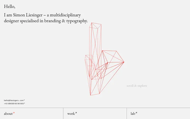
Use generous blank canvas around major identity moments.
✕ 不该做
Do not add unmeasured accent colours to interface elements.
Do not introduce gradients, shadows, or rounded cards.
Do not replace the editorial serif character with geometric sans-serif display type.
Do not place every project inside a boxed card.
Do not let image treatments overpower the monochrome page framework.
Do not make dense archives visually indistinguishable; preserve year and row alignment.
给 AI 的提示词
想快速出一个同风格的新页面,把这段话连同 DESIGN.md 一起发给 AI。
Build a new portfolio page in Arthur Simonini’s restrained editorial style. Use White Canvas (#ffffff) across the page and Black Ink (#000000) for type, links, and fine dividing rules; do not add interface accent colours. Pair an expressive high-contrast serif display face, similar to Bodoni Moda, with a readable serif body face such as Lora. Use oversized uppercase headings, compact supporting labels, and deliberately varied density: spacious identity areas, ruled single-column lists, and tightly aligned artwork grids. Keep everything flat, square-cornered, and free of shadows. Treat project images as the content, not as decoration, and preserve their rectangular framing. Make long archives scannable through consistent year, title, and action alignment. Favor generous white intervals between major blocks and fine hairlines within repeated rows.