North star · Let oversized, art-directed typography carry the identity, and use white space to make every mark feel deliberate.
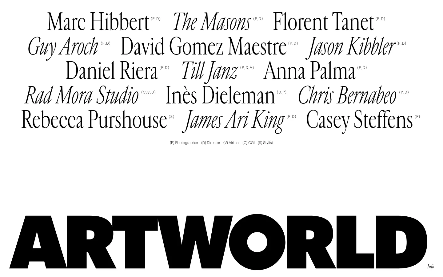
The page is built around a pure white canvas (#ffffff) and black typography (#000000), with no measured accent colours. The opening roster uses large, elegant serif names, mixing upright and italic treatments to create an editorial rhythm; small discipline markers and a tiny legend sit quietly beside them. Below, an enormous, heavy ARTWORLD wordmark anchors the viewport like a graphic object. The measured type system pairs Cardinal Fruit for display names with lighter Graphik Light for small utility text and an italic serif for body copy. Layout is intentionally sparse: names form loose, staggered rows, while broad white intervals separate the roster from the brand mark. The screenshot is primarily typography rather than photography or illustration. Keep the visual hierarchy driven by scale, contrast, type style and empty space, not by decorative colour, cards or effects.
配色
点色块复制色值。用途说明来自对页面的实测位置(背景、文字、描边、按钮)与截图判读。
品牌色
表层色
页面底色 · Gallery White主文字 · Ink Black
文字
背景
对比度
WCAG
#000000 Ink Black
#ffffff Gallery White
21:1
AAA
字体
字号阶梯:Custom(比例约 4.139,正文 18px)。示例用免费替代字体渲染,数值为实测。
Aa 设计
Graphik Light
网络字体 · 字重 300 · 占比 51%
免费替代:Inter
Small captions, discipline labels, and utility text.
Aa 设计
Cardinal Fruit
网络字体 · 字重 300 · 占比 28%
免费替代:Bodoni Moda
Large artist names and display typography.
Aa 设计
Cardinal Fruit Italic
网络字体 · 字重 300 · 占比 21%
免费替代:Bodoni Moda
Italic emphasis within the artist roster and expressive display text.
Aa 设计
Cardinal Classic Italic
网络字体 · 字重 300 · 占比 1%
免费替代:Cormorant Garamond
Measured body-copy style; the page screenshot mainly shows small supporting text.
角色
示例
字号
字重
行高
字距
特大标题
Oversized artist names form the main roster and editorial focal point.
Artworld
74.5px
300
1
-0.01em
正文
Supporting copy or artist-related text in an italic serif style.
The quick brown fox 敏捷的狐狸
18px
300
normal
-0.011em
辅助文字
Small discipline abbreviations and the roster’s explanatory legend.
The quick brown fox 敏捷的狐狸
12px
300
normal
0
间距与布局
基准单位 2px · 密度:适中
90px版块间距
—元素间距
—卡片内边距
—内容最大宽度
20px
29px
30px
90px
The viewport presents a broad, loose roster of artist names across staggered rows, followed by a small centered discipline legend and a large vertical interval. The oversized ARTWORLD wordmark spans nearly the full lower viewport, aligned close to the page edges. The composition feels open rather than card-based; preserve the irregular rhythm and generous white areas. Measurements do not establish a grid or maximum content width, so match the screenshot’s visual alignment rather than imposing a rigid column system.
圆角与层次
没有测到阴影:页面是扁平的,层次靠底色和描边区分。
The measured system reports no shadows, gradients, or component borders. Keep the page flat and unlayered: contrast comes from black lettering against white canvas, while spacing separates content. Avoid cards, panels, outlines, or floating surfaces that would interrupt the open editorial composition.
组件
下面的预览按实测的按钮、输入框、徽标、卡片样式重建(字体用替代字体)。
Artist name roster
Large black serif names in loose, staggered rows; vary upright and italic cuts to reproduce the expressive editorial rhythm.
Discipline markers
Tiny parenthetical abbreviations sit beside artist names, using subdued scale so they do not compete with the names.
Roster legend
A small centered caption explains the discipline abbreviations beneath the names.
ARTWORLD wordmark
A massive, bold black uppercase wordmark anchors the bottom of the viewport against uninterrupted white.
Info label
A tiny italic 'Info' label appears near the lower-right edge beside the large wordmark.
Imagery · The supplied first viewport and full-page overview are typographic: artist names and the ARTWORLD wordmark provide the visual content. No photography, illustration, or 3D imagery defines this view. Preserve the restrained presentation by treating text as the artwork; if imagery appears elsewhere, avoid inventing a treatment based on this screenshot alone.
该做与不该做
✓ 该做
Use only measured black and white for the defining interface palette.
Make artist names the first visual focus.
Mix serif italics and roman forms for editorial variation.
Keep discipline labels much smaller than the names.
Leave broad, deliberate intervals between content groups.
Scale the wordmark until it reads as a graphic anchor.
✕ 不该做
Do not add unmeasured accent colours.
Do not place the roster inside cards or bordered panels.
Do not add shadows, gradients, or decorative effects.
Do not crowd the page with dense explanatory copy.
Do not make utility labels compete with the artist names.
Do not impose a conventional uniform card grid.
给 AI 的提示词
想快速出一个同风格的新页面,把这段话连同 DESIGN.md 一起发给 AI。
Build a new page in Artworld’s sparse, editorial style. Use Gallery White (#ffffff) as the uninterrupted canvas and Ink Black (#000000) for all defining typography. Make expressive serif display text the visual anchor, mixing upright and italic forms; use a light sans-serif only for tiny captions and utility labels. Arrange key names or content in loose, staggered lines rather than cards, and separate major groups with generous white space. Use one oversized, bold uppercase wordmark or equivalent typographic anchor near the viewport edge. Keep the composition flat: no shadows, gradients, borders, decorative colour, or unnecessary imagery. Let scale, letterform contrast, irregular rhythm, and negative space establish hierarchy.