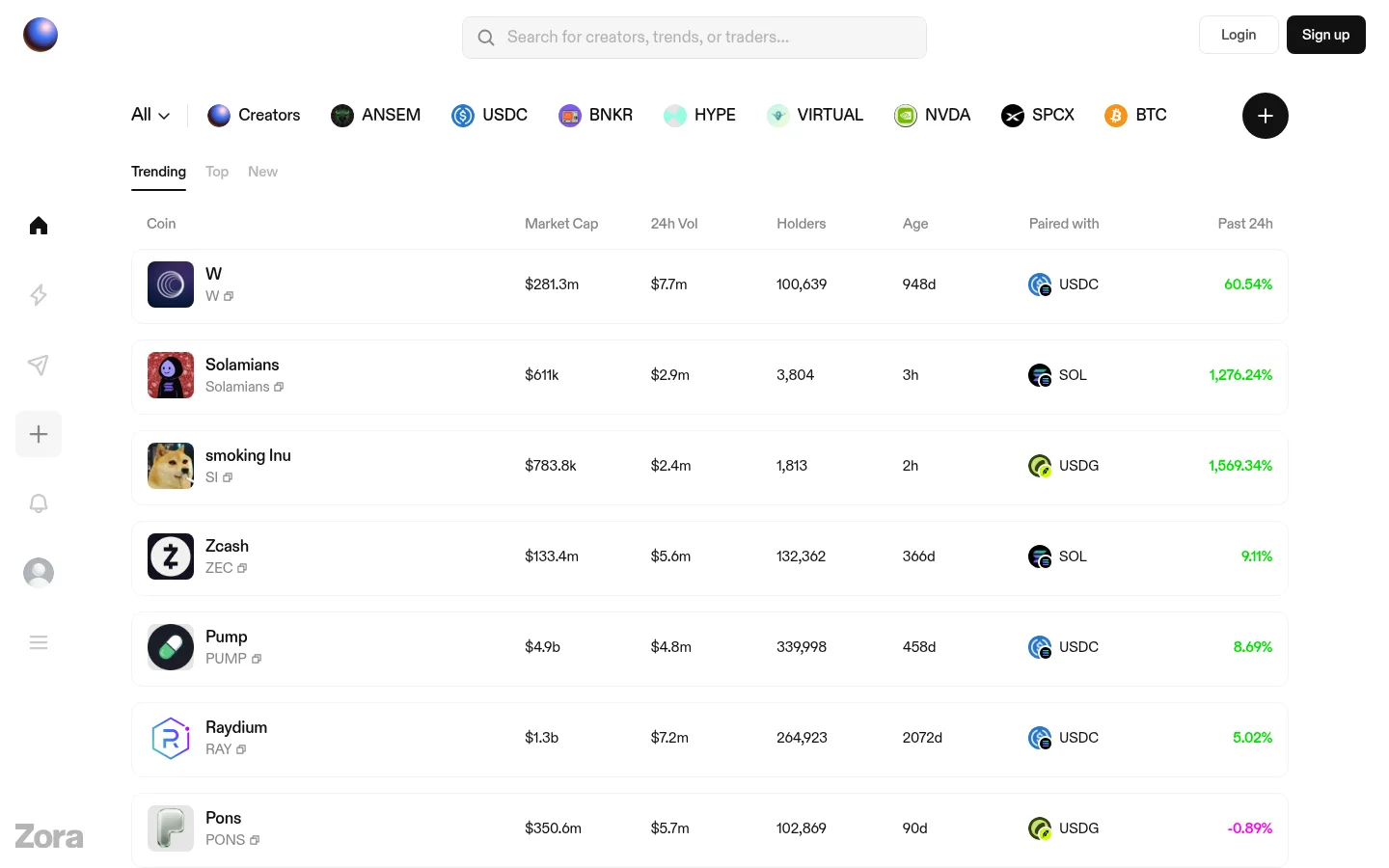
North star · Keep the market table visually quiet and let compact, aligned data rows and selective movement colors carry the experience.
The page is built on a near-white canvas, keeping attention on a dense market table rather than decorative sections. Ink-colored text establishes a clear reading hierarchy, while muted gray labels and faint hairlines separate column headings and token rows with little visual weight. Signal green marks positive market movement and appears as a highly selective text accent; vivid magenta distinguishes negative movement. These colors are functional indicators, not broad background treatments. DiatypeRounded supplies a consistent rounded sans-serif voice across navigation, controls, and compact data. The layout pairs a persistent narrow icon rail with a wider centered market area, then stacks category navigation, table controls, column labels, and many repeated token rows. Small token logos add varied color and texture, but remain contained within the otherwise orderly grid. Spacing is comfortable at the page level while row content stays information-dense. Borders, rather than shadows or cards, define the structure.
Used throughout the interface for navigation, search, token labels, buttons, and market data.
角色
示例
字号
字重
行高
字距
一级标题
Small page-level heading role; the measured viewport emphasizes market navigation and data instead.
The quick brown fox 敏捷的狐狸
19px
505
1.47
-0.032em
正文
Token names, symbols, market values, controls, and supporting interface text.
The quick brown fox 敏捷的狐狸
15px
420
1.33
-0.014em
导航
Top navigation, category links, and account actions.
The quick brown fox 敏捷的狐狸
15px
595
1.33
-0.014em
间距与布局
基准单位 4px · 密度:适中
72px版块间距
8px元素间距
—卡片内边距
—内容最大宽度
4px
8px
12px
16px
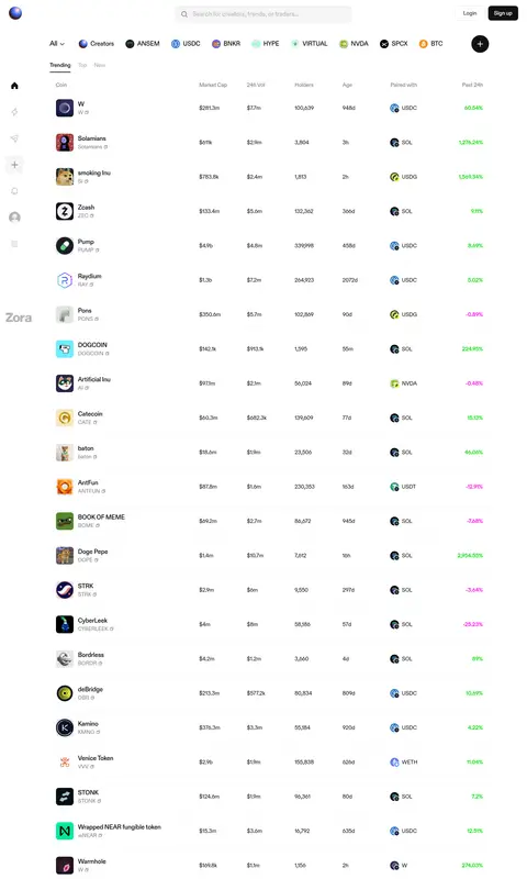
A slim fixed-looking icon rail sits at the left, beside a broad market region centered within the page. The top area combines search and account actions, followed by a horizontal category strip and compact Trending, Top, and New controls. A column-heading row anchors a long, two-part market table. The screenshot shows many repeated rows extending well below the first viewport. Alignment is column-based and consistent; the exact maximum width is not measured. Page-level breathing room contrasts with dense row content.
圆角与层次
按钮 · 8px
图片 · 50%
没有测到阴影:页面是扁平的,层次靠底色和描边区分。
The interface reads as mostly flat: no measured shadows are present, and white space does most of the separation. Very light horizontal rules and subtle row boundaries organize the table without card-like depth. The filled dark Sign up button is a compact focal point; other controls remain understated. Keep layering restrained and avoid raised panels.
组件
下面的预览按实测的按钮、输入框、徽标、卡片样式重建(字体用替代字体)。
Left icon rail
A narrow vertical navigation strip with compact monochrome icons, a softly treated selected control, and a brand mark near the lower portion.
Search field
A centered, light-gray search control with a magnifier and muted placeholder text for creators, trends, or traders.
Account actions
A quiet Login control sits beside a dark #121212 Sign up button with white text, rounded corners, and compact padding.
Category navigation
A horizontal row of All and creator/token categories, pairing concise labels with small circular or square icons.
Market tabs
Trending, Top, and New form a compact selector; the active option uses darker text and a short underline.
Token market table
Repeated aligned rows show token identity, market cap, 24-hour volume, holders, age, paired asset, and movement.
Movement values
Positive figures use #00df00 and negative figures use #ff00f0; keep both as text accents rather than filled badges.
Imagery · There is no dominant hero photography or large illustration. Small circular or square token and creator marks sit at the start of rows and within category navigation, often using colorful logos against the white page. Keep these assets thumbnail-sized and aligned to the table grid; their varied colors belong to market content, not to a broader brand background or image treatment.
Keep token information aligned in consistent columns.
Use green for positive and magenta for negative movement.
Keep labels secondary in muted gray.
Use small token marks as row-level content.
Separate rows with faint hairlines rather than shadows.
✕ 不该做
Do not turn market signals into large colored panels.
Do not add heavy card shadows or layered surfaces.
Do not use oversized display typography for dense data.
Do not let token logos disrupt row alignment.
Do not use green or magenta as broad page backgrounds.
Do not crowd the category navigation with oversized controls.
给 AI 的提示词
想快速出一个同风格的新页面,把这段话连同 DESIGN.md 一起发给 AI。
Build a new Zora-style crypto interface with a white Gallery White (#ffffff) canvas and a narrow icon rail beside the main content. Use DiatypeRounded or a close rounded sans-serif substitute throughout, with compact labels and clearly aligned market data. Keep the top area restrained: search, Login, and a dark Market Ink (#121212) Sign up button, followed by horizontal category navigation and simple market tabs. Organize content in a broad, dense table with consistent columns, small token logos, and faint Quiet Rule (#f2f2f2) separators. Use Ticker Gray (#878787) for secondary text. Reserve Signal Green (#00df00) for positive figures and Alert Magenta (#ff00f0) for negative figures. Avoid large illustrations, gradients, heavy shadows, and decorative cards.