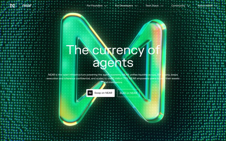
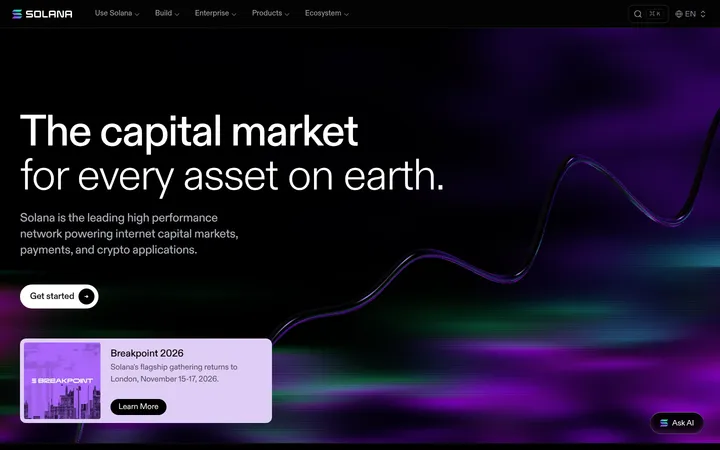
North star · Use a near-black canvas and disciplined grid as the foundation, then reserve orange and mint for unmistakable signals.
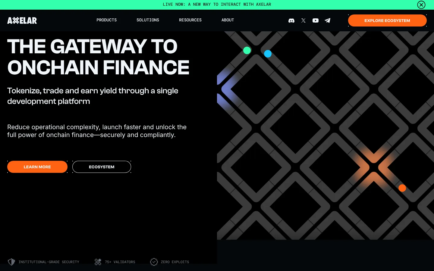
The visual strategy is built around a near-black canvas (#04070a) and restrained, high-contrast signals. A vivid orange (#ff6314) anchors primary calls to action and featured content; mint (#33ffac) is used sparingly for the live announcement and small visual accents. Pale blue-white sections interrupt the dark run of content, while white carries the strongest text and muted gray supports secondary labels. Clash Grotesk gives headlines a broad, uppercase, engineered presence; Inter handles readable body copy, and DM Mono adds a technical register to navigation, captions, and small labels. The hero uses a split composition: text and pill actions on the left, a large geometric network illustration on the right. Below, card groups and editorial columns align to a consistent grid. Section changes rely on strong light/dark bands rather than decorative framing; thin borders and restrained inset outlines define controls and cards. Generous section breaks let the dense content breathe.
配色
点色块复制色值。用途说明来自对页面的实测位置(背景、文字、描边、按钮)与截图判读。
品牌色
强调色
表层色
中性色
功能色
页面底色 · Obsidian Canvas表层 · Glacier Light表层 2 · Carbon Panel表层 3 · Night Panel表层 4 · Clean White主文字 · Clean White次要文字 · Slate Copy弱文字 · Obsidian Canvas描边 · Graphite Rule强调 · Signal Orange强调 2 · Ember Core强调 3 · Mint Signal
Display and section headings, navigation, eyebrow labels, and CTA text
Aa 设计
Inter
网络字体 · 字重 400 · 占比 29%
免费替代:Inter
Body copy and card descriptions
Aa 设计
DM Mono
网络字体 · 字重 500 / 400 · 占比 14%
免费替代:IBM Plex Mono
Navigation labels, captions, and code-like metadata
Aa 设计
F77 Minecraft
网络字体 · 字重 400 · 占比 1%
免费替代:Press Start 2P
Small decorative or branded display detail
角色
示例
字号
字重
行高
字距
特大标题
Oversized hero or campaign display headline.
Axelar
74.5px
600
1
0
一级标题
Main hero headline, set in uppercase.
Axelar
69.5px
600
1
0
二级标题
Major section titles such as case studies.
Axelar
37px
500
1.25
0
三级标题
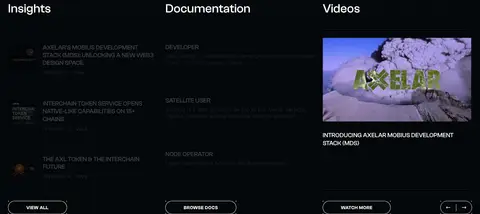
Subsection and card-group headings.
Axelar
28px
500
1.25
0
四级标题
Supporting card or editorial item titles.
The quick brown fox 敏捷的狐狸
21px
400
1.25
0
正文
Paragraphs describing the network, products, and use cases.
The quick brown fox 敏捷的狐狸
16.5px
400
1.25
0
辅助文字
Uppercase metadata, dates, and compact labels.
The quick brown fox 敏捷的狐狸
14px
500
1
0
导航
Primary navigation and prominent menu labels.
The quick brown fox 敏捷的狐狸
16.5px
500
1.25
0
眉题
Short uppercase lead-ins above headings or sections.
The quick brown fox 敏捷的狐狸
14px
600
1
0.033em
代码
Technical, code-like labels and compact identifiers.
const style = 1;
14px
500
1
0
间距与布局
基准单位 4px · 密度:适中
64px版块间距
5px元素间距
—卡片内边距
1392px内容最大宽度
4px
5px
7px
8px
12px
14px
16px
19px
24px
32px
43px
48px
64px
Use a centered content grid with a measured maximum width of 1392px and a comfortable density. The hero divides copy and geometric artwork into strong columns; later sections alternate between dark and pale full-width bands. Align section headings and card groups to the grid, with three-column content areas visible in measured sections and five-column footer navigation. Keep section transitions spacious: the measured section gap is 64px, while internal spacing follows the measured 4px-based scale. Preserve clean alignment and avoid crowding labels against cards.
圆角与层次
按钮 · 8px
输入框 · 9999px
卡片 · 8px
徽标 · 4px
导航 · 4px
链接 · 8px
inset · link, footer
inset · link
inset · input
The page is mostly flat: section color bands do the heavy lifting instead of drop shadows. Dark cards are separated from the canvas with thin graphite borders, and link controls use subtle inset outlines. Use measured rounded corners on cards and buttons, but keep surfaces visually crisp and avoid adding decorative shadow stacks.
组件
下面的预览按实测的按钮、输入框、徽标、卡片样式重建(字体用替代字体)。
Announcement strip
A full-width mint band at the very top, with compact uppercase mono messaging and a close control.
Primary pill CTA
Orange-filled uppercase Clash Grotesk action with a pill silhouette; used for ecosystem exploration and newsletter subscription.
Outlined link CTA
White or pale outlined pill link with uppercase Clash Grotesk text and a subtle inset border.
Partner cards
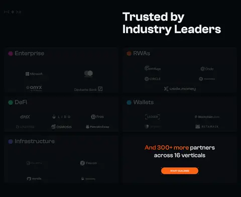
Dark cards organized by vertical, separated with fine graphite borders and populated with partner marks.
Orange feature cards
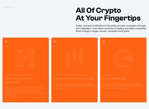
Orange-backed product or capability cards on the pale section band, with compact illustrative content.
Newsletter form
Centered email field with a pill outline and a compact orange subscription action.
Footer link columns
Multi-column navigation on the dark canvas, using small muted labels and compact link lists.
Imagery · The hero's defining artwork is a large, dark geometric network pattern with bright colored signal nodes, treated as a graphic field rather than photography. Partner marks and editorial thumbnails appear in modular cards and columns. Product-related orange cards use illustrative motifs. Keep imagery tightly framed within its grid area, with restrained contrast on dark sections; photographic color should remain secondary to the brand palette.
Keep the core canvas near-black and use pale bands selectively.
Reserve Signal Orange for primary actions and high-priority features.
Use Mint Signal as a small, high-visibility accent.
Set major headlines in bold, uppercase Clash Grotesk.
Align cards, copy, and section headings to one consistent grid.
Use thin graphite borders to define dark cards and controls.
✕ 不该做
Do not replace the dark canvas with a generic gradient background.
Do not spread orange across large areas where it weakens CTA hierarchy.
Do not use mint as a broad section background.
Do not add heavy shadows or layered glow effects to ordinary cards.
Do not mix many unrelated typefaces or decorative heading styles.
Do not crowd the section rhythm with tightly packed content.
给 AI 的提示词
想快速出一个同风格的新页面,把这段话连同 DESIGN.md 一起发给 AI。
Build a new page in Axelar's technical, institution-focused visual style. Use Obsidian Canvas (#04070a) for the primary background, Clean White (#ffffff) and Glacier Light (#f0f5fa) for readable contrast, and Carbon Panel (#0f1214) or Night Panel (#090d0f) for raised dark surfaces. Apply Signal Orange (#ff6314) to primary CTA actions and use Mint Signal (#33ffac) only for small notices or accents. Set large, often uppercase headings in Clash Grotesk or Space Grotesk; use Inter for body copy and DM Mono for compact technical labels. Structure content on a centered grid, with deliberate full-width light/dark section changes, modular cards, and generous section breaks. Prefer geometric network artwork to decorative gradients. Keep borders thin and shadows minimal.