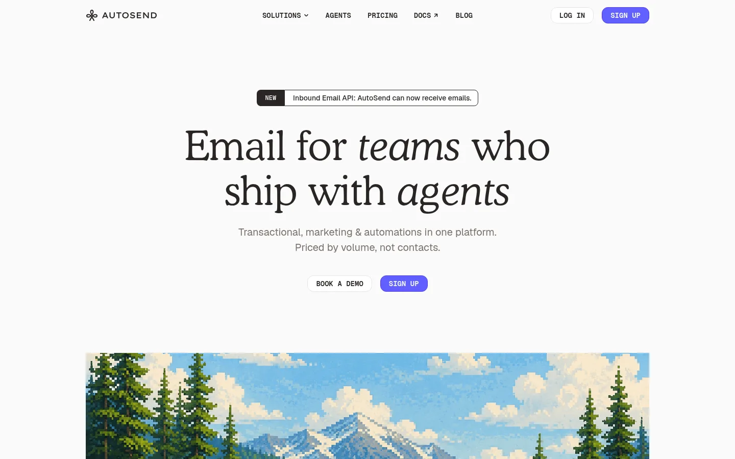
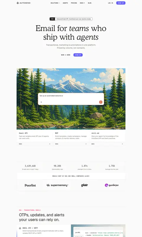
AutoSend以柔和的近白底色、鲜明的编辑风格标题和克制的紫色行动按钮,塑造清爽的品牌视觉。像素风景插画与清晰的产品界面预览,为信息丰富的模块化SaaS首页增添个性。
North star · Keep the page calm and editorial: warm white space, precise technical labeling, and violet reserved for the clearest action.
The page is built on a warm near-white canvas (#fafaf9), with white panels and fine stone-gray rules separating a long sequence of product stories. Ink-dark copy carries the interface, while muted gray is reserved for supporting explanations. Saturated violet marks the primary signup action and selected links; green and coral appear sparingly as semantic or product accents rather than broad brand fields. A large, characterful Cooper-style serif headline contrasts with practical Geist sans-serif body copy and Geist Mono labels, buttons, and technical details. The centered hero leaves generous breathing room before a wide pixel-art landscape, then shifts into compact bordered feature modules with embedded interface and code previews. Repeated alignment, thin dividers, and restrained shadows keep the varied imagery coherent without making the page feel like a conventional dashboard.
配色 点色块复制色值。用途说明来自对页面的实测位置(背景、文字、描边、按钮)与截图判读。
品牌色
Signal Violet
#615fff
Primary signup buttons and occasional links or interface highlights.
强调色
Deep Violet
#4f39f6
Darker violet detail on primary-button outlines and selected badge text.
表层色
Warm Canvas
#fafaf9
Dominant page background and button text on saturated accents.
Panel White
#ffffff
Feature panels, cards, logo areas, secondary buttons, and product UI surfaces.
中性色
Warm Ink
#292524
Headings, body copy, footer text, dark badges, and secondary-button labels.
Stone Copy
#79716b
Muted descriptions, supporting hero text, and subdued heading details.
Stone Rule
#e7e5e4
Fine borders and dividers around panels, cards, and secondary controls.
功能色
Coral Signal
#d97757
Small product-interface accent; measured on controls and cards, not a page-wide brand field.
Status Green
#008236
Technical status and feature text; use as a restrained semantic highlight.
文字 背景 对比度 WCAG #292524 Warm Ink#fafaf9 Warm Canvas14.52:1 AAA #292524 Warm Ink#ffffff Panel White15.17:1 AAA #292524 Warm Ink#e7e5e4 Stone Rule12.08:1 AAA #79716b Stone Copy#fafaf9 Warm Canvas4.58:1 AA #79716b Stone Copy#ffffff Panel White4.79:1 AA #79716b Stone Copy#e7e5e4 Stone Rule3.81:1 AA-large
字体 字号阶梯:Perfect Fifth(比例约 1.495,正文 16px)。示例用免费替代字体渲染,数值为实测。
Aa 设计
Geist 网络字体 · 字重 400 / 500 / 600 · 占比 53%
免费替代:Inter
Main interface and marketing copy, including headings, body text, and feature descriptions.
Aa 设计
Geist Mono 网络字体 · 字重 500 / 600 / 400 · 占比 37%
免费替代:Geist Mono
Navigation, buttons, labels, eyebrow text, code, and compact technical metadata.
Aa 设计
cooperLtBT 网络字体 · 字重 400 · 占比 10%
免费替代:DM Serif Display
Oversized editorial hero display headline.
角色 示例 字号 字重 行高 字距 特大标题 Oversized serif hero headline with editorial character.
AutoSend
80px 400 1.1 0 一级标题 Primary page and feature-section headings in Geist.
AutoSend
40px 400 1.2 0 二级标题 Secondary feature headings and explanatory section titles.
The quick brown fox 敏捷的狐狸
24px 400 1.33 0 三级标题 Smaller feature and card headings.
The quick brown fox 敏捷的狐狸
20px 400 1.5 0 正文 Product descriptions, explanations, and testimonial copy.
The quick brown fox 敏捷的狐狸
16px 400 1.5 0 辅助文字 Compact monospaced technical labels and metadata.
The quick brown fox 敏捷的狐狸
13px 500 1.54 0 按钮 Uppercase monospaced calls to action.
The quick brown fox 敏捷的狐狸
14px 600 1.43 0 链接 Uppercase monospaced section and resource links.
The quick brown fox 敏捷的狐狸
14px 600 1.43 0 眉题 Small uppercase mono labels above feature headings.
The quick brown fox 敏捷的狐狸
12px 600 1.33 0.04em 代码 Monospaced snippets inside developer-oriented previews.
const style = 1;
13px 500 1.54 0
间距与布局 基准单位 8px · 密度:适中
80px 版块间距
8px 元素间距
24px 卡片内边距
1102px 内容最大宽度
2px
3px
4px
6px
8px
12px
16px
24px
80px
Use a centered content frame with a measured maximum width of 1102px. The hero is centrally aligned, with the navigation spanning the top and substantial whitespace around the headline and calls to action. Below it, alternate wide product imagery with bordered feature panels, split layouts, logo strips, metrics, integrations, testimonials, and FAQ-style content. Maintain a comfortable density and an approximately 80px section rhythm; align copy and previews consistently within each module.
圆角与层次 The interface is mostly flat, with white panels set against the warm canvas and fine stone borders defining their edges. Product previews may feel layered through a restrained card shadow, but avoid pervasive elevation. Use contrast, spacing, and framing—not stacked shadows—to establish hierarchy.
组件 下面的预览按实测的按钮、输入框、徽标、卡片样式重建(字体用替代字体)。
Primary action Violet SIGN UP button with warm-white text, a darker violet outline, rounded corners, and uppercase Geist Mono lettering.
Secondary action White LOG IN or demo button with dark text and a fine stone-gray border; visually quieter than signup.
Announcement pill A compact outlined update link with a dark NEW badge preceding a short product announcement.
Feature module Border-defined white or canvas-colored panel pairing an eyebrow and heading with concise copy, a product preview, and a small learn-more link.
Technical preview Code, API, campaign, or workflow interface shown inside a clean framed product image with readable dark text.
Proof strip A divided horizontal row for customer marks or metrics, using restrained typography and minimal decoration.
Imagery · The hero uses a broad, colorful pixel-art landscape as a distinctive brand moment. Later sections rely mainly on crisp product screenshots, code examples, workflow diagrams, and integration marks, often inset into white framed panels. Supporting customer logos and testimonials stay small. Keep imagery contained within the modular page structure; illustration colors are product storytelling, not a replacement for the restrained site palette.
页面版块 共 1 个版块,按页面从上到下排列,每个都标了类型、布局和交互套路。
该做与不该做 ✓ 该做 Use #fafaf9 as the dominant page canvas. Reserve #615fff for the primary signup action. Pair expressive serif display text with practical Geist copy. Use Geist Mono for technical labels and uppercase actions. Separate product stories with thin #e7e5e4 rules. Give screenshots clear white framing and room to breathe. ✕ 不该做 Do not flood large sections with saturated accent colors. Do not make every heading a display serif. Do not turn the modular layout into a dense dashboard grid. Do not add heavy shadows to routine cards. Do not treat illustration colors as the site-wide palette. Do not use decorative gradients as a substitute for hierarchy. 给 AI 的提示词 想快速出一个同风格的新页面,把这段话连同 DESIGN.md 一起发给 AI。
复制 Build a new AutoSend page in a calm, editorial developer-tool style. Use Warm Canvas (#fafaf9) as the main background, Panel White (#ffffff) for framed content, Warm Ink (#292524) for primary copy, Stone Copy (#79716b) for supporting text, and Stone Rule (#e7e5e4) for dividers. Apply Signal Violet (#615fff) selectively to the main CTA, with Deep Violet (#4f39f6) as its outline detail. Set an expressive Cooper-like serif display headline against clean Geist sans-serif copy; use Geist Mono for uppercase buttons, eyebrows, navigation, and technical metadata. Center content in a measured 1102px frame, leave generous hero whitespace, then organize features as bordered split modules with product screenshots or code previews. Keep surfaces mostly flat and accents sparse. Use coral and green only as small semantic details.
DESIGN.md Tailwind v4 CSS 变量 Design Tokens
---
title: "AutoSend design system"
variant: extended
source: https://autosend.com/
captured_at: 2026-10-12
theme: light
industry: devtools
generator: Design DNA (https://four.wiralomi.com/style/autosend-com)
ai_generated: true
ai_label: "本文件由 AI 辅助生成:数值取自公开网页的实测样式,命名、用途说明与建议为模型解读。商标归原所有者。 / AI-assisted content"
---
# AutoSend · Design System
> Quiet editorial polish for developer email infrastructure
**Theme:** light · **Industry:** devtools · **Source:** https://autosend.com/ · **Captured:** 2026-10-12 (1440×900 desktop)
_AI-assisted content: values are measured from the public page at capture time; names, roles and guidance are model-written interpretations. Trademarks belong to their owners._
AutoSend pairs a calm, near-white canvas with expressive editorial typography and restrained violet calls to action. Pixel-art landscapes and crisp product UI previews bring personality to a dense, modular SaaS homepage.
## North star
Keep the page calm and editorial: warm white space, precise technical labeling, and violet reserved for the clearest action.
## Overview
The page is built on a warm near-white canvas (## Colors
| Name | Hex | Token | Group | Role |
|---|---|---|---|---|
| Warm Canvas | ` | `--color-warm-canvas` | surface | Dominant page background and button text on saturated accents. |
| Deep Violet | ` | `--color-deep-violet` | accent | Darker violet detail on primary-button outlines and selected badge text. |
| Panel White | ` | `--color-panel-white` | surface | Feature panels, cards, logo areas, secondary buttons, and product UI surfaces. |
| Warm Ink | ` | `--color-warm-ink` | neutral | Headings, body copy, footer text, dark badges, and secondary-button labels. |
| Stone Copy | ` | `--color-stone-copy` | neutral | Muted descriptions, supporting hero text, and subdued heading details. |
| Stone Rule | ` | `--color-stone-rule` | neutral | Fine borders and dividers around panels, cards, and secondary controls. |
| Coral Signal | ` | `--color-coral-signal` | semantic | Small product-interface accent; measured on controls and cards, not a page-wide brand field. |
| Signal Violet | ` | `--color-signal-violet` | brand | Primary signup buttons and occasional links or interface highlights. |
| Status Green | ` | `--color-status-green` | semantic | Technical status and feature text; use as a restrained semantic highlight. |
### Semantic aliases
`--color-canvas` → ` (Warm Canvas) · `--color-surface` → ` (Panel White) · `--color-surface-2` → ` (Stone Rule) · `--color-text` → ` (Warm Ink) · `--color-text-muted` → ` (Stone Copy) · `--color-border` → ` (Stone Rule) · `--color-accent` → ` (Status Green) · `--color-accent-2` → ` (Signal Violet) · `--color-accent-3` → ` (Coral Signal) · `--color-on-accent` → ` (Warm Canvas)
### Contrast (WCAG 2.x)
| Text | Background | Ratio | Level |
|---|---|---|---|
| ` | ` | 14.52:1 | AAA |
| ` | ` | 15.17:1 | AAA |
| ` | ` | 12.08:1 | AAA |
| ` | ` | 4.58:1 | AA |
| ` | ` | 4.79:1 | AA |
| ` | ` | 3.81:1 | AA-large |
| ` | ` | 4.74:1 | AA |
| ` | ` | 4.95:1 | AA |
| ` | ` | 3.94:1 | AA-large |
### Gradients
- `linear-gradient(to top, oklab(0.999998 -0.00000980496 0.0000234246 / 0.8) 0%, oklab(0.999998 -0.00000980496 0.0000234246 / 0.4) 50%, rgba(0, 0, 0, 0) 100%)`
- `linear-gradient(to top, oklab(0.984998 -0.000292599 0.000982165 / 0.8) 0%, oklab(0.984998 -0.000292599 0.000982165 / 0.4) 50%, rgba(0, 0, 0, 0) 100%)`
- `linear-gradient(lab(100 0 0) 0%, lab(100 0 0) 40%, rgb(97, 95, 255) 100%)`
- `linear-gradient(45deg, rgb(120, 113, 108) 0%, rgb(120, 113, 108) 42%, rgb(231, 229, 228) 50%, rgb(120, 113, 108) 60%, rgb(120, 113, 108) 100%)`
## Typography
| Family | Token | Source | Weights | Role | Free substitute |
|---|---|---|---|---|---|
| Geist | `--font-body` | webfont | 400, 500, 600 | Main interface and marketing copy, including headings, body text, and feature descriptions. | Inter |
| Geist Mono | `--font-mono` | webfont | 500, 600, 400 | Navigation, buttons, labels, eyebrow text, code, and compact technical metadata. | Geist Mono |
| cooperLtBT | `--font-display` | webfont | 400 | Oversized editorial hero display headline. | DM Serif Display |
- **Geist:** Use measured regular weight for most copy; keep line spacing open and casing natural.
- **Geist Mono:** Use compact monospaced uppercase for actions and eyebrows; reserve stronger weights for controls.
- **cooperLtBT:** Use a light, expressive serif at display scale; preserve natural casing and relaxed line spacing.
### Type scale — Perfect Fifth (ratio ≈ 1.495, base 16px)
| Role | Size | Weight | Line height | Letter spacing | Case | Family | Used for |
|---|---|---|---|---|---|---|---|
| display | 80px | 400 | 1.1 | 0 | — | cooperLtBT | Oversized serif hero headline with editorial character. |
| h1 | 40px | 400 | 1.2 | 0 | — | Geist | Primary page and feature-section headings in Geist. |
| h2 | 24px | 400 | 1.33 | 0 | — | dataType | Secondary feature headings and explanatory section titles. |
| h3 | 20px | 400 | 1.5 | 0 | — | Geist | Smaller feature and card headings. |
| body | 16px | 400 | 1.5 | 0 | — | Geist | Product descriptions, explanations, and testimonial copy. |
| caption | 13px | 500 | 1.54 | 0 | — | Geist Mono | Compact monospaced technical labels and metadata. |
| button | 14px | 600 | 1.43 | 0 | uppercase | Geist Mono | Uppercase monospaced calls to action. |
| link | 14px | 600 | 1.43 | 0 | uppercase | Geist Mono | Uppercase monospaced section and resource links. |
| eyebrow | 12px | 600 | 1.33 | 0.04em | uppercase | Geist Mono | Small uppercase mono labels above feature headings. |
| code | 13px | 500 | 1.54 | 0 | — | Geist Mono | Monospaced snippets inside developer-oriented previews. |
## Spacing & layout
- Base unit **8px**, density **comfortable**.
- Scale (most used values): 2, 3, 4, 6, 8, 12, 16, 24, 80 px.
- Section rhythm 80px · element gap 8px · card padding 24px · max content width 1102px.
Use a centered content frame with a measured maximum width of 1102px. The hero is centrally aligned, with the navigation spanning the top and substantial whitespace around the headline and calls to action. Below it, alternate wide product imagery with bordered feature panels, split layouts, logo strips, metrics, integrations, testimonials, and FAQ-style content. Maintain a comfortable density and an approximately 80px section rhythm; align copy and previews consistently within each module.
## Shape & elevation
- Radius: button `8px` · card `16px` · media `50%` · badge `8px` · link `8px` · xs `8px` · sm `12px` · md `16px`
- Shadow `lg` (card): `rgba(0, 0, 0, 0) 0px 0px 0px 0px, rgba(0, 0, 0, 0) 0px 0px 0px 0px, rgba(0, 0, 0, 0) 0px 0px 0px 0px, rgba(0, 0, 0, 0) 0px 0px 0px 0px, rgba(0, 0, 0, 0.1) 0px 20px 25px -5px, rgba(0, 0, 0, 0.1) 0px 8p`
- Shadow `md` (card): `rgba(0, 0, 0, 0) 0px 0px 0px 0px, rgba(0, 0, 0, 0) 0px 0px 0px 0px, rgba(0, 0, 0, 0) 0px 0px 0px 0px, rgba(0, 0, 0, 0) 0px 0px 0px 0px, rgba(33, 33, 33, 0.05) 0px 8px 16px 0px`
- Motion: standard transition `0.1s cubic-bezier(0.4, 0, 0.2, 1)` on interactive elements.
The interface is mostly flat, with white panels set against the warm canvas and fine stone borders defining their edges. Product previews may feel layered through a restrained card shadow, but avoid pervasive elevation. Use contrast, spacing, and framing—not stacked shadows—to establish hierarchy.
## Imagery
The hero uses a broad, colorful pixel-art landscape as a distinctive brand moment. Later sections rely mainly on crisp product screenshots, code examples, workflow diagrams, and integration marks, often inset into white framed panels. Supporting customer logos and testimonials stay small. Keep imagery contained within the modular page structure; illustration colors are product storytelling, not a replacement for the restrained site palette.
## Components
### Primary action
Violet SIGN UP button with warm-white text, a darker violet outline, rounded corners, and uppercase Geist Mono lettering.
### Secondary action
White LOG IN or demo button with dark text and a fine stone-gray border; visually quieter than signup.
### Announcement pill
A compact outlined update link with a dark NEW badge preceding a short product announcement.
### Feature module
Border-defined white or canvas-colored panel pairing an eyebrow and heading with concise copy, a product preview, and a small learn-more link.
### Technical preview
Code, API, campaign, or workflow interface shown inside a clean framed product image with readable dark text.
### Proof strip
A divided horizontal row for customer marks or metrics, using restrained typography and minimal decoration.
### Measured component styles
- **Primary button** (“SIGN UP”): background ## Do
- Use ## Don't
- Do not flood large sections with saturated accent colors.
- Do not make every heading a display serif.
- Do not turn the modular layout into a dense dashboard grid.
- Do not add heavy shadows to routine cards.
- Do not treat illustration colors as the site-wide palette.
- Do not use decorative gradients as a substitute for hierarchy.
## Agent prompt
Build a new AutoSend page in a calm, editorial developer-tool style. Use Warm Canvas (## Page sections (top to bottom)
| # | Type | Layout | UX patterns | UI patterns |
|---|---|---|---|---|
| 1 | hero | Long, centered homepage: navigation and announcement lead into a spacious hero, then product modules, proof strips, integrations, testimonials, and footer. | Top navigation links, Announcement link, Demo and signup actions, Feature learn-more links | Centered serif hero, Pixel-art landscape, Bordered feature panels, Product interface previews, Metrics and customer logos |
---
本文件由 AI 辅助生成:数值取自公开网页的实测样式,命名、用途说明与建议为模型解读。商标归原所有者。
Generated by Design DNA · https://four.wiralomi.com/style/autosend-com