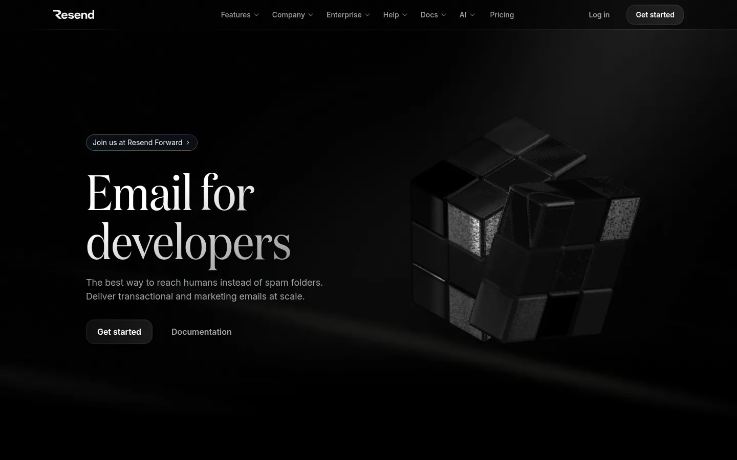
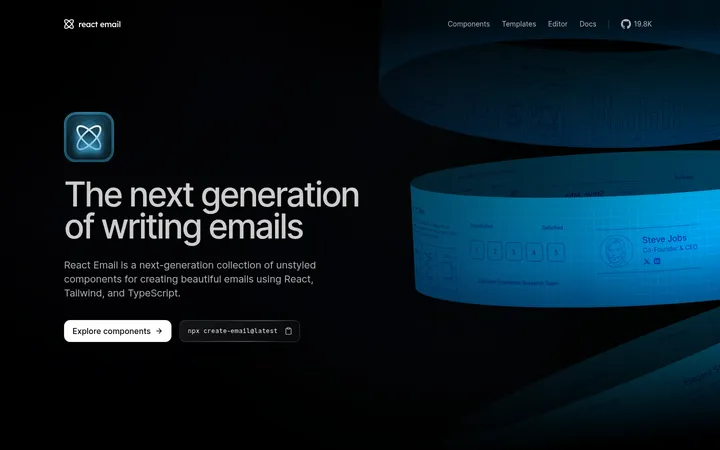
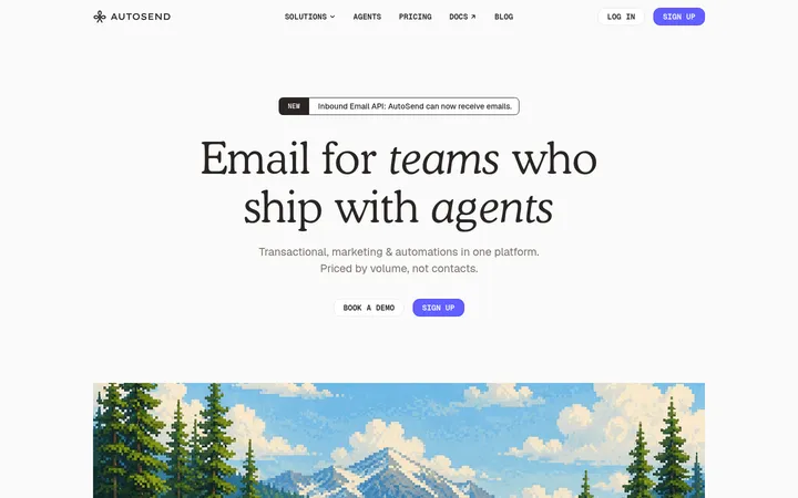
Resend 以近黑色画布搭配醒目的编辑式标题和克制的技术细节。单色 3D 首屏视觉与紧凑的开发者功能模块营造氛围,同时保持产品信息清晰。
North star · Keep the page nearly black and let editorial typography, product evidence, and subtle hairlines provide the hierarchy.
The page builds its identity around a nearly uninterrupted black canvas, with soft gray body text, bright headings, and fine charcoal borders defining the interface. Saturated blue is reserved as a very restrained accent rather than a dominant surface color; tiny green and other vivid hues belong mainly to interface badges and technical mockups. Typography supplies the contrast: a distinctive high-contrast serif display headline anchors the hero, while aBCFavorit and Inter handle section headings, navigation, and readable body copy. Commit Mono marks code and compact technical labels. The hero sets text against a dark, sculptural 3D object, then the page alternates centered feature introductions with split product demonstrations, testimonials, and further feature panels. Broad black intervals let each section breathe, while rounded controls and cards soften the otherwise precise, engineering-led presentation. Borders and restrained shadows separate content without creating a glossy, heavily layered UI.
配色
点色块复制色值。用途说明来自对页面的实测位置(背景、文字、描边、按钮)与截图判读。
品牌色
强调色
表层色
中性色
功能色
页面底色 · Obsidian Canvas表层 · Paper White主文字 · Cloud Text次要文字 · Soft Alloy弱文字 · Silver Mist描边 · Graphite Hairline强调 · Electric Azure强调 2 · Signal Blue
Body copy, navigation, links, buttons, and many section headings.
Aa 设计
commitMono
网络字体 · 字重 400 · 占比 17%
免费替代:IBM Plex Mono
Code samples and compact technical captions or labels.
Aa 设计
aBCFavorit
网络字体 · 字重 400 / 500 · 占比 4%
免费替代:DM Sans
Large sans-serif page heading and selected feature headings.
Aa 设计
Helvetica
系统字体 · 字重 400 / 600 / 700 · 占比 2%
免费替代:Arial
System fallback for occasional interface text.
角色
示例
字号
字重
行高
字距
特大标题
Oversized editorial serif headline in the hero.
Resend
77px
400
1
-0.01em
一级标题
Primary sans-serif page heading where the alternate heading style is used.
Resend
56px
400
1.2
-0.05em
二级标题
Major section titles and key feature introductions.
The quick brown fox 敏捷的狐狸
24px
500
1.5
0
三级标题
Feature-card and product-demo headings.
The quick brown fox 敏捷的狐狸
20px
400
1
0
四级标题
Supporting subsection headings.
The quick brown fox 敏捷的狐狸
18px
400
1.5
0
正文
Descriptions, testimonials, and supporting product copy.
The quick brown fox 敏捷的狐狸
14px
400
1.6
0
辅助文字
Compact technical captions and understated labels.
The quick brown fox 敏捷的狐狸
12px
400
1.33
0
按钮
CTA and secondary action labels.
The quick brown fox 敏捷的狐狸
14px
400
1.6
0
导航
Top navigation items and dropdown labels.
The quick brown fox 敏捷的狐狸
14px
500
1.43
0
链接
Inline actions such as documentation and learn-more links.
The quick brown fox 敏捷的狐狸
14px
400
1.43
0
代码
Code samples and developer-facing technical strings.
const style = 1;
12px
400
1.33
0
间距与布局
基准单位 8px · 密度:适中
32px版块间距
16px元素间距
28px卡片内边距
1232px内容最大宽度
1px
2px
4px
6px
8px
12px
14px
16px
24px
32px
48px
96px
A centered, wide content frame supports a long, vertically paced landing page. The hero is a two-part composition: left-aligned copy and actions sit opposite dark product imagery. Below it, sections alternate centered introductions, split feature demonstrations, and multi-column cards or testimonials. The measured page max width is 1232px; use the measured 8px-based spacing scale and comfortable density to maintain clear separation between blocks. Keep navigation compact, align feature copy consistently, and use large black intervals rather than contrasting section bands.
圆角与层次
按钮 · 16px
卡片 · 16px
图片 · 50%
徽标 · 6px
链接 · 9999px
hairline · media
hairline · other
sm · button
inset · footer
The interface is mostly flat: black surfaces dominate, with fine charcoal borders separating cards and technical media. Rounded card and button forms soften the geometry without relying on conspicuous drop shadows. Use layering chiefly for interface previews and hero imagery; preserve restrained contrast and avoid floating panels that feel detached from the canvas.
组件
下面的预览按实测的按钮、输入框、徽标、卡片样式重建(字体用替代字体)。
Top navigation
Compact horizontal navigation on black, using Inter, muted secondary actions, and a bright rounded Get started control.
Hero announcement
Small outlined pill above the hero headline, with restrained muted text and a discreet directional cue.
Hero CTA pair
A rounded primary Get started action sits beside a quieter Documentation link beneath the supporting copy.
Feature demonstration
Split sections combine short feature headings and copy with dark interface previews, code, or product video.
Product card
Dark cards use subtle borders, rounded corners, and light Inter text; keep the card surface close to the black canvas.
Status badge
Small rounded status labels use a subdued dark fill with a focused semantic color, such as green for delivered.
Testimonial panel
Customer proof appears in a bordered, dark panel with readable light copy and restrained attribution.
Imagery · The first viewport uses a dark, sculptural 3D arrangement of geometric forms, framed to the right of the hero copy and blended into the black background. Further sections rely on product-interface demonstrations, video, illustrations, and customer imagery rather than bright lifestyle photography. Keep mockups low-glare and predominantly monochrome; vivid colors should read as small functional details within product UI, not as a new visual theme.
Pair editorial display type with practical sans-serif text.
Use fine borders to distinguish dark cards.
Let generous black intervals pace the sections.
✕ 不该做
Do not introduce bright section backgrounds.
Do not turn accent blue into a dominant surface.
Do not use colorful lifestyle imagery in the hero.
Do not overuse shadows or floating-card effects.
Do not crowd headings, copy, and product previews together.
Do not use decorative typography for technical labels.
给 AI 的提示词
想快速出一个同风格的新页面,把这段话连同 DESIGN.md 一起发给 AI。
Build a new page in Resend’s developer-focused visual style. Use Obsidian Canvas (#000000) as the continuous background, Cloud Text (#f0f0f0) for primary copy, Soft Alloy (#a1a4a5) for secondary text, and Graphite Hairline (#282c30) for restrained borders. Compose an editorial hero with a high-contrast serif display headline, concise supporting copy, paired actions, and dark sculptural or product imagery. Use Inter for navigation and body content, a mono face for code, and simple sans-serif feature headings. Organize the page into centered introductions, split product demonstrations, and compact dark cards with rounded corners. Keep blue accents such as Electric Azure (#00a3ff) sparse and functional. Favor flat surfaces, fine separators, comfortable spacing, and clear hierarchy over gradients or heavy shadows.