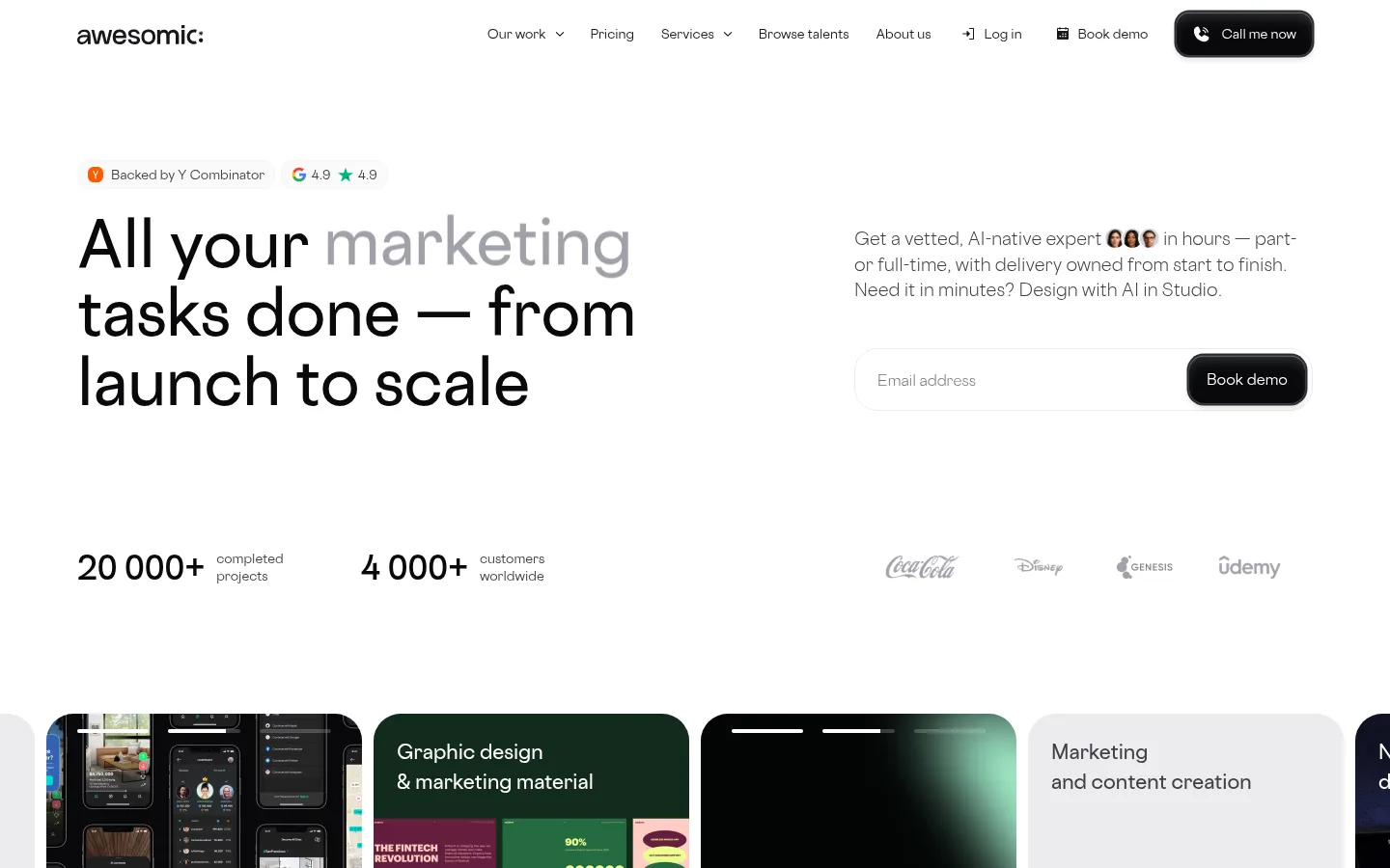
Awesomic 以明亮、编辑式的界面呈现订阅制人才市场,整体采用克制的黑白灰配色。醒目的大字、紧凑的转化入口与丰富多彩的作品案例相互平衡,突出创意服务的专业度。
North star · Keep the interface calm and typographic, using monochrome structure to make vivid portfolio work the focal point.
The page is built on a white canvas with pale gray section bands used selectively to separate problem-solving content and project showcases. Near-black headings and charcoal supporting copy create a restrained hierarchy; bright color is largely supplied by client work and portfolio imagery rather than interface chrome. Cosmica is used throughout, from oversized, lightly set hero messaging to compact navigation and practical body copy. The hero pairs a broad left-aligned headline with a right-side explanation and email form, then uses statistics and client marks as a quiet credibility row. Rounded cards, pills, and buttons soften the otherwise clean geometry. Content alternates between spacious white sections and softly tinted bands, while image-heavy grids bring energy and evidence of craft. Keep controls legible and understated, and let real work provide the strongest color and visual texture.
配色 点色块复制色值。用途说明来自对页面的实测位置(背景、文字、描边、按钮)与截图判读。
品牌色
Gallery White
#ffffff
Primary page canvas, open hero area, and light button or card surfaces.
Ink Black
#18181b
Headings, dark text, navigation emphasis, and text on light controls.
Pitch Button
#09090b
High-priority dark CTA backgrounds, especially Book demo.
强调色
Badge Orange
#ff5a00
Small badge detail; treat as a minor signal rather than a broad interface color.
Pop Magenta
#fe45e2
Sparse accent detail; keep secondary to the portfolio imagery.
表层色
Mist Gray
#f4f4f5
Soft section bands and fading overlays behind selected content and project galleries.
Cloud Panel
#ececee
Filled service cards and secondary content panels.
Stone Edge
#d4d4d8
Subtle card outlines and muted project or content boundaries.
中性色
Slate Copy
#3f3f46
Muted body copy, navigation labels, talent details, and project descriptions.
Deep Graphite
#27272a
Occasional dark text or card detail; not a dominant page surface.
Ash Gray
#a1a1aa
Low-emphasis text and subdued supporting labels.
功能色
Hairline Gray
#e4e4e7
Fine borders and delicate separators around cards, badges, and controls.
文字 背景 对比度 WCAG #18181b Ink Black#ffffff Gallery White17.72:1 AAA #18181b Ink Black#f4f4f5 Mist Gray16.12:1 AAA #18181b Ink Black#ececee Cloud Panel15.02:1 AAA #18181b Ink Black#d4d4d8 Stone Edge11.99:1 AAA #3f3f46 Slate Copy#ffffff Gallery White10.44:1 AAA #3f3f46 Slate Copy#f4f4f5 Mist Gray9.5:1 AAA
字体 字号阶梯:Perfect Fourth(比例约 1.32,正文 16px)。示例用免费替代字体渲染,数值为实测。
Aa 设计
Cosmica 网络字体 · 字重 400 / 600 / 300 / 700 / 500 · 占比 100%
免费替代:DM Sans
Site-wide typeface for display headings, navigation, body text, buttons, and labels.
角色 示例 字号 字重 行高 字距 特大标题 Oversized hero or high-impact campaign headline.
Awesomic
64px 600 1.12 0 一级标题 Primary page headline and major section title.
Awesomic
56px 600 1.28 0 二级标题 Section headings such as pricing or problem statements.
Awesomic
40px 600 1.28 0 三级标题 Prominent card or feature titles.
Awesomic
32px 700 1.5 0 四级标题 Compact subheadings and card labels.
The quick brown fox 敏捷的狐狸
20px 600 1.56 0 正文 Supporting paragraphs, explanations, and standard interface copy.
The quick brown fox 敏捷的狐狸
16px 400 1.5 0 辅助文字 Fine-print notes, metadata, and compact supporting labels.
The quick brown fox 敏捷的狐狸
13px 400 1.5 0 导航 Header links and compact navigation controls.
The quick brown fox 敏捷的狐狸
13px 500 1.25 0
间距与布局 基准单位 4px · 密度:适中
80px 版块间距
12px 元素间距
24px 卡片内边距
1280px 内容最大宽度
2px
4px
6px
8px
10px
12px
16px
20px
24px
28px
32px
Use a centered content frame with a measured maximum width of 1280px and comfortable density. The hero is a two-column composition with left-aligned display copy and a right-side explanatory form; credibility metrics sit beneath it. Long-form sections alternate full-width bands and modular card or image grids. Preserve generous section breathing room, with measured section gaps around 80px and tighter element groupings around 12px. Keep text aligned to the start except for centered process content.
圆角与层次 inset · button, other
inset · other, link, button
inset · other, button
hairline · card
Most content sits flat on white or pale gray surfaces, with fine gray borders defining card edges. Reserve visible shadow for dark primary CTAs and a few raised controls; their inset highlight and soft outer shadow give them a tactile, polished finish. Use gentle gradients mainly as fades over galleries, not as decorative fills.
组件 下面的预览按实测的按钮、输入框、徽标、卡片样式重建(字体用替代字体)。
Header navigation Compact Cosmica links across the top with dark text, a dark rounded Call me now control, and a separate Book demo action.
Hero lead form Large left-aligned headline paired with explanatory copy and an email input ending in a dark Book demo button.
Credibility row Project and customer metrics sit beneath the hero beside subdued customer logos.
Primary CTA Near-black button with white label, rounded 16px corners, and measured inset highlight plus soft shadow.
Service cards Rounded service panels use pale gray fills, compact supporting text, and image-led examples.
Portfolio cards Large rounded project tiles and galleries use subtle borders and let the supplied work determine their color.
Badges and tags Small outlined category pills use delicate hairlines and compact Cosmica labels.
Imagery · Use portfolio and client-work imagery as the main source of saturated color, including interface mockups, branding, and creative deliverables. Frame samples in rounded cards and broad horizontal galleries; avoid adding decorative imagery that competes with the work. The first viewport includes a cropped horizontal work strip below the hero. Talent portraits and customer marks support credibility, while the broader page also includes video content.
页面版块 共 2 个版块,按页面从上到下排列,每个都标了类型、布局和交互套路。
该做与不该做 ✓ 该做 Keep the main canvas white and uncluttered. Use pale gray bands to distinguish selected sections. Set strong headlines in Cosmica-style sans typography. Pair wide headline content with a clear secondary column. Use dark, rounded CTAs for the primary conversion action. Let portfolio images carry most of the vivid color. Separate cards with subtle borders rather than heavy shadows. ✕ 不该做 Do not introduce a large saturated brand background. Do not make every section a boxed card. Do not use heavy shadows on ordinary content. Do not center all copy; preserve the editorial left alignment. Do not let decorative accents overpower client work. Do not crowd the hero form or credibility row. 给 AI 的提示词 想快速出一个同风格的新页面,把这段话连同 DESIGN.md 一起发给 AI。
复制 Build a new page in Awesomic’s calm, work-first visual style. Use Gallery White (#ffffff) as the canvas, Mist Gray (#f4f4f5) for occasional section bands, Ink Black (#18181b) for headings, and Slate Copy (#3f3f46) for supporting text. Use Cosmica or a close sans-serif substitute such as DM Sans, with large semibold headings and compact practical body copy. Structure the page in a centered frame, using a left-aligned editorial headline, a clear secondary action or form column, and generous section spacing. Use rounded cards, fine Hairline Gray (#e4e4e7) borders, and near-black CTA buttons in Pitch Button (#09090b). Keep the UI mostly monochrome; let portfolio images supply the color. Use shadows sparingly and avoid decorative gradients except for image fades.
DESIGN.md Tailwind v4 CSS 变量 Design Tokens
---
title: "Awesomic design system"
variant: extended
source: https://www.awesomic.com/
captured_at: 2026-10-12
theme: light
industry: saas
generator: Design DNA (https://four.wiralomi.com/style/awesomic-io)
ai_generated: true
ai_label: "本文件由 AI 辅助生成:数值取自公开网页的实测样式,命名、用途说明与建议为模型解读。商标归原所有者。 / AI-assisted content"
---
# Awesomic · Design System
> Quiet monochrome framing for work that speaks
**Theme:** light · **Industry:** saas · **Source:** https://www.awesomic.com/ · **Captured:** 2026-10-12 (1440×900 desktop)
_AI-assisted content: values are measured from the public page at capture time; names, roles and guidance are model-written interpretations. Trademarks belong to their owners._
Awesomic presents its subscription-based talent marketplace with a bright, editorial interface and restrained monochrome styling. Large typography, compact conversion controls, and colorful work samples balance a clean corporate shell with creative proof.
## North star
Keep the interface calm and typographic, using monochrome structure to make vivid portfolio work the focal point.
## Overview
The page is built on a white canvas with pale gray section bands used selectively to separate problem-solving content and project showcases. Near-black headings and charcoal supporting copy create a restrained hierarchy; bright color is largely supplied by client work and portfolio imagery rather than interface chrome. Cosmica is used throughout, from oversized, lightly set hero messaging to compact navigation and practical body copy. The hero pairs a broad left-aligned headline with a right-side explanation and email form, then uses statistics and client marks as a quiet credibility row. Rounded cards, pills, and buttons soften the otherwise clean geometry. Content alternates between spacious white sections and softly tinted bands, while image-heavy grids bring energy and evidence of craft. Keep controls legible and understated, and let real work provide the strongest color and visual texture.
## Colors
| Name | Hex | Token | Group | Role |
|---|---|---|---|---|
| Gallery White | ` | `--color-gallery-white` | brand | Primary page canvas, open hero area, and light button or card surfaces. |
| Mist Gray | ` | `--color-mist-gray` | surface | Soft section bands and fading overlays behind selected content and project galleries. |
| Slate Copy | ` | `--color-slate-copy` | neutral | Muted body copy, navigation labels, talent details, and project descriptions. |
| Badge Orange | ` | `--color-badge-orange` | accent | Small badge detail; treat as a minor signal rather than a broad interface color. |
| Cloud Panel | ` | `--color-cloud-panel` | surface | Filled service cards and secondary content panels. |
| Ink Black | ` | `--color-ink-black` | brand | Headings, dark text, navigation emphasis, and text on light controls. |
| Stone Edge | ` | `--color-stone-edge` | surface | Subtle card outlines and muted project or content boundaries. |
| Hairline Gray | ` | `--color-hairline-gray` | semantic | Fine borders and delicate separators around cards, badges, and controls. |
| Pitch Button | ` | `--color-pitch-button` | brand | High-priority dark CTA backgrounds, especially Book demo. |
| Deep Graphite | ` | `--color-deep-graphite` | neutral | Occasional dark text or card detail; not a dominant page surface. |
| Pop Magenta | ` | `--color-pop-magenta` | accent | Sparse accent detail; keep secondary to the portfolio imagery. |
| Ash Gray | ` | `--color-ash-gray` | neutral | Low-emphasis text and subdued supporting labels. |
### Semantic aliases
`--color-canvas` → ` (Gallery White) · `--color-surface` → ` (Mist Gray) · `--color-surface-2` → ` (Cloud Panel) · `--color-surface-3` → ` (Stone Edge) · `--color-text` → ` (Ink Black) · `--color-text-muted` → ` (Slate Copy) · `--color-text-subtle` → ` (Gallery White) · `--color-border` → ` (Hairline Gray) · `--color-accent` → ` (Pop Magenta)
### Contrast (WCAG 2.x)
| Text | Background | Ratio | Level |
|---|---|---|---|
| ` | ` | 17.72:1 | AAA |
| ` | ` | 16.12:1 | AAA |
| ` | ` | 15.02:1 | AAA |
| ` | ` | 11.99:1 | AAA |
| ` | ` | 10.44:1 | AAA |
| ` | ` | 9.5:1 | AAA |
| ` | ` | 8.85:1 | AAA |
| ` | ` | 7.07:1 | AAA |
| ` | ` | 1.1:1 | fail |
| ` | ` | 1.18:1 | fail |
### Gradients
- `linear-gradient(rgba(244, 244, 245, 0), rgba(244, 244, 245, 0.67) 21%, rgb(244, 244, 245) 44%)`
- `linear-gradient(270deg, rgba(244, 244, 245, 0), rgba(255, 255, 255, 0.68) 50%, rgb(255, 255, 255))`
- `linear-gradient(90deg, rgba(244, 244, 245, 0), rgba(255, 255, 255, 0.68) 50%, rgb(255, 255, 255))`
- `linear-gradient(270deg, rgba(244, 244, 245, 0), rgba(244, 244, 245, 0.68) 50%, rgb(244, 244, 245))`
## Typography
| Family | Token | Source | Weights | Role | Free substitute |
|---|---|---|---|---|---|
| Cosmica | `--font-body` | webfont | 400, 600, 300, 700, 500 | Site-wide typeface for display headings, navigation, body text, buttons, and labels. | DM Sans |
- **Cosmica:** Use a clean sans-serif feel; headings are semibold, body regular, and navigation or controls compact at medium weight. Avoid decorative casing.
### Type scale — Perfect Fourth (ratio ≈ 1.32, base 16px)
| Role | Size | Weight | Line height | Letter spacing | Case | Family | Used for |
|---|---|---|---|---|---|---|---|
| display | 64px | 600 | 1.12 | 0 | — | Cosmica | Oversized hero or high-impact campaign headline. |
| h1 | 56px | 600 | 1.28 | 0 | — | Cosmica | Primary page headline and major section title. |
| h2 | 40px | 600 | 1.28 | 0 | — | Cosmica | Section headings such as pricing or problem statements. |
| h3 | 32px | 700 | 1.5 | 0 | — | Cosmica | Prominent card or feature titles. |
| h4 | 20px | 600 | 1.56 | 0 | — | Cosmica | Compact subheadings and card labels. |
| body | 16px | 400 | 1.5 | 0 | — | Cosmica | Supporting paragraphs, explanations, and standard interface copy. |
| caption | 13px | 400 | 1.5 | 0 | — | Cosmica | Fine-print notes, metadata, and compact supporting labels. |
| nav | 13px | 500 | 1.25 | 0 | — | Cosmica | Header links and compact navigation controls. |
## Spacing & layout
- Base unit **4px**, density **comfortable**.
- Scale (most used values): 2, 4, 6, 8, 10, 12, 16, 20, 24, 28, 32 px.
- Section rhythm 80px · element gap 12px · card padding 24px · max content width 1280px.
Use a centered content frame with a measured maximum width of 1280px and comfortable density. The hero is a two-column composition with left-aligned display copy and a right-side explanatory form; credibility metrics sit beneath it. Long-form sections alternate full-width bands and modular card or image grids. Preserve generous section breathing room, with measured section gaps around 80px and tighter element groupings around 12px. Keep text aligned to the start except for centered process content.
## Shape & elevation
- Radius: button `14px` · input `14px` · card `36px` · media `12px` · badge `12px` · nav `14px` · link `36px` · xs `10px` · sm `12px` · md `14px` · lg `16px` · xl `24px` · 2xl `28px` · pill `9999px`
- Shadow `inset` (button, other): `rgba(255, 255, 255, 0.5) 0px 0.5px 0px 0px inset, rgba(117, 123, 133, 0.4) 0px 9px 14px -5px inset, rgb(44, 46, 52) 0px 0px 0px 1.5px, rgba(0, 0, 0, 0.14) 0px 4px 6px 0px`
- Shadow `inset-2` (other, link, button): `rgb(255, 255, 255) 0px 0.5px 0px 0px inset`
- Shadow `inset-3` (other, button): `rgb(228, 228, 231) 0px 1px 0px 0px inset`
- Shadow `hairline` (card): `rgb(228, 228, 231) 0px -1px 0px 0px`
- Shadow `md` (card): `rgba(0, 0, 0, 0.04) 0px 4px 12px 0px`
- Motion: standard transition `0.25s ease` on interactive elements.
Most content sits flat on white or pale gray surfaces, with fine gray borders defining card edges. Reserve visible shadow for dark primary CTAs and a few raised controls; their inset highlight and soft outer shadow give them a tactile, polished finish. Use gentle gradients mainly as fades over galleries, not as decorative fills.
## Imagery
Use portfolio and client-work imagery as the main source of saturated color, including interface mockups, branding, and creative deliverables. Frame samples in rounded cards and broad horizontal galleries; avoid adding decorative imagery that competes with the work. The first viewport includes a cropped horizontal work strip below the hero. Talent portraits and customer marks support credibility, while the broader page also includes video content.
## Components
### Header navigation
Compact Cosmica links across the top with dark text, a dark rounded Call me now control, and a separate Book demo action.
### Hero lead form
Large left-aligned headline paired with explanatory copy and an email input ending in a dark Book demo button.
### Credibility row
Project and customer metrics sit beneath the hero beside subdued customer logos.
### Primary CTA
Near-black button with white label, rounded 16px corners, and measured inset highlight plus soft shadow.
### Service cards
Rounded service panels use pale gray fills, compact supporting text, and image-led examples.
### Portfolio cards
Large rounded project tiles and galleries use subtle borders and let the supplied work determine their color.
### Badges and tags
Small outlined category pills use delicate hairlines and compact Cosmica labels.
### Measured component styles
- **Primary button** (“Book demo”): background ## Do
- Keep the main canvas white and uncluttered.
- Use pale gray bands to distinguish selected sections.
- Set strong headlines in Cosmica-style sans typography.
- Pair wide headline content with a clear secondary column.
- Use dark, rounded CTAs for the primary conversion action.
- Let portfolio images carry most of the vivid color.
- Separate cards with subtle borders rather than heavy shadows.
## Don't
- Do not introduce a large saturated brand background.
- Do not make every section a boxed card.
- Do not use heavy shadows on ordinary content.
- Do not center all copy; preserve the editorial left alignment.
- Do not let decorative accents overpower client work.
- Do not crowd the hero form or credibility row.
## Agent prompt
Build a new page in Awesomic’s calm, work-first visual style. Use Gallery White (## Page sections (top to bottom)
| # | Type | Layout | UX patterns | UI patterns |
|---|---|---|---|---|
| 1 | hero | Two columns: large left headline; supporting copy and email form on the right, followed by metrics and logos. | email lead capture, Book demo CTA, trust signals | oversized headline, dark pill button, logo row |
| 2 | category-nav | Wide horizontal strip of image-led service cards in a multi-column grid. | browse service categories, visual scanning | rounded image cards, mixed light and dark panels |
| 3 | other | Single-column spacer between the service strip and pricing content. | visual breathing room | open white canvas |
| 4 | pricing | Four-column plan-selection area with a left-aligned heading and compact plan actions. | select company stage, choose working model, book demo | plan cards, rounded controls, clear CTA |
| 5 | other | Single-column white spacer beneath the plan section. | breathing room | minimal transition |
| 6 | feature-grid | Pale gray band with a left-aligned heading and three feature columns. | scan pain points, compare benefits | soft gray background, three-column feature layout |
| 7 | team | Bright multi-column talent grid with profile links and compact details. | browse talent, inspect specialties | profile cards, category labels, rounded borders |
| 8 | other | Single-column white transition area. | visual pacing | open canvas |
| 9 | testimonials | Two-column proof area with metrics, client feedback, and supporting media. | build trust, review customer evidence | testimonial content, statistics, video |
| 10 | newsletter | Pale gray two-column CTA band with copy and a lead form. | submit contact details, start a conversation | email form, dark CTA, soft background |
| 11 | gallery | Pale gray, wide multi-column project gallery with links and card actions. | explore project work, view all projects | image-heavy grid, rounded project tiles |
| 12 | other | Short single-column continuation of the pale gray gallery band. | continue browsing | section tail, soft gray field |
| 13 | feature-grid | White three-column service directory with grouped linked offerings and supporting media. | browse by service, follow category links | grouped text links, service columns |
| 14 | cta | Full-bleed media-backed block with centered consultation message and demo link. | book a consultation | full-bleed visual, single primary action |
| 15 | how-it-works | Centered heading above a two-column, numbered process explanation. | follow numbered steps, view plans | numbered steps, centered section title |
## Source CSS custom properties (selected)
```css
--_colors---gray--gray-700: