North star · Let one atmospheric, full-bleed product image lead; keep type and controls quiet, legible, and warm-toned.
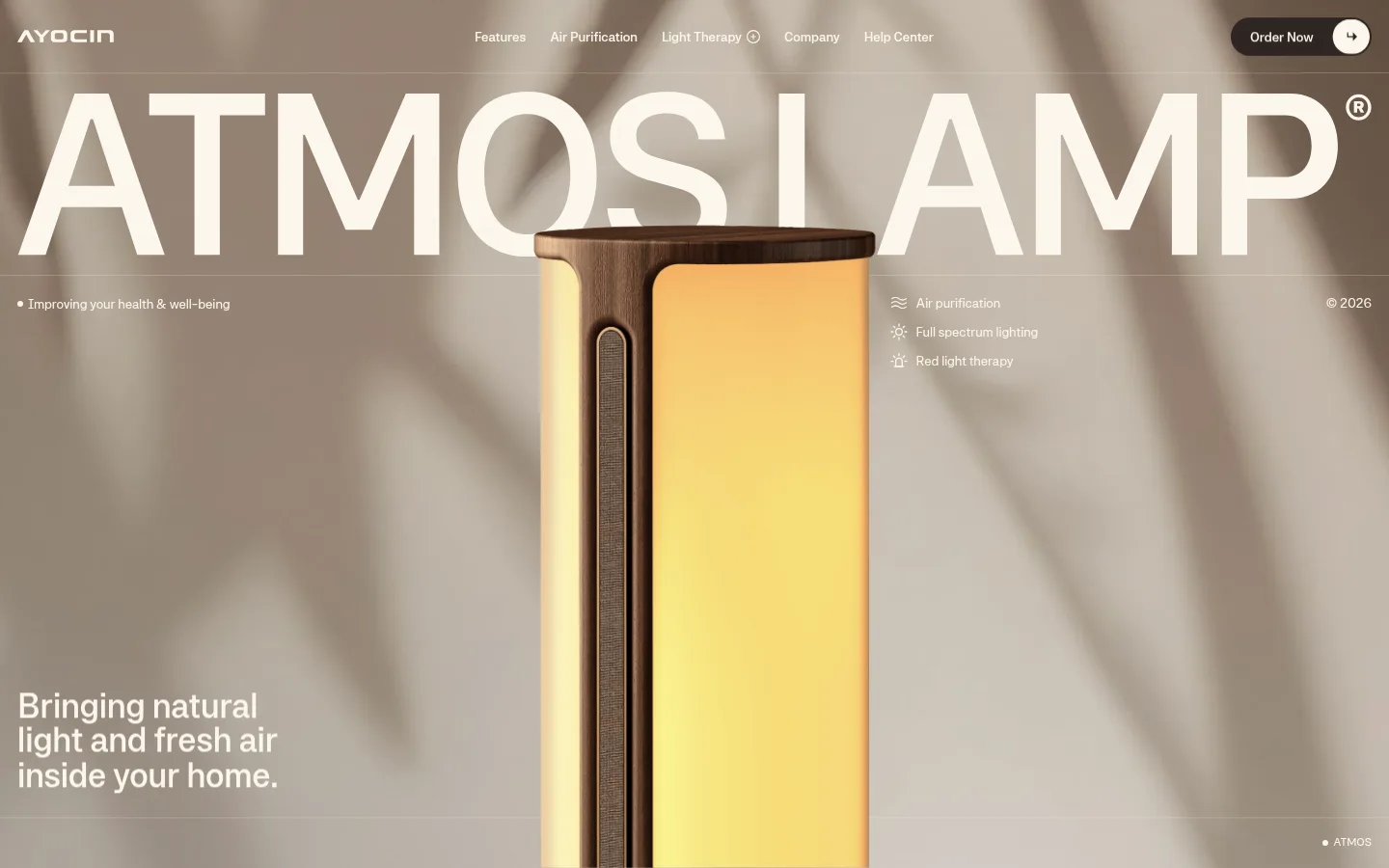
The page builds its identity around a restrained warm-neutral palette: cream typography sits over a softly blurred taupe interior, while dark brown is reserved for the Order Now control and limited supporting details. Several measured beige tones appear in gradients or rendered imagery; treat them as supporting atmosphere rather than additional interface colours. Systemia is used consistently, from the compact navigation and utility copy to the oversized, all-caps product name. The hero is a single expansive visual field: large type spans the upper canvas, while a tall illuminated lamp anchors the center and smaller copy sits near the lower edges. Fine horizontal rules and a translucent-feeling navigation band organize the composition without making it feel boxed in. Spacious separation, sparse interface chrome, and the lamp’s golden light create contrast and hierarchy without relying on heavy cards, shadows, or decorative accents.
Site-wide type for navigation, oversized product title, supporting copy, captions, and buttons.
角色
示例
字号
字重
行高
字距
特大标题
Oversized product name across the hero image.
AYOCIN
60px
500
1
0
一级标题
Primary editorial headline in supporting content.
AYOCIN
36px
500
1
0
正文
Benefit descriptions and explanatory copy.
The quick brown fox 敏捷的狐狸
14px
400
1.4
0
辅助文字
Small uppercase utility labels and product annotations.
The quick brown fox 敏捷的狐狸
12px
400
1.4
0
按钮
Order Now CTA label.
The quick brown fox 敏捷的狐狸
14px
500
1
0
导航
Compact top-level navigation links.
The quick brown fox 敏捷的狐狸
14px
500
1.2
0
间距与布局
基准单位 2px · 密度:宽松
100px版块间距
8px元素间距
—卡片内边距
680px内容最大宽度
5px
8px
9px
10px
12px
18px
20px
25px
35px
100px
Use a full-bleed hero as the primary page grid, with navigation spanning the top and the product image centered beneath a very large title. Keep secondary copy aligned to the lower-left and feature notes toward the right, with small utility details at the edges. The measured page max width is 680px for constrained content, while hero media runs edge to edge. The spacing system is spacious, with a 100px section gap and 8px element gap. Maintain centered headline alignment and avoid dense card layouts.
圆角与层次
按钮 · 9999px
导航 · 9999px
没有测到阴影:页面是扁平的,层次靠底色和描边区分。
The interface reads as largely flat, with no measured shadows and no prominent card borders. Separate navigation and hero details with delicate hairlines rather than boxed panels. Preserve depth through the photograph’s soft-focus background, natural shadows, lamp glow, and careful foreground layering.
组件
下面的预览按实测的按钮、输入框、徽标、卡片样式重建(字体用替代字体)。
Overlay navigation
Compact top-row links in 14px Systemia medium, set in cream over the hero image, with brand mark at left and purchase control at right.
Order Now CTA
Dark brown pill-shaped button with cream 14px medium text; pair it with a small separate light circular cart/count control.
Hero product title
Very large uppercase cream product name spanning almost the full viewport width, layered behind or above the centered lamp.
Benefit list
Short cream labels with small line icons for air purification, full-spectrum lighting, and red-light therapy, placed beside the product.
Hero utility captions
Small cream supporting copy and copyright details aligned to the hero edges, balanced against the central product.
Imagery · Use cinematic product photography or high-quality 3D rendering of a tall interior wellness lamp. Frame it centrally and large, against a soft-focus taupe room with diagonal natural-light shadows. Let the warm yellow lamp glow be the main image color accent; it belongs to the product rendering, not the interface palette. Keep the image full-bleed and let overlaid cream text remain readable.
Use cream typography over warm, image-led backgrounds.
Keep the hero product large and centrally framed.
Use dark brown sparingly for the primary purchase action.
Set the product name in oversized uppercase lettering.
Place small benefit labels around the hero subject.
Keep content spacious and interface chrome restrained.
✕ 不该做
Do not add bright interface accents outside the product imagery.
Do not turn the hero into a grid of cards.
Do not use heavy shadows or thick borders.
Do not let navigation compete with the product title.
Do not treat image-only golden yellow as a core UI colour.
Do not crowd the hero with long paragraphs.
给 AI 的提示词
想快速出一个同风格的新页面,把这段话连同 DESIGN.md 一起发给 AI。
Build a new AYOCIN-style wellness product page with an immersive, edge-to-edge hero. Use Linen Glow (#fcf6ec) for overlaid type and Warm Stone (#cec1b2) for the warm canvas atmosphere; reserve Roasted Bark (#2e2521) for the primary purchase button and occasional dark text. Let a softly blurred, taupe-toned room frame one large centered product rendering, with its own warm illumination kept within the image. Use Systemia or a close sans-serif substitute, with an oversized uppercase product title, compact navigation, and brief supporting captions. Align benefit labels beside the product and small utility copy near the edges. Keep the page open and spacious, use delicate hairlines only where needed, and avoid cards, heavy shadows, or extra accent colours.