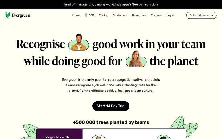
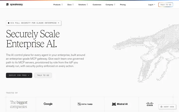
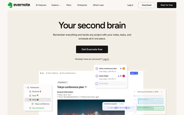
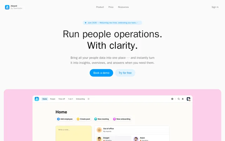
Ease Health 以沉静、编辑式的版面展示行为健康服务平台,整体由森林绿文字和柔和绿色面板构成。大幅衬线标题、圆角产品卡片、界面插画与充足留白,让复杂的临床和 billing 产品显得清晰易读、亲切可信。
North star · Pair editorial serif headlines and forest-green clarity with expansive white space and soft, functional color panels.
The visual strategy balances a clinical product story with a warm, editorial tone. Gallery White (#fffefc) is the quiet canvas; Forest Ink (#0f3e17) anchors headings, body copy, links, navigation, and the dark primary CTA. Soft green panels—Keylime Wash (#e1f4df), Sage Leaf (#b1dbb8), and Pale Mint (#cfe7d3)—differentiate feature cards and content bands without heavy outlines. Mist Blue (#b6ced5) appears as a contrasting panel, most notably behind the hero product illustration. Faire Octave supplies the oversized, light-weight serif display voice, while Suisseintl keeps navigation and supporting copy clear and practical. Layouts use broad two-column splits, card groupings, and large intervals between sections. Product screens are presented as crisp interface illustrations inside rounded panels; customer and investor marks add evidence without turning the page into a dense dashboard. The overall effect is restrained, airy, and quietly confident.
Navigation, body copy, buttons, and practical interface labels.
Aa 设计
Faire Octave
网络字体 · 字重 300 · 占比 30%
免费替代:Cormorant Garamond
Display and editorial headings, including the hero and section titles.
角色
示例
字号
字重
行高
字距
特大标题
Oversized editorial hero or standout section headline.
Ease Health
74px
300
1.05
-0.03em
一级标题
Primary page headline and high-emphasis section heading.
Ease Health
56.5px
300
1.2
-0.03em
二级标题
Major section titles across features, testimonials, and trust content.
Ease Health
40.5px
300
1.35
-0.01em
三级标题
Card and subsection headings in product and feature areas.
Ease Health
28px
400
1.3
0
四级标题
Smaller editorial headings and supporting feature titles.
The quick brown fox 敏捷的狐狸
24.5px
300
1.35
-0.01em
正文
Paragraphs, descriptions, proof points, and supporting copy.
The quick brown fox 敏捷的狐狸
14px
400
1.5
0
按钮
Demo, case-study, and product-action labels.
The quick brown fox 敏捷的狐狸
14px
400
1
0
导航
Header navigation and footer navigation links.
The quick brown fox 敏捷的狐狸
14px
400
1.5
0
间距与布局
基准单位 1px · 密度:适中
70px版块间距
21px元素间距
42px卡片内边距
—内容最大宽度
7px
9px
11px
14px
21px
28px
35px
42px
56px
70px
99px
Use a broad centered content area with responsive two-column hero and feature splits; the measured page does not specify a maximum width. Align headings and copy to the start, with occasional right-aligned product-section titles. Alternate open white canvas with clustered rounded cards rather than continuous colored bands. The section rhythm is spacious, with large pauses between major stories and tighter grouping inside card grids. Keep content density comfortable: short paragraphs, distinct labels, and clear separation between proof points, product UI, and calls to action.
圆角与层次
按钮 · 14px
卡片 · 14px
导航 · 14px
没有测到阴影:页面是扁平的,层次靠底色和描边区分。
The page is predominantly flat: no measured shadows or gradients define the components. Rounded cards rely on distinct soft-green or blue fills rather than strong borders. Maintain layering through contrast between the colored panel, white interface mockup, and canvas; reserve the dark filled treatment for prominent action buttons.
组件
下面的预览按实测的按钮、输入框、徽标、卡片样式重建(字体用替代字体)。
Primary CTA
Forest Ink (#0f3e17) filled button with white text, a subtle border in the same green, and measured 14px rounding.
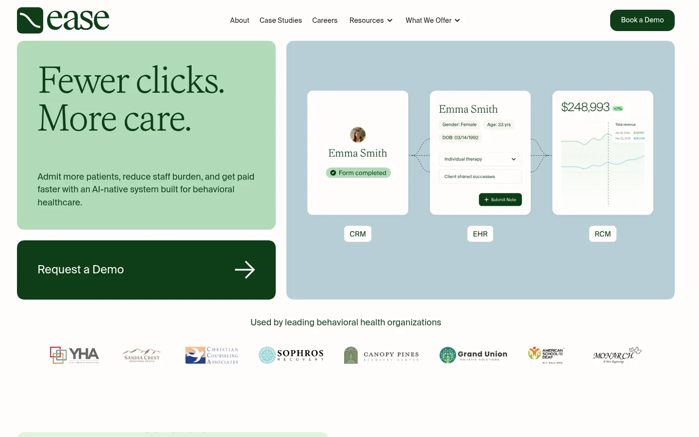
Hero split
Two-column opening: a Keylime Wash (#e1f4df) headline panel and a Mist Blue (#b6ced5) CRM/EHR/RCM product illustration panel.
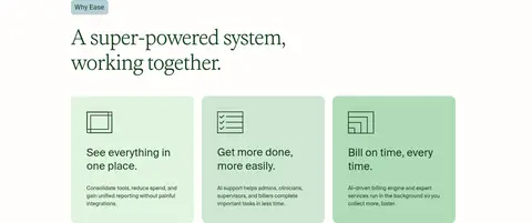
Feature card
Rounded card with a solid soft-green fill, Forest Ink copy, and generous internal breathing room; cards may vary between measured green surfaces.
Eyebrow label
Small text label on a pale blue-green chip above editorial section headings.
Logo cloud
Compact horizontal row of customer or investor marks with a short centered caption and ample surrounding white space.
Product showcase
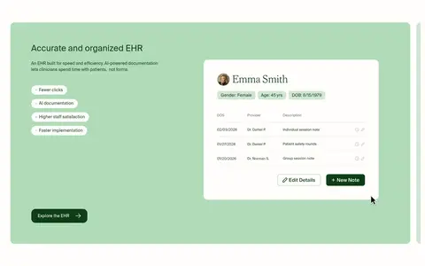
Large sage-toned feature panel pairing concise copy and benefits with a white, rounded clinical interface mockup.
Testimonial feature
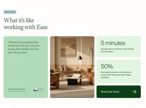
Three-part composition with a green quote card, warm interior photo, and stacked proof-point cards plus a dark action card.
Imagery · Use product interface illustrations as the primary visual proof: crisp white CRM/EHR/RCM panels sit within softly colored fields. The hero pairs a green text card with a blue product-visual panel. Add customer and investor logos in restrained horizontal rows, and use occasional warm interior photography in testimonial content. Keep imagery clean and bright; do not let decorative assets overpower the type or call to action.
Use Forest Ink (#0f3e17) for primary text and key actions.
Keep large headlines in a light editorial serif.
Use soft green and blue fills to distinguish content panels.
Give sections generous breathing room.
Show product interfaces inside clean, rounded white frames.
Keep body copy short and clearly grouped.
✕ 不该做
Do not make the page feel like a dense admin dashboard.
Do not introduce unmeasured palette colors as brand surfaces.
Do not rely on shadows to separate cards.
Do not use heavy borders around every panel.
Do not set long paragraphs in the display serif.
Do not crowd logos, proof points, or calls to action.
给 AI 的提示词
想快速出一个同风格的新页面,把这段话连同 DESIGN.md 一起发给 AI。
Build a new Ease Health page that feels calm, editorial, and clinically credible. Use Gallery White (#fffefc) as the canvas and Forest Ink (#0f3e17) for headings, body text, links, and the primary button. Introduce Keylime Wash (#e1f4df), Sage Leaf (#b1dbb8), and Pale Mint (#cfe7d3) as rounded feature surfaces, with Mist Blue (#b6ced5) as a sparing cool contrast panel. Set prominent headings in a light Faire Octave-like serif and use Suisseintl-like sans-serif for navigation, body, and controls. Organize content into spacious splits and compact card groups, keeping hierarchy clear and paragraphs concise. Illustrate the product with bright, legible interface mockups in white frames. Keep surfaces mostly flat, use restrained borders, and let white space—not shadows—create separation.