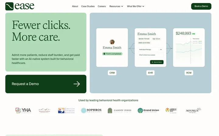
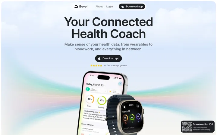
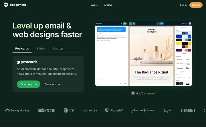
North star · Let warm cream, botanical green, and authentic product imagery carry the story, keeping science content as clear as the commerce.
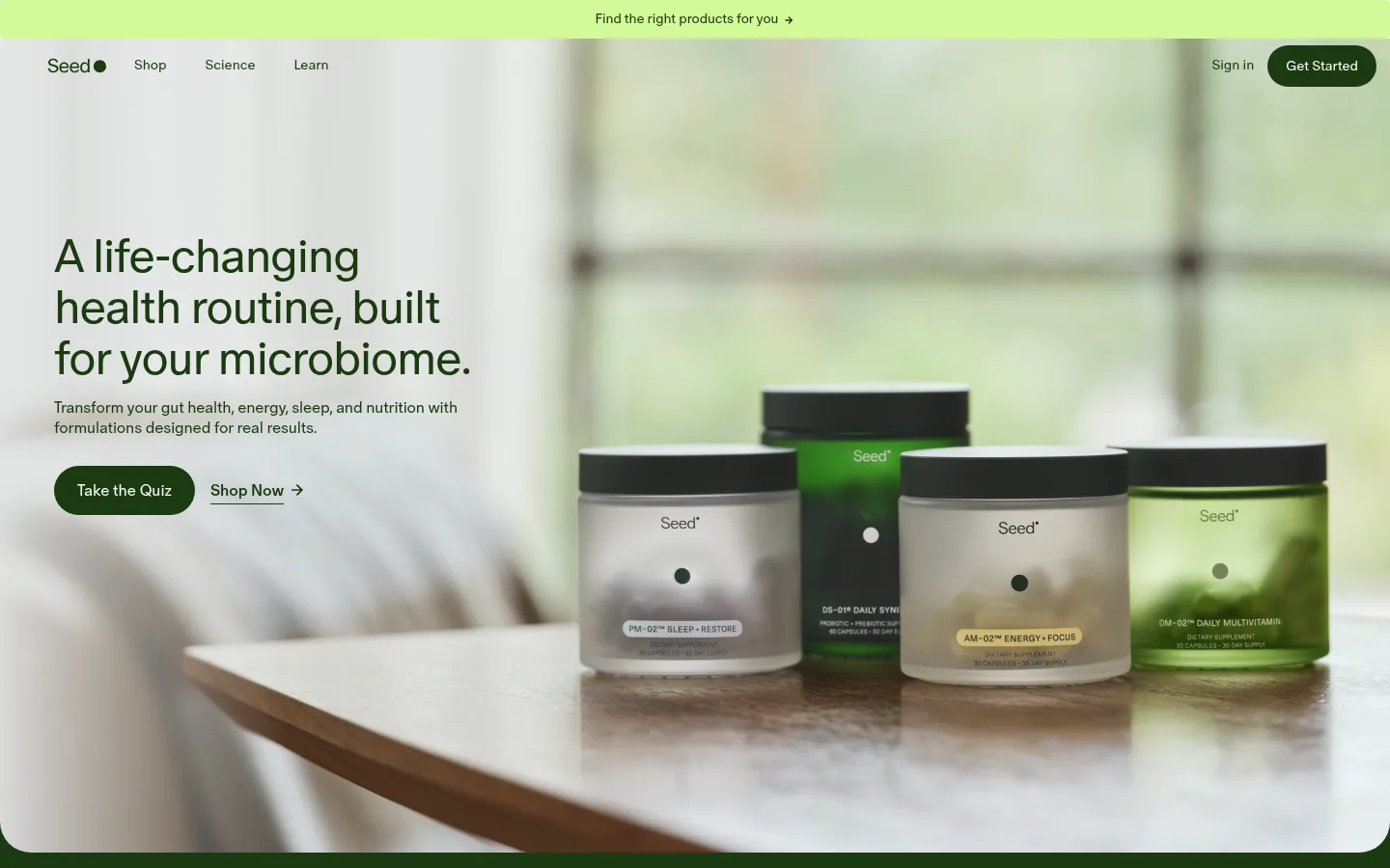
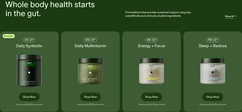
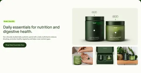
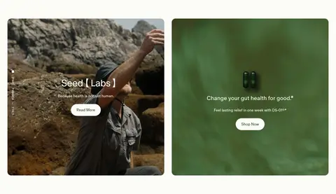
The page is built around a warm near-white canvas (#fcfcf7) and deep botanical green (#1c3a13), with bright lime (#d3fa99) reserved for the slim quiz announcement and small promotional badges. Seed Sans carries nearly all text: large, lightly weighted headlines create an editorial feel, while compact navigation and body copy stay understated. The opening is a full-bleed lifestyle photograph with text aligned to the left; product jars occupy the opposite side and remain the focal point. A dark green product band follows, using a row of rounded product cards, then the layout returns to light backgrounds for bundles, capsule science, education, and member stories. The page alternates broad, calm sections with denser product and media groupings rather than relying on decorative effects. Borders are restrained hairlines; cards and buttons provide the main soft geometry. Green-on-cream contrasts keep calls to action legible and consistent.
Headlines, body copy, navigation, links, buttons, and labels throughout the page.
Aa 设计
Seed Sans Mono
网络字体 · 字重 300 / 400 · 占比 1%
免费替代:Roboto Mono
Small technical or code-like labels, including uppercase microcopy.
角色
示例
字号
字重
行高
字距
一级标题
Hero statement introducing a health routine built for the microbiome.
Seed
48px
350
1.1
-0.015em
二级标题
Major section headlines and prominent editorial or product statements.
Seed
40px
350
1.1
-0.01em
三级标题
Secondary feature headings and prominent content-card titles.
Seed
32px
400
1.1
0
四级标题
Compact section and product-group headings.
The quick brown fox 敏捷的狐狸
24px
350
1.2
-0.02em
正文
Product descriptions, explanatory science copy, and editorial paragraphs.
The quick brown fox 敏捷的狐狸
16px
350
1.3
-0.01em
辅助文字
Badges, image captions, and compact supporting labels.
The quick brown fox 敏捷的狐狸
12px
350
1.4
-0.003em
按钮
Primary and secondary action labels.
The quick brown fox 敏捷的狐狸
16px
350
normal
-0.002em
导航
Main navigation and utility links.
The quick brown fox 敏捷的狐狸
14px
350
1.4
0
链接
Inline and standalone shopping or discovery links.
The quick brown fox 敏捷的狐狸
16px
350
normal
-0.002em
代码
Small technical labels and uppercase scientific microcopy.
const style = 1;
12px
300
1.5
0
间距与布局
基准单位 8px · 密度:适中
32px版块间距
16px元素间距
88px卡片内边距
1376px内容最大宽度
4px
6px
7px
8px
10px
11px
12px
16px
20px
24px
32px
40px
48px
56px
80px
The homepage uses a wide desktop canvas, with content reaching close to the viewport edges in immersive media sections and a measured page max width of 1376px. The hero aligns text left over full-bleed photography; subsequent content shifts between a full-width dark product band, split bundle and education layouts, and multi-column cards or media rails. Sections are generously separated, with comfortable density and clear alignment. Product cards create the densest commerce area, while editorial and testimonial sections retain open space.
圆角与层次
按钮 · 9999px
输入框 · 8px
卡片 · 16px
徽标 · 9999px
导航 · 9999px
链接 · 24px
没有测到阴影:页面是扁平的,层次靠底色和描边区分。
The visual system is mostly flat: no measured shadows or gradients define the page. Separate content through background-color changes, restrained borders such as #d3d5d3, and rounded card silhouettes. Image and video panels may feel layered through their crops and placement, while buttons use filled green or lime treatments rather than shadow-based elevation.
组件
下面的预览按实测的按钮、输入框、徽标、卡片样式重建(字体用替代字体)。
Announcement strip
A narrow lime (#d3fa99) bar above navigation, centering a product-finder link in dark green.
Primary pill CTA
Deep green (#1c3a13) filled button with warm cream (#fcfcf7) text and a fully rounded silhouette.
Product card
Rounded cards sit together in a dark green product band, combining concise labels, jar imagery, and a compact Shop Now action.
Promotion badge
Small lime pill with dark green text marks bestseller or bundle offers without competing with the product.
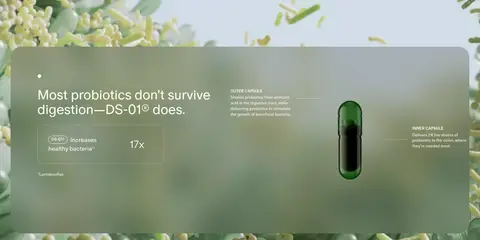
Science information card
A rounded explanatory panel pairs concise capsule or benefit content with restrained mineral-gray hairlines.
Media story tile
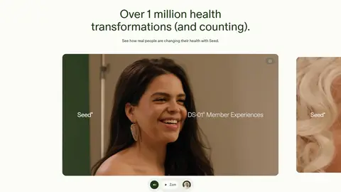
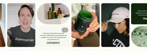
Rounded photographic or video tile overlays short light text and a clear action on immersive imagery.
Newsletter form
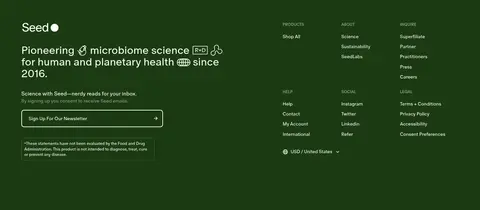
Footer signup uses a simple email input, fine light border, compact explanatory text, and a clear submit action.
Imagery · Use real, softly lit lifestyle and product photography as the main visual asset. The hero places Seed jars in a natural interior, with subdued green and cream surroundings; later sections mix product still lifes, human stories, ingredient or capsule visuals, and video-led science content. Keep imagery immersive and photographic rather than adding decorative illustration. Image cards use rounded corners and uncluttered framing.
Reserve #1c3a13 for core text, dark bands, and primary actions.
Keep #d3fa99 to announcement and small promotional accents.
Let authentic product and lifestyle photography lead the hero.
Use generous space between distinct content sections.
Keep card corners soft and borders subtle.
✕ 不该做
Do not introduce unmeasured brand colors.
Do not make every section a dark green band.
Do not use heavy shadows or decorative gradients.
Do not crowd editorial copy with product controls.
Do not let badges overpower product imagery.
Do not replace the restrained type with bold all-caps display styling.
给 AI 的提示词
想快速出一个同风格的新页面,把这段话连同 DESIGN.md 一起发给 AI。
Build a new Seed-style health-commerce page with an editorial, science-led feel. Use Seed Cream (#fcfcf7) for the main light canvas and Botanical Ink (#1c3a13) for headings, body text, dark section bands, and primary CTAs. Reserve Lime Signal (#d3fa99) for a narrow announcement or compact promotional badge. Set type in a clean sans-serif close to Seed Sans, favoring light-to-regular weights and tight headline tracking. Use a strong lifestyle or product photograph as an immersive hero, then organize content into calm split layouts, rounded product cards, and clear science or editorial modules. Keep borders restrained, use little or no elevation, and preserve ample breathing room between sections. Make shopping actions obvious without sacrificing the considered, natural mood.