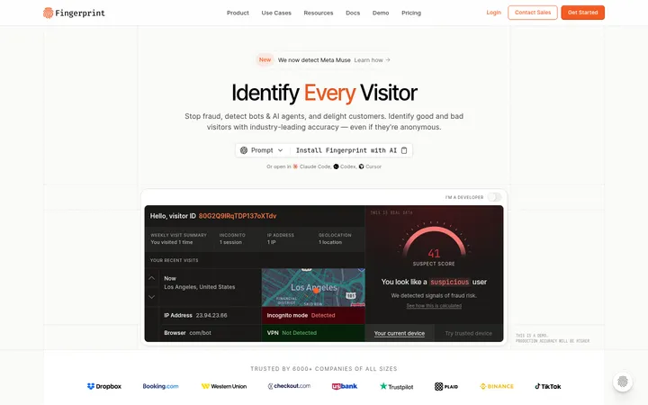
North star · Keep the page predominantly white and spacious, letting bold black type and real product evidence carry the story while accents stay selective.
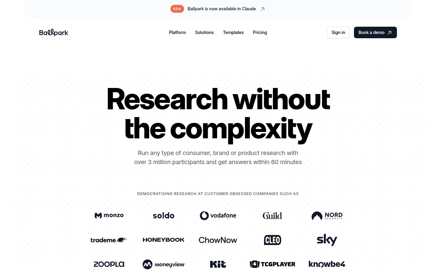
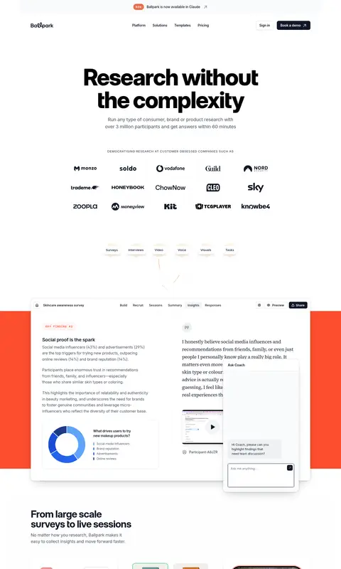
The visual system is built on a white canvas, with very pale gray bands and surfaces separating long sections without heavy dividers. Near-black headings create strong contrast; muted grays keep supporting copy quiet and readable. Orange marks the small announcement badge and selected emphasis, while saturated pink appears in a prominent product feature band. Oversized, tightly tracked sans-serif headlines establish hierarchy, balanced by compact Inter navigation and body copy. The hero is centered and spacious, with a faint dotted field and a monochrome customer logo grid. Farther down, the page alternates between product-interface showcases, text-and-image feature rows, cards, customer stories, and a softly tinted participant section. Product screenshots and photography supply most of the visual detail; subtle card shadows create depth while the surrounding layout remains open and restrained.
Navigation, body copy, captions, and most section headings.
Aa 设计
Source Serif 4
网络字体 · 字重 400 · 占比 6%
免费替代:Literata
Occasional serif detail within the otherwise sans-serif presentation.
Aa 设计
Inter Display
网络字体 · 字重 700 / 800 · 占比 6%
免费替代:Inter
Large display headlines and primary page headings.
角色
示例
字号
字重
行高
字距
特大标题
Large campaign-scale headline moments.
Ballpark
96px
800
1
-0.035em
一级标题
Centered hero headline.
Ballpark
60px
800
1
-0.03em
二级标题
Major section titles and closing CTA headline.
Ballpark
42px
700
1
-0.03em
三级标题
Feature titles and testimonial or product-story headings.
The quick brown fox 敏捷的狐狸
24px
600
1.4
-0.03em
四级标题
Smaller supporting headings within content blocks.
The quick brown fox 敏捷的狐狸
20px
500
1.5
-0.02em
正文
Explanatory paragraphs and interface-adjacent copy.
The quick brown fox 敏捷的狐狸
14px
400
1.43
-0.01em
辅助文字
Card labels, participant details, and fine print.
The quick brown fox 敏捷的狐狸
12px
400
1.33
0
导航
Header navigation links.
The quick brown fox 敏捷的狐狸
14px
600
1.43
-0.01em
眉题
Compact uppercase section labels and category cues.
The quick brown fox 敏捷的狐狸
13px
500
1.38
0.05em
代码
Small uppercase technical or system labels where present.
const style = 1;
11px
600
1.5
0.15em
间距与布局
基准单位 4px · 密度:宽松
120px版块间距
16px元素间距
13px卡片内边距
1180px内容最大宽度
2px
3px
4px
5px
6px
8px
10px
12px
14px
16px
18px
20px
24px
32px
40px
48px
Use a centered content frame with a measured page max width of 1180px and generous side breathing room. The opening hero is center-aligned, followed by a compact monochrome logo grid. Across the long single-page flow, alternate centered sections with asymmetric feature rows, wide product showcases, card grids, and testimonial panels. Preserve spacious section rhythm and moderate component density; let large gaps distinguish ideas instead of relying on rules. Pale full-width bands and the vivid feature strip provide occasional changes of pace.
圆角与层次
按钮 · 7px
卡片 · 16px
图片 · 50%
导航 · 7px
链接 · 16px
md · card
md · other
md · other
hairline · other
Keep most page regions visually flat, using pale background bands rather than outlines to separate sections. Product and testimonial cards sit above the canvas with soft, low-contrast shadows and rounded corners. Use fine, subtle hairline treatments around selected floating interface elements; avoid making borders or shadows the main visual feature.
组件
下面的预览按实测的按钮、输入框、徽标、卡片样式重建(字体用替代字体)。
Announcement bar
A compact centered update sits above the navigation, with a small orange NEW badge and dark announcement text.
Header navigation
Brand mark on the left, centered product links, and sign-in plus dark demo CTA on the right.
Hero
Centered oversized black headline, short muted supporting copy, and a faint dotted field behind the customer-logo proof.
Product showcase
Layered research dashboard and response interface overlap a vivid feature band to show the real product in context.
Feature cards
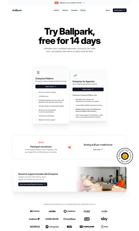
Rounded white cards present research methods and examples, with subtle shadowing and product imagery.
Customer proof
Monochrome brand marks and testimonial panels establish credibility, while photography remains part of the customer story.
Closing CTA and footer
A centered dark-button call to action leads into a pale, multi-column footer with dense links and small status details.
Imagery · Use detailed product-interface captures as the primary evidence: dashboards, survey responses, prototype previews, and cards. Mix these with selectively framed customer photography and illustrative interface content. The hero’s dotted background stays faint and subordinate. Customer logos are mostly monochrome, while product mockups and participant flags retain their own colors; treat these as content imagery rather than extra brand colors.
Use near-black for high-priority headings and CTAs.
Reserve orange and pink for selective emphasis.
Let product screenshots explain the software.
Use pale section bands to separate content gently.
Maintain generous space around headline groups.
✕ 不该做
Do not fill every section with a colored background.
Do not replace the product evidence with abstract decoration.
Do not use saturated accents for ordinary body copy.
Do not crowd the hero with navigation or extra content.
Do not add heavy borders to every card.
Do not make the entire page feel like a dashboard.
给 AI 的提示词
想快速出一个同风格的新页面,把这段话连同 DESIGN.md 一起发给 AI。
Build a new SaaS page in Ballpark’s restrained, research-focused visual style. Use Gallery White (#ffffff) as the dominant canvas, Mist Surface (#f9fafb) for gentle section changes, Ink (#111827) for headlines and primary actions, Slate Copy (#4b5563) for supporting text, and reserve Ballpark Orange (#fc4a2b) and Signal Pink (#e11d48) for small, intentional accents. Set oversized, tightly tracked sans-serif headlines above compact, readable Inter-style copy. Create a centered hero, customer proof, alternating feature layouts, and product-interface showcases with generous open space. Favor real interface imagery, rounded white cards, and subtle shadows; keep decorative dotted texture faint. Maintain a calm editorial rhythm, using wide pale bands and one vivid feature moment rather than repeated colored blocks.