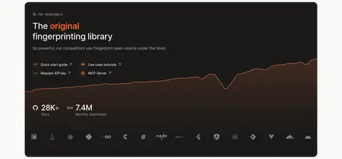
North star · Keep the page calm and spacious, using orange only to direct attention and product interfaces to prove technical credibility.
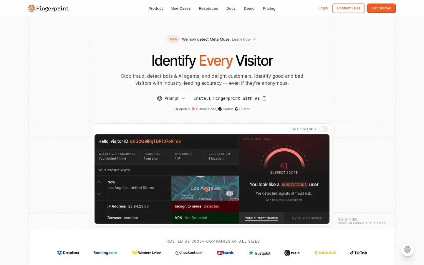
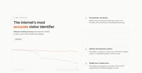
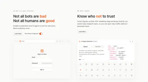
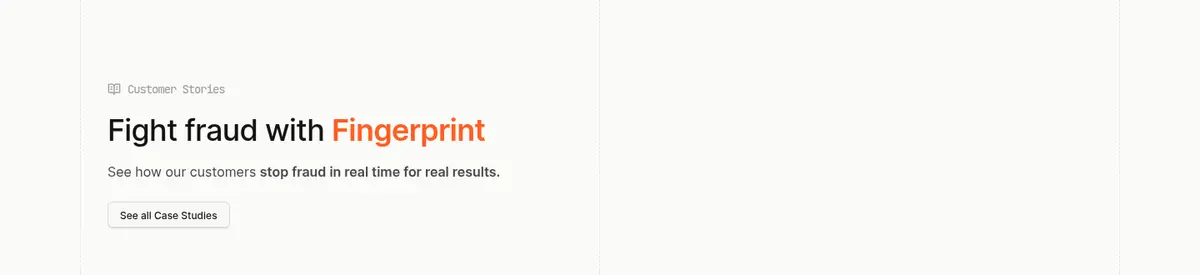
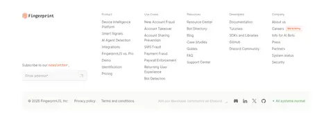
The page uses a warm off-white canvas (#fafaf8) as its visual constant, with white surfaces separating selected proof and footer areas. Bright orange (#f35b22) marks the primary action and highlights selected words, while dark text and muted grays keep long-form product explanations quiet and legible. Inter is the main workhorse: centered, medium-weight hero typography gives way to compact navigation, small uppercase eyebrows, and comfortably spaced body copy. JetBrains Mono appears in code-like details and technical interface fragments. The composition begins with a centered hero and a prominent dark product demo, then shifts into left-aligned feature sections, split panels, customer proof, a dark developer showcase, and a white metrics-and-footer zone. Fine gray rules and faint grid lines give structure without visual heaviness. Product screenshots and data visualizations carry the technical story; orange is a signal, not a broad decorative wash.
配色
点色块复制色值。用途说明来自对页面的实测位置(背景、文字、描边、按钮)与截图判读。
品牌色
强调色
表层色
中性色
功能色
页面底色 · Warm Canvas表层 · Clean Surface表层 2 · Night Panel主文字 · Near-Black Ink次要文字 · Stone Gray弱文字 · Navigation Gray描边 · Soft Rule强调 · Signal Orange强调 2 · Bright Ember强调 3 · Rose Signal
文字
背景
对比度
WCAG
#141415 Near-Black Ink
#fafaf8 Warm Canvas
17.62:1
AAA
#141415 Near-Black Ink
#ffffff Clean Surface
18.41:1
AAA
#141415 Near-Black Ink
#1a1917 Night Panel
1.05:1
不达标
#484946 Stone Gray
#fafaf8 Warm Canvas
8.67:1
AAA
#484946 Stone Gray
#ffffff Clean Surface
9.06:1
AAA
#484946 Stone Gray
#1a1917 Night Panel
1.94:1
不达标
字体
字号阶梯:Custom(比例约 2.25,正文 16px)。示例用免费替代字体渲染,数值为实测。
Aa 设计
Inter
网络字体 · 字重 400 / 500 / 600 · 占比 82%
免费替代:Inter
Headings, body copy, navigation, labels, links, buttons, and most interface text.
Aa 设计
JetBrains Mono
网络字体 · 字重 400 / 500 / 470 / 300 / 700 · 占比 19%
免费替代:Roboto Mono
Code-like details and technical or metric fragments within product-facing content.
角色
示例
字号
字重
行高
字距
一级标题
Centered hero headline and prominent section headlines.
Fingerprint
36px
500
1.22
-0.02em
正文
Explanatory copy beneath headlines and within feature sections.
The quick brown fox 敏捷的狐狸
16px
400
1.5
0
辅助文字
Small supporting notes, customer labels, and interface annotations.
The quick brown fox 敏捷的狐狸
14px
400
1.5
0
按钮
Compact CTA labels such as Get Started and Contact Sales.
The quick brown fox 敏捷的狐狸
12px
500
1.33
0
导航
Primary navigation links and secondary product navigation.
The quick brown fox 敏捷的狐狸
14px
400
1.5
0
链接
Inline links, documentation links, and resource actions.
The quick brown fox 敏捷的狐狸
14px
400
1.4
0
眉题
Small uppercase section labels above feature and case-study content.
The quick brown fox 敏捷的狐狸
9px
500
1.6
0.08em
代码
Monospaced snippets, technical labels, and API-oriented interface details.
const style = 1;
12px
500
1.5
0
间距与布局
基准单位 4px · 密度:宽松
96px版块间距
6px元素间距
—卡片内边距
1248px内容最大宽度
3px
4px
6px
7px
8px
10px
12px
14px
16px
24px
32px
96px
A measured page max width of 1248px supports a spacious, modular composition. The opening hero is centered, with a broad product demo beneath; subsequent feature areas alternate single-column introductions and two-column product or benefit layouts. The customer story and developer showcase use distinct full-width moments, followed by metrics and a multi-column footer. Sections have generous measured rhythm, with a 96px section gap and 4px spacing base. Fine grid lines and thin borders provide alignment cues without crowding content.
圆角与层次
按钮 · 4px
输入框 · 6px
卡片 · 12px
图片 · 12px
徽标 · 4px
导航 · 4px
链接 · 12px
hairline · button
inset · button
hairline · other
inset · button, other
The page is mostly flat, using #e4e5e1 hairlines and quiet inset edges to define cards and inputs. Buttons have restrained layered shadows rather than dramatic elevation. Rounded card and media frames separate embedded product content; dark panels contrast by color, not by heavy shadow.
组件
下面的预览按实测的按钮、输入框、徽标、卡片样式重建(字体用替代字体)。
Primary CTA
Orange #f35b22 fill, white label, subtle burnt border, compact Inter text, and a small rounded rectangular shape.
Secondary CTA
Pale neutral fill with dark text, fine gray border, and a restrained inset or low shadow.
Outline CTA
White or near-white surface with orange text and orange outline for actions such as Contact Sales.
Product demo panel
Rounded light outer frame surrounding a dense, dark product interface with muted labels and selective alert colors.
Feature card
Quiet card surface with a thin #e4e5e1 edge, restrained rounding, and room for copy or a compact product visual.
Eyebrow label
Small uppercase Inter label with expanded tracking, muted color, and a short section-identifying phrase.
Customer logo strip
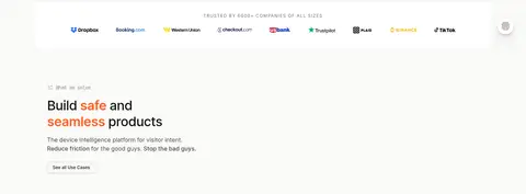
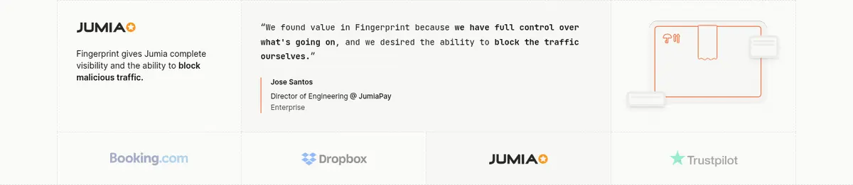
Horizontal company marks centered within a calm band, used as understated trust evidence.
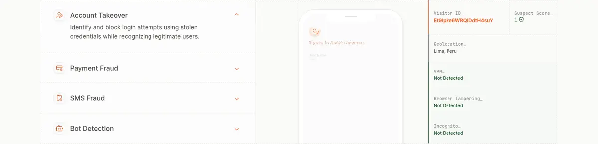
Imagery · Imagery is primarily product evidence rather than lifestyle photography: interface previews, visitor-risk panels, charts, maps, logos, and developer visuals. The hero demo is framed as a large rounded white card containing a high-contrast dark interface. Smaller illustrations remain contained within cards and feature columns, with restrained color and fine borders. Customer logos are presented as a quiet horizontal proof strip; no prominent full-bleed photography defines the page.
Reserve #f35b22 for primary actions and selective emphasis.
Pair explanatory copy with visible product evidence.
Keep section transitions airy and well organized.
Use fine borders instead of heavy card shadows.
Keep technical details compact and use monospaced type sparingly.
✕ 不该做
Do not turn the page into a saturated orange experience.
Do not place every section inside a raised card.
Do not use dense, continuous text blocks.
Do not add decorative photography that competes with product UI.
Do not use strong gradients as the primary brand treatment.
Do not make secondary links as visually loud as the primary CTA.
给 AI 的提示词
想快速出一个同风格的新页面,把这段话连同 DESIGN.md 一起发给 AI。
Build a new Fingerprint-style SaaS page with a warm #fafaf8 canvas, crisp #141415 text, muted #484946 and #6e6f6c supporting copy, and thin #e4e5e1 rules. Use #f35b22 sparingly for the main CTA and short emphasis; use #ffffff for selected surfaces and #1a1917 for product-proof panels. Set the page in Inter, with JetBrains Mono reserved for technical fragments. Favor a spacious centered hero, followed by clearly aligned feature blocks, product-interface evidence, proof points, and a structured footer. Use compact, subtly rounded controls, quiet borders, and restrained shadows. Keep content readable and modular; let authentic-looking product UI, charts, and customer marks communicate credibility instead of decorative imagery or oversized color fields.