North star · Keep the interface strictly black and white, and let project imagery provide the colour and visual character.
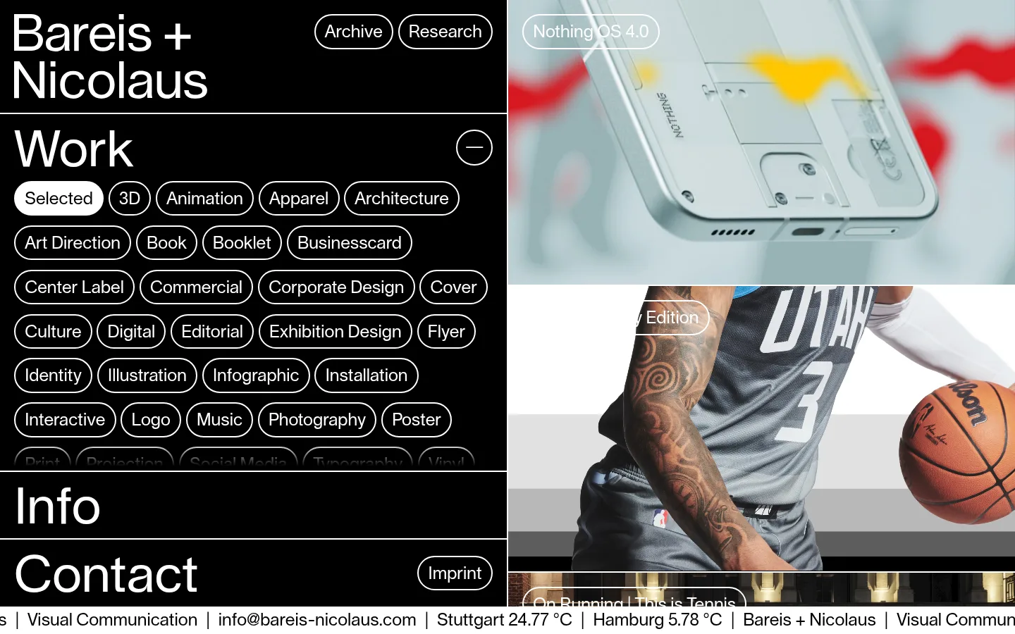
The page is built on a strict black-and-white palette: black fills the navigation and information column, while white carries type, outlines, dividers, and the selected category. Project photography supplies nearly all other colour, so the interface remains neutral as images change from a pale product close-up to a basketball campaign. Lausanne is the dominant sans serif, used in large, regular-weight headings and compact, readable category labels; Victor Serif is the secondary measured face. The desktop composition places a dense index on the left and a tall, scrolling project-image column on the right. Thin white horizontal rules divide the left-side blocks, while rounded outline pills distinguish navigable categories without adding filled surfaces. The layout feels deliberately packed in its index but spacious around the large imagery. Use flat black fields, crisp white borders, and image-led contrast rather than shadows, gradients, or decorative colour.
配色
点色块复制色值。用途说明来自对页面的实测位置(背景、文字、描边、按钮)与截图判读。
品牌色
中性色
页面底色 · Studio Black表层 · Gallery White主文字 · Gallery White次要文字 · Studio Black描边 · Gallery White
文字
背景
对比度
WCAG
#ffffff Gallery White
#000000 Studio Black
21:1
AAA
#000000 Studio Black
#ffffff Gallery White
21:1
AAA
字体
字号阶梯:Custom(比例约 3,正文 24px)。示例用免费替代字体渲染,数值为实测。
Aa 设计
Lausanne
网络字体 · 字重 400 · 占比 63%
免费替代:Inter
Display headings, body labels, category controls, and navigation
Aa 设计
Victor Serif
网络字体 · 字重 400 · 占比 37%
免费替代:Lora
Secondary measured serif face; use sparingly where a serif accent is needed
角色
示例
字号
字重
行高
字距
特大标题
Large section headings such as Work, Info, and Contact.
Bareis + Nicolaus
72px
400
1
0
正文
Category labels, project titles, and compact information text.
The quick brown fox 敏捷的狐狸
24px
400
1
0
导航
Top-level Archive and Research links and category navigation.
The quick brown fox 敏捷的狐狸
24px
400
1
0
间距与布局
基准单位 1px · 密度:适中
—版块间距
—元素间距
—卡片内边距
—内容最大宽度
10px
12px
13px
20px
A desktop split composition places a dense black index and information stack on the left beside a vertical project-image feed on the right. The left column aligns content to a consistent inset, with thin horizontal rules separating the brand, Work, Info, and Contact areas. The image stream is edge-to-edge within its column and continues below the viewport. Category pills wrap into tightly packed rows; preserve this dense rhythm and let imagery occupy the contrasting open field. Measurements do not specify a maximum width or section gap.
圆角与层次
按钮 · 9999px
导航 · 50%
没有测到阴影:页面是扁平的,层次靠底色和描边区分。
The interface is flat, with no measured shadows or gradients. White hairline rules and outlined pills define structure against the black canvas. Project media sits directly in its column; use image boundaries and occasional overlaid labels for layering rather than cards, drop shadows, or raised surfaces.
组件
下面的预览按实测的按钮、输入框、徽标、卡片样式重建(字体用替代字体)。
Brand header
Large two-line Bareis + Nicolaus wordmark sits at upper left, with outlined Archive and Research pills aligned alongside it.
Category index
Work heading and a wrapping set of outlined white category pills; Selected is the white-filled active pill.
Project image feed
Vertical, edge-to-edge column of project photography and video, with concise white outlined title labels over some images.
Section dividers
Thin white horizontal rules divide the brand header, Work index, Info, and Contact areas.
Contact block
Large Contact heading paired with a compact outlined Imprint pill.
Ticker strip
A narrow white footer-like strip carries black studio and location information in a single horizontal line.
Imagery · Use large, edge-to-edge project photography and video rather than decorative illustrations. The visible work includes a cool-toned close-up of a Nothing phone and a basketball campaign; their colour and subject matter change independently of the monochrome interface. Preserve broad image crops and allow project-title pills to sit over imagery with white outlines and text.
Keep category controls rounded and densely wrapped.
Let project photography provide colour.
Separate left-side blocks with fine white rules.
Keep typography regular-weight and unembellished.
✕ 不该做
Don't introduce accent colours into interface controls.
Don't add shadows or gradients.
Don't place project images inside decorative cards.
Don't loosen the category index into sparse rows.
Don't replace the flat split layout with a centered hero.
Don't use heavy typography or decorative type effects.
给 AI 的提示词
想快速出一个同风格的新页面,把这段话连同 DESIGN.md 一起发给 AI。
Build a new creative-studio portfolio page with the stark monochrome character of Bareis + Nicolaus. Use Studio Black (#000000) for the main interface canvas and Gallery White (#ffffff) for typography, rules, outlines, and active controls. Set large, regular sans-serif headings in Lausanne or a close alternative such as Inter; use compact labels and rounded outline pills for navigation and filters. Create a dense index-and-information column beside a vertical, edge-to-edge project media feed. Separate content blocks with thin white rules, and let photography or video supply the page’s colour. Keep surfaces flat: no shadows, gradients, or decorative cards. Preserve the contrast between tightly packed category labels and large image crops, and use restrained white title pills over selected project imagery.