North star · Let oversized dark typography and a warm neutral canvas lead; use vivid blue and orange only to focus attention.
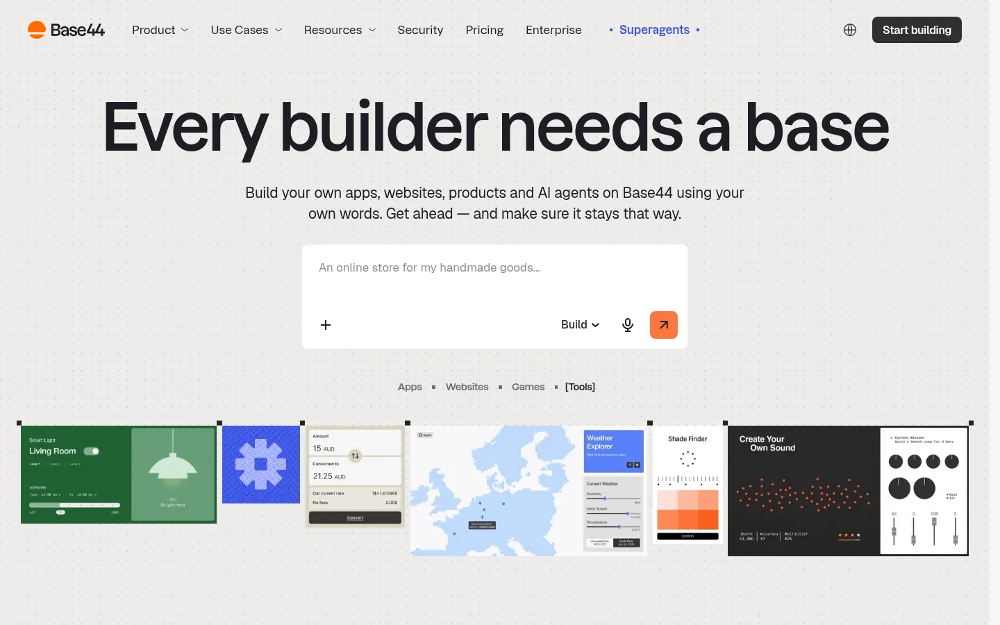
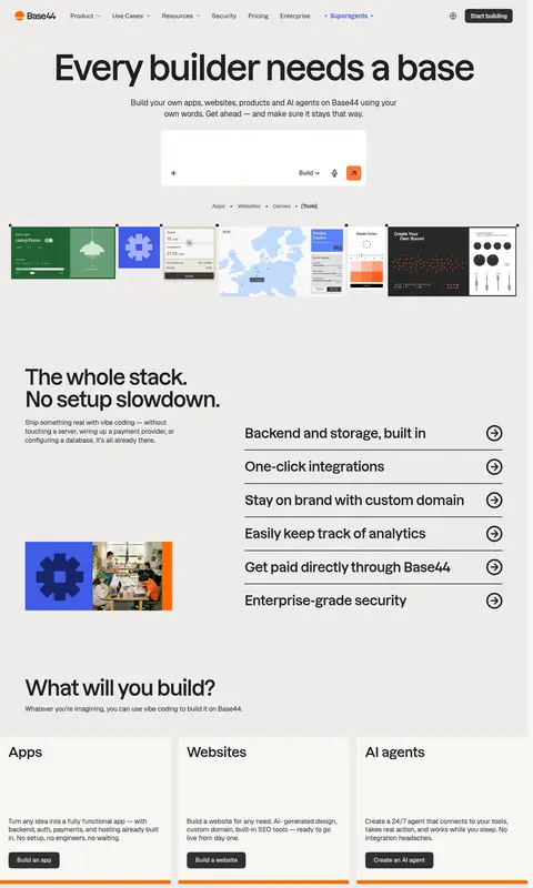
The page builds its identity from a warm light canvas (#eeeceb), near-black text (#1e1e24), and large, confident Dazzed headlines. Geist handles supporting copy, navigation, and controls, keeping dense product information readable against the spacious editorial structure. White and near-white panels separate cards and later FAQ and footer areas from the long neutral page background. Blue is reserved for standout feature panels and select navigation emphasis; orange appears as a vivid CTA detail, card edge, or pricing highlight rather than a general wash. The hero centers a short value proposition above a white prompt composer, then uses a wide strip of varied app examples as product proof. Further down, the page alternates split feature layouts, card rows, statistics, pricing, and FAQ content. Hairline dividers and mostly flat surfaces keep the interface precise; the strongest visual layering comes from contrasting section bands and illustrative product previews.
配色
点色块复制色值。用途说明来自对页面的实测位置(背景、文字、描边、按钮)与截图判读。
品牌色
强调色
表层色
中性色
页面底色 · Warm Canvas表层 · Porcelain Mist表层 2 · Clean Paper主文字 · Soft Ink描边 · Signal Orange强调 · Electric Blue强调 2 · Coral Spark强调 3 · Signal Orange
Supporting copy, buttons, links, and much of the navigation and interface text.
Aa 设计
Dazzed
网络字体 · 字重 600 / 500 · 占比 21%
免费替代:Manrope
Display headings and prominent feature or card text; also used in some navigation and link instances.
角色
示例
字号
字重
行高
字距
特大标题
Large hero-scale display headline.
Base44
93px
600
0.89
-0.04em
一级标题
Primary hero and major section headlines.
Base44
57px
600
1.05
-0.03em
二级标题
Section headings, including features, pricing, and FAQ.
Base44
36px
600
1.08
-0.021em
三级标题
Card titles and smaller feature headlines.
The quick brown fox 敏捷的狐狸
24px
600
1.25
-0.03em
四级标题
Supporting subheads and explanatory statements.
The quick brown fox 敏捷的狐狸
21px
400
1.39
-0.01em
正文
Main paragraphs and feature descriptions.
The quick brown fox 敏捷的狐狸
16px
400
1.44
0
辅助文字
Compact helper copy and secondary annotations.
The quick brown fox 敏捷的狐狸
15px
400
1.33
0
按钮
Primary and secondary CTA labels.
The quick brown fox 敏捷的狐狸
16px
500
1
0
导航
Top navigation items and prominent navigation labels.
The quick brown fox 敏捷的狐狸
16px
500
1.5
0
链接
Inline and standalone text links.
The quick brown fox 敏捷的狐狸
16px
400
1.44
0
间距与布局
基准单位 2px · 密度:适中
90px版块间距
24px元素间距
8px卡片内边距
—内容最大宽度
3px
4px
6px
9px
10px
11px
12px
14px
15px
20px
21px
22px
23px
24px
27px
30px
A long, single-page composition uses broad section bands and a modular content grid. The hero is centered, while subsequent feature blocks shift between split layouts and three-column cards; pricing and FAQ return to a two-column feel. The measured maximum width is unspecified, so preserve the screenshot’s generous side margins without inventing a fixed width. Comfortable density and substantial vertical breathing room distinguish major sections, while compact lists and rules keep information-heavy areas orderly.
圆角与层次
按钮 · 8px
卡片 · 8px
导航 · 2px
没有测到阴影:页面是扁平的,层次靠底色和描边区分。
The overall design is flat, with no measured shadow system. Separate content using white or near-white panels, contrasting section backgrounds, and thin dark dividers. Some cards use prominent outlines or orange accents; avoid adding soft shadow stacks or artificial depth.
组件
下面的预览按实测的按钮、输入框、徽标、卡片样式重建(字体用替代字体)。
Top navigation
A slim horizontal header with the Base44 mark, text links, a small blue-highlighted item, language icon, and dark rounded CTA.
Hero prompt composer
Centered white input panel with muted prompt text, utility controls, and a coral-orange submit control with an 8px measured radius.
App preview strip
A wide, tightly aligned row of heterogeneous app previews, allowing each interface to retain its own palette and visual character.
Feature list
Editorial split section pairing a short headline and illustration with stacked text rows separated by dark rules and arrow icons.
Category cards
Three light cards for Apps, Websites, and AI agents, each with a concise explanation, dark button, and orange lower-edge accent.
Pricing panels
Side-by-side plan information with a white free tier and a strong orange paid tier; keep pricing labels and actions clearly grouped.
FAQ accordion
A heading column alongside a list of question rows, thin dividers, and circular expand controls on a clean white band.
Closing CTA
A broad vivid-blue panel with oversized white centered text and an underlined build link.
Imagery · The hero uses a horizontal collage of app interfaces as product proof, with contrasting greens, maps, dashboards, and dark panels contained in their own previews. Feature areas pair interface-like illustrations with text; a blue block carries a large typographic message. Later content includes a founder portrait and warm-toned card artwork. Treat these as varied product examples, not as a unified photography palette.
Set major headlines in Dazzed-style bold display typography.
Use near-black text for navigation, headings, and rules.
Reserve vivid blue for selected feature and CTA panels.
Keep orange accents concentrated in controls, card edges, and highlights.
Separate sections with generous whitespace and simple dividers.
✕ 不该做
Do not make gradients or shadows a defining visual feature.
Do not use orange as a full-page background.
Do not flatten app previews into one uniform illustration style.
Do not crowd the hero with competing navigation or extra copy.
Do not add unmeasured dimensions, spacing, or corner radii.
Do not replace the restrained palette with many unrelated accents.
给 AI 的提示词
想快速出一个同风格的新页面,把这段话连同 DESIGN.md 一起发给 AI。
Build a new Base44-style SaaS page with a warm, editorial interface. Use Warm Canvas (#eeeceb) for broad page areas and Soft Ink (#1e1e24) for text, navigation, and rules. Use Dazzed-like display typography for large, tightly tracked headings, with Geist-like sans serif for readable copy and controls. Create a clear hero with a centered prompt panel, then organize content into split feature sections and light cards. Use Clean Paper (#ffffff) and Porcelain Mist (#f9f8f6) to distinguish panels. Reserve Electric Blue (#3950e6) for a few bold feature or CTA areas, and Coral Spark (#ff773c) or Signal Orange (#ff6a00) for small action details. Keep the page spacious, mostly flat, and structured with restrained dividers; avoid unmeasured styling claims or decorative shadow effects.