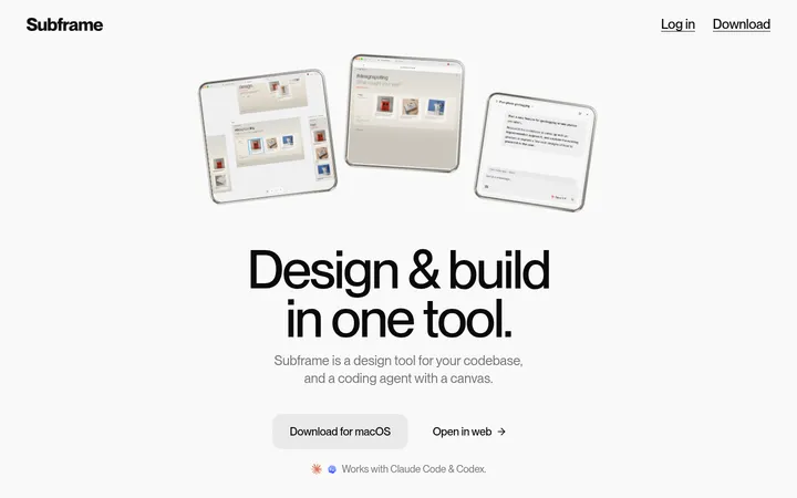
North star · Keep the product story calm and legible: use neutral surfaces, editorial headings, generous separation, and real interface imagery rather than decorative effects.
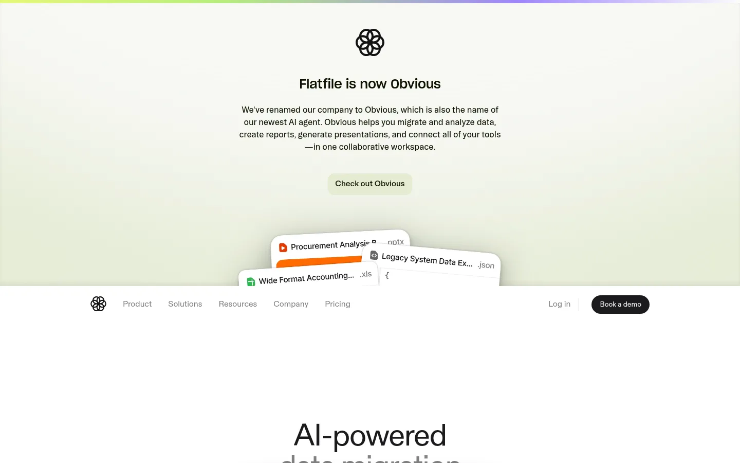
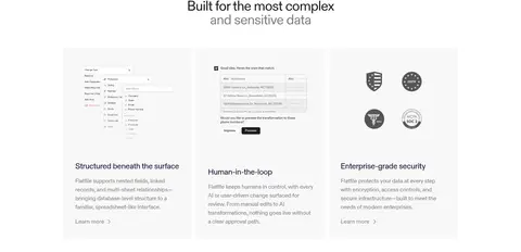
The page uses white as its primary canvas, punctuated by very light gray feature surfaces and a near-black footer. A pale green-tinted announcement panel and product artwork add gentle color, but the measured core palette remains neutral; illustration colors should not be mistaken for brand-wide accents. FlatfileDiatype carries most interface and body copy, while Source Serif 4 adds a more editorial voice to the main heading. Headlines are compact and tightly tracked, with centered alignment in the introductory areas and left alignment in many feature sections. A narrow, centered content column expands into two- and three-column card groups where product details benefit from comparison. Large vertical gaps separate sections, while small internal gaps keep cards and text clusters readable. Interface screenshots and file-like graphics provide concrete product evidence. Borders are thin and pale, cards are mostly flat, and pill-shaped actions provide the most distinctive component shape.
Display headings, feature titles, body copy, and common text.
Aa 设计
FlatfileDiatypeVariable
网络字体 · 字重 400 / 500 · 占比 17%
免费替代:Inter
Navigation, feature-card text, and medium-weight button labels.
Aa 设计
SourceSerif4
网络字体 · 字重 400 · 占比 10%
免费替代:Source Serif 4
Large editorial H1 treatment.
Aa 设计
Booton
网络字体 · 字重 469 · 占比 4%
免费替代:DM Sans
Minor branded or decorative type use.
角色
示例
字号
字重
行高
字距
特大标题
Oversized introductory display headline.
Flatfile
60px
400
1
-0.03em
一级标题
Editorial serif hero or major statement heading.
Flatfile
38px
400
1
-0.032em
二级标题
Section headings and prominent feature titles.
The quick brown fox 敏捷的狐狸
26px
500
1.42
-0.01em
三级标题
Feature-card and supporting subsection titles.
The quick brown fox 敏捷的狐狸
22px
400
1.18
-0.023em
正文
Primary explanatory paragraphs and product descriptions.
The quick brown fox 敏捷的狐狸
16px
400
1.5
-0.016em
辅助文字
Small labels, fine print, and supporting annotations.
The quick brown fox 敏捷的狐狸
14px
400
1.43
0
按钮
CTA labels, often centered in pill-shaped controls.
The quick brown fox 敏捷的狐狸
16px
500
1.5
0
导航
Header navigation and menu labels.
The quick brown fox 敏捷的狐狸
16px
400
1.5
0
间距与布局
基准单位 8px · 密度:宽松
120px版块间距
16px元素间距
32px卡片内边距
1088px内容最大宽度
4px
8px
12px
16px
24px
32px
40px
88px
120px
Use a centered content area with a measured maximum width of 1088px, then let selected color bands and the footer span the viewport. The page alternates centered introductions with left-aligned feature sections, two-column product explanations, and three-column card groups. Maintain a spacious vertical rhythm: section separation is prominent, while text and card interiors remain compact. Keep the navigation visually quiet and separate from the oversized whitespace around the hero. Feature imagery sits alongside copy or within pale cards rather than filling the page.
圆角与层次
按钮 · 9999px
inset · section
xl · other
The design is predominantly flat, with pale hairline borders defining controls and card edges. Use inset or layered shadows only where a product panel needs separation; avoid heavy elevation across the page. Rounded pill buttons contrast with mostly square-cornered cards. Artwork and overlapping file previews provide occasional depth without changing the calm surface system.
组件
下面的预览按实测的按钮、输入框、徽标、卡片样式重建(字体用替代字体)。
Primary demo button
Compact dark pill with white label; use the measured #1b1b1e background and #ffffff text.
Outlined text button
Light, understated pill with a fine #d7d7d7 border and dark label.
Announcement CTA
Pale green promo button with dark olive-toned text; preserve as a one-off announcement treatment.
Feature card
Flat card with generous measured padding, either white or #f8f8f8, and dark blue-black copy.
Feature split
Pair concise copy and a product UI preview in a two-column composition; alternate image placement where appropriate.
Footer link columns
Dense multi-column navigation on #151515 with restrained muted text and small brand marks.
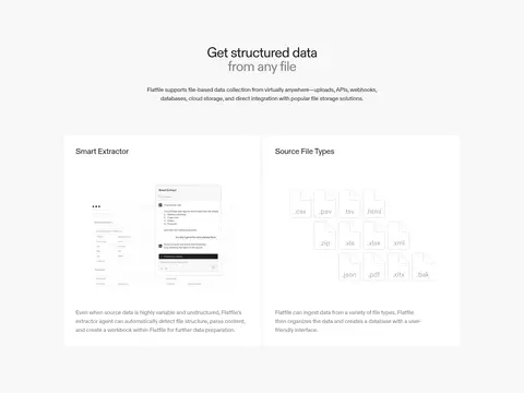
Imagery · Use product-interface screenshots, simplified file-type visuals, and small brand marks rather than lifestyle photography. Images are framed in clean, pale panels and often sit beside explanatory copy or in a card grid. Some large product visuals may carry soft, muted colors; keep these as contained artwork instead of extending their hues into the global palette. The announcement area’s layered file previews add a light sense of depth.
Reserve #f8f8f8 for gentle section and card contrast.
Keep headings concise and tightly tracked.
Pair feature explanations with relevant product UI.
Use dark pill CTAs sparingly for conversion moments.
Maintain substantial vertical separation between major sections.
✕ 不该做
Do not turn illustration colors into global brand accents.
Do not add gradients to otherwise flat sections.
Do not round every card; reserve pills for actions.
Do not crowd the centered hero with extra controls.
Do not use heavy shadows on ordinary feature cards.
Do not make secondary navigation compete with the content.
给 AI 的提示词
想快速出一个同风格的新页面,把这段话连同 DESIGN.md 一起发给 AI。
Build a new SaaS page in Flatfile’s quiet, product-led visual style. Use Gallery White (#ffffff) as the main canvas, Mist Surface (#f8f8f8) for occasional section bands, Midnight Ink (#090b2b) for strong headings, and Quiet Gray (#808080) for secondary links. Use FlatfileDiatype-like sans typography for UI and body copy, with a restrained editorial serif headline where useful. Center content within the measured 1088px maximum width, alternate centered introductions with left-aligned feature copy, and preserve generous vertical section spacing. Show the product through interface screenshots and file visuals in clean flat panels. Use thin Hairline Gray (#e5e5e5) borders and dark pill CTAs in Button Charcoal (#1b1b1e). Keep cards mostly square-cornered, avoid decorative gradients, and finish with a Footer Charcoal (#151515) navigation area.