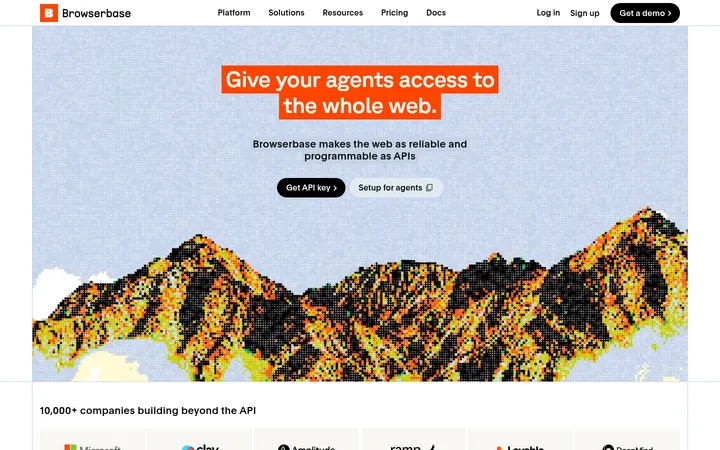
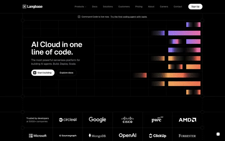
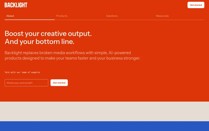
North star · Keep the page nearly black and let clear product UI, precise type, and sparing orange accents carry the hierarchy.
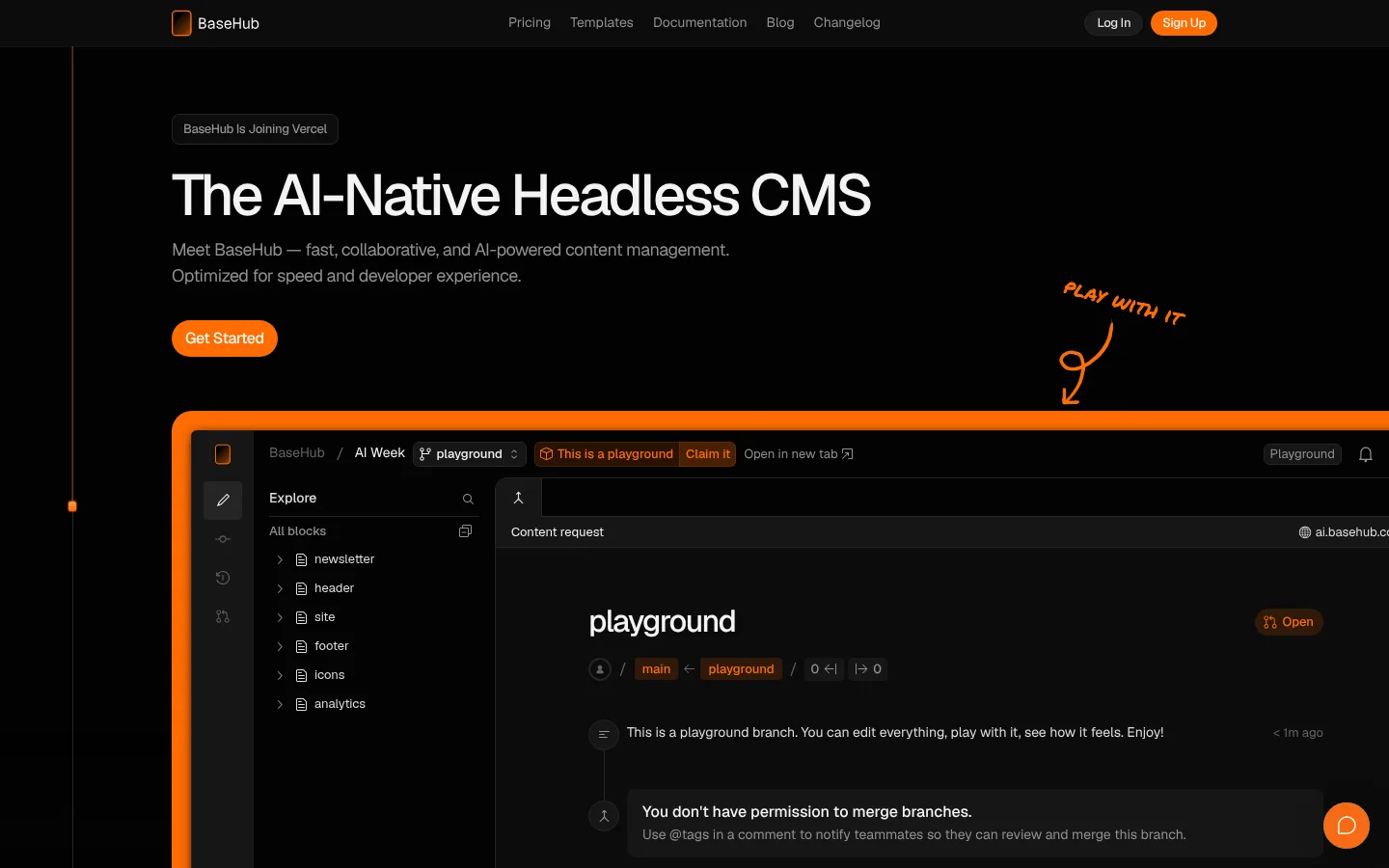
The page uses a nearly black canvas (#040404) throughout, with subtly differentiated charcoal surfaces to frame cards and product previews without breaking the dark continuity. Vivid orange (#ff6c02) is reserved for primary actions, selected interface details, and occasional visual cues; a warmer orange gradient appears in decorative or media treatments. Headings use Geist with compact tracking and medium weight, while muted gray supporting text keeps the hierarchy calm and readable. Geist Mono is limited to captions and code, reinforcing the developer-tool context. The layout begins with a spacious, left-aligned hero and an oversized product screenshot, then continues through editorial feature sections, interface demonstrations, pricing, and templates. Content sits within a centered, constrained column, with generous gaps between sections and tighter spacing inside cards. Thin charcoal borders and restrained shadows define layers; rounded pill buttons provide the clearest interactive contrast.
Display, headings, body copy, navigation, and buttons.
Aa 设计
Geist Mono
网络字体 · 字重 400 · 占比 15%
免费替代:IBM Plex Mono
Captions, code samples, and developer-oriented metadata.
角色
示例
字号
字重
行高
字距
特大标题
Oversized hero headline and major promotional statements.
BaseHub
60px
500
1.2
-0.05em
一级标题
Primary page headline and leading section headings.
BaseHub
48px
500
1.2
-0.05em
二级标题
Feature and product section headings.
BaseHub
32px
500
1.2
-0.05em
三级标题
Subsection headings and supporting feature titles.
The quick brown fox 敏捷的狐狸
24px
500
1.5
-0.05em
正文
Explanatory copy, testimonials, and card descriptions.
The quick brown fox 敏捷的狐狸
16px
400
1.4
-0.03em
辅助文字
Compact monospace labels and technical metadata.
The quick brown fox 敏捷的狐狸
13px
400
1.5
-0.03em
按钮
CTA and control labels.
The quick brown fox 敏捷的狐狸
13px
500
1.23
-0.03em
导航
Top-level navigation links.
The quick brown fox 敏捷的狐狸
14px
400
1.5
0
链接
Inline actions and secondary navigation links.
The quick brown fox 敏捷的狐狸
13px
500
1.5
-0.03em
代码
Code examples and developer snippets.
const style = 1;
13px
400
1.5
-0.03em
间距与布局
基准单位 8px · 密度:适中
80px版块间距
12px元素间距
12px卡片内边距
1148px内容最大宽度
2px
4px
6px
8px
10px
12px
16px
18px
20px
24px
32px
33px
80px
Use a centered content column with a measured maximum width of 1148px, while allowing prominent product media to feel broad and immersive. The hero is left-aligned, with the headline, supporting copy, and CTA above a large interface preview. Follow with stacked editorial feature sections, alternating text and product demonstrations, then pricing and template cards. Section spacing is generous; internal card spacing is tighter and comfortable. Keep the overall density low, with clear separation between blocks.
圆角与层次
按钮 · 9999px
卡片 · 12px
图片 · 50%
导航 · 4px
链接 · 8px
hairline · nav
md · other
lg · card
lg · media
The design is mostly flat: dark surfaces sit close to the canvas, with thin charcoal borders defining cards and controls. Use restrained shadows for media or layered interface previews rather than broad ambient elevation. The orange hero frame and CTA provide stronger visual separation than shadows.
组件
下面的预览按实测的按钮、输入框、徽标、卡片样式重建(字体用替代字体)。
Top navigation
Compact horizontal navigation on a dark surface, with muted links, a bordered Log In pill, and an orange Sign Up pill.
Primary CTA
Orange pill-shaped button with near-white medium-weight Geist text; used for Get Started and Sign Up.
Hero product preview
Large dark CMS interface screenshot framed with a thick, rounded orange edge, accompanied by a hand-drawn orange annotation.
Feature cards
Near-black cards with thin #252525 borders and rounded corners, pairing concise copy with interface or workflow details.
Code panel
Dark code example with small Geist Mono text, restrained syntax color, and supporting documentation links.
Template gallery
Three compact preview cards with distinct thumbnails, dark caption surfaces, and brief title and description text.
Footer CTA band
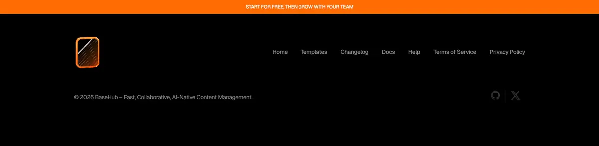
A vivid orange horizontal prompt above a black footer, followed by subdued navigation links and brand details.
Imagery · Use product UI as the primary visual asset: dark CMS interfaces, editor panels, code samples, and template previews. Frame screenshots within dark, thin-bordered cards; the hero preview receives a vivid orange outline and an informal orange annotation. Template thumbnails can introduce small image-specific color variations, but keep the surrounding page dark. No photography-led art direction is evident.
Use orange for primary actions and a few deliberate cues.
Let product screenshots occupy the largest visual areas.
Set headlines in Geist with tight, compact tracking.
Use Geist Mono for code and technical metadata.
Separate dark cards with thin charcoal borders.
Maintain generous gaps between major page sections.
✕ 不该做
Do not introduce bright section backgrounds.
Do not use orange as a broad page background.
Do not add decorative imagery that competes with product UI.
Do not make every card glow or cast a heavy shadow.
Do not use muted gray for primary headlines or actions.
Do not crowd the hero with multiple competing CTAs.
给 AI 的提示词
想快速出一个同风格的新页面,把这段话连同 DESIGN.md 一起发给 AI。
Build a new page in the BaseHub visual style. Use Carbon Canvas (#040404) as the dominant background, with Raised Charcoal (#0c0c0c) panels and Graphite Line (#252525) borders. Set headings and body in Geist, keeping headline tracking compact; use Geist Mono only for code and technical labels. Reserve Signal Orange (#ff6c02) for primary pill buttons and selected interface details, with Button White (#fafafa) button labels. Organize content in a centered, constrained column with generous gaps between sections and tighter card interiors. Make realistic dark product UI the main imagery, framed with subtle borders rather than heavy shadows. Use a clear left-aligned hero, followed by concise feature sections and large interface previews. Keep secondary text Quiet Gray (#909090), and avoid bright backgrounds or unnecessary decoration.