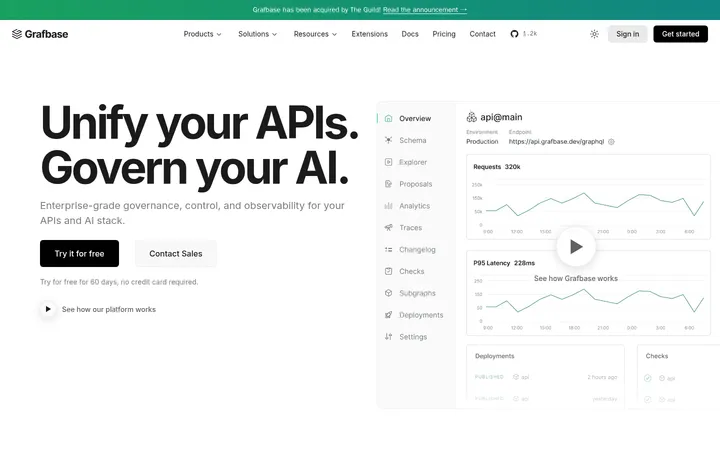
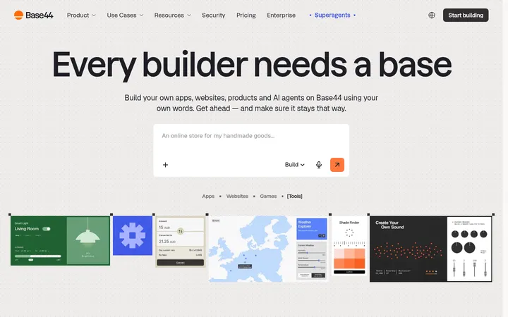
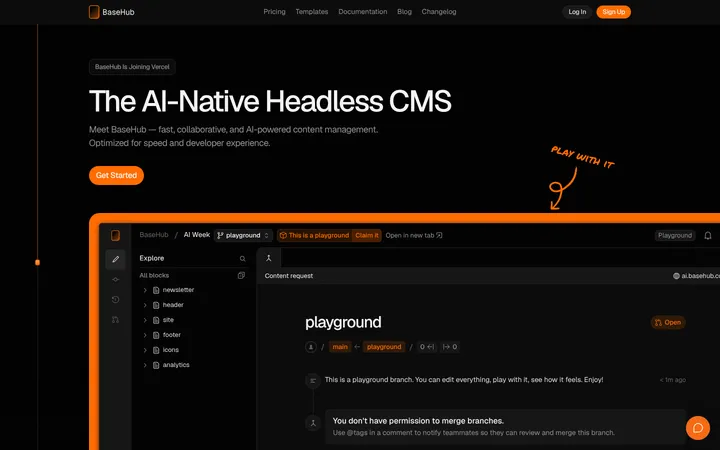
North star · Keep the page nearly black and structurally precise; reserve bright color for product media and crisp calls to action.
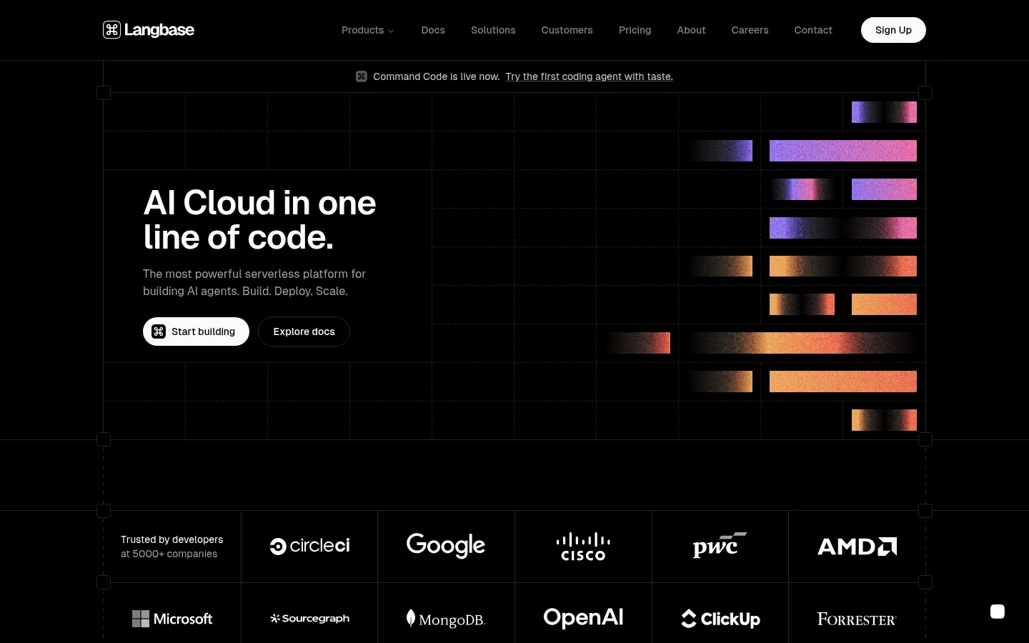
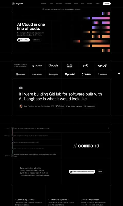
The visual system is built on a near-black canvas, with charcoal panels and thin, low-contrast borders defining a precise technical grid. White headings and controls establish hierarchy, while muted gray copy keeps dense explanations legible without competing with the product. Geist Sans gives navigation and editorial content a clean, contemporary voice; Geist Mono signals code, compact labels, and oversized slash-prefixed product names. The first screen balances a left-aligned text-and-action block against abstract gradient bars on the right. Farther down, the same grid organizes product walkthroughs, code panes, feature cards, and customer testimonials into clear bands. Colorful media is concentrated in product illustrations rather than used as broad page backgrounds, so the purple accent remains selective. Spacious section breaks offset the otherwise information-rich layout, and pill-shaped controls provide the main soft contrast to square-edged, border-led panels.
Navigation, headings, body copy, links, and buttons.
Aa 设计
GeistMono
网络字体 · 字重 500 / 400 · 占比 31%
免费替代:Space Mono
Code, compact labels, captions, and oversized product display names.
角色
示例
字号
字重
行高
字距
特大标题
Oversized slash-prefixed names for product areas such as command and memory.
Langbase
72px
500
1
0
一级标题
Primary hero headline and other top-level page statements.
Langbase
48px
400
1.17
-0.025em
二级标题
Section and product-feature headings.
The quick brown fox 敏捷的狐狸
20px
400
1.4
0
三级标题
Supporting feature titles and smaller content headings.
The quick brown fox 敏捷的狐狸
18px
400
1.56
0
正文
Compact technical descriptions and mono-styled explanatory copy.
The quick brown fox 敏捷的狐狸
13px
500
1.52
0
辅助文字
Small metadata, code annotations, and tertiary labels.
The quick brown fox 敏捷的狐狸
12px
400
1.33
0
按钮
Compact text in pill-shaped actions.
The quick brown fox 敏捷的狐狸
12px
500
1.33
0
导航
Top navigation items and navigation controls.
The quick brown fox 敏捷的狐狸
14px
500
1.43
0
链接
Inline links, customer-story references, and supporting actions.
The quick brown fox 敏捷的狐狸
14px
400
1.43
0
代码
Code samples and developer-oriented snippets.
const style = 1;
13px
500
1.52
0
间距与布局
基准单位 4px · 密度:宽松
160px版块间距
8px元素间距
—卡片内边距
1150px内容最大宽度
4px
8px
10px
12px
16px
20px
24px
32px
40px
160px
Use a centered, wide content frame with a measured maximum width of 1150px. Organize most content in a fine, dark grid with thin outlined cells and left-aligned copy. The hero pairs text and actions on the left with abstract product artwork on the right. Below it, alternate logo proof, testimonials, product walkthroughs, code examples, and feature-card rows. Keep section breaks spacious, but let product demonstrations carry denser content inside their grid panels.
圆角与层次
按钮 · 9999px
图片 · 4px
导航 · 9999px
sm · button
md · button
The page is predominantly flat: fine charcoal borders, gridlines, and outlined panels establish structure rather than elevated cards. Keep the dark surfaces close to the canvas in tone, and avoid large drop shadows. Pill buttons provide the main rounded contrast; product panels remain square and precisely divided.
组件
下面的预览按实测的按钮、输入框、徽标、卡片样式重建(字体用替代字体)。
Top navigation
A compact horizontal header with white brand mark, restrained links, and a bright pill-shaped sign-up action.
Announcement strip
A narrow, centered product announcement below navigation, with a small icon and an underlined supporting link.
Dark, grid-aligned customer quotes with small portraits, names, roles, and subdued supporting text.
Imagery · The hero and feature sections use abstract horizontal bars with colorful gradients as product-adjacent artwork, not photographic brand imagery. Product walkthroughs and code panes are framed as dark interface mockups within the grid. Customer proof includes small portrait images, while the logo cloud uses monochrome marks. Preserve the vivid media as localized accents against the black canvas.
Use fine charcoal gridlines to define content regions.
Keep primary headings white and supporting copy muted.
Use Geist Mono for code and technical display labels.
Reserve gradients for localized product artwork.
Use white-filled pill buttons for primary actions.
✕ 不该做
Do not introduce bright full-width color bands.
Do not use heavy shadows to separate panels.
Do not round every card or grid cell.
Do not make supporting copy compete with headlines.
Do not replace product artwork with generic stock photography.
Do not scatter accent colors across ordinary text.
给 AI 的提示词
想快速出一个同风格的新页面,把这段话连同 DESIGN.md 一起发给 AI。
Build a new Langbase-style AI developer page on a Pitch Black (#000000) canvas. Structure the content with thin Gridline Charcoal (#232324) borders and subtle Graphite Panel (#161618) surfaces, keeping the grid precise and largely flat. Use Clean White (#ffffff) for headings and key actions, Soft Alloy (#a1a1aa) for supporting copy, and Signal Lavender (#9887ff) sparingly. Set editorial content in Geist Sans or a close substitute; use Geist Mono for code, compact labels, and slash-prefixed product names. Make the hero left-aligned with concise copy and pill actions, balancing it with localized abstract gradient product artwork. Continue with product demonstrations, code panes, feature cards, and customer proof, separated by generous section breaks. Favor borders over shadows and preserve strong contrast.