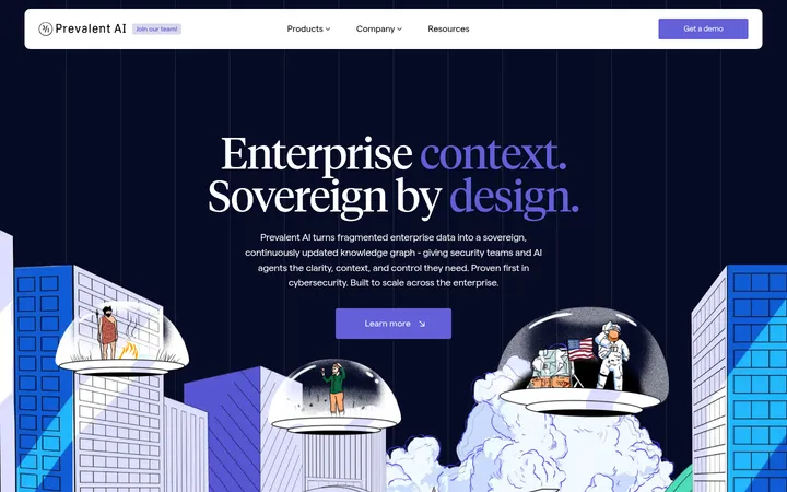
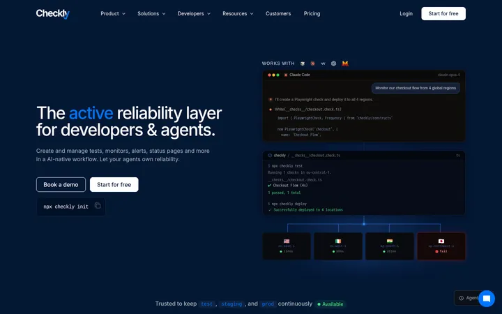
North star · Pair editorial-scale headlines with an orderly, low-noise interface, using navy as the trust anchor and bright accents sparingly.
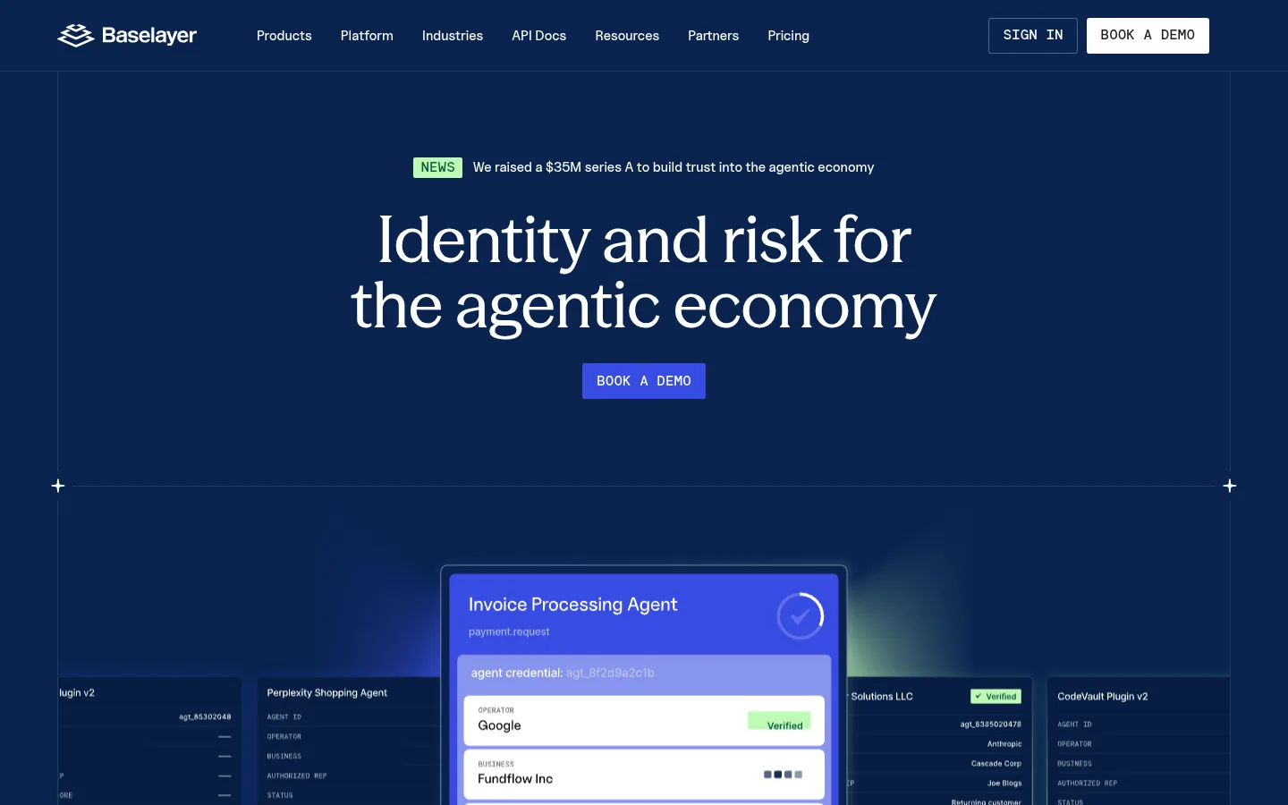
The visual system opens with a deep navy hero that gives the white serif headline strong contrast and a confident editorial feel. A restrained electric-blue CTA and small mint news label provide the brightest accents; the product illustration adds luminous blue and green tones but should read as media, not as the core palette. Below the hero, broad white sections return to black text, generous breathing room, and hairline gray dividers. Season is used for expressive display headlines, while Uncut Sans carries navigation, body copy, and functional labels; mono typography marks compact uppercase metadata. Layouts alternate centered brand statements with left-aligned product explanations and modular grids. Product-interface imagery is framed as evidence of the platform, not decorative photography. Keep surfaces largely flat, use borders to define structure, and reserve dark bands for selected conversion or testimonial moments.
Navigation, body copy, functional links, and compact interface text.
Aa 设计
__modernEraMono_e11d9c
网络字体 · 字重 500 · 占比 14%
免费替代:IBM Plex Mono
Uppercase metadata, captions, and technical-style labels.
Aa 设计
__seasonVF_f6436e
网络字体 · 字重 515 · 占比 12%
免费替代:DM Serif Display
Display headlines and prominent section headings.
角色
示例
字号
字重
行高
字距
特大标题
Large editorial statements, especially the centered hero headline.
Baselayer
72px
515
1.02
-0.005em
一级标题
Primary page-level heading and major feature headline.
Baselayer
60px
500
0.8
-0.02em
二级标题
Large section titles across product and proof-point content.
Baselayer
56px
515
1.02
-0.005em
三级标题
Subsection titles and prominent customer or product statements.
Baselayer
48px
515
1.1
-0.005em
四级标题
Smaller feature titles and supporting content headings.
Baselayer
40px
515
1.15
-0.005em
正文
Explanatory product copy, testimonials, and descriptive text.
The quick brown fox 敏捷的狐狸
20px
400
1.4
-0.009em
辅助文字
Uppercase category labels and compact metadata.
The quick brown fox 敏捷的狐狸
16px
500
1.15
0
导航
Primary navigation labels and menu items.
The quick brown fox 敏捷的狐狸
15px
500
0.8
0
代码
Technical or API-oriented labels and compact identifiers.
const style = 1;
16px
500
1.15
0
间距与布局
基准单位 4px · 密度:紧凑
32px版块间距
4px元素间距
—卡片内边距
1312px内容最大宽度
4px
6px
8px
10px
12px
16px
20px
24px
28px
32px
40px
48px
80px
164px
Use a centered content frame with a measured maximum width of 1312px and a compact overall density. The hero is centered within a ruled, full-bleed navy stage; its product artwork sits below the headline. White content sections shift between centered introductions, two-column product explanations, and multi-column proof or editorial grids. Preserve generous vertical breathing room between major bands, while using fine dividers and aligned edges to keep the long page orderly.
圆角与层次
按钮 · 4px
卡片 · 4px
导航 · 4px
链接 · 4px
inset · nav
The page is predominantly flat, with no prominent drop-shadow system. Fine gray rules and inset navigation borders define edges; modest card outlines separate content without heavy containers. The hero illustration creates depth through overlapping interface panels and glow, rather than through reusable card shadows.
组件
下面的预览按实测的按钮、输入框、徽标、卡片样式重建(字体用替代字体)。
Navy navigation
White wordmark and navigation on the navy surface, with a bordered sign-in control and contrasting white demo action.
Hero announcement
Compact news line centered above the hero headline, with a pale mint label and small white supporting copy.
Hero headline and CTA
Centered white serif statement on navy with a bright blue demo button immediately below.
Ruled feature row
Product information separated by fine gray borders, paired with clear black copy and restrained link styling.
Metric card
A light mint-gray surface with compact black metric content and a subtle rounded edge.
Dark testimonial band
Customer proof on a near-black surface, contrasting with the otherwise white page and using restrained dividers.
Imagery · The hero uses a layered product-interface illustration: a bright verification panel floats in front of darker agent and business data panels. Keep its crisp UI surfaces, blue glow, and limited green verification cues; those vivid colors belong to the illustration rather than the core brand palette. Later imagery supports product features, customer stories, and articles. Favor framed interface and editorial media over generic decorative photography.
Anchor the opening viewport with Trust Navy (#09234f).
Use Season-style serif headlines for the highest-impact statements.
Keep body copy and navigation clean and sans-serif.
Use mono type for short uppercase metadata only.
Separate white content modules with fine gray rules.
Let product UI imagery carry its own blue and green glow.
✕ 不该做
Do not turn illustration colors into broad page backgrounds.
Do not add heavy shadows to otherwise flat cards.
Do not crowd the hero headline with supporting copy.
Do not use all-caps mono for long passages.
Do not round every content block into a pill or panel.
Do not make every section dark; preserve the white content rhythm.
给 AI 的提示词
想快速出一个同风格的新页面,把这段话连同 DESIGN.md 一起发给 AI。
Build a new Baselayer-style page as a polished financial-risk SaaS experience. Use Trust Navy (#09234f) for a confident opening or conversion band, Gallery White (#ffffff) for the main canvas, and Print Black (#000000) for readable copy. Set large editorial headlines in a Season-like serif, with clean sans-serif body and navigation, and compact mono uppercase labels for metadata. Organize content in a centered frame with ruled edges, alternating centered statements and practical two-column feature blocks. Use Rule Gray (#e5e5e5) for quiet separators; reserve Signal Teal (#1888a2) and Glacier Tint (#c4f0ff) for small accents. Feature product UI panels as evidence, with illustration-only glow and verification colors. Keep cards mostly flat, spacing breathable, and conversion actions unmistakable without adding visual clutter.