North star · Balance editorial serif headlines and vivid narrative illustration against calm, spacious layouts and a disciplined navy-violet palette.
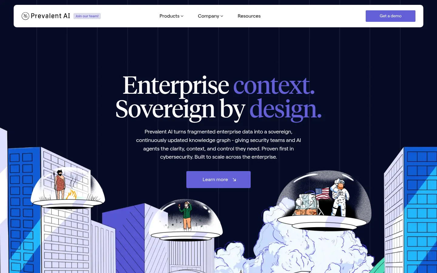
The visual strategy alternates immersive dark bands with bright, open content sections. The hero and footer use Midnight Ink (#060b25), making white type and Signal Violet (#6360d8) headline emphasis and CTA buttons stand out; the central narrative and resources sections return to white or near-white canvases. Matter handles navigation, body copy, and buttons in a clean sans-serif voice, while Tiempos Headline brings an editorial, literary character to display and section headings. Typography is generally regular-weight, with tight headline tracking and selective violet emphasis rather than decorative effects. The spacious layout uses a centered hero, broad content width, and clear section breaks; product blocks shift into two-column layouts, with three-column capability and resource groupings. Illustrations carry much of the personality: they are large, colorful, and integrated into the page story rather than treated as generic stock imagery. Cards remain mostly flat, differentiated by pale mint or lavender fills and fine rules.
配色
点色块复制色值。用途说明来自对页面的实测位置(背景、文字、描边、按钮)与截图判读。
品牌色
强调色
表层色
中性色
功能色
页面底色 · Gallery White表层 · Midnight Ink表层 2 · Mint Veil表层 3 · Lavender Veil主文字 · True Ink次要文字 · Gallery White弱文字 · Slate Copy描边 · Signal Violet强调 · Signal Violet
Navigation, body copy, captions, buttons, and the measured sans-serif h1.
Aa 设计
Tiempos Headline
网络字体 · 字重 400 · 占比 11%
免费替代:Instrument Serif
Display and section headlines, including editorial statements and product titles.
角色
示例
字号
字重
行高
字距
特大标题
Oversized editorial hero statement.
Prevalent AI
80px
400
0.98
-0.02em
一级标题
Hero heading in a clean sans-serif treatment where used.
Prevalent AI
50px
400
1
-0.02em
二级标题
Major section statements and prominent product headings.
Prevalent AI
48px
400
1.1
-0.02em
三级标题
Secondary editorial headings and content group titles.
Prevalent AI
45px
400
1.1
-0.02em
四级标题
Product-card and smaller section headings.
Prevalent AI
30px
400
1.1
-0.02em
正文
Explanatory copy, product descriptions, and article summaries.
The quick brown fox 敏捷的狐狸
18px
400
1.55
-0.02em
辅助文字
Small supporting labels and resource metadata.
The quick brown fox 敏捷的狐狸
16px
400
1.55
-0.02em
按钮
Compact CTA labels such as demo and contact actions.
The quick brown fox 敏捷的狐狸
14px
400
1
-0.02em
导航
Primary navigation links and menu labels.
The quick brown fox 敏捷的狐狸
16px
400
1.55
0
间距与布局
基准单位 4px · 密度:宽松
144px版块间距
32px元素间距
—卡片内边距
1200px内容最大宽度
1px
2px
4px
5px
7px
8px
12px
14px
15px
17px
18px
22px
24px
26px
29px
32px
The page uses a spacious, long-form rhythm with a measured 1200px maximum content width and substantial section separation. A centered, single-column hero gives way to left-aligned introduction and three-column capability content, followed by centered product framing and two-column product cards. Team content uses a media-and-copy split; resources use a three-column article grid. Dark full-width bands bookend the mostly white page. Keep alignments clear and density low, using whitespace rather than heavy dividers to distinguish sections.
圆角与层次
按钮 · 4px
导航 · 4px
hairline · nav
The design is predominantly flat: cards rely on tinted fills, framing, and whitespace rather than shadows. Borders and hairlines are restrained, with occasional fine rules in content and footer areas. Layering comes from the hero illustration overlapping the dark field and the white navigation panel sitting above it, not from prominent elevation effects.
组件
下面的预览按实测的按钮、输入框、徽标、卡片样式重建(字体用替代字体)。
Floating navigation
A broad white rounded navigation panel over the dark hero, with a logo and hiring badge at left, centered menu links, and a violet demo CTA at right.
Hero statement
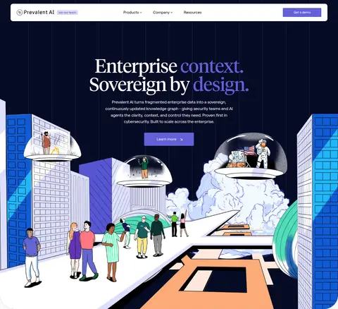
Centered editorial headline with white and violet emphasis, supporting copy, a violet Learn more button, and a large illustrated scene below.
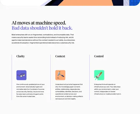
Capability columns
Three evenly distributed text-led columns for Clarity, Context, and Control, separated by fine vertical rules and paired with small colorful illustrations.
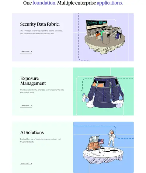
Product showcase cards
Wide, flat cards combine concise left-aligned product copy and Learn more link with a large illustration; use pale lavender or mint surfaces.
Resource grid
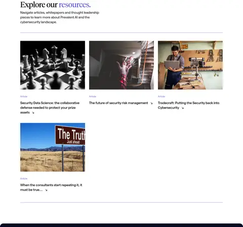
Editorial article cards arranged in three columns with landscape thumbnails, small category labels, compact titles, and subtle separators.
Footer CTA
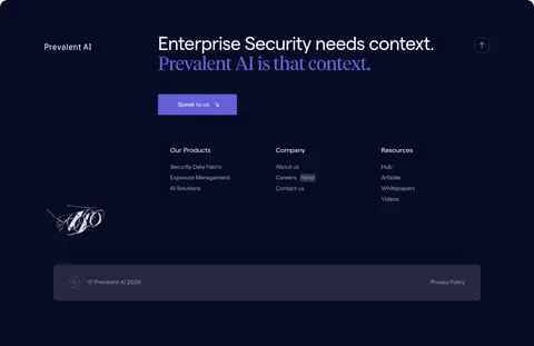
Dark full-width closing band with a two-line headline, violet emphasis, contact button, grouped navigation links, and a subdued legal bar.
Imagery · The hero is built around a large, colorful illustrated enterprise world that extends across the dark background and anchors the opening story. Product cards pair concise copy with distinct illustrated scenes on pale mint, lavender, and blue-toned panels. The team block uses a media image, and the resource area uses photographic article thumbnails. Preserve the contrast between narrative illustration and documentary-style editorial photography; imagery is integrated into broad page blocks rather than small decorative icons.
Use Midnight Ink (#060b25) for the hero and closing footer bands.
Set editorial display headlines in a restrained serif.
Reserve Signal Violet (#6360d8) for CTAs and selective emphasis.
Keep content sections bright, spacious, and easy to scan.
Use illustrations as integrated storytelling, especially in the hero and product cards.
Differentiate product cards with pale mint or lavender fills.
✕ 不该做
Do not turn every section into a dark panel.
Do not replace the illustrated narrative with generic interface mockups.
Do not add heavy shadows to otherwise flat cards.
Do not use multiple competing accent colors for controls.
Do not compress sections into a dense dashboard layout.
Do not set all headings in the same sans-serif voice.
给 AI 的提示词
想快速出一个同风格的新页面,把这段话连同 DESIGN.md 一起发给 AI。
Build a new page in Prevalent AI’s editorial enterprise-security style. Use Midnight Ink (#060b25) for immersive hero or closing bands, Gallery White (#ffffff) for the main canvas, True Ink (#000000) for primary copy, and Signal Violet (#6360d8) for CTAs and selective headline emphasis. Set major statements in a Tiempos-like editorial serif and navigation/body copy in a Matter-like sans serif. Favor a spacious content width, clear section breaks, and simple column grids. Use large narrative illustrations as meaningful content, with product panels on Mint Veil (#f1fff9) or Lavender Veil (#f1f1ff). Keep cards flat, borders restrained, and hierarchy obvious. Build a new composition rather than copying the exact homepage sections; preserve its contrast, typography, and calm pacing.